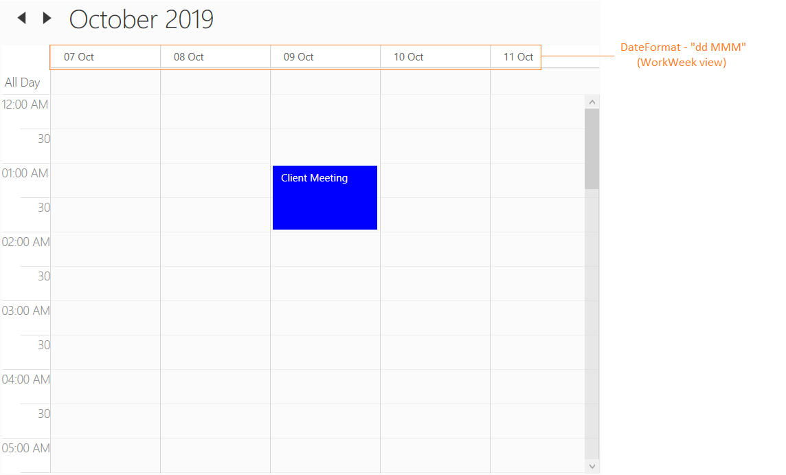
Views in WPF Scheduler (SfSchedule)
Scheduler provides the following different types of views.
- Day view
- Week view
- WorkWeek view
- Timeline View - Refer scheduler timeline view documentation for more customization details.
- Month View - Refer scheduler month view documentation for more customization details.
This topic covers customization of day, week and workweek views of the scheduler which shares common properties.
NOTE
This topic explains all customization using day view. But the same applies for week and workweek views also. if you want to make customization specific to views, then please refer link
Header date format
Scheduler supports to customize the default header date format of the day, week, workweek and timeline view by using the HeaderDateFormat property.
<Schedule:SfSchedule HeaderDateFormat="dd-MMMM-yyyy"/>this.schedule.HeaderDateFormat = "dd-MMMM-yyyy";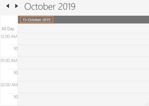
Time formatting
Scheduler supports to customize time format for day, week, workweek and timeline views by using MajorTickTimeFormat and MinorTickTimeFormat property.
<syncfusion:SfSchedule MajorTickTimeFormat="hh mm ss" MinorTickTimeFormat="mm ss"/>this.schedule.MajorTickTimeFormat = "hh mm ss";
this.schedule.MinorTickTimeFormat = "hh mm ss";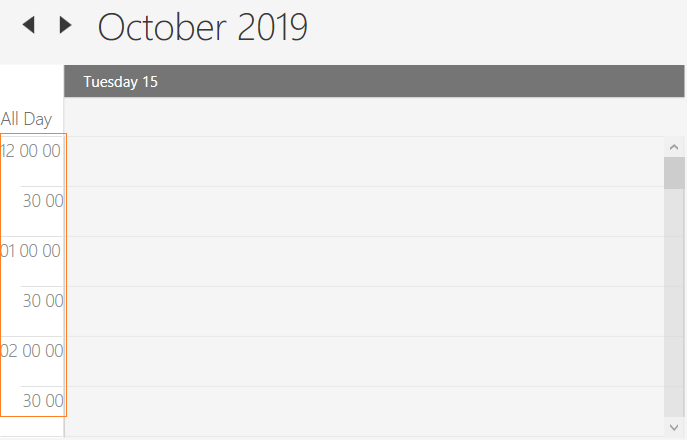
Enable auto formatting
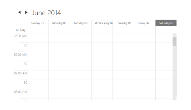
When reducing the size of the schedule in week and month views, headers may be only partially shown. To avoid incompletely displayed headers, automatic formatting can be enabled by setting the EnableAutoFormat property of the Scheduler control as true. If this property enabled, HeaderDateFormat settings will not apply.
<syncfusion:SfSchedule x:Name="schedule" Background="White"
                        Height="400" Width="500"
                        EnableAutoFormat="True"
                        ScheduleType="Week">
</syncfusion:SfSchedule>schedule.Background = new SolidColorBrush(Colors.White);
schedule.Height = 400;
schedule.Width = 500;
schedule.EnableAutoFormat = true;
schedule.ScheduleType = ScheduleType.Week;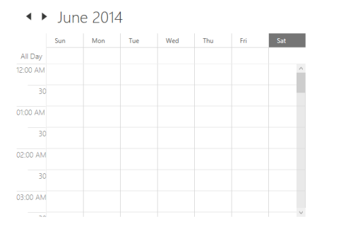
After changing the window size by resizing the window.
Change time interval
Scheduler supports to change the time interval by using TimeInterval property.
<Schedule:SfSchedule TimeInterval = "OneHour" />this.schedule.TimeInterval = TimeInterval.OneHour;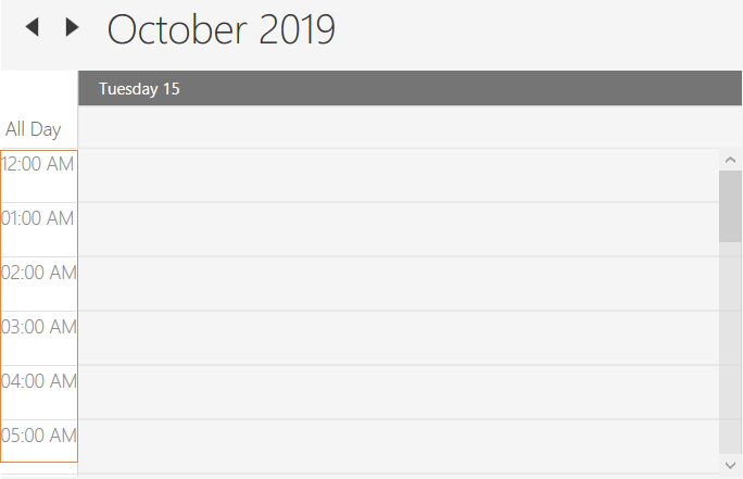
Change time interval height
Scheduler supports to change the time interval height by using IntervalHeight property.
<Schedule:SfSchedule IntervalHeight = 100 />this.schedule.IntervalHeight = 100;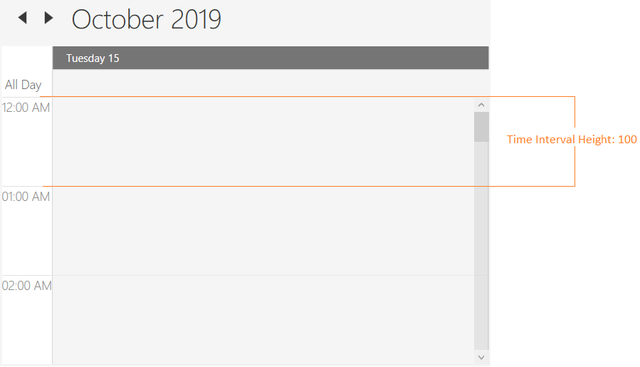
Change between 12-hour and 24-hour format
Scheduler supports to change the time format from 12hours to 24 hours by using the TimeMode property.
<Grid Background="White" Name="grid">
    <Schedule:SfSchedule ScheduleType="Day" TimeMode="TwelveHours" >
    </Schedule:SfSchedule>
</Grid>schedule.ScheduleType = ScheduleType.Day;
schedule.TimeMode = TimeModes.TwelveHours;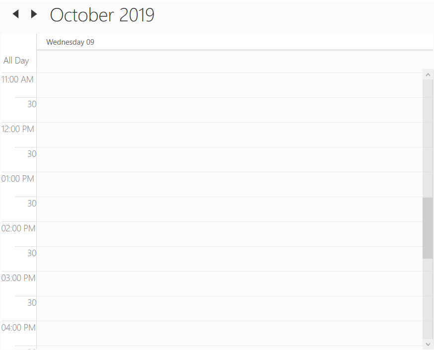

Change first day of week
Scheduler supports to change the first day of week with any day by using FirstDayOfWeek property.
Day - FirstDayOfWeek of Scheduler is not applicable for day view as it displays only one day.
Week/Month - By default, scheduler control will be rendered with Sunday as the first day of the week.
WorkWeek - By default, scheduler control will be rendered with Monday as the first day. Saturday and Sunday has considered as a non working days.
Non-accessible timeslots
Scheduler supports to mark certain timeslots as non-accessible timeslots by using NonAccessibleBlocks property. User can’t interact over the timeslot marked as non-accessible timeslots.
<Schedule:SfSchedule>
    <Schedule:SfSchedule.NonAccessibleBlocks>
        <Schedule:NonAccessibleBlock Background="Black" StartHour="13" EndHour="14" Label="Lunch">
        </Schedule:NonAccessibleBlock>
    </Schedule:SfSchedule.NonAccessibleBlocks>
</Schedule:SfSchedule>this.schedule.NonAccessibleBlocks.Add(new NonAccessibleBlock() { Background = new SolidColorBrush(Colors.Black), StartHour = 13, EndHour = 14, Label = "Lunch" });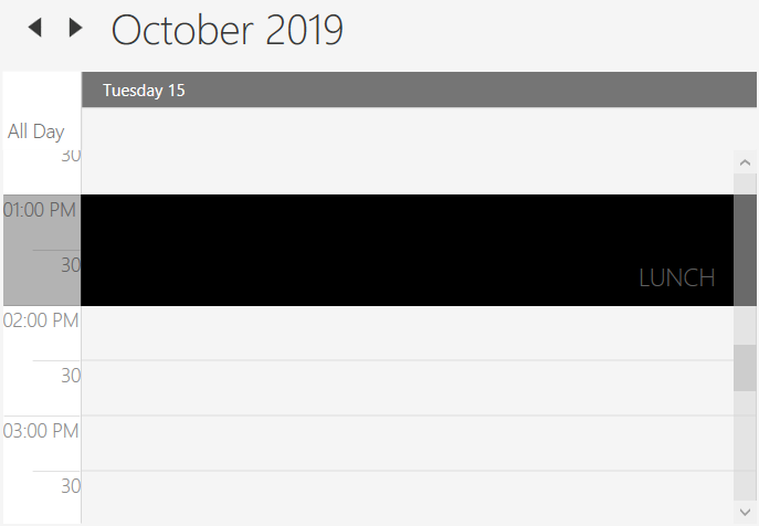
Customize non-accessible timeslots using template
Scheduler supports to customize the non-accessible timeslots by using NonAccessibleBlockTemplate property.
<syncfusion:SfSchedule.NonAccessibleBlockTemplate>
    <DataTemplate>
        <Border Background="{Binding Color}">
            <TextBlock Text="{Binding EventName}" Foreground="White" HorizontalAlignment="Center" VerticalAlignment="Center"/>
        </Border>
    </DataTemplate>
</syncfusion:SfSchedule.NonAccessibleBlockTemplate>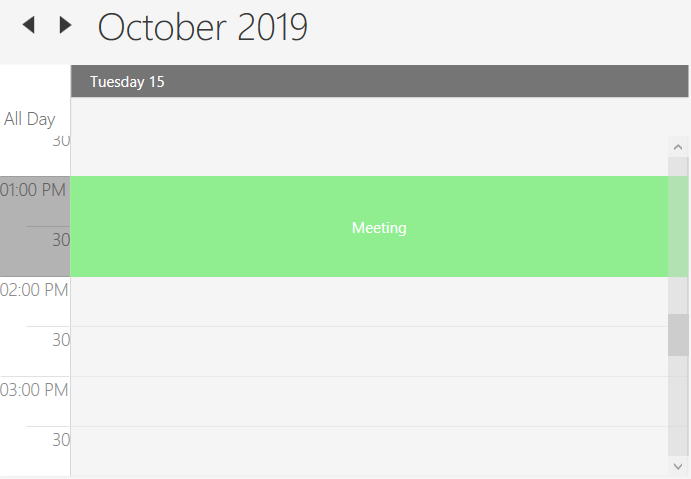
Change non-working days
By default Schedule considers Saturday and Sunday as a non working days. You can change the non-working days using NonWorkingDays property.
<schedule:SfSchedule x:Name="schedule" ScheduleType="WorkWeek" NonWorkingDays="Monday,Tuesday"/>this.schedule.ScheduleType = ScheduleType.WorkWeek;
this.schedule.NonWorkingDays = DayOfWeek.Monday.ToString() + "," + DayOfWeek.Tuesday.ToString();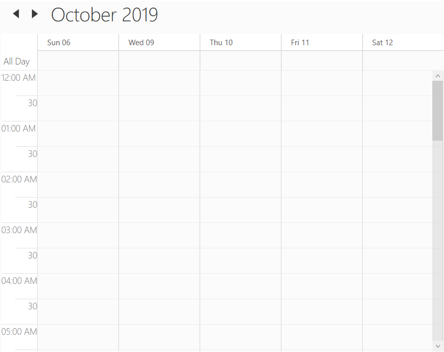
Collapsed hours
Scheduler supports to hide the selected hours by using CollapsedHours property. ScheduleCollapsedHours does have the following properties.
StartHour - To set start time of collapsed hour.
EndHour - To set end time of collapsed hour.
Background - To set the background of collapsed hours.
<schedule:SfSchedule Background="White" x:Name="schedule" ScheduleType="Week">
    <schedule:SfSchedule.CollapsedHours>
        <schedule:ScheduleCollapsedHour StartHour="1" EndHour="5"  Background="Red"/>
    </schedule:SfSchedule.CollapsedHours>
</schedule:SfSchedule>this.schedule.CollapsedHours.Add(new ScheduleCollapsedHour() { StartHour = 1, EndHour = 5, Background = new SolidColorBrush(Colors.Red)});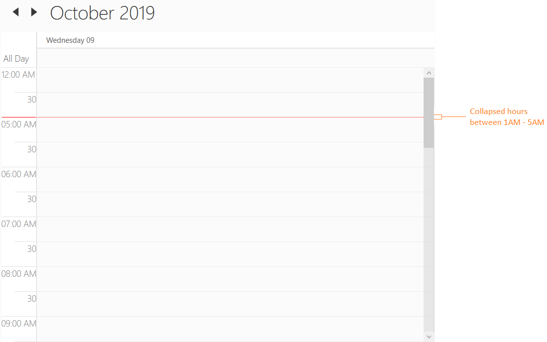
Change working hours
Working hours of Scheduler will be differentiated with non-working hours by separate color using IsHighLightWorkingHours property for day, week, workweek and timeline views. By default, working hours will be between 09 to 18. You can customize the working hours by setting WorkStartHour and WorkEndHour properties.
<schedule:SfSchedule x:Name="schedule"
                     WorkStartHour="9"
                     WorkEndHour="12"
IsHighLightWorkingHours="True"/>this.schedule.WorkStartHour = 9;
this.schedule.WorkEndHour = 12;
this.schedule.IsHighLightWorkingHours = true;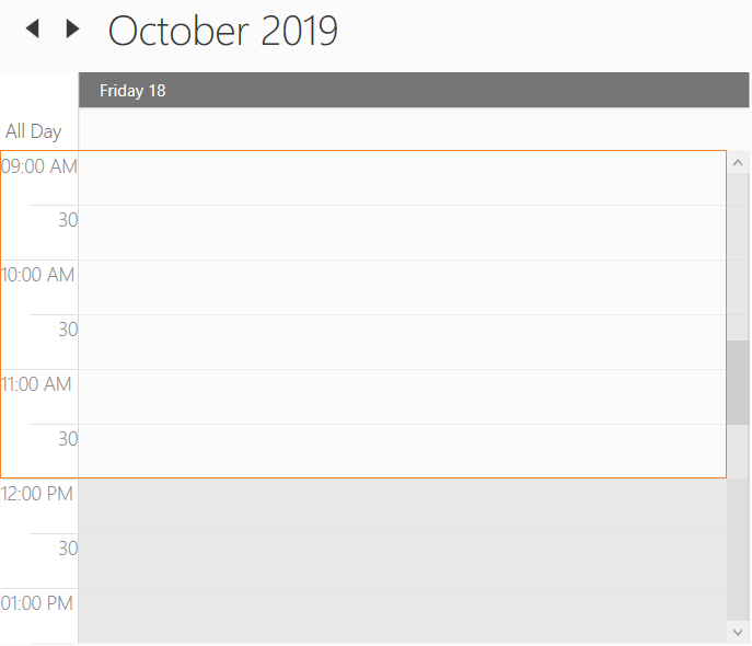
Display working hours only
Scheduler supports to display the working hours only by disabling the ShowNonWorkingHours property.
<schedule:SfSchedule x:Name="schedule"
                     WorkStartHour="9"
                     WorkEndHour="12"
ShowNonWorkingHours="False"/>this.schedule.WorkStartHour = 9;
this.schedule.WorkEndHour = 12;
this.schedule.ShowNonWorkingHours = false;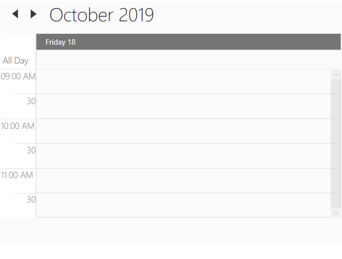
Change non-working hours background
Scheduler supports to change the background color for non-working hours by using NonWorkingHourBrush property.
<schedule:SfSchedule x:Name="schedule"
                     WorkStartHour="9"
                     WorkEndHour="12"
                     NonWorkingHourBrush="LightSteelBlue"
IsHighLightWorkingHours="True"/>this.schedule.WorkStartHour = 9;
this.schedule.WorkEndHour = 12;
this.schedule.NonWorkingHourBrush = Brushes.LightSteelBlue;
this.schedule.IsHighLightWorkingHours = true;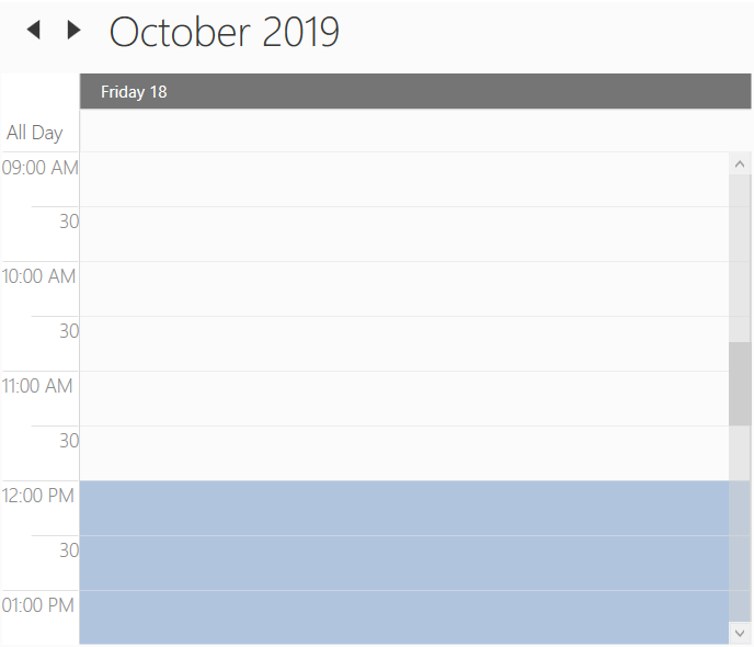
Current time indicator
Scheduler supports to display the current time indicator by using the CurrentTimeIndicatorVisibility property.
<syncfusion:SfSchedule ScheduleType="Day" CurrentTimeIndicatorVisibility="Visible"/>schedule.ScheduleType = ScheduleType.Day;
this.schedule.CurrentTimeIndicatorVisibility = Visibility.Visible;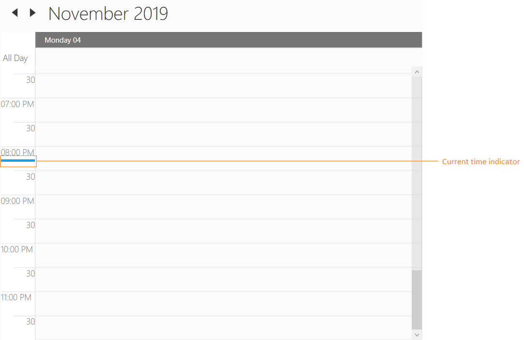
Customize current time indicator
Scheduler supports to customize the current time indicator by using CurrentTimeIndicatorTemplate property.
<Schedule:SfSchedule x:Name="schedule" ScheduleType="Day" CurrentTimeIndicatorVisibility="Visible">
    <Schedule:SfSchedule.CurrentTimeIndicatorTemplate>
        <DataTemplate>
            <Border Background="DarkGreen" Height="10" Width="100"></Border>
        </DataTemplate>
    </Schedule:SfSchedule.CurrentTimeIndicatorTemplate>
</Schedule:SfSchedule>schedule.ScheduleType = ScheduleType.Day;
schedule.CurrentTimeIndicatorVisibility = Visibility.Visible;
schedule.CurrentTimeIndicatorTemplate = (DataTemplate)this.Resources["CurrentTimeIndicatorTemplate"];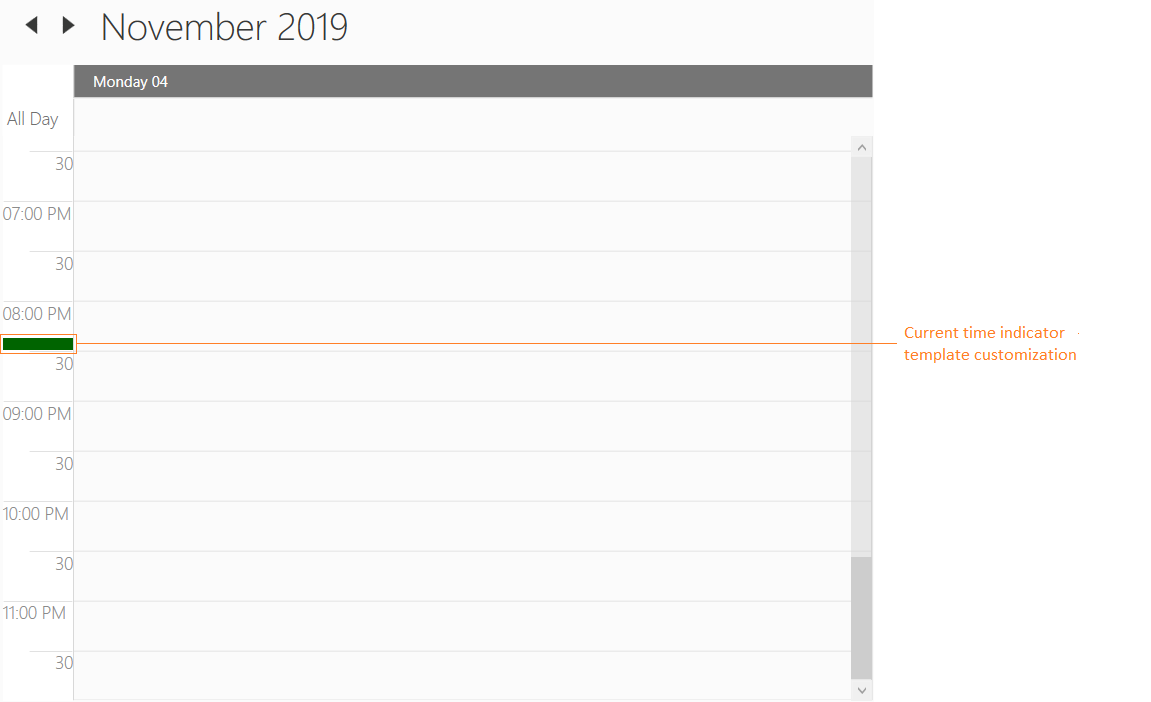
Change hours or minutes time label visibility
Scheduler supports to visible/collapse the hours and minutes time label visiblity by using MajorTickVisibility and MinorTickVisibility properties.
<Schedule:SfSchedule ScheduleType="Day" MajorTickVisibility="Collapsed" MinorTickVisibility="Collapsed" />this.schedule.ScheduleType = ScheduleType.Day;
this.schedule.MajorTickVisibility = Visibility.Collapsed;
this.schedule.MinorTickVisibility = Visibility.Collapsed;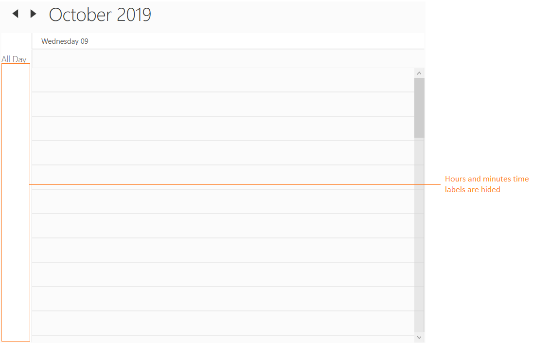
Appearance
Changing time label background
Scheduler supports to change the time slot label background by using HeaderBackground property.
<Schedule:SfSchedule HeaderBackground="LightSkyBlue" />this.schedule.HeaderBackground = Brushes.LightSkyBlue;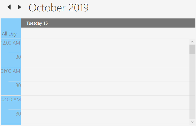
Stroke customization
In Scheduler control, major, minor horizontal and vertical lines drawn in the day, week, workweek and timeline views by using following properties,
Property Table
| API Name | Data Type | Description |
|---|---|---|
| MajorTickStroke | Brush | Used to customize the major line stroke of the day, week, workweek and timeline views. |
| MinorTickStroke | Brush | Used to customize the minor line stroke of the day, week, workweek and timeline views. |
| MajorTickLabelStroke | Brush | Used to customize the major line label stroke in the day, week, workweek and timeline views. |
| MinorTickLabelStroke | Brush | Used to customize the minor line label stroke of the day, week, workweek and timeline views. |
| MajorTickStrokeDashArray | DoubleCollection | Used to customize the major line stroke dash array of the day, week, workweek and timeline views. |
| MinorTickStrokeDashArray | DoubleCollection | Used to customize the minor line stroke dash array of the day, week, workweek and timeline views. |
| DayViewVerticalLineStroke | Brush | Used to customize the vertical line stroke of the day, week and workweek view. |
Changing time label foreground
Scheduler supports to change the time label foreground by using MinorTickLabelStroke and MajorTickLabelStroke property.
<syncfusion:SfSchedule MajorTickLabelStroke="DarkRed" MinorTickLabelStroke="Red"/>this.schedule.MajorTickLabelStroke = Brushes.DarkRed;
this.schedule.MinorTickLabelStroke = Brushes.Red;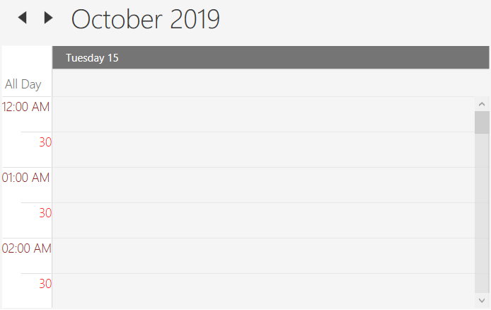
Changing timeslots line color
Scheduler supports to change the time slots line color by using MajorTickStroke and MinorTickStroke property.
<syncfusion:SfSchedule MajorTickStroke="LawnGreen" MinorTickStroke="LightBlue"/>this.schedule.MajorTickStroke = Brushes.LawnGreen;
this.schedule.MinorTickStroke = Brushes.LightBlue;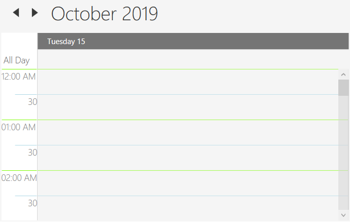
Changing timeslots line style
Scheduler supports to customize the major/minor line stroke style of the day, week, workweek and time line views.
<syncfusion:SfSchedule MajorTickStroke="Red" MajorTickStrokeDashArray="5,10" MinorTickStroke="Blue" MinorTickStrokeDashArray="5,5"/>this.schedule.MajorTickStroke = Brushes.Red;
this.schedule.MajorTickStrokeDashArray="5,10";
this.schedule.MinorTickStroke = Brushes.Blue;
this.schedule.MinorTickStrokeDashArray="5,5";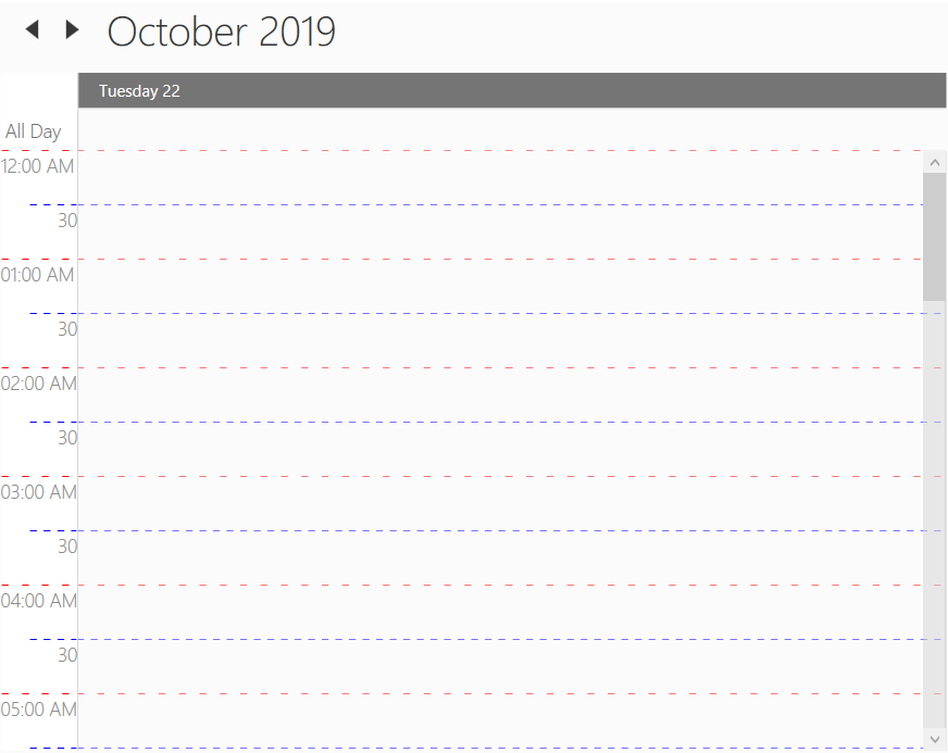
Changing vertical line color
Scheduler supports to change the vertical line for day, week and workweek view by using DayViewVerticalLineStroke.
<syncfusion:SfSchedule ScheduleType="WorkWeek" DayViewVerticalLineStroke="Brown"/>this.schedule.ScheduleType = ScheduleType.WorkWeek;
this.schedule.DayViewVerticalLineStroke = Brushes.Brown;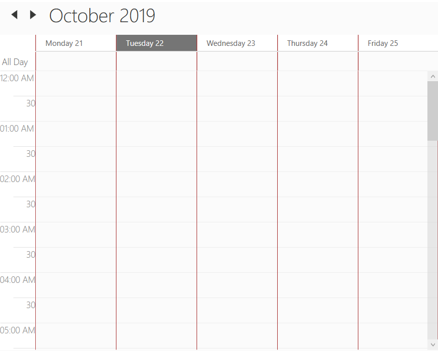
Current day highlighting
Scheduler supports to change current day background and foreground for all views by using CurrentDateBackground and CurrentDateForeground property.
<syncfusion:SfSchedule CurrentDateBackground="Brown" CurrentDateForeground="White"/>this.schedule.CurrentDateBackground = Brushes.Brown;
this.schedule.CurrentDateForeground = Brushes.White;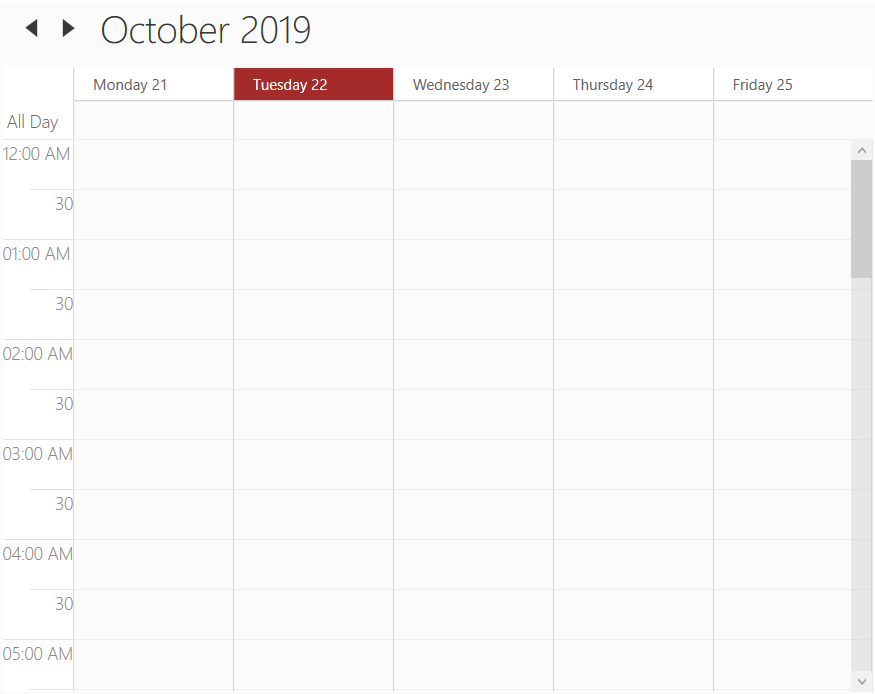
Change schedule view settings based on the views at run time
Scheduler supports to notify before that changing the schedule view by using ScheduleTypeChanging event. By this event, the appearance can be adjusted depending on the view.
For example, if you want to change the header date format based on the schedule view, you can use this event. Please refer the following code example,
this.schedule.ScheduleTypeChanging += Schedule_ScheduleTypeChanging;
private void Schedule_ScheduleTypeChanging(object sender, ScheduleTypeChangingEventArgs e)
{
    switch (e.NewValue)
    {
        case ScheduleType.Day:
            this.schedule.HeaderDateFormat = "dd-MMM-yyyy";
            break;
        case ScheduleType.Week:
            this.schedule.HeaderDateFormat = "dd-MMM";
            break;
        case ScheduleType.WorkWeek:
            this.schedule.HeaderDateFormat = "dd MMM";
            break;
    }
}