How can I help you?
Working With RadialSlider in WPF Radial Slider (SfRadialSlider)
7 May 202122 minutes to read
This section explains different UI customization and common features available in SfRadialSlider control.
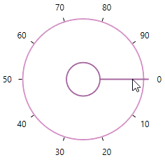
Select tick value
You can select any tick value by dragging the pointer along the circular track or clicking on the corresponding track value. You can get the selected value by using the Value property. The default value of Value property is 0.
Select tick value programmatically
You can select a tick value programmatically by assigning the tick value to the Value property.
<syncfusion:SfRadialSlider Value="34"
Name="radialSlider" />radialSlider.Value = 34;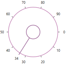
NOTE
Display selected value
You can display the selected value in the content area of the SfRadialSlider by setting the selected value to the Content property. The default value of Content property is null.
public class ViewModel
{
    private double selectedValue;

    public double SelectedValue {
        get {
            return selectedValue;
        }
        set {
            selectedValue= value;
        }
    }
}<syncfusion:SfRadialSlider Content="{Binding SelectedValue,Mode=TwoWay}"
Value="{Binding SelectedValue,Mode=TwoWay}"
Name="radialSlider">
<syncfusion:SfRadialSlider.DataContext>
<local:ViewModel/>
</syncfusion:SfRadialSlider.DataContext>
</syncfusion:SfRadialSlider>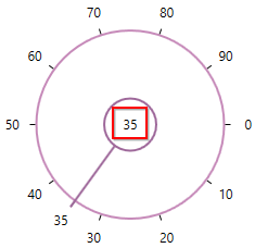
NOTE
Custom UI for display content
You can customize the appearance of display content area by using the ContentTemplate property. The default value of ContentTemplate property is null. The DataContext of the ContentTemplate property is SfRadialSlider.
public class ViewModel
{
    private double selectedValue;

    public double SelectedValue {
        get {
            return selectedValue;
        }
        set {
            selectedValue= value;
        }
    }
}<syncfusion:SfRadialSlider Value="{Binding SelectedValue,Mode=TwoWay}"
Name="radialSlider">
<syncfusion:SfRadialSlider.ContentTemplate>
<DataTemplate>
<TextBlock Text="{Binding SelectedValue}"
FontWeight="Bold"
Background="Yellow"/>
</DataTemplate>
</syncfusion:SfRadialSlider.ContentTemplate>
<syncfusion:SfRadialSlider.DataContext>
<local:ViewModel/>
</syncfusion:SfRadialSlider.DataContext>
</syncfusion:SfRadialSlider>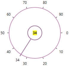
Change min-max tick value
You can change the minimum and maximum ticks value of the SfRadialSlider by using the Minimum and Maximum properties. The default value of Minimum property is 0 and Maximum property is 100.
<syncfusion:SfRadialSlider Minimum="100"
                           Maximum="200"
Name="radialSlider" />radialSlider.Minimum = 100;
radialSlider.Maximum = 200;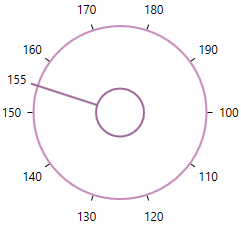
NOTE
Change start and end position
You can change starting and ending position for generating the ticks in the circular track by using the StartAngle and EndAngle properties. The default value of StartAngle property is 0 and EndAngle property is 360.
<syncfusion:SfRadialSlider StartAngle="90"
                           EndAngle="330"
Name="radialSlider" />radialSlider.StartAngle = 90;
radialSlider.EndAngle = 300;
NOTE
Change tick display interval
You can change the tick display interval from the Minimum to Maximum values by using the TickFrequency property. Based on TickFrequency’s multiples, the display interval is set from Minimum to Maximum value.
<syncfusion:SfRadialSlider TickFrequency="20"
Name="radialSlider" />radialSlider.TickFrequency = 20;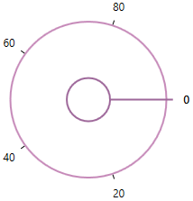
NOTE
Step interval
If you want to control the smallest possible range of value to be selected in SfRadialSlider, use the SmallChange property. The default value of SmallChange property is 0.1. For example, if SmallChange is set to 5, then it is only possible to select values that are multiples of 5.
<syncfusion:SfRadialSlider SmallChange="5"
Name="radialSlider" />radialSlider.SmallChange = 5;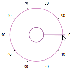
NOTE
Change tick direction
You can change the ticks direction either clockwise or counter-clockwise direction by using the SweepDirection property. The default value of SweepDirection property is Clockwise.
<syncfusion:SfRadialSlider SweepDirection="Counterclockwise"
                           StartAngle="180"
                           EndAngle="360"
Name="radialSlider" />radialSlider.SweepDirection = SweepDirection.Counterclockwise;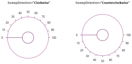
NOTE
Display maximum value
By default, the maximum value is not shown in the SfRadialSlider. If you want to show the maximum value when difference of the minimum and maximum value is not a TickFrequency multiples, use the ShowMaximumValue property value as true. The default value of ShowMaximumValue property is false.
<syncfusion:SfRadialSlider TickFrequency="9"
                           ShowMaximumValue="True"
Name="radialSlider" />radialSlider.TickFrequency = 9;
radialSlider.ShowMaximumValue = true;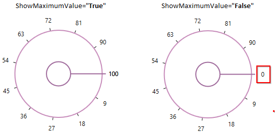
NOTE
Change tick radius
You can change the each tick radius by using the TickRadiusFactor property. The default value of TickRadiusFactor property is 0.72. You can hide the ticks by using the TickVisibility property value as Hidden.
<syncfusion:SfRadialSlider TickRadiusFactor="0.5"
                           TickVisibility="Visible"
Name="radialSlider" />radialSlider.TickRadiusFactor = 0.5;
radialSlider.TickVisibility = Visibility.Visible;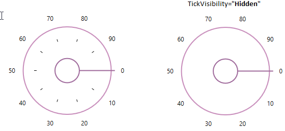
NOTE
Custom UI of ticks
You can customize the appearance of ticks by using the TickTemplate property. The default value of TickTemplate property is null. The DataContext of the TickTemplate property is SfRadialSlider tick value count.
<syncfusion:SfRadialSlider Name="radialSlider">
    <syncfusion:SfRadialSlider.TickTemplate>
        <DataTemplate>
            <Border Background="Red"/>
        </DataTemplate>
    </syncfusion:SfRadialSlider.TickTemplate>
</syncfusion:SfRadialSlider>
NOTE
Change tick label radius
You can change the each tick label radius by using the LabelRadiusFactor property. The default value of LabelRadiusFactor property is 0.87. You can hide the tick labels by using the LabelVisibility property value as Hidden.
<syncfusion:SfRadialSlider LabelRadiusFactor="0.5"
                           LabelVisibility="Visible"
Name="radialSlider" />radialSlider.LabelRadiusFactor = 0.5;
radialSlider.LabelVisibility = Visibility.Visible;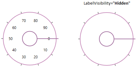
NOTE
Custom UI of tick labels
You can customize the appearance of tick labels by using the LabelTemplate property. The default value of LabelTemplate property is null. The DataContext of the LabelTemplate property is SfRadialSlider tick values.
<syncfusion:SfRadialSlider Name="radialSlider">
    <syncfusion:SfRadialSlider.LabelTemplate>
        <DataTemplate>
            <TextBlock Text="{Binding}"
                       Foreground="Red"
                       Background="Yellow"/>
        </DataTemplate>
    </syncfusion:SfRadialSlider.LabelTemplate>
</syncfusion:SfRadialSlider>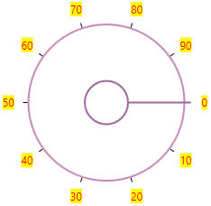
NOTE
Change inner rim radius
You can change inner rim(circle in the center of radial slider) radius of the SfRadialSlider by using the InnerRimRadiusFactor property. The default value of InnerRimRadiusFactor property is 0.2.
<syncfusion:SfRadialSlider InnerRimRadiusFactor="0.5"
Name="radialSlider" />radialSlider.InnerRimRadiusFactor = 0.5;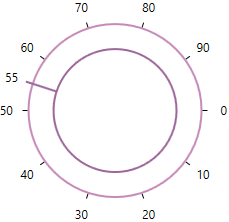
NOTE
Custom appearance of inner rim
You can change the background of the inner rim by using the InnerRimFill
property. You can also change the border color and border thickness of the inner rim by using the InnerRimStroke and InnerRimStrokeThickness properties. The default value of InnerRimStroke property is Light SlateGray and InnerRimStrokeThickness property is 2.
<syncfusion:SfRadialSlider InnerRimFill="Yellow"
                           InnerRimStroke="Red"
                           InnerRimStrokeThickness="4"
Name="radialSlider" />radialSlider.InnerRimFill = Brushes.Yellow;
radialSlider.InnerRimStroke = Brushes.Red;
radialSlider.InnerRimStrokeThickness = 4;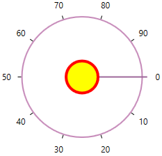
NOTE
Change outer rim radius
You can change outer rim radius of the SfRadialSlider by using the OuterRimRadiusFactor properties. The default value of OuterRimRadiusFactor property is 0.7.
<syncfusion:SfRadialSlider OuterRimRadiusFactor="0.5"
Name="radialSlider" />radialSlider.OuterRimRadiusFactor = 0.5;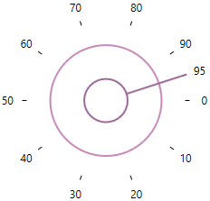
NOTE
Custom appearance of outer rim
You can change the fill color of the outer rim by using the Background property. You can also change the border color and border thickness of the outer rim by using the OuterRimStroke and OuterRimStrokeThickness properties. The default value of OuterRimStroke property is Rosy Brown and OuterRimStrokeThickness property is 2.
<syncfusion:SfRadialSlider Background="Yellow"
                           OuterRimStroke="Red"
Name="radialSlider" />radialSlider.Background = Brushes.Yellow;
radialSlider.OuterRimStroke = Brushes.Red;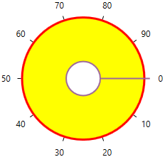
NOTE
Change selection pointer radius
You can change the selection pointer radius by using the PointerRadiusFactor property. The default value of PointerRadiusFactor property is 0.75.
<syncfusion:SfRadialSlider PointerRadiusFactor="0.5"
Name="radialSlider" />radialSlider.PointerRadiusFactor = 0.5;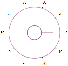
NOTE
Custom UI of selection pointer
You can customize the appearance of selection pointer by using the PointerStyle property. The DataContext of the PointerStyle property is syncfusion:RadialPointer.
<syncfusion:SfRadialSlider Name="radialSlider">
    <syncfusion:SfRadialSlider.PointerStyle>
        <Style TargetType="syncfusion:RadialPointer">
            <Setter Property="Height" Value="2"/>
            <Setter Property="Template">
                <Setter.Value>
                    <ControlTemplate TargetType="syncfusion:RadialPointer">
                        <Border  Background="Red"/>
                    </ControlTemplate>
                </Setter.Value>
            </Setter>
        </Style>
    </syncfusion:SfRadialSlider.PointerStyle>
</syncfusion:SfRadialSlider>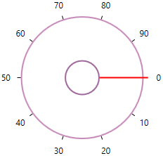
NOTE
Custom UI of preview selection pointer
You can customize the appearance of preview selection pointer by using the PreviewPointerStyle property. The DataContext of the PreviewPointerStyle property is syncfusion:RadialPreviewPointer.
<syncfusion:SfRadialSlider Name="radialSlider">
    <syncfusion:SfRadialSlider.PreviewPointerStyle>
        <Style TargetType="syncfusion:RadialPreviewPointer">
            <Setter Property="Height" Value="2"/>
            <Setter Property="Template">
                <Setter.Value>
                    <ControlTemplate TargetType="syncfusion:RadialPreviewPointer">
                        <Border Opacity="0.2"  Background="Red"/>
                    </ControlTemplate>
                </Setter.Value>
            </Setter>
        </Style>
    </syncfusion:SfRadialSlider.PreviewPointerStyle>
</syncfusion:SfRadialSlider>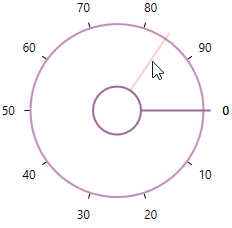
NOTE
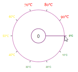
Text formatting
You can customize the text format for the specific or all tick labels by handling the DrawLabel event and setting the DrawLabelEventArgs.Handled property value as true. You can change the content and foreground of the tick labels by using the DrawLabelEventArgs.Text and DrawLabelEventArgs.Foreground properties. You can also change the font family and font size of the tick labels by using the DrawLabelEventArgs.FontFamily and DrawLabelEventArgs.FontSize properties.
<syncfusion:SfRadialSlider DrawLabel="sfRadialSlider_DrawLabel"
                           Name="sfRadialSlider">
    <TextBlock Text="{Binding ElementName=sfRadialSlider, Path=Value}"
               FontSize="15"
               HorizontalAlignment="Center"
               VerticalAlignment="Center"/>
</syncfusion:SfRadialSlider>sfRadialSlider.DrawLabel += sfRadialSlider_DrawLabel;You can handle the event as follows,
private void sfRadialSlider_DrawLabel(object sender, DrawLabelEventArgs e) {
    e.Handled = true;
    e.Text += "°C";
    if (e.Value <= 33) {
        e.FontSize = 8;
        e.FontFamily = new FontFamily("Arial");
        e.Foreground = Brushes.Green;
    }
    else if (e.Value > 33 && e.Value <= 66) {
        e.FontSize = 10;
        e.FontFamily = new FontFamily("Courier");
        e.Foreground = Brushes.Gold;
    }
    else {
        e.FontSize = 12;
        e.FontFamily = new FontFamily("Georgia");
        e.Foreground = Brushes.Red;
    }
}
NOTE
Value changed notification
The selected value changed in SfRadialSlider can be examined using ValueChanged event. The ValueChanged event contains the old and newly selected tick value in the OldValue and NewValue properties.
<syncfusion:SfRadialSlider ValueChanged="RadialSlider_ValueChanged"
                      Name="radialSlider"/>
SfRadialSlider radialSlider = new SfRadialSlider();
radialSlider.ValueChanged += RadialSlider_ValueChanged;You can handle the event as follows,
private void RadialSlider_ValueChanged(object sender, RoutedPropertyChangedEventArgs<double> e){
    //Get old and new selected tick value
    var oldValue = e.OldValue;
    var newValue = e.NewValue;
}