Interactive Features in WPF Notify Icon
28 Jan 20254 minutes to read
This section illustrates the following interactive features of NotifyIcon control.
BalloonTip
This section illustrates the following parts of a BalloonTip.
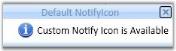
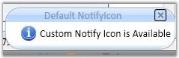
Header of BalloonTip
Using the BalloonTipHeaderVisibility property, user can collapse or show the header of the NotifyIcon control.
The following code snippet is used to set this property.
<!--BalloonTipHeaderVisibility="Visible" -->
<syncfusion:NotifyIcon Name="notifyIcon" BalloonTipText="Custom Notify
Icon is Available"  BalloonTipTitle="Default NotifyIcon" BalloonTipHeaderVisibility="Visible"
ShowBalloonTipTime="1000" HideBalloonTipTime="1000"/>

<!--BalloonTipHeaderVisibility="Collapsed" -->
<syncfusion:NotifyIcon Name="notifyIcon" BalloonTipText="Custom Notify
Icon is Available"  BalloonTipTitle="Default NotifyIcon" BalloonTipHeaderVisibility="Collapsed"
ShowBalloonTipTime="1000" HideBalloonTipTime="1000"/>
//BalloonTipHeaderVisibility="Visible"
notifyIcon.BalloonTipHeaderVisibility = Visibility.Visible;
//BalloonTipHeaderVisibility="Collapsed"
notifyIcon.BalloonTipHeaderVisibility = Visibility.Collapsed;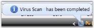

Text and Title of BalloonTip
BalloonTipText property is used to set the text that should be displayed in the Notify icon. BalloonTipTitle is used to set the title for NotifyIcon. The following code snippet is used to set these properties.
<syncfusion:NotifyIcon Name="notifyIcon" BalloonTipText="Virus Scan has been
completed" BalloonTipTitle="AntiVirus Software" ShowBalloonTipTime="1000"
HideBalloonTipTime="1000"/>notifyIcon.BalloonTipText = "Virus Scan has been completed";
notifyIcon.BalloonTipTitle = "AntiVirus Software";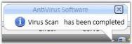
BalloonTipTitle = “AntiVirus Software”
Icon of BalloonTip
You can display the following five different icons in the NotifyIcon control.
- Custom
- Info
- Error
- None
- Warning
The following code snippet is used to set this property.
<!-- BalloonTipIcon="Warning" -->
<syncfusion:NotifyIcon Name="notifyIcon" BalloonTipText="Custom Notify
Icon is Available"  BalloonTipTitle="Default NotifyIcon" BalloonTipIcon="Warning"
ShowBalloonTipTime="1000" HideBalloonTipTime="1000"/>
//BalloonTipIcon="Warning"
notifyIcon.BalloonTipIcon = BalloonTipIcon.Warning;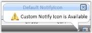
Animation
This topic illustrates the animation type and animation time for NotifyIcon control.
Animation Type
You can set different animation effects for the NotifyIcon by using the BalloonTipAnimationEffect property. They are listed below.
- Custom
- Fade
- Slide
- Scale
Animation Time
NotifyIcon display time is set by using the property called ShowBalloonTipTime. The time during which the NotifyIcon is hidden is set by using the property called HideBalloonTipTime.
The following code snippet is used to set these properties.
<!-- For Fade -->
<syncfusion:NotifyIcon Name="notifyIcon" BalloonTipText="Custom Notify
Icon is Available"  BalloonTipTitle="Default NotifyIcon" BalloonTipAnimationEffect="Fade"
ShowBalloonTipTime="1000" HideBalloonTipTime="1000"/>

<!-- For Scale -->
<syncfusion:NotifyIcon Name="notifyIcon" BalloonTipText="Custom Notify
Icon is Available"  BalloonTipTitle="Default NotifyIcon" BalloonTipAnimationEffect="Scale"
ShowBalloonTipTime="1000" HideBalloonTipTime="1000"/>
NotifyIcon notifyIcon = new NotifyIcon();
notifyIcon.BalloonTipText = "Custom Notify Icon is Available";
notifyIcon.BalloonTipTitle = "Default NotifyIcon";
//For Fade
notifyIcon.BalloonTipAnimationEffect = BalloonTipAnimationEffects.Fade;
//For Scale
notifyIcon.BalloonTipAnimationEffect = BalloonTipAnimationEffects.Scale;
// Duration for Showing NotifyIcon
notifyIcon.ShowBalloonTipTime = 1000;
// Duration for Hiding NotifyIcon
notifyIcon.HideBalloonTipTime = 1000;Setting the position of the Notify Icon
The position where the NotifyIcon is to be displayed is specified using the property called BalloonTipLocation. To set this property, refer the below code.
<syncfusion:NotifyIcon Name="notifyIcon" BalloonTipLocation="500,500" BalloonTipText="Custom Notify
Icon is Available"BalloonTipTitle="Default NotifyIcon"
ShowBalloonTipTime="1000" HideBalloonTipTime="1000"/>defaults.BalloonTipLocation = new Point(500, 500);Setting the Shape of the Notify Icon
NotifyIcon can take the following three different shapes.
- Balloon
- Rectangle
- RoundedRectangle
The shape for the NotifyIcon is set by using the BalloonTipShape property. The following code snippet is used to change the Shape of the NotifyIcon control.
<!-- Rectangle Shape -->
<syncfusion:NotifyIcon Name="notifyIcon" BalloonTipText="Custom Notify
Icon is Available"  BalloonTipTitle="Default NotifyIcon" BalloonTipShape="Rectangle"
ShowBalloonTipTime="1000" HideBalloonTipTime="1000"/>

<!-- RoundedRectangle Shape -->
<syncfusion:NotifyIcon Name="notifyIcon" BalloonTipText="Custom Notify
Icon is Available"  BalloonTipTitle="Default NotifyIcon" BalloonTipShape="RoundedRectangle"
ShowBalloonTipTime="1000" HideBalloonTipTime="1000"/>

<!-- Balloon Shape -->
<syncfusion:NotifyIcon Name="notifyIcon" BalloonTipText="Custom Notify
Icon is Available"  BalloonTipTitle="Default NotifyIcon" BalloonTipShape="Balloon"
ShowBalloonTipTime="1000" HideBalloonTipTime="1000"/>
// Rectangle Shape
notifyIcon.BalloonTipShape = BalloonTipShapes.Rectangle;
//RoundedRectangle Shape
notifyIcon.BalloonTipShape = BalloonTipShapes.RoundedRectangle;
//Balloon Shape
notifyIcon.BalloonTipShape = BalloonTipShapes.RoundedRectangle;