Toolbar Customization
3 Sep 20205 minutes to read
Customization
Visibility
Toolbar can be made visible or hidden using the IsToolbarVisiblity property in the ToolbarSettings.
<editor:SfImageEditor.ToolbarSettings>
        <editor:ToolbarSettings IsToolbarVisiblity="True" />
</editor:SfImageEditor.ToolbarSettings>editor.ToolbarSettings.IsToolbarVisibility = true;Add a item
You can add additional items to the toolbar and can perform your own operation. To add an additional item, specify the toolbar item, and add it in the ToolbarItems collection as demonstrated in following code snippet. You can specify your own template using the IconTemplate property in ToolbarItem.
<Grid.Resources>
            <DataTemplate x:Key="template">
                <TextBlock Text="New Item"></TextBlock>
            </DataTemplate>
</Grid.Resources>editor.ToolbarSettings.ToolbarItems.Add(new ToolbarItem() { IconTemplate = grid.Resources["template"] as DataTemplate });Customization
You can change the Background and BorderColor of the toolbar. Also, you can change the height of the main toolbar using the HeaderToolbarHeight property, and the height of the sub toolbar can be changed using the SubItemToolbarHeight property, and the footer toolbar height can be changed using the FooterToolbarHeight.
This can be done as in the following code snippet.
<editor:SfImageEditor.ToolbarSettings>
                <editor:ToolbarSettings IsToolbarVisibility="True" HeaderToolbarHeight="36"
                                        FooterToolbarHeight="36"  Background="#DEDEDE" BorderColor="Black"
                                        />
</editor:SfImageEditor.ToolbarSettings>editor.ToolbarSettings.Background= (SolidColorBrush)new BrushConverter().ConvertFromString("#DEDEDE");
editor.ToolbarSettings.BorderColor = new SolidColorBrush(Colors.Black);
editor.ToolbarSettings.HeaderToolbarHeight = 36;
editor.ToolbarSettings.FooterToolbarHeight = 36;
editor.ToolbarSettings.IsToolbarVisibility = true;
Events
ToolbarItemSelected
This event occurs when an item in the toolbar is selected. ToolbarItemSelectedEventArgs is the parameter. You can control the selected item operation by setting the Cancel property to true. You can also get the information about the ToolbarItem.
private void ToolbarSettings_ToolbarItemSelected(object sender, ToolbarItemSelectedEventArgs e)
        {
           e.Cancel = true;
        }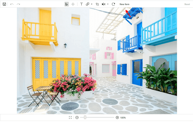
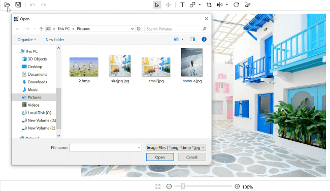
Image picker support
You can browse images in a local folder and load them in the Image Editor using the toolbar item browse icon.
Commands
Invoke commands from the custom toolbar to customize toolbar items of the image editor. Must set the CommandTarget while using the Command.
|
Command |
Description |
|
BrowseImage |
Browses the local folder to pick and load the image to an image editor. |
|
Save |
Saves the edited image. |
|
Undo |
Reverses the last performed action. |
|
Redo |
Restores the actions carried out by Undo. |
|
Reset |
Clears all the editing done on the image and brings to an initial state. |
|
ResetZoom |
Resets the zooming applied to the image. |
|
IncreaseZoom |
Zoom In the image by increasing the zoom level from its current state. |
|
DecreaseZoom |
Zoom Out the image by decreasing the zoom level from its current state. |
|
Select |
Used to select the items such as Shapes, Text, Custom view added on the image. |
|
Pan |
Used to Pan the image when it is in zoomed state. |
This can be done as in the below code snippet.
<Grid>
        <Grid.ColumnDefinitions>
            <ColumnDefinition Width="*"/>
            <ColumnDefinition Width="200"/>
        </Grid.ColumnDefinitions>
        <editor:SfImageEditor Grid.Column="0" x:Name="imageEditor" ImageSource="Assets\RoadView.jpeg">
            <editor:SfImageEditor.ToolbarSettings>
                <editor:ToolbarSettings IsToolbarVisiblity="False"></editor:ToolbarSettings>
            </editor:SfImageEditor.ToolbarSettings>
        </editor:SfImageEditor>

          <Button  Grid.Column="1" HorizontalAlignment="Center" VerticalAlignment="Center" Background="White"
                    Width="Auto" CommandTarget="{Binding ElementName=imageEditor}"
                    Content="Save" Command="{x:Static editor:ImageEditorCommands.Save}"></Button>
    </Grid>