Color Themes in WPF Color Picker Palette
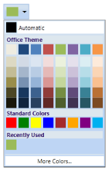
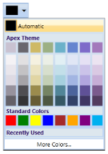
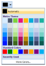
The ColorPickerPalette control includes a list of predefined themes. It allows you to set the required themes. Based on the selected themes, combination of selected theme colors will be displayed on the ThemePanel. The default theme if set to “Office” theme. You can also set the visibility of the ThemePanel by using the ThemePanelVisibility Property.
Use Case Scenarios
You can use the Color Themes to have colors based on specific themes.
Adding Color Theme to an Application
Color themes can be added to an application by using XAML or C# code.
The following code example illustrates how to add the Color Theme feature to an application through XAML.
<sync:ColorPickerPalette x:Name="ColorPicker" Themes="Apex" />The following code example illustrates how to add the Color Theme feature to an application through C#.
ColorPickerPalette colorpicker = new ColorPickerPalette();

colorpicker.Themes = PaletteTheme.Apex;
ColorPickerPalette colorpicker = new ColorPickerPalette()
colorpicker.Themes = PaletteTheme.Apex


Properties
| Property | Description | Type | Data Type | Reference links |
|---|---|---|---|---|
| Themes | Describes the enum which contains Palette Themes that can be applied to ColorPickerPalette Themes Panel. | Dependency Property | PaletteTheme.Office |
Sample Link
To view samples:
- Select Start -> Programs -> Syncfusion -> Essential Studio xx.x.x.xx -> Dashboard.
- Select Run Locally Installed Samples in WPF Button.
- Now select the ColorPickerPalette Sample under it.
Creating Custom ColorPalette
ColorPickerPalette control can be entirely customized with a custom collection of colors. The following properties must be set for creating custom color palette.
| Property | Description | Data Type | ||||||||||||
|---|---|---|---|---|---|---|---|---|---|---|---|---|---|---|
| CustomColorsCollection | Gets or sets a collection of CustomColors to be displayed in custom tab |
ObservableCollection|
IsCustomTabVisible |
Gets or Sets the visibility of Custom tab |
Visibility |
SetCustomColors |
Gets or Sets the value indicating whether custom colors are enabled or not |
Boolean |
CustomHeaderVisibility |
Gets or Sets the visibility of Custom tab header |
Visibility |
CustomHeaderText |
Gets or Sets the header text in Custom tab |
string |
|