Data Label in WPF Charts (SfChart)
8 Jul 202620 minutes to read
Data points can be easily annotated with labels to help improve the readability of data.
Define Data Label
To enable the Label in adornments you have to set the ShowLabel property of ChartAdornmentInfo.
SegmentLabelContent property allows you to define the value to be displayed as adornment label.
The following code example demonstrates about define the value to be displayed as adornment label.
<syncfusion:ChartAdornmentInfo
    SegmentLabelContent="YValue"
    ShowLabel="True"
    LabelPosition="Outer">
</syncfusion:ChartAdornmentInfo>
ChartAdornmentInfo adornmentInfo = new ChartAdornmentInfo()
{
ShowLabel = true,
SegmentLabelContent = LabelContent.YValue
};| SegmentLabelContent values | Description | Output |
|---|---|---|
| DateTime | Displays LabelContent.DateTime value | 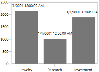 |
| LabelContentPath | Without using a LabelTemplate, it displays the y value by default. If we use LabelTemplate for Adornment, we must specify this in to get the underlying data model as DataContext. | 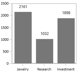 |
| Percentage | Displays the percentage value of series’ point among other points | 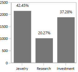 |
| XValue | Displays the X value of series’ point | 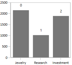 |
| YofTot | Displays the value of Y of total values’ point | 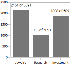 |
| YValue | Displays the Y value of series’ point | 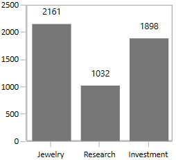 |
Customizing Labels
The following properties are used to customize the adornment label.
-
BorderBrush- used to change the border color. -
BorderThickness- used to change the thickness of the border. -
Margin- used to change the margin size for label. -
FontStyle- used to change font family of the label. -
FontSize- used to change font size of the label. -
Foreground- used to change the color of the label. -
FontFamily- used to change the font family of the label. -
Background- used to change the label background color.
The following code example demonstrates the customization of label using the above properties:
<syncfusion:ColumnSeries.AdornmentsInfo>
    <syncfusion:ChartAdornmentInfo
        LabelPosition="Outer"
        Foreground="Black"
        FontSize="11"
        FontFamily="Calibri"
        BorderBrush="Black"
        BorderThickness="1"
        Margin="1"
        FontStyle="Italic"
        Background="DarkGray"
        ShowLabel="True">
    </syncfusion:ChartAdornmentInfo>
</syncfusion:ColumnSeries.AdornmentsInfo>
ChartAdornmentInfo adornmentInfo = new ChartAdornmentInfo()
{
ShowLabel = true,
LabelPosition = AdornmentsLabelPosition.Outer,
Foreground = new SolidColorBrush(Colors.Black),
BorderBrush = new SolidColorBrush(Colors.Black),
Background = new SolidColorBrush(Colors.DarkGray),
BorderThickness= new Thickness(1),
Margin = new Thickness(1),
FontStyle = FontStyles.Italic,
FontFamily = new FontFamily("Calibri"),
FontSize = 11
};
Label Template
The default appearance of the label can be customized using LabelTemplate property and along with SegmentLabelContent property value as LabelContentPath as in the below code example:
<Window.Resources>
    <DataTemplate x:Key="adornmentTemplate">
        <StackPanel Orientation="Vertical">
            <Path Grid.Row="0"
                Stretch="Uniform"
                Fill="#FF0F0E0E"
                Width="15"
                Height="15"
                Margin="0,0,0,0"
                RenderTransformOrigin="0.5,0.5">

                <Path.Data>
                    <PathGeometry
                    FillRule="Nonzero"
                    Figures="M22.5,15.8899993896484L37.5,30.8899993896484 7.5,30.8899993896484 22.5,15.8899993896484z"/>
                </Path.Data>

                <Path.RenderTransform>
                    <TransformGroup>
                        <TransformGroup.Children>
                            <RotateTransform Angle="0"/>
                            <ScaleTransform ScaleX="1" ScaleY="1"/>
                        </TransformGroup.Children>
                    </TransformGroup>
                </Path.RenderTransform>
            </Path>
            <TextBlock
                Grid.Row="1"
                Text="{Binding Item.Value}"
                FontSize="11"
                Foreground="Black"/>
        </StackPanel>
    </DataTemplate>
</Window.Resources>

<Grid>
    <chart:SfChart Width="400" Height="300">
        <!-- code omitted for brevity -->
        <syncfusion:ColumnSeries Interior="#777777" ItemsSource="{Binding Demands}" XBindingPath="Category" YBindingPath="Value">
            <syncfusion:ColumnSeries.AdornmentsInfo>
                <syncfusion:ChartAdornmentInfo
                    ShowLabel="True"
                    LabelTemplate="{StaticResource adornmentTemplate}"
                    LabelPosition="Outer"
                    SegmentLabelContent="LabelContentPath">
                </syncfusion:ChartAdornmentInfo>
            </syncfusion:ColumnSeries.AdornmentsInfo>
        </syncfusion:ColumnSeries>
        <!-- code omitted for brevity -->
    </chart:SfChart>
</Grid>
ColumnSeries series = new ColumnSeries()
{
ItemsSource = new ViewModel().Demands,
XBindingPath = "Category",
YBindingPath = "Value",
Interior = new SolidColorBrush(Color.FromRgb(0x77, 0x77, 0x77))
};
ChartAdornmentInfo adornmentInfo = new ChartAdornmentInfo()
{
ShowLabel = true,
LabelPosition = AdornmentsLabelPosition.Outer,
LabelTemplate = this.Resources["adornmentTemplate"] as DataTemplate
};
series.AdornmentsInfo = adornmentInfo;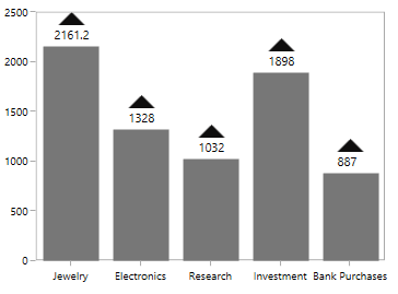
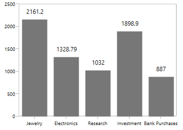
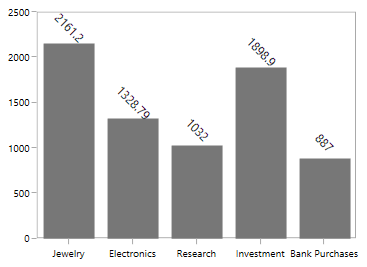
Label Format
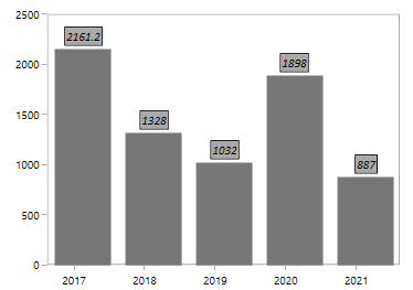
SegmentLabelFormat property allows you to provide formatting for the labels.
The following code example demonstrates the y value having three decimal digits.
<syncfusion:ChartAdornmentInfo
    ShowLabel="True"
    SegmentLabelFormat="#.000"
    AdornmentsPosition="Top">
</syncfusion:ChartAdornmentInfo>
ChartAdornmentInfo adornmentInfo = new ChartAdornmentInfo()
{
ShowLabel = true,
SegmentLabelFormat = "0.000"
};In the following image, you can see the decimal position will be rounded off to two digits by default.
Label Rotation
LabelRotationAngle property is used to define the angle to which the label has to rotate. The following code demonstrates the label rotating angle.
<syncfusion:ColumnSeries.AdornmentsInfo>
    <syncfusion:ChartAdornmentInfo
        LabelPosition="Outer"
        LabelRotationAngle="45"
        ShowLabel="True">
    </syncfusion:ChartAdornmentInfo>
</syncfusion:ColumnSeries.AdornmentsInfo>
ChartAdornmentInfo adornmentInfo = new ChartAdornmentInfo()
{
ShowLabel = true,
LabelRotationAngle = 45,
LabelPosition = AdornmentsLabelPosition.Outer
};
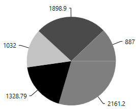
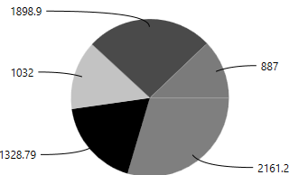
Connector Line
This feature is used to connect label and data point using a line. It can be enabled for any chart types but this is often used with Pie and Doughnut chart types. You can add connector line for the adornments using ShowConnectorLine property.
The connector line can be customized using the below properies.
The following code example shows the customization options for connector line:
<Window.Resources>
    <Style TargetType="Path" x:Key="lineStyle">
        <Setter Property="StrokeDashArray" Value="10,7,5"/>
        <Setter Property="Stroke" Value="Black"/>
    </Style>
</Window.Resources>

<Grid>
    <chart:SfChart Width="400" Height="400">
        <!-- code omitted for brevity -->
        <syncfusion:PieSeries Interior="#777777"
                              ItemsSource="{Binding Demands}"
                              XBindingPath="Category"
                              YBindingPath="FloatValue"
                              LabelPosition="OutsideExtended">
            <syncfusion:PieSeries.AdornmentsInfo>
                <syncfusion:ChartAdornmentInfo
                    ShowLabel="True"
                    ConnectorLineStyle="{StaticResource lineStyle}"
                    ShowConnectorLine="True"
                    LabelPosition="Outer">
                </syncfusion:ChartAdornmentInfo>
            </syncfusion:PieSeries.AdornmentsInfo>
        </syncfusion:PieSeries>
        <!-- code omitted for brevity -->
    </chart:SfChart>
</Grid>
PieSeries series = new PieSeries()
{
ItemsSource = new ServerViewModel().Performance,
XBindingPath = "Year",
YBindingPath = "Plastic",
LabelPosition = CircularSeriesLabelPosition.OutsideExtended,
Interior = new SolidColorBrush(Color.FromRgb(0x77, 0x77, 0x77))
};
ChartAdornmentInfo adornmentInfo = new ChartAdornmentInfo()
{
ShowLabel = true,
ShowConnectorLine = true,
UseSeriesPalette = true,
ConnectorLineStyle=this.Resources["lineStyle"] as Style
LabelPosition =AdornmentsLabelPosition.Outer,
};
series.AdornmentsInfo = adornmentInfo;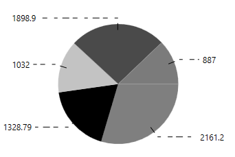
Connector Type
ConnectorType property in AccumulationSeries is used to specify the connector line type such as Line or Bezier. This property is only for AccumulationSeries like PieSeries, DoughnutSeries, PyramidSeries and FunnelSeries.
<chart:PieSeries
    Interior="#777777"
    ItemsSource="{Binding Performance}"
    XBindingPath="ServerLoad"
    YBindingPath="Server1"
    EnableSmartLabels="True"
    ConnectorType="Bezier"
    LabelPosition="OutsideExtended">
    <chart:PieSeries.AdornmentsInfo>
        <chart:ChartAdornmentInfo
            HorizontalAlignment="Center"
            VerticalAlignment="Center"
            ShowConnectorLine="True"
            ConnectorHeight="80"
            ShowLabel="True"/>
    </chart:PieSeries.AdornmentsInfo>
</chart:PieSeries>
PieSeries series = new PieSeries()
{
ItemsSource = new ServerViewModel().Performance,
XBindingPath = "ServerLoad",
YBindingPath = "Server1",
EnableSmartLabels = true,
ExplodeAll = true,
ExplodeRadius = 3,
ConnectorType = ConnectorMode.Bezier,
LabelPosition = CircularSeriesLabelPosition.OutsideExtended,
Interior = new SolidColorBrush(Color.FromRgb(0x77, 0x77, 0x77))
};
ChartAdornmentInfo adornmentInfo = new ChartAdornmentInfo()
{
ShowLabel = true,
ShowConnectorLine = true,
HorizontalAlignment= HorizontalAlignment.Center,
VerticalAlignment = VerticalAlignment.Center,
ConnectorHeight = 80
};Line
Bezier
Straight Line
Applying Series Brush
UseSeriesPalette property is used to set the interior of the series to the adornment background.
NOTE
For Accumulation like Pie, Doughnut, Funnel and Pyramid the segment interior color will be reflected in adornment background.
<syncfusion:ChartAdornmentInfo
    ShowLabel="True"
    UseSeriesPalette="True">
</syncfusion:ChartAdornmentInfo>
ChartAdornmentInfo adornmentInfo = new ChartAdornmentInfo()
{
ShowLabel = true,
UseSeriesPalette = true
};Smart Labels
When you have more data points in Pie or Doughnut series, the adornment labels might get overlap with each other. SfChart provides built-in support to avoid these overlapping by using EnableSmartLabels property.
The following code example demonstrates the EnableSmartLabels property:
<chart:PieSeries
    Interior="#777777"
    ItemsSource="{Binding CategoricalData}"
    XBindingPath="Year"
    YBindingPath="Plastic"
    ConnectorType="Bezier"
    EnableSmartLabels="True"
    LabelPosition="OutsideExtended"
    ExplodeAll="True"
    ExplodeRadius="3">

    <chart:PieSeries.AdornmentsInfo>
        <chart:ChartAdornmentInfo
            ShowLabel="True"
            HorizontalAlignment="Center"
            VerticalAlignment="Center"
            ShowConnectorLine="True">
        </chart:ChartAdornmentInfo>
    </chart:PieSeries.AdornmentsInfo>
</chart:PieSeries>
PieSeries series = new PieSeries()
{
ItemsSource = new ViewModel().CategoricalData,
XBindingPath = "Year",
YBindingPath = "Plastic",
EnableSmartLabels = true,
ExplodeAll = true,
ExplodeRadius = 3,
Palette = ChartColorPalette.Custom,
LabelPosition = CircularSeriesLabelPosition.OutsideExtended,
Interior = new SolidColorBrush(Color.FromRgb(0x77, 0x77, 0x77))
};
ChartAdornmentInfo adornmentInfo = new ChartAdornmentInfo()
{
ShowLabel = true,
ShowConnectorLine = true,
UseSeriesPalette = true,
HorizontalAlignment = HorizontalAlignment.Center,
VerticalAlignment = VerticalAlignment.Center
};
series.AdornmentsInfo = adornmentInfo;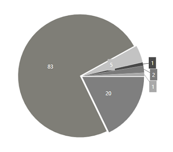
NOTE
For circular series, the adornment position can be changed to
Inside,OutsideorOutsideExtendedusing theLabelPositionproperty.