Styling in WPF Card View
23 Oct 2019 / 5 minutes to read
Styling can be applied to the CardView control and its items.
Visual Styles
The CardView control has the following built-in styles:
- Office2007Blue
- Office2007Black
- Office2007Silver
- Office2010Blue
- Office2010Black
- Office2010Silver
- Blend
- Metro
- Transparent
These visual styles can be applied to the CardView control through XAML. The following example illustrates how to apply Office2007Blue style to the CardView control.
<syncfusion:CardView syncfusion:SkinStorage.VisualStyle="Office2010Blue"/>These styles can also be applied to the CardView control through C#. The following code example illustrates this.
SkinStorage.SetVisualStyle(cardViewInstance, "Office2010Blue");ItemContainerStyle
The ItemContainerStyle property of CardView is used to set the styles for CardViewItem. This style can be applied to all items available in the CardView control.
-
Create a style for CardViewItem.
<Style TargetType="{x:Type syncfusion:CardViewItem}" x:Key="contactStyle"> <Setter Property="Header" Value="{Binding Name}"/> <Setter Property="Foreground" Value="Green"/> <Setter Property="FontWeight" Value="Bold"/> <Setter Property="FontSize" Value="16"/> </Style> -
Set the ItemContainerStyle of CardView.
     <syncfusion:CardView ItemsSource="{Binding Contacts}" CanEdit="True"

              ItemTemplate="{StaticResource contactTemplate}"

              EditItemTemplate="{StaticResource contactEditTemplate}"

              ItemContainerStyle="{StaticResource contactStyle}"/>
This generates the following CardView control.
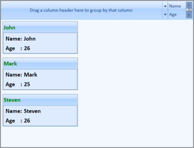
CardView control with styled items
ItemContainerStyleSelector
The ItemContainerStyleSelector property is used to choose the ItemContainerStyle at run-time base on some conditions.
-
Create the styles in the Window’s resource as follows.
<Style TargetType="{x:Type syncfusion:CardViewItem}" x:Key="ageStyle1"> <Setter Property="Header" Value="{Binding Name}"/> <Setter Property="Foreground" Value="Green"/> <Setter Property="FontWeight" Value="Bold"/> <Setter Property="FontSize" Value="16"/> </Style> <Style TargetType="{x:Type syncfusion:CardViewItem}" x:Key="ageStyle2"> <Setter Property="Header" Value="{Binding Name}"/> <Setter Property="Foreground" Value="Blue"/> <Setter Property="FontWeight" Value="Bold"/> <Setter Property="FontSize" Value="16"/> </Style> -
Create StyleSelector in the code.
public class CardViewItemContainerStyleSelector : StyleSelector { public override Style SelectStyle(object item, DependencyObject container) { Window window = Application.Current.MainWindow; int age = (item as Contact).Age; if (age > 18) { return ((Style)window.Resources["ageStyle1"]); } else { return ((Style)window.Resources["ageStyle2"]); } } } -
Define the style selector in the Window’s resource.
<local:CardViewItemContainerStyleSelector x:Key="cardViewItemContainerStyleSelector"/> -
Set the ItemContainerStyleSelector for the CardView control.
     <syncfusion:CardView ItemsSource="{Binding Contacts}" CanEdit="True"

                      ItemTemplate="{StaticResource contactTemplate}"

                      EditItemTemplate="{StaticResource contactEditTemplate}"

                      ItemContainerStyleSelector="{StaticResource cardViewItemContainerStyleSelector}" />
This generates the following CardView control.
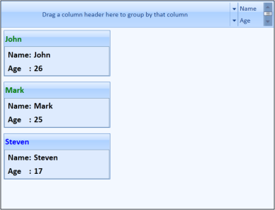
CardView control styled with ItemContainerStyleSelector