Grouping Mode in WPF Card View
4 May 202111 minutes to read
This section describes how to enable or disable the grouping mode and perform group operations in CardView control.
Enable/disable the grouping mode
You can enable or disable the grouping mode of card items by setting the CanGroup property value as true or false. The default value of CanGroup property is true.
<syncfusion:CardView CanGroup="True"
Name="cardView"/>cardView.CanGroup = true;NOTE
Group the CardViewItems
You can group the cards inside the CardView control by dragging the available field from the list and drop it into the dropping region of the CardView control header. Based on the dropped field, the cards are grouped.
//Model.cs
public class CardViewModel
{
    public string FirstName { get; set; }
    public string LastName { get; set; }
    public int Age { get; set; }
}

//ViewModel.cs
public class ViewModel : NotificationObject
{
    private ObservableCollection<CardViewModel> cardViewItems;
    public ObservableCollection<CardViewModel> CardViewItems
    {
        get { return cardViewItems; }
        set { cardViewItems = value;
            this.RaisePropertyChanged(nameof(CardViewItems)); }
    }
    public ViewModel()
    {
        CardViewItems = new ObservableCollection<CardViewModel>();
        populateItems();
    }
    private void populateItems()
    {
        CardViewItems.Add(new CardViewModel() { FirstName = "John", LastName= "Paulin", Age = 23});
        CardViewItems.Add(new CardViewModel() { FirstName = "Mark", LastName = "Paulin",Age = 26 });
        CardViewItems.Add(new CardViewModel() { FirstName = "Steven", LastName = "John", Age = 25 });
        CardViewItems.Add(new CardViewModel() { FirstName = "John", LastName = "Steven", Age = 23 });
        CardViewItems.Add(new CardViewModel() { FirstName = "Steven", LastName = "Smith", Age = 25 });
    }
}<syncfusion:CardView CanGroup="True"
ItemsSource="{Binding CardViewItems}"
Name="cardView">
<syncfusion:CardView.HeaderTemplate>
<DataTemplate>
<TextBlock Text="{Binding FirstName}"/>
</DataTemplate>
</syncfusion:CardView.HeaderTemplate>
<syncfusion:CardView.ItemTemplate>
<DataTemplate >
<ListBox ScrollViewer.HorizontalScrollBarVisibility="Disabled">
<ListBoxItem Padding="1">
<Grid>
<Grid.ColumnDefinitions>
<ColumnDefinition Width="75" />
<ColumnDefinition />
</Grid.ColumnDefinitions>
<TextBlock Text="First Name:" />
<TextBlock Grid.Column="1"
Text="{Binding FirstName,
UpdateSourceTrigger=PropertyChanged}" />
</Grid>
</ListBoxItem>
<ListBoxItem Padding="1">
<Grid>
<Grid.ColumnDefinitions>
<ColumnDefinition Width="75" />
<ColumnDefinition Width="*" />
</Grid.ColumnDefinitions>
<TextBlock Text="Last Name:" />
<TextBlock Grid.Column="1"
Text="{Binding LastName,
UpdateSourceTrigger=PropertyChanged}" />
</Grid>
</ListBoxItem>
<ListBoxItem Padding="1">
<Grid>
<Grid.ColumnDefinitions>
<ColumnDefinition Width="75" />
<ColumnDefinition Width="*" />
</Grid.ColumnDefinitions>
<TextBlock Text="Age:" />
<TextBlock Grid.Column="1"
Text="{Binding Age,
UpdateSourceTrigger=PropertyChanged}" />
</Grid>
</ListBoxItem>
</ListBox>
</DataTemplate>
</syncfusion:CardView.ItemTemplate>
</syncfusion:CardView>cardView.CanGroup = true;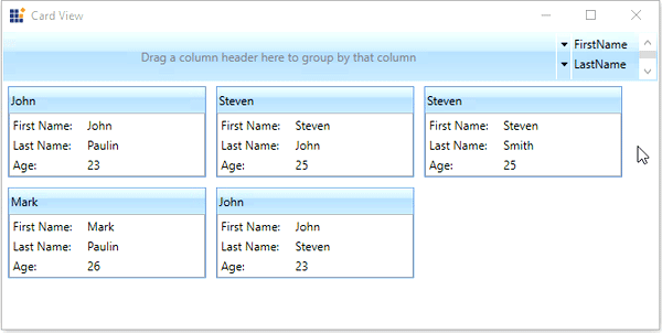
Here, CardViewItems grouped based on Age field.
NOTE
Group the cards programmatically
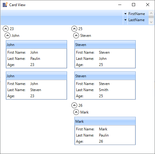
You can group the cards programmatically by passing the specific field name into the GroupCards(String) method. Based on the field name, cards are grouped programmatically. You can also make the multi-level grouping programmatically.
cardView.CanGroup = true;
cardView.GroupCards("Age");
cardView.GroupCards("FirstName");
Here, the cards are grouped programmatically based on the Age and FirstName fields.
NOTE
Nested grouping of CardViewItems
You can group the card items in multiple nested level by dragging the required fields from the list and drop it into the dropping region of the CardView control header. Based on the fields add into the dropping region, the card items will be grouped in nested level.
<syncfusion:CardView CanGroup="True"
                     ItemsSource="{Binding CardViewItems}"
Name="cardView"/>cardView.CanGroup = true;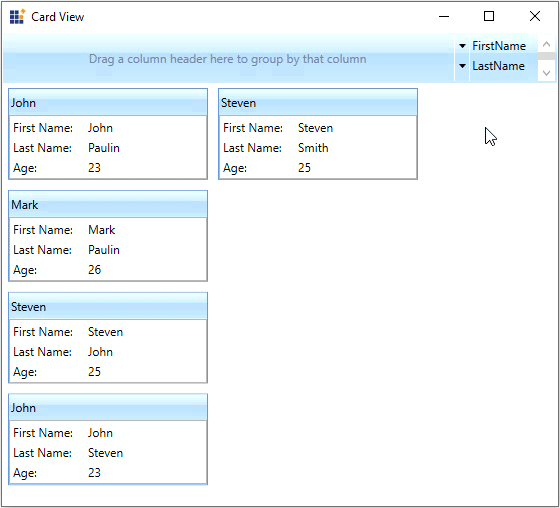
NOTE
Hide the grouping header
You can hide the grouping header by using the ShowHeader property value as false. The default value of ShowHeader property is true.
<syncfusion:CardView ShowHeader="False"
                     ItemsSource="{Binding CardViewItems}"
Name="cardView"/>cardView.ShowHeader = false;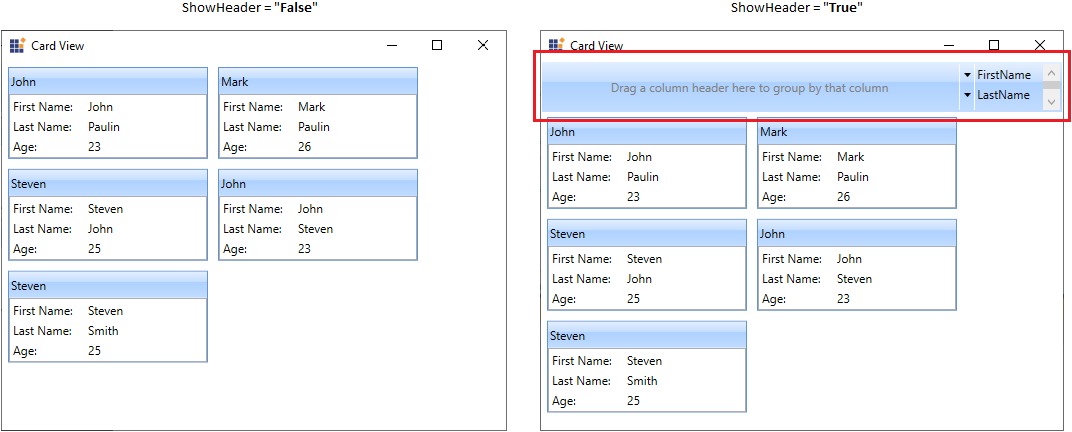
NOTE