Customizing Data Templates in WPF Card View
4 Sep 2020 / 6 minutes to read
Data templates can be customized for items and headers. This section explains how to customize the data templates.
Item Template
You can customize how a business object is displayed using ItemTemplate of CardViewItem. The following example shows the usage of ItemTemplate.
<syncfusion:CardView ItemsSource="{Binding Contacts}" >

	<syncfusion:CardView.ItemTemplate>

		<DataTemplate >

			<ListBox ScrollViewer.HorizontalScrollBarVisibility="Disabled">

				<ListBoxItem>

					<StackPanel Orientation="Horizontal">

						<TextBlock Text="Name:"/>

						<TextBlock Text="{Binding Name}" Margin="5,0,0,0"/>

					</StackPanel>

				</ListBoxItem>


				<ListBoxItem>

					<StackPanel Orientation="Horizontal">

						<TextBlock Text="Age    :"/>

						<TextBlock Text="{Binding Age}" Margin="5,0,0,0"/>

					</StackPanel>

				</ListBoxItem>

			</ListBox>

		</DataTemplate>

	</syncfusion:CardView.ItemTemplate>

</syncfusion:CardView>
Implementing the above code generates the following output.
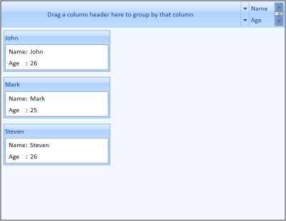
CardView with ItemTemplate
Header Template
You can also customize header of the CardViewItem using a header template. This is illustrated in the following example.
-
Define a data template for the header as follows.
<DataTemplate x:Key="headerTemplate"> <Grid> <Border Background="Gray"> <TextBlock Text="{Binding Path=Name}" Margin="5" Foreground="White" VerticalAlignment="Center" FontWeight="Bold" FontFamily="Bookman Old Style" Grid.Column="1"/> </Border> </Grid> </DataTemplate> -
Set the HeaderTemplate for the CardViewItem to the above template.
     <syncfusion:CardView ItemsSource="{Binding Contacts}"

                          ItemTemplate="{StaticResource contactTemplate}"

                          HeaderTemplate="{StaticResource headerTemplate}"

                         />
This generates the following CardView control.
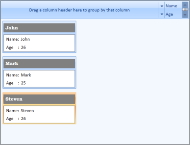
CardView control with Header Template
EditItem Template
You can edit the values loaded in CardViewItem using EditItemTemplate. This is illustrated in the following example.
-
Define a data template for the content as follows.
<DataTemplate x:Key="contactEditTemplate"> <ListBox ScrollViewer.HorizontalScrollBarVisibility="Disabled" SelectedIndex="0" ToolTip="{Binding Path=Validation.HasError, ElementName=txt}"> <ListBoxItem HorizontalContentAlignment="Stretch" Padding="1"> <Grid > <Grid.ColumnDefinitions> <ColumnDefinition Width="75"/> <ColumnDefinition /> </Grid.ColumnDefinitions> <TextBlock Text="Name:"/> <TextBox Grid.Column="1" x:Name="txt" HorizontalAlignment="Stretch" Text="{Binding Name, UpdateSourceTrigger=PropertyChanged, ValidatesOnDataErrors=True}" /> </Grid> </ListBoxItem> <ListBoxItem HorizontalContentAlignment="Stretch" Padding="1"> <Grid > <Grid.ColumnDefinitions> <ColumnDefinition Width="75"/> <ColumnDefinition Width="*"/> </Grid.ColumnDefinitions> <TextBlock Text="Age:"/> <TextBox Grid.Column="1" Text="{Binding Age, UpdateSourceTrigger=PropertyChanged, ValidatesOnDataErrors=True}" /> </Grid> </ListBoxItem> </ListBox> </DataTemplate> -
Set EditItemTemplate for the CardView to the above template.
     <syncfusion:CardView ItemsSource="{Binding Contacts}" CanEdit="True"

                      ItemTemplate="{StaticResource contactTemplate}"

                      EditItemTemplate="{StaticResource contactEditTemplate}"

                      HeaderTemplate="{StaticResource headerTemplate}" />
Implementing the above codes generate the following CardView control.
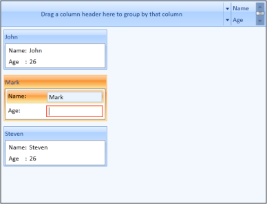
CardView with EditItemTemplate
NOTE
You can edit the values in the CardView control by double-clicking the CardViewItem.