Controls and Components in WPF Card View
24 Nov 2020 / 24 minutes to read
The following controls assemble the CardView control.
- CardView
- CardViewItem
CardView
Use Case Scenarios
CardView control helps to sort or group items based on the given field names.Structure of the CardView Control
The following screenshot displays the CardView:
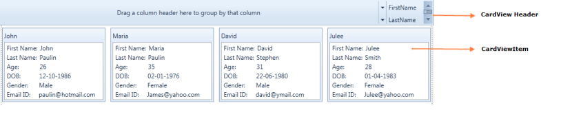
Structure of the CardView Control
- CardViewHeader: It shows the header of the card view control
- CardViewItem: It contains the list of ComboBox’s items
Sample link
- Select Start -> Programs -> Syncfusion -> Essential Studio 9.2.0.137 -> Dashboard.
- Select Run Locally Installed Samples in WPF CardView.
- Now select the CardView item in the tree.
- Choose CardView demo.
Appearance
You can customize the appearance of the ComboBoxAdv control by editing the style of the control in Expression Blend or by using the following properties exposed by CardView control:
- Edit style in Expression Blend
- Customizing by using properties
Blendability
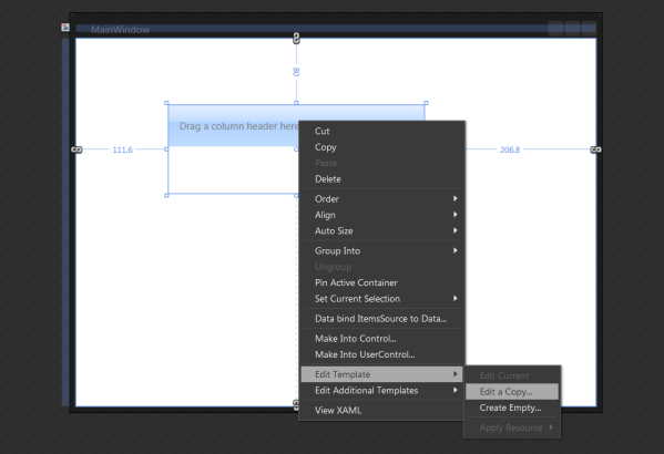
You can edit the style of ComboBoxAdv by using Expression Blend. To edit the ComboBoxAdv control’s style in Expression Blend:
-
Drag the CardView control to the Design view. The CardView control will appear as shown in the screen shot displayed below.
-
Right-click the CardView control, select Edit Template, and then select Edit a Copy.
CardView Control in Edit Template
Features of CardView control
Grouping
Cards inside the CardView control can be grouped by the fields available in the list. Grouping can be achieved by dragging the field from the list to the header panel in the CardView control. Grouping can be controlled by the property called CanGroup. By default CanGroup value will be true.
Adding grouping to an Application
CanGroup property can be added directly to an application using the following code snippet:
<syncfusion:CardView CanGroup="False">

</syncfusion:CardView>CardView cardview = new CardView();
cardview.CanGroup = false;Filtering
Cards can be filtered by the values which are given for the fields. To filter the cards, just check the values in the listed popup that opens when you click the button which is available in the front of the fields list.
Sorting
Cards can be sorted inside the CardView Control. It can be achieved by the fields available. To sort the cards just click on the field name listed in the header. It can be controlled by the property called CanSort. By default the value is true.
Adding sorting to an Application
CanSort can be added directly to an application using the following code snippet:
<syncfusion:CardView CanSort="False">

</syncfusion:CardView>CardView cardview = new CardView();
cardview.CanSort = false;Card editing using keyboard and mouse interaction
You can edit the selected CardViewItem value by double-clicking on that item or by pressing the F2 key. You can enable the editing by setting the value of the CanEdit property as true. Otherwise, you will not be able to perform the edit operation. To get out from the editing mode, you need to press the Esc or Enter key. The default value of CanEdit property is false.
NOTE
To perform an edit operation on selected
CardViewItem, you need to define theCardViewItemedit mode UI with editable functionalities by using EditItemTemplate.EditItemTemplateis applied to the selected item in the edit mode, andItemTemplateis applied to the selected item in the view mode.
//Model.cs
public class CardViewModel {
    public string Name { get; set; }
    public int Age { get; set; }
}

//ViewModel.cs
public class ViewModel : NotificationObject {
    private ObservableCollection<CardViewModel> cardViewItems;
    public ObservableCollection<CardViewModel> CardViewItems {
        get { return cardViewItems; }
        set { cardViewItems = value;
            this.RaisePropertyChanged("CardViewItems");
        }
    }
    public ViewModel() {
        CardViewItems = new ObservableCollection<CardViewModel>();
        populateItems();
    }
    private void populateItems() {
        CardViewItems.Add(new CardViewModel() { Name = "John", Age = 23 });
        CardViewItems.Add(new CardViewModel() { Name = "Mark", Age = 26 });
        CardViewItems.Add(new CardViewModel() { Name = "Steven", Age = 25 });
    }
}<Window.DataContext>
<local:ViewModel/>
</Window.DataContext>
<Grid>
<StackPanel>
<syncfusion:CardView CanEdit="True"
Name="cardView"
ItemsSource="{Binding CardViewItems}">
<syncfusion:CardView.EditItemTemplate>
<DataTemplate>
<Grid>
<Grid.RowDefinitions>
<RowDefinition Height="20"/>
<RowDefinition Height="20"/>
</Grid.RowDefinitions>
<Grid.ColumnDefinitions>
<ColumnDefinition Width="75"/>
<ColumnDefinition/>
</Grid.ColumnDefinitions>
<TextBlock Text="Name:"
Grid.Row="0"
Grid.Column="0"/>
<TextBox Text="{Binding Name, UpdateSourceTrigger=PropertyChanged}"
Grid.Row="0"
Grid.Column="1"/>
<TextBlock Text="Age:"
Grid.Row="1"
Grid.Column="0"/>
<TextBox Text="{Binding Age, UpdateSourceTrigger=PropertyChanged}"
Grid.Row="1"
Grid.Column="1"/>
</Grid>
</DataTemplate>
</syncfusion:CardView.EditItemTemplate>
<syncfusion:CardView.ItemTemplate>
<DataTemplate>
<Grid>
<Grid.RowDefinitions>
<RowDefinition Height="20"/>
<RowDefinition Height="20"/>
</Grid.RowDefinitions>
<Grid.ColumnDefinitions>
<ColumnDefinition Width="75"/>
<ColumnDefinition/>
</Grid.ColumnDefinitions>
<TextBlock Text="Name:"
Grid.Row="0"
Grid.Column="0"/>
<TextBlock Text="{Binding Name, UpdateSourceTrigger=PropertyChanged}"
Grid.Row="0"
Grid.Column="1"/>
<TextBlock Text="Age:"
Grid.Row="1"
Grid.Column="0"/>
<TextBlock Text="{Binding Age, UpdateSourceTrigger=PropertyChanged}"
Grid.Row="1"
Grid.Column="1"/>
</Grid>
</DataTemplate>
</syncfusion:CardView.ItemTemplate>
<syncfusion:CardView.HeaderTemplate>
<DataTemplate>
<TextBlock Text="{Binding Name}"/>
</DataTemplate>
</syncfusion:CardView.HeaderTemplate>
</syncfusion:CardView>
</StackPanel>
</Grid>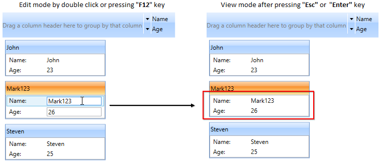
NOTE
View Sample in GitHub
Start card editing programmatically
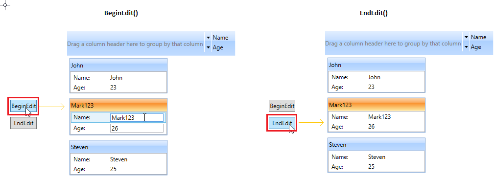
If you want to programmatically start the edit mode of selected CardViewItem, use the BeginEdit method. You can also programmatically change the edit mode to view mode by using the EndEdit method.
NOTE
You must set the
CanEditproperty astrueto performBeginEditorEndEdit.
//Model.cs
public class CardViewModel {
    public string Name { get; set; }
    public int Age { get; set; }
}

//ViewModel.cs
public class ViewModel : NotificationObject {
    private ObservableCollection<CardViewModel> cardViewItems;
    public ObservableCollection<CardViewModel> CardViewItems {
        get { return cardViewItems; }
        set { cardViewItems = value;
            this.RaisePropertyChanged("CardViewItems");
        }
    }
    public ViewModel() {
        CardViewItems = new ObservableCollection<CardViewModel>();
        populateItems();
    }
    private void populateItems() {
        CardViewItems.Add(new CardViewModel() { Name = "John", Age = 23 });
        CardViewItems.Add(new CardViewModel() { Name = "Mark", Age = 26 });
        CardViewItems.Add(new CardViewModel() { Name = "Steven", Age = 25 });
    }
}<Window.DataContext>
<local:ViewModel/>
</Window.DataContext>
<Grid VerticalAlignment="Center">
<StackPanel Orientation="Horizontal">
<syncfusion:CardView CanEdit="True"
Name="cardView"
ItemsSource="{Binding CardViewItems}">
<syncfusion:CardView.EditItemTemplate>
<DataTemplate>
<Grid>
<Grid.RowDefinitions>
<RowDefinition Height="20"/>
<RowDefinition Height="20"/>
</Grid.RowDefinitions>
<Grid.ColumnDefinitions>
<ColumnDefinition Width="75"/>
<ColumnDefinition/>
</Grid.ColumnDefinitions>
<TextBlock Text="Name:"
Grid.Row="0"
Grid.Column="0"/>
<TextBox Text="{Binding Name, UpdateSourceTrigger=PropertyChanged}"
Grid.Row="0"
Grid.Column="1"/>
<TextBlock Text="Age:"
Grid.Row="1"
Grid.Column="0"/>
<TextBox Text="{Binding Age, UpdateSourceTrigger=PropertyChanged}"
Grid.Row="1"
Grid.Column="1"/>
</Grid>
</DataTemplate>
</syncfusion:CardView.EditItemTemplate>
<syncfusion:CardView.ItemTemplate>
<DataTemplate>
<Grid>
<Grid.RowDefinitions>
<RowDefinition Height="20"/>
<RowDefinition Height="20"/>
</Grid.RowDefinitions>
<Grid.ColumnDefinitions>
<ColumnDefinition Width="75"/>
<ColumnDefinition/>
</Grid.ColumnDefinitions>
<TextBlock Text="Name:"
Grid.Row="0"
Grid.Column="0"/>
<TextBlock Text="{Binding Name, UpdateSourceTrigger=PropertyChanged}"
Grid.Row="0"
Grid.Column="1"/>
<TextBlock Text="Age:"
Grid.Row="1"
Grid.Column="0"/>
<TextBlock Text="{Binding Age, UpdateSourceTrigger=PropertyChanged}"
Grid.Row="1"
Grid.Column="1"/>
</Grid>
</DataTemplate>
</syncfusion:CardView.ItemTemplate>
<syncfusion:CardView.HeaderTemplate>
<DataTemplate>
<TextBlock Text="{Binding Name}"/>
</DataTemplate>
</syncfusion:CardView.HeaderTemplate>
</syncfusion:CardView>
<StackPanel Orientation="Vertical" >
<Button Click="BeginEdit_Click" Content="BeginEdit"/>
<Button Click="EndEdit_Click" Content="EndEdit"/>
</StackPanel>
</StackPanel>
</Grid>private void BeginEdit_Click(object sender, RoutedEventArgs e) {
cardView.BeginEdit();
}
private void EndEdit_Click(object sender, RoutedEventArgs e) {
cardView.EndEdit();
}
NOTE
View Sample in GitHub
Header Panel
It is the base to showcase the fields when you drop the fields from the list. We can customize the visibility of the Header panel by using the property called ShowHeader.
Adding Header Panel visibility customization to an Application
ShowHeader property can be added directly to an application using the following code example:
<syncfusion:CardView ShowHeader="False">

</syncfusion:CardView>CardView cardview = new CardView();
cardview.ShowHeader = false;</td></tr>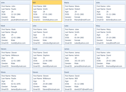
CardView control view when ShowHeader=false.