Customization in WPF Autocomplete (SfTextBoxExt)
AutoComplete provides the user-friendly customizing options for both text box and drop-down. This section explains how to customize the entire AutoComplete control.
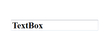
Customizing the text box
The Text, FontSize, FontWeight, and FontFamily properties are used to customize the text box.
<Window x:Class="AutoCompleteSample.MainWindow"
        xmlns="http://schemas.microsoft.com/winfx/2006/xaml/presentation"
        xmlns:x="http://schemas.microsoft.com/winfx/2006/xaml"
        xmlns:d="http://schemas.microsoft.com/expression/blend/2008"
        xmlns:mc="http://schemas.openxmlformats.org/markup-compatibility/2006"
        xmlns:local="clr-namespace:AutoCompleteSample"
        mc:Ignorable="d"
        xmlns:editors="clr-namespace:Syncfusion.Windows.Controls.Input;assembly=Syncfusion.SfInput.Wpf"
        Title="MainWindow" Height="450" Width="800">
    <Window.Content>
        <Grid>
            <editors:SfTextBoxExt x:Name="textBoxExt"
                              Text="TextBox"
                              FontSize="20"
                              FontWeight="Bold"
                              FontFamily="Times New Roman"
                              HorizontalAlignment="Center"
                              VerticalAlignment="Center"
                              Width="200">
            </editors:SfTextBoxExt>
        </Grid>
    </Window.Content>
</Window>
using Syncfusion.Windows.Controls.Input;
using System.Windows;
using System.Windows.Media;
namespace AutoCompleteSample
{
/// <summary>
/// Interaction logic for MainWindow.xaml
/// </summary>
public partial class MainWindow : Window
{
public MainWindow()
{
InitializeComponent();
SfTextBoxExt textBoxExt = new SfTextBoxExt()
{
Text = "TextBox",
FontSize = 20,
FontWeight = FontWeights.Bold,
FontFamily = new FontFamily("Time New Roman"),
HorizontalAlignment = HorizontalAlignment.Center,
VerticalAlignment = VerticalAlignment.Center,
Width = 200
};
this.Content = textBoxExt;
}
}
}
Customizing the suggestion box
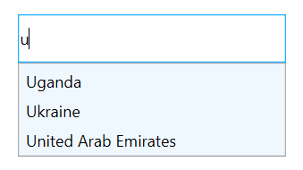
Changing the background color of suggestion box
The DropDownBackground property is used to modify the background color of suggestion box. The following code example demonstrates how to change the background color of suggestion box.
<Window x:Class="AutoCompleteSample.MainWindow"
        xmlns="http://schemas.microsoft.com/winfx/2006/xaml/presentation"
        xmlns:x="http://schemas.microsoft.com/winfx/2006/xaml"
        xmlns:d="http://schemas.microsoft.com/expression/blend/2008"
        xmlns:mc="http://schemas.openxmlformats.org/markup-compatibility/2006"
        xmlns:local="clr-namespace:AutoCompleteSample"
        mc:Ignorable="d"
        xmlns:editors="clr-namespace:Syncfusion.Windows.Controls.Input;assembly=Syncfusion.SfInput.Wpf"
        Title="MainWindow" Height="450" Width="800">
    <Window.Content>
        <Grid>
            <editors:SfTextBoxExt x:Name="textBoxExt"
                                  HorizontalAlignment="Center"
                                  VerticalAlignment="Center"
                                  AutoCompleteMode="Suggest"
                                  DropDownBackground="AliceBlue"
                                  Width="300"/>
        </Grid>
    </Window.Content>
</Window>
using Syncfusion.Windows.Controls.Input;
using System.Collections.Generic;
using System.Windows;
using System.Windows.Media;
namespace AutoCompleteSample
{
/// <summary>
/// Interaction logic for MainWindow.xaml
/// </summary>
public partial class MainWindow : Window
{
public MainWindow()
{
InitializeComponent();
SfTextBoxExt textBoxExt = new SfTextBoxExt()
{
HorizontalAlignment = HorizontalAlignment.Center,
VerticalAlignment = VerticalAlignment.Center,
Width = 200,
AutoCompleteMode = AutoCompleteMode.Suggest,
DropDownBackground = new SolidColorBrush(Colors.AliceBlue)
};
List<string> list = new List<string>()
{
"India",
"Uganda",
"Ukraine",
"Canada",
"United Arab Emirates"
};
textBoxExt.AutoCompleteSource = list;
this.Content = textBoxExt;
}
}
}
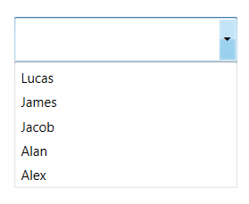
DropDownIcon
This feature allows the users to set the drop-down icon for the text box control using the ShowDropDownButton.
<Window x:Class="Demo_Sample.IsSelectedItemsVisibleInDropDown"
        xmlns="http://schemas.microsoft.com/winfx/2006/xaml/presentation"
        xmlns:x="http://schemas.microsoft.com/winfx/2006/xaml"
        xmlns:d="http://schemas.microsoft.com/expression/blend/2008"
        xmlns:editors="clr-namespace:Syncfusion.Windows.Controls.Input;assembly=Syncfusion.SfInput.Wpf"
        xmlns:mc="http://schemas.openxmlformats.org/markup-compatibility/2006"
        xmlns:local="clr-namespace:Demo_Sample"
        mc:Ignorable="d"
        Title="IsSelectedItemsVisibleInDropDown" Height="450" Width="800">
        <StackPanel VerticalAlignment="Center" Margin="20">
            <TextBlock Text="DropDownIcon:" VerticalAlignment="Center"/>
            <editors:SfTextBoxExt HorizontalAlignment="Left"
                                  x:Name="autoComplete1"
                                  ShowDropDownButton="True"
                                  VerticalAlignment="Center"
                                  Height="40" Width="200"/>
        </StackPanel>
</Window>
using System.Collections.Generic;
using System.Windows;
using Syncfusion.Windows.Controls.Input;
namespace Demo_Sample
{
/// <summary>
/// Interaction logic for IsSelectedItemsVisibleInDropDown.xaml
/// </summary>
public partial class IsSelectedItemsVisibleInDropDown : Window
{
public IsSelectedItemsVisibleInDropDown()
{
InitializeComponent();
SfTextBoxExt textBoxExt = new SfTextBoxExt()
{
VerticalAlignment = VerticalAlignment.Center,
Width = 200,
Height = 40,
ShowDropDownButton = true,
AutoCompleteMode = AutoCompleteMode.Suggest,
};
List<string> list = new List<string>()
{
"Lucas",
"James",
"Jacob",
"Alan",
"Alex",
};
autoComplete1.AutoCompleteSource = list;
}
}
}
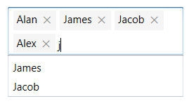
EnableAutoSize
AutoSizing can be enabled in AutoComplete control so that the control will extend its layout based on the token size.
EnableAutoSize property is used to enable the AutoSizing in AutoComplete control. To enable the API, you need to set the MultiSelectMode as Token and TokensWrapMode as Wrap. The default value of EnableAutoSize is false.
<Window x:Class="Demo_Sample.EnableAutoSize"
        xmlns="http://schemas.microsoft.com/winfx/2006/xaml/presentation"
        xmlns:x="http://schemas.microsoft.com/winfx/2006/xaml"
        xmlns:d="http://schemas.microsoft.com/expression/blend/2008"
        xmlns:mc="http://schemas.openxmlformats.org/markup-compatibility/2006"
        xmlns:editors="clr-namespace:Syncfusion.Windows.Controls.Input;assembly=Syncfusion.SfInput.Wpf"
        xmlns:local="clr-namespace:Demo_Sample"
        mc:Ignorable="d"
        Title="EnableAutoSize" Height="450" Width="800">
    <StackPanel VerticalAlignment="Center">
            <TextBlock Text="EnableAutoSize:" Height="40" HorizontalAlignment="Center"/>
            <editors:SfTextBoxExt x:Name="autoComplete"
                                  MultiSelectMode="Token"
                                  TokensWrapMode="Wrap"
                                  AutoCompleteMode="Suggest"
                                  HorizontalAlignment="Center"
                                  EnableAutoSize="True"
                                  Width="200"/>

    </StackPanel>
</Window>
using System.Collections.Generic;
using System.Windows;
namespace Demo_Sample
{
/// <summary>
/// Interaction logic for EnableAutoSize.xaml
/// </summary>
public partial class EnableAutoSize : Window
{
public EnableAutoSize()
{
InitializeComponent();
List<string> items = new List<string>()
{
"Lucas",
"James",
"Jacob",
"Alan",
"Alex",
};
autoComplete.AutoCompleteSource = items;
}
}
}