Appearance in WinUI TreeView
8 Jul 202622 minutes to read
The TreeView allows you to customize the appearance of the underlying data and provides different functionalities to the end user.
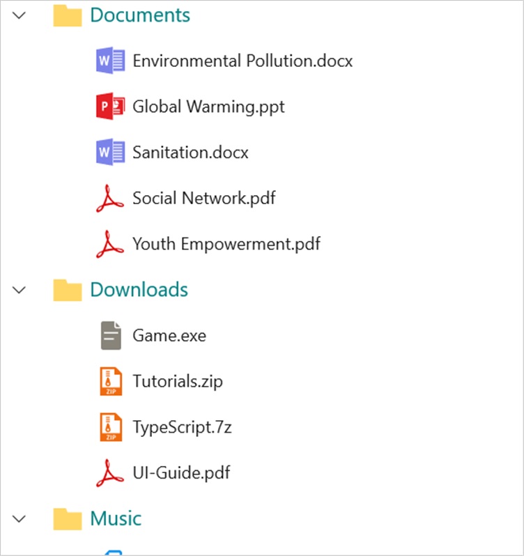
ItemTemplate
The TreeView allows you to customize the appearance of the content view and the expander view by setting the ItemTemplate and ExpanderTemplate properties.
<Page x:Class="syncfusion.treeviewdemos.winui.NodeWithImagePage"
      xmlns="http://schemas.microsoft.com/winfx/2006/xaml/presentation"
      xmlns:x="http://schemas.microsoft.com/winfx/2006/xaml"
      xmlns:local="using:syncfusion.treeviewdemos.winui"
      xmlns:treeView="using:Syncfusion.UI.Xaml.TreeView"
      xmlns:d="http://schemas.microsoft.com/expression/blend/2008"
      xmlns:mc="http://schemas.openxmlformats.org/markup-compatibility/2006"
      mc:Ignorable="d"
      Background="{ThemeResource ApplicationPageBackgroundThemeBrush}"
      NavigationCacheMode="Disabled">

    <Page.DataContext>
        <local:NodeWithImageViewModel />
    </Page.DataContext>

    <Grid>
       <treeView:SfTreeView x:Name="treeView"
                              FullRowSelect="True"
                              ChildPropertyName=”Files”
                              ItemsSource="{Binding Folders}">
                    <treeView:SfTreeView.ItemTemplate>
                        <DataTemplate>
                            <StackPanel Orientation="Horizontal">
                                <ContentPresenter Width="20"
                                                  Height="20"
                                                  HorizontalAlignment="Stretch"
                                                  VerticalAlignment="Center"
                                                  ContentTemplate="{Binding ImageTemplate}" />
                                <TextBlock Margin="5"
                                           VerticalAlignment="Center"
                                           Text="{Binding FileName}" />
                            </StackPanel>
                        </DataTemplate>
                    </treeView:SfTreeView.ItemTemplate>
        </treeView:SfTreeView>
    </Grid >
</Page>
BindingContext for ItemTemplate
By default, the binding context of a TreeView item will be the data model object for bound mode and the TreeViewNode for unbound mode.
In bound mode, you can change the binding context of the TreeView items by using the ItemTemplateDataContextType property.
<Page x:Class="syncfusion.treeviewdemos.winui.NodeWithImagePage"
      xmlns="http://schemas.microsoft.com/winfx/2006/xaml/presentation"
      xmlns:x="http://schemas.microsoft.com/winfx/2006/xaml"
      xmlns:local="using:syncfusion.treeviewdemos.winui"
      xmlns:treeView="using:Syncfusion.UI.Xaml.TreeView"
      xmlns:d="http://schemas.microsoft.com/expression/blend/2008"
      xmlns:mc="http://schemas.openxmlformats.org/markup-compatibility/2006"
      mc:Ignorable="d"
      Background="{ThemeResource ApplicationPageBackgroundThemeBrush}"
      NavigationCacheMode="Disabled">

    <Page.DataContext>
        <local:NodeWithImageViewModel />
    </Page.DataContext>

    <Grid>
        <Grid.RowDefinitions>
            <RowDefinition Height="Auto" />
            <RowDefinition />
        </Grid.RowDefinitions>

        <TextBlock VerticalAlignment="Center"
                   TextWrapping="Wrap"
                   FontSize="14"
                   Margin="5,5,5,20"
                   Text="This sample demonstrates the default functionalities to include images in SfTreeView." />

        <treeView:SfTreeView x:Name="treeView" Grid.Row="1"
                               FullRowSelect="True"
                               ItemTemplateDataContextType="Node"
                               ChildPropertyName=”Files”
                               ItemsSource="{Binding Folders}">
                    <treeView:SfTreeView.ItemTemplate>
                        <DataTemplate>
                            <StackPanel Orientation="Horizontal">
                                <ContentPresenter Width="20"
                                                  Height="20"
                                                  HorizontalAlignment="Stretch"
                                                  VerticalAlignment="Center"
                                                  ContentTemplate="{Binding Content.ImageTemplate}"/>
                                <TextBlock Margin="5"
                                           VerticalAlignment="Center"
                                           Text="{Binding Content.FileName}"/>
                            </StackPanel>
                        </DataTemplate>
                    </treeView:SfTreeView.ItemTemplate>
        </treeView:SfTreeView>
    </Grid >
</Page>
ItemTemplate Selector
The TreeView allows to customize the appearance of each item with different templates based on specific constraints by using the ItemTemplateSelector. You can choose a DataTemplate for each item at runtime based on the value of data-bound property using ItemTemplateSelector.
<Page x:Class="syncfusion.treeviewdemos.winui.NodeWithImagePage"
      xmlns="http://schemas.microsoft.com/winfx/2006/xaml/presentation"
      xmlns:x="http://schemas.microsoft.com/winfx/2006/xaml"
      xmlns:local="using:syncfusion.treeviewdemos.winui"
      xmlns:treeView="using:Syncfusion.UI.Xaml.TreeView"
      xmlns:d="http://schemas.microsoft.com/expression/blend/2008"
      xmlns:mc="http://schemas.openxmlformats.org/markup-compatibility/2006"
      mc:Ignorable="d"
      Background="{ThemeResource ApplicationPageBackgroundThemeBrush}"
      NavigationCacheMode="Disabled">

    <Page.DataContext>
        <local:NodeWithImageViewModel />
    </Page.DataContext>

    <Page.Resources>
        <DataTemplate x:Key="headerTemplate">
            <StackPanel Orientation="Horizontal">
                <ContentPresenter Width="20"
                                  Height="20"
                                  HorizontalAlignment="Stretch"
                                  VerticalAlignment="Center"
                                  ContentTemplate="{Binding Content.ImageTemplate}" />
                <TextBlock Text="{Binding Content.FileName}"
                           Foreground="Teal"
                           Margin="5"
                           FontSize="14"
                           VerticalAlignment="Center" />
            </StackPanel>
        </DataTemplate>

        <DataTemplate x:Key="childTemplate">
            <StackPanel Orientation="Horizontal">
                <ContentPresenter Width="20"
                                  Height="20"
                                  HorizontalAlignment="Stretch"
                                  VerticalAlignment="Center"
                                  ContentTemplate="{Binding Content.ImageTemplate}" />
                <TextBlock Text="{Binding Content.FileName}"
                           Margin="5"
                           FontSize="12"
                           VerticalAlignment="Center" />
            </StackPanel>
        </DataTemplate>

        <local:ItemTemplateSelector x:Key="itemTemplateSelector"
                                    HeaderTemplate="{StaticResource headerTemplate}"
                                    ChildTemplate="{StaticResource childTemplate}">
        </local:ItemTemplateSelector>
    </Page.Resources>

    <Grid>
  	    <treeView:SfTreeView x:Name="treeView"
                               ChildPropertyName="Files"
                               ItemTemplateDataContextType="Node"
                               ItemsSource="{Binding Folders}"
                               ItemTemplateSelector="{StaticResource itemTemplateSelector}"/>
    </Grid>
</Page>
class ItemTemplateSelector : DataTemplateSelector
{
public DataTemplate HeaderTemplate { get; set; }
public DataTemplate ChildTemplate { get; set; }
protected override DataTemplate SelectTemplateCore(object item, DependencyObject container)
{
var treeviewNode = item as Syncfusion.UI.Xaml.TreeView.TreeViewNode;
if (treeviewNode == null)
return null;
if (treeviewNode.Level == 0)
return HeaderTemplate;
else
return ChildTemplate;
}
}
NOTE
Indentation
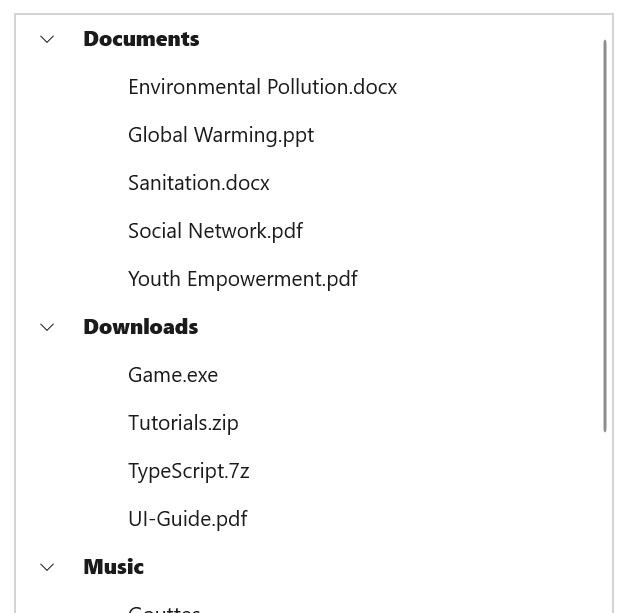
The TreeView allows you to customize the indent spacing of items by setting the Indentation property. The default value of this property is 30. This property can be customized at runtime.
<Syncfusion:SfTreeView x:Name="treeView" Indentation="40" />SfTreeView treeView = new SfTreeView();
treeView.Indentation = 40;ExpanderWidth
The TreeView allows you to customize the width of the expander view by setting the ExpanderWidth property. The default value of this property is 30. This property can be customized at runtime.
<Syncfusion:SfTreeView x:Name="treeView" ExpanderWidth="40" />SfTreeView treeView = new SfTreeView();
treeView.ExpanderWidth = "40";ExpanderPosition
The TreeView allows you change the position of expander view by setting the ExpanderPosition property. The default value of this property is Start. This property has following two positions:
-
Start: Allows displaying the expander view at the start position. -
End: Allows displaying the expander view at the end position.
<treeView:SfTreeView x:Name="treeView" ExpanderPosition="End">SfTreeView treeView = new SfTreeView();
treeView.ExpanderPosition = ExpanderPosition.End;Level based styling
The TreeView allows you to customize the style of a TreeViewItem based on different levels by using IValueConverter.
<Page x:Class="syncfusion.treeviewdemos.winui.NodeWithImagePage"
      xmlns="http://schemas.microsoft.com/winfx/2006/xaml/presentation"
      xmlns:x="http://schemas.microsoft.com/winfx/2006/xaml"
      xmlns:local="using:syncfusion.treeviewdemos.winui"
      xmlns:treeView="using:Syncfusion.UI.Xaml.TreeView"
      xmlns:d="http://schemas.microsoft.com/expression/blend/2008"
      xmlns:mc="http://schemas.openxmlformats.org/markup-compatibility/2006"
      mc:Ignorable="d"
      Background="{ThemeResource ApplicationPageBackgroundThemeBrush}"
      NavigationCacheMode="Disabled">

    <Page.DataContext>
        <local:NodeWithImageViewModel />
    </Page.DataContext>

    <Page.Resources>
        <local:FontAttributeConverter x:Key="FontAttributeConverter" />
    </Page.Resources>

    <Grid>
        <treeView:SfTreeView x:Name="treeView"
                           ChildPropertyName="Files"
                           ItemTemplateDataContextType="Node"
                           ItemsSource="{Binding Folders}">
                    <treeView:SfTreeView.ItemTemplate>
                        <DataTemplate>
                            <StackPanel Orientation="Horizontal">
                                <TextBlock FontSize="14"
                                           VerticalAlignment="Center"
                                           FontWeight="{Binding Level, Converter={StaticResource FontAttributeConverter}}"
                                           Text="{Binding Content.FileName}" />
                            </StackPanel>
                        </DataTemplate>
                    </treeView:SfTreeView.ItemTemplate>
        </treeView:SfTreeView>
    </Grid>
</Page>
public class FontAttributeConverter : IValueConverter
{
public object Convert(object value, Type targetType, object parameter, string culture)
{
var level = (int)value;
return level == 0 ? FontWeights.ExtraBold : FontWeights.Normal;
}
public object ConvertBack(object value, Type targetType, object parameter, string culture)
{
throw new NotImplementedException();
}
}
NOTE
Animation
The TreeView supports animating the expand or collapse of the TreeViewNode. To enable or disable the animation, use the IsAnimationEnabled property of the TreeView.
<Syncfusion:SfTreeView x:Name="treeView" IsAnimationEnabled="true">SfTreeView treeView = new SfTreeView();
treeView.IsAnimationEnabled = true;