Custom Templates in WinUI Segmented Control
1 Oct 202124 minutes to read
This section explains how to customize the SfSegmentedItem and its related operations in the Segmented control.
Ellipse style
Users can achieve the ellipse style, by changing corner radius of the segmented item using the ItemContainerStyle property and changing CornerRadius property in the SelectedSegmentStyle style property.
The following code example illustrates how to customize the ellipse style.
<Window
    x:Class="GettingStarted.MainWindow"
    xmlns="http://schemas.microsoft.com/winfx/2006/xaml/presentation"
    xmlns:x="http://schemas.microsoft.com/winfx/2006/xaml"
    xmlns:local="using:GettingStarted"
    xmlns:d="http://schemas.microsoft.com/expression/blend/2008"
    xmlns:mc="http://schemas.openxmlformats.org/markup-compatibility/2006"
    xmlns:syncfusion="using:Syncfusion.UI.Xaml.Editors"
    mc:Ignorable="d">
    <Grid x:Name="Root_Grid">
        <Grid.DataContext>
            <local:SegmentedViewModel/>
        </Grid.DataContext>
         <Grid.Resources>
            <Style TargetType="Border" x:Key="backLightStyle" >
               <Setter Property="CornerRadius" Value="25" />
               <Setter Property="Background" Value="#ffe521"/>
            </Style>
        </Grid.Resources>
        <syncfusion:SfSegmentedControl x:Name="segmentedControl"
                            Height="50"
                            HorizontalAlignment="Center"
                            VerticalAlignment="Center"
                            CornerRadius="25"
                            ItemBorderThickness="0"
                            SelectedIndex="0"
                            SelectedSegmentStyle="{StaticResource backLightStyle}"
                            ItemsSource="{Binding Backlight}">
            <syncfusion:SfSegmentedControl.Resources>
                <ResourceDictionary>
                    <ResourceDictionary.ThemeDictionaries>
                        <ResourceDictionary x:Key="Light">
                            <SolidColorBrush x:Key="SyncfusionSegmentedControlBackground" Color="#464646"/>
                            <SolidColorBrush x:Key="SyncfusionSegmentedItemBackground" Color="#464646"/>
                            <SolidColorBrush x:Key="SyncfusionSegmentedItemHoverBackground" Color="#464646"/>
                            <SolidColorBrush x:Key="SyncfusionSegmentedItemSelectedHoverBackground" Color="#ffe521"/>
                            <SolidColorBrush x:Key="SyncfusionSegmentedItemForeground" Color="White"/>
                            <SolidColorBrush x:Key="SyncfusionSegmentedItemHoverForeground" Color="White"/>
                            <SolidColorBrush x:Key="SyncfusionSegmentedItemSelectedForeground" Color="#464646"/>
                            <SolidColorBrush x:Key="SyncfusionSegmentedItemSelectedHoverForeground" Color="#464646"/>
                            <SolidColorBrush x:Key="SyncfusionSegmentedControlBorderBrush" Color="#464646"/>
                        </ResourceDictionary>
                    </ResourceDictionary.ThemeDictionaries>
                </ResourceDictionary>
            </syncfusion:SfSegmentedControl.Resources>
            <syncfusion:SfSegmentedControl.ItemContainerStyle>
                <Style TargetType="syncfusion:SfSegmentedItem">
                    <Setter Property="CornerRadius" Value="25"/>
                </Style>
            </syncfusion:SfSegmentedControl.ItemContainerStyle>
            <syncfusion:SfSegmentedControl.ItemTemplate>
                    <DataTemplate>
                        <Grid>
                            <TextBlock Text="{Binding Name}"
                                        HorizontalAlignment="Center"
                                        VerticalAlignment="Center"/>
                        </Grid>
                    </DataTemplate>
            </syncfusion:SfSegmentedControl.ItemTemplate>
         </syncfusion:SfSegmentedControl>
    </Grid>
</Window>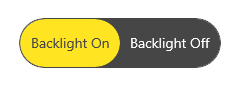
NOTE
Circle style
Users can achieve the circle style, by changing CornerRadius and Margin of the segmented item using the ItemContainerStyle property and changing similar properties in the SelectedSegmentStyle.
The following code example illustrates how to customize the circle style.
<Window
    x:Class="GettingStarted.MainWindow"
    xmlns="http://schemas.microsoft.com/winfx/2006/xaml/presentation"
    xmlns:x="http://schemas.microsoft.com/winfx/2006/xaml"
    xmlns:local="using:GettingStarted"
    xmlns:d="http://schemas.microsoft.com/expression/blend/2008"
    xmlns:mc="http://schemas.openxmlformats.org/markup-compatibility/2006"
    xmlns:syncfusion="using:Syncfusion.UI.Xaml.Editors"
    mc:Ignorable="d">
    <Grid x:Name="Root_Grid">
        <Grid.DataContext>
            <local:SegmentedViewModel/>
        </Grid.DataContext>
       <Grid.Resources>
            <Style TargetType="Border" x:Key="circleStyle">
                <Setter Property="BorderThickness" Value="2" />
                <Setter Property="BorderBrush" Value="{ThemeResource SystemBaseHighColor}"/>
                <Setter Property="Width" Value="50"/>
                <Setter Property="Height" Value="50"/>
                <Setter Property="Margin" Value="-5,0,0,0"/>
                <Setter Property="CornerRadius" Value="25" />
                <Setter Property="Background" Value="Transparent"/>
                <Setter Property="Canvas.ZIndex" Value="2"/>
            </Style>
        </Grid.Resources>
        <syncfusion:SfSegmentedControl x:Name="segmentedControl"
                            HorizontalAlignment="Center"
                            VerticalAlignment="Center"
                            BorderThickness="0"
                            SelectedIndex="2"
                            ItemBorderThickness="0"
                            SelectionAnimationType="None"
                            SelectedSegmentStyle="{StaticResource circleStyle}"
                            ItemsSource="{Binding Colors}" >
            <syncfusion:SfSegmentedControl.ItemContainerStyle>
                <Style TargetType="syncfusion:SfSegmentedItem">
                    <Setter Property="Width" Value="40" />
                    <Setter Property="Height" Value="40" />
                    <Setter Property="CornerRadius" Value="20" />
                    <Setter Property="Padding" Value="0" />
                    <Setter Property="Margin" Value="8,0,8,0"/>
                </Style>
            </syncfusion:SfSegmentedControl.ItemContainerStyle>
            <syncfusion:SfSegmentedControl.ItemTemplate>
                <DataTemplate>
                    <Border Width="40" Height="40" Background="{Binding Background}" CornerRadius="20"/>
                </DataTemplate>
            </syncfusion:SfSegmentedControl.ItemTemplate>
        </syncfusion:SfSegmentedControl>
    </Grid>
</Window>
NOTE
Image with text style
Users can create an image with text style, by adding the image and content to the ItemTemplate.
The following code example illustrates how to customize the image with text style.
<Window
    x:Class="GettingStarted.MainWindow"
    xmlns="http://schemas.microsoft.com/winfx/2006/xaml/presentation"
    xmlns:x="http://schemas.microsoft.com/winfx/2006/xaml"
    xmlns:local="using:GettingStarted"
    xmlns:d="http://schemas.microsoft.com/expression/blend/2008"
    xmlns:mc="http://schemas.openxmlformats.org/markup-compatibility/2006"
    xmlns:syncfusion="using:Syncfusion.UI.Xaml.Editors"
    mc:Ignorable="d">
    <Grid x:Name="Root_Grid">
        <Grid.DataContext>
            <local:SegmentedViewModel/>
        </Grid.DataContext>
        <syncfusion:SfSegmentedControl x:Name="segmentedControl"
                            HorizontalAlignment="Center"
                            VerticalAlignment="Center"
                            SelectedIndex="2"
                            ItemsSource="{Binding Items}">
                <syncfusion:SfSegmentedControl.ItemTemplate>
                    <DataTemplate>
                        <StackPanel Height="50">
                            <Path Data="{Binding Icon}" Stretch="Uniform"
                                  Fill="{Binding Background}"
                                  Width="16" Height="16"
                                  Margin="0,8,0,0" RenderTransformOrigin="0.5,0.5">
                                <Path.RenderTransform>
                                    <TransformGroup>
                                        <TransformGroup.Children>
                                            <RotateTransform Angle="0" />
                                            <ScaleTransform ScaleX="1" ScaleY="1" />
                                        </TransformGroup.Children>
                                    </TransformGroup>
                                </Path.RenderTransform>
                            </Path>
                            <TextBlock Text="{Binding Name}"
                                       Margin="0,6,0,0"/>
                        </StackPanel>
                    </DataTemplate>
                </syncfusion:SfSegmentedControl.ItemTemplate>
         </syncfusion:SfSegmentedControl>
    </Grid>
</Window>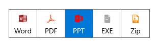
NOTE
Top indicator style
By using the ItemBorderThickness property and handling BorderThickness in the SelectedSegmentStyle property helps users to achieve the top indicator style.
The following code example illustrates how to customize the top indicator style.
<Window
    x:Class="GettingStarted.MainWindow"
    xmlns="http://schemas.microsoft.com/winfx/2006/xaml/presentation"
    xmlns:x="http://schemas.microsoft.com/winfx/2006/xaml"
    xmlns:local="using:GettingStarted"
    xmlns:d="http://schemas.microsoft.com/expression/blend/2008"
    xmlns:mc="http://schemas.openxmlformats.org/markup-compatibility/2006"
    xmlns:syncfusion="using:Syncfusion.UI.Xaml.Editors"
    mc:Ignorable="d">
    <Grid x:Name="Root_Grid">
        <Grid.DataContext>
            <local:SegmentedViewModel/>
        </Grid.DataContext>
        <Grid.Resources>
            <ResourceDictionary>
                <ResourceDictionary.ThemeDictionaries>
                    <ResourceDictionary x:Key="Light">
                        <SolidColorBrush x:Key="SelectedBorderBrush" Color="DarkBlue"/>
                    </ResourceDictionary>
                    <ResourceDictionary x:Key="Dark">
                        <SolidColorBrush x:Key="SelectedBorderBrush" Color="Red"/>
                    </ResourceDictionary>
                </ResourceDictionary.ThemeDictionaries>
                <Style TargetType="Border" x:Key="topBorderStyle" >
                    <Setter Property="Margin" Value="0,-6,0,0" />
                    <Setter Property="BorderThickness" Value="0,4,0,0" />
                    <Setter Property="BorderBrush" Value="{ThemeResource SelectedBorderBrush}" />
                </Style>
            </ResourceDictionary>
        </Grid.Resources>
        <syncfusion:SfSegmentedControl x:Name="segmentedControl"
                            HorizontalAlignment="Center"
                            VerticalAlignment="Center"
                            SelectedIndex="2"
                            BorderThickness="0"
                            ItemBorderThickness="0,4,0,0"
                            SelectedSegmentStyle="{StaticResource topBorderStyle}"
                            ItemsSource="{Binding Days}">
            <syncfusion:SfSegmentedControl.Resources>
                <ResourceDictionary>
                    <ResourceDictionary.ThemeDictionaries>
                        <ResourceDictionary x:Key="Light">
                            <SolidColorBrush x:Key="SyncfusionSegmentedItemHoverBackground" Color="#7995f2"/>
                            <SolidColorBrush x:Key="SyncfusionSegmentedItemHoverForeground" Color="White"/>
                            <SolidColorBrush x:Key="SyncfusionSegmentedItemSelectedHoverBackground" Color="#7995f2"/>
                            <SolidColorBrush x:Key="SyncfusionSegmentedItemSelectedHoverForeground" Color="White"/>
                            <SolidColorBrush x:Key="SyncfusionSegmentedItemSelectedForeground" Color="Black"/>
                        </ResourceDictionary>
                        <ResourceDictionary x:Key="Dark">
                            <SolidColorBrush x:Key="SyncfusionSegmentedItemHoverBackground" Color="#f78b8b"/>
                            <SolidColorBrush x:Key="SyncfusionSegmentedItemHoverForeground" Color="White"/>
                            <SolidColorBrush x:Key="SyncfusionSegmentedItemSelectedHoverBackground" Color="#f78b8b"/>
                            <SolidColorBrush x:Key="SyncfusionSegmentedItemSelectedHoverForeground" Color="White"/>
                            <SolidColorBrush x:Key="SyncfusionSegmentedItemSelectedForeground" Color="White"/>
                        </ResourceDictionary>
                    </ResourceDictionary.ThemeDictionaries>
                </ResourceDictionary>
            </syncfusion:SfSegmentedControl.Resources>
            <syncfusion:SfSegmentedControl.ItemContainerStyle>
                <Style TargetType="syncfusion:SfSegmentedItem">
                    <Setter Property="BorderBrush" Value="Transparent" />
                    <Setter Property="Padding" Value="8" />
                    <Setter Property="Margin" Value="2,0,2,0"/>
                </Style>
            </syncfusion:SfSegmentedControl.ItemContainerStyle>
            <syncfusion:SfSegmentedControl.ItemTemplate>
                <DataTemplate>
                    <StackPanel Orientation="Horizontal">
                        <Path Data="{Binding Icon}" Stretch="Uniform"
                                              Fill="{Binding RelativeSource={RelativeSource Mode=TemplatedParent}, Path=Foreground}"
                                              Width="16" Height="16"
                                              RenderTransformOrigin="0.5,0.5">
                            <Path.RenderTransform>
                                <TransformGroup>
                                    <TransformGroup.Children>
                                        <RotateTransform Angle="0" />
                                        <ScaleTransform ScaleX="1" ScaleY="1" />
                                    </TransformGroup.Children>
                                </TransformGroup>
                            </Path.RenderTransform>
                        </Path>
                        <TextBlock Text="{Binding Name}" Margin="6,0,0,0"
                                   VerticalAlignment="Center"
                                   HorizontalAlignment="Center"/>
                    </StackPanel>
                </DataTemplate>
            </syncfusion:SfSegmentedControl.ItemTemplate>
        </syncfusion:SfSegmentedControl>
    </Grid>
</Window>
Light Theme

Dark Theme

NOTE