Tooltip in WinUI Pyramid Chart
18 Nov 201810 minutes to read
Tooltip is used to display information over segments. It appears at the data point position when the mouse hovers over any chart segment. It is set to display the metadata of the hovered segment or data point.
Define Tooltip
To define the tooltip in the chart, set the EnableTooltip property to true. The default value of the EnableTooltip property is false.
<chart:SfPyramidChart
    x:Name="chart"
    EnableTooltip="True"
    ItemsSource="{Binding Data}"
    XBindingPath="Category"
    YBindingPath="Value">
</chart:SfPyramidChart>
SfPyramidChart chart = new SfPyramidChart();
chart.SetBinding(SfPyramidChart.ItemsSourceProperty, new Binding()
{
Path = new PropertyPath("Data")
});
chart.XBindingPath = "Category";
chart.YBindingPath = "Value";
chart.EnableTooltip = true;
// Configure additional chart elements
this.Content = chart;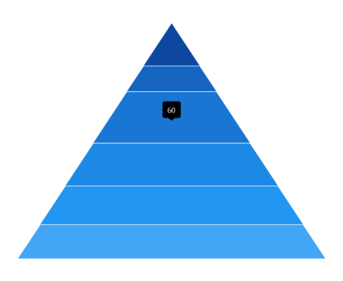
Customization
The ChartTooltipBehavior is used to customize the tooltip. To customize the tooltip, create an instance of ChartTooltipBehavior and set it to the TooltipBehavior property of the SfPyramidChart. The following properties are used to customize the tooltip:
- Style - Used to customize the fill and stroke of the tooltip.
- LabelStyle - Used to customize the tooltip label.
- HorizontalAlignment - Used to align the tooltip label at the left, right, and center of the data point position or cursor position horizontally.
- VerticalAlignment - Used to align the tooltip label at the top, center, and bottom of the data point position or cursor position vertically.
- HorizontalOffset - Used to position the tooltip at a distance from the data point or cursor position horizontally.
- VerticalOffset - Used to position the tooltip at a distance from the data point or cursor position vertically.
- Duration - Used to set the amount of time that the tooltip remains visible in milliseconds.
- EnableAnimation - Used to enable the animation when showing the tooltip.
- InitialShowDelay - Used to delay the display of the tooltip in milliseconds after the user interacts with the series.
<chart:SfPyramidChart x:Name="chart">

    <!-- Configure additional chart elements -->
    <chart:SfPyramidChart.TooltipBehavior>
        <chart:ChartTooltipBehavior/>
    </chart:SfPyramidChart.TooltipBehavior>

</chart:SfPyramidChart>
SfPyramidChart chart = new SfPyramidChart();
chart.EnableTooltip = true;
ChartTooltipBehavior behavior = new ChartTooltipBehavior();
chart.TooltipBehavior = behavior;
// Configure additional chart elements
this.Content = chart;Background Style
The tooltip’s fill and stroke color can be customized by using the Style property. To define a Style for the tooltip, specify the style of TargetType as Path.
<chart:SfPyramidChart
     x:Name="chart"
     EnableTooltip="True">

     <!-- Configure additional chart elements -->
     <chart:SfPyramidChart.Resources>
         <Style TargetType="Path" x:Key="style">
             <Setter Property="Stroke" Value="Black"/>
             <Setter Property="Fill" Value="Gray"/>
         </Style>
     </chart:SfPyramidChart.Resources>

     <chart:SfPyramidChart.TooltipBehavior>
         <chart:ChartTooltipBehavior Style="{StaticResource style}"/>
     </chart:SfPyramidChart.TooltipBehavior>

</chart:SfPyramidChart>
SfPyramidChart chart = new SfPyramidChart();
chart.EnableTooltip = true;
Style style = new Style(typeof(Path));
style.Setters.Add(new Setter(Path.StrokeProperty, new SolidColorBrush(Colors.Black)));
style.Setters.Add(new Setter(Path.FillProperty, new SolidColorBrush(Colors.Gray)));
// Configure additional chart elements
ChartTooltipBehavior tooltipBehavior = new ChartTooltipBehavior();
tooltipBehavior.Style = style;
chart.TooltipBehavior = tooltipBehavior;
this.Content = chart;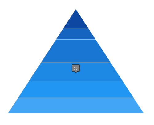
Label Style
The tooltip label style can be customized by using the LabelStyle property. To define a Style for the tooltip label, specify the style of TargetType as TextBlock.
<chart:SfPyramidChart x:Name="chart" EnableTooltip="True">

    <!-- Configure additional chart elements -->
    <chart:SfPyramidChart.Resources>
        <Style TargetType="TextBlock" x:Key="labelStyle">
            <Setter Property="FontSize" Value="14"/>
            <Setter Property="Foreground" Value="Red"/>
            <Setter Property="FontStyle" Value="Italic"/>
        </Style>
    </chart:SfPyramidChart.Resources>

    <chart:SfPyramidChart.TooltipBehavior>
        <chart:ChartTooltipBehavior LabelStyle="{StaticResource labelStyle}"/>
    </chart:SfPyramidChart.TooltipBehavior>

</chart:SfPyramidChart>
SfPyramidChart chart = new SfPyramidChart();
chart.EnableTooltip = true;
Style labelStyle = new Style(typeof(TextBlock));
labelStyle.Setters.Add(new Setter(TextBlock.FontSizeProperty, 14d));
labelStyle.Setters.Add(new Setter(TextBlock.FontStyleProperty, FontStyle.Italic));
labelStyle.Setters.Add(new Setter(TextBlock.ForegroundProperty, new SolidColorBrush(Colors.Red)));
// Configure additional chart elements
ChartTooltipBehavior tooltipBehavior = new ChartTooltipBehavior();
tooltipBehavior.LabelStyle = labelStyle;
chart.TooltipBehavior = tooltipBehavior;
this.Content = chart;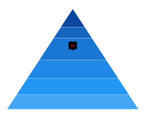
Template
The pyramid chart provides support to customize the appearance of the tooltip by using the TooltipTemplate property.
<Grid x:Name="grid">
    <Grid.Resources>
        <DataTemplate x:Key="tooltipTemplate" x:DataType="chart:ChartSegment">
            <StackPanel Orientation="Horizontal">
                <TextBlock
                   Text="{Binding Item.Category}"
                   Foreground="Black"
                   FontWeight="Medium"
                   FontSize="12"
                   HorizontalAlignment="Center"
                   VerticalAlignment="Center"/>
                <TextBlock
                   Text=" : "
                   Foreground="Black"
                   FontWeight="Medium"
                   FontSize="12"
                   HorizontalAlignment="Center"
                   VerticalAlignment="Center"/>
                <TextBlock
                   Text="{Binding Item.Value}"
                   Foreground="Black"
                   FontWeight="Medium"
                   FontSize="12"
                   HorizontalAlignment="Center"
                   VerticalAlignment="Center"/>
            </StackPanel>
        </DataTemplate>

        <Style TargetType="Path" x:Key="style">
            <Setter Property="Stroke" Value="Black"/>
            <Setter Property="Fill" Value="LightGreen"/>
            <Setter Property="StrokeThickness" Value="2"/>
        </Style>
    </Grid.Resources>

    <chart:SfPyramidChart
        x:Name="chart"
        ItemsSource="{Binding Data}"
        XBindingPath="Category"
        YBindingPath="Value"
        EnableTooltip="True"
        TooltipTemplate="{StaticResource tooltipTemplate}">

        <chart:SfPyramidChart.TooltipBehavior>
            <chart:ChartTooltipBehavior Style="{StaticResource style}"/>
        </chart:SfPyramidChart.TooltipBehavior>

    </chart:SfPyramidChart>
</Grid>
SfPyramidChart chart = new SfPyramidChart();
chart.SetBinding(SfPyramidChart.ItemsSourceProperty, new Binding()
{
Path = new PropertyPath("Data")
});
chart.XBindingPath = "Category";
chart.YBindingPath = "Value";
// The 'tooltipTemplate' resource is defined in XAML Resources and referenced here.
chart.TooltipTemplate = this.grid.Resources["tooltipTemplate"] as DataTemplate;
chart.EnableTooltip = true;
// Configure additional chart elements
this.Content = chart;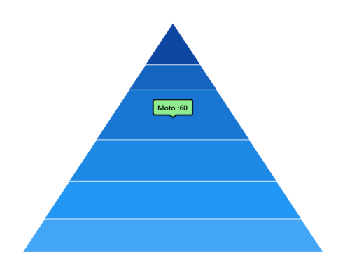
The Item can be used to access the data linked to the associated model class. The binding context for the Chart
TooltipTemplateis ChartSegment, which provides the necessary data for the tooltip labels.