Axis in WinUI Linear Gauge
10 Jul 202623 minutes to read
The Linear axis is a linear scale, where a set of values can be plotted along with a linear or custom scale, based on the design requirements. Axis elements such as labels, ticks, and axis line can be easily customized with built-in properties.
Axis customization
Setting axis minimum and maximum value
The Minimum and Maximum properties of an axis can be used to customize the axis value range. The default value of Minimum is 0 and the default value of Maximum is 100.
<gauge:SfLinearGauge>
    <gauge:SfLinearGauge.Axis>
        <gauge:LinearAxis Minimum="-60"
                          Maximum="60" />
    </gauge:SfLinearGauge.Axis>
</gauge:SfLinearGauge>
SfLinearGauge sfLinearGauge = new SfLinearGauge();
sfLinearGauge.Axis.Minimum = -60;
sfLinearGauge.Axis.Maximum = 60;
this.Content = sfLinearGauge;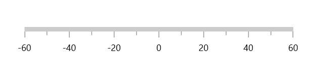
Interval
The interval between labels can be customized using the Interval property of axis.
<gauge:SfLinearGauge>
    <gauge:SfLinearGauge.Axis>
        <gauge:LinearAxis Interval="20" />
    </gauge:SfLinearGauge.Axis>
</gauge:SfLinearGauge>
SfLinearGauge sfLinearGauge = new SfLinearGauge();
sfLinearGauge.Axis.Interval = 20;
this.Content = sfLinearGauge;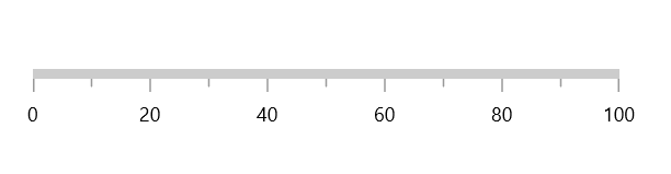
Axis direction customization
The direction of Linear axis can be customized by the IsInversed property of Linear gauge.
When the IsInversed property is true, the axis can be placed in the right-to-left direction. When the IsInversed property is set to false, the axis will be positioned in the left-to-right direction.
<gauge:SfLinearGauge IsInversed="True" />this.Content = new SfLinearGauge { IsInversed = true };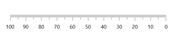
Mirrored axis support
Linear axis can be displayed as mirrored by using the IsMirrored property of Linear gauge.
When the IsMirrored property is true, the axis can be rendered in a mirrored or opposite direction.
<gauge:SfLinearGauge IsMirrored="True" />this.Content = new SfLinearGauge { IsMirrored = true };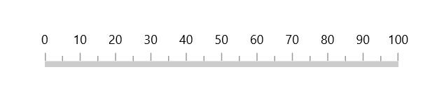
Axis orientation support
The orientation of Linear axis can be customized by using the Orientation property of Linear gauge.
When the Orientation property is Vertical, the axis will be rendered in a bottom-to-top direction.
<gauge:SfLinearGauge Orientation="Vertical" />this.Content = new SfLinearGauge { Orientation = Orientation.Vertical };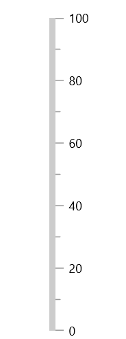
Maximum number of labels per 100 logical pixels
The maximum number of labels that should be present within a 100 logical pixel length can be customized using the MaximumLabelsCount property of the axis. This property is applicable only for automatic range calculation and will not work if you set a value for the Interval property of an axis.
<gauge:SfLinearGauge>
    <gauge:SfLinearGauge.Axis>
        <gauge:LinearAxis MaximumLabelsCount="1" />
    </gauge:SfLinearGauge.Axis>
</gauge:SfLinearGauge>
SfLinearGauge sfLinearGauge = new SfLinearGauge();
sfLinearGauge.Axis.MaximumLabelsCount = 1;
this.Content = sfLinearGauge;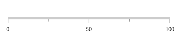
Axis line customization
The linear axis line can be customized using the following properties:
-
AxisLineStrokeThickness– Customizes the thickness of the axis line. -
AxisLineStroke– Customizes the color of the axis line. -
AxisLineStyle– Customizes the style of the axis line.
Axis line stroke thickness
The axis line will be rendered based on the pixel value given in AxisLineStrokeThickness.
<gauge:SfLinearGauge>
    <gauge:SfLinearGauge.Axis>
        <gauge:LinearAxis AxisLineStrokeThickness="30" />
    </gauge:SfLinearGauge.Axis>
</gauge:SfLinearGauge>
SfLinearGauge sfLinearGauge = new SfLinearGauge();
sfLinearGauge.Axis.AxisLineStrokeThickness = 30;
this.Content = sfLinearGauge;
Setting axis line stroke color
To apply the color to the axis line, use the AxisLineStroke property of the linear axis.
<gauge:SfLinearGauge>
    <gauge:SfLinearGauge.Axis>
        <gauge:LinearAxis AxisLineStroke="BlueViolet" />
    </gauge:SfLinearGauge.Axis>
</gauge:SfLinearGauge>
SfLinearGauge sfLinearGauge = new SfLinearGauge();
sfLinearGauge.Axis.AxisLineStroke = new SolidColorBrush(Colors.BlueViolet);
this.Content = sfLinearGauge;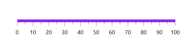
Axis line visibility
The visibility of the axis line can be customized using the ShowAxisLine property of axis. By default, this property is set to true.
<gauge:SfLinearGauge>
    <gauge:SfLinearGauge.Axis>
        <gauge:LinearAxis ShowAxisLine="False" />
    </gauge:SfLinearGauge.Axis>
</gauge:SfLinearGauge>
SfLinearGauge sfLinearGauge = new SfLinearGauge();
sfLinearGauge.Axis.ShowAxisLine = false;
this.Content = sfLinearGauge;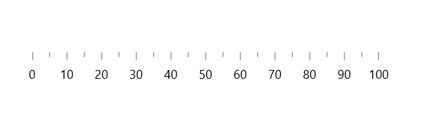
Axis label customization
The axis labels can be customized using the following properties:
-
Foreground– Allows you to customize the color of the labels. -
FontFamily– Allows you to specify the font family for labels. -
FontStyle– Allows you to specify the font style for labels. -
FontWeight– Allows you to specify the font weight for labels. -
FontSize– Allows you to specify the font size for labels.
<gauge:SfLinearGauge>
    <gauge:SfLinearGauge.Axis>
        <gauge:LinearAxis FontSize="15"
                          Foreground="Red"
                          FontFamily="Comic Sans MS"
                          FontWeight="Bold"
                          FontStyle="Italic" />
    </gauge:SfLinearGauge.Axis>
</gauge:SfLinearGauge>
SfLinearGauge sfLinearGauge = new SfLinearGauge();
sfLinearGauge.Axis.FontSize = 15;
sfLinearGauge.Axis.Foreground = new SolidColorBrush(Colors.Red);
sfLinearGauge.Axis.FontFamily = new FontFamily("Comic Sans MS");
sfLinearGauge.Axis.FontWeight = FontWeights.SemiBold;
sfLinearGauge.Axis.FontStyle = Windows.UI.Text.FontStyle.Italic;
this.Content = sfLinearGauge;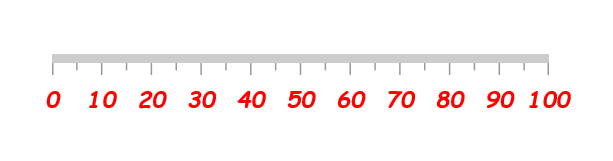
Formatting axis label
The LabelFormat allows you to customize the axis label with the globalized label format.
<gauge:SfLinearGauge>
    <gauge:SfLinearGauge.Axis>
        <gauge:LinearAxis LabelFormat="c" />
    </gauge:SfLinearGauge.Axis>
</gauge:SfLinearGauge>
SfLinearGauge sfLinearGauge = new SfLinearGauge();
sfLinearGauge.Axis.LabelFormat = "c";
this.Content = sfLinearGauge;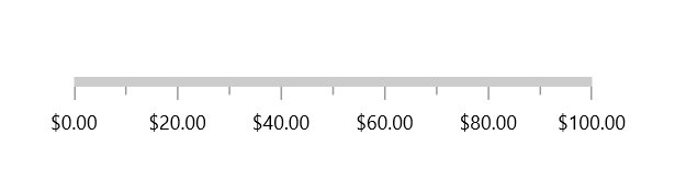
Template support for axis label
The LabelTemplate property allows you to define the customized style for the axis label as shown in the following code sample.
<Page.Resources>
    <DataTemplate x:Key="labelTemplate">
        <Border Background="Gray"
                CornerRadius="5">
            <TextBlock Text="{Binding Text}"
                       Foreground="White"
                       FontStyle="Normal"
                       FontWeight="Bold"
                       Margin="3" />
        </Border>
    </DataTemplate>
</Page.Resources>

<gauge:SfLinearGauge>
    <gauge:SfLinearGauge.Axis>
        <gauge:LinearAxis LabelTemplate="{StaticResource labelTemplate}" />
    </gauge:SfLinearGauge.Axis>
</gauge:SfLinearGauge>
SfLinearGauge sfLinearGauge = new SfLinearGauge();
// The 'labelTemplate' resource is defined in XAML Resources and referenced here.
sfLinearGauge.Axis.LabelTemplate = this.Resources["labelTemplate"] as DataTemplate;
this.Content = sfLinearGauge;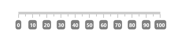
Label visibility
The ShowLabels property of the axis allows you to enable or disable the visibility of labels. The default value of this property is true.
<gauge:SfLinearGauge>
    <gauge:SfLinearGauge.Axis>
        <gauge:LinearAxis ShowLabels="False" />
    </gauge:SfLinearGauge.Axis>
</gauge:SfLinearGauge>
SfLinearGauge sfLinearGauge = new SfLinearGauge();
sfLinearGauge.Axis.ShowLabels = false;
this.Content = sfLinearGauge;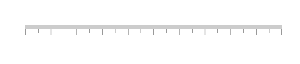
Label placement
The linear axis allows you to position the labels either inside or outside the axis line using the LabelPosition property. By default, labels are positioned inside the axis line.
<gauge:SfLinearGauge>
    <gauge:SfLinearGauge.Axis>
        <gauge:LinearAxis LabelPosition="Outside" />
    </gauge:SfLinearGauge.Axis>
</gauge:SfLinearGauge>
SfLinearGauge sfLinearGauge = new SfLinearGauge();
sfLinearGauge.Axis.LabelPosition = GaugeLabelsPosition.Outside;
this.Content = sfLinearGauge;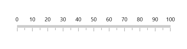
Label position customization
The LabelOffset property allows you to adjust the distance between the axis line and the labels. By default, the value of the label offset is 5.
<gauge:SfLinearGauge>
    <gauge:SfLinearGauge.Axis>
        <gauge:LinearAxis LabelOffset="40" />
    </gauge:SfLinearGauge.Axis>
</gauge:SfLinearGauge>
SfLinearGauge sfLinearGauge = new SfLinearGauge();
sfLinearGauge.Axis.LabelOffset = 40;
this.Content = sfLinearGauge;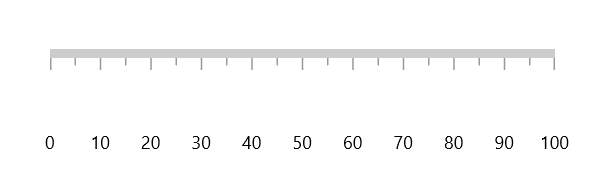
Tick customization
The major and minor tick lines of an axis can be customized using the following properties:
-
MajorTickLength– Specifies the major length of ticks. -
MinorTickLength– Specifies the minor length of ticks. -
MajorTickStyle– Allows you to specify the style for the major tick line. -
MinorTickStyle– Allows you to specify the style for the minor tick line.
Tick length
The major and minor tick lines will be rendered based on the pixel values given in MajorTickLength and MinorTickLength.
<gauge:SfLinearGauge>
    <gauge:SfLinearGauge.Axis>
        <gauge:LinearAxis MajorTickLength="15"
                          MinorTickLength="10" />
    </gauge:SfLinearGauge.Axis>
</gauge:SfLinearGauge>
SfLinearGauge sfLinearGauge = new SfLinearGauge();
sfLinearGauge.Axis.MajorTickLength = 15;
sfLinearGauge.Axis.MinorTickLength = 10;
this.Content = sfLinearGauge;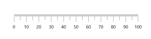
Setting style for major ticks
The MajorTickStyle property allows you to define the style for the major ticks, as shown in the following code example.
<Page.Resources>
    <Style x:Key="MajorTickLineStyle"
           TargetType="Line">
        <Setter Property="Stroke"
                Value="Black"></Setter>
        <Setter Property="StrokeThickness"
                Value="1.5"></Setter>
    </Style>
</Page.Resources>

<gauge:SfLinearGauge>
    <gauge:SfLinearGauge.Axis>
        <gauge:LinearAxis MajorTickStyle="{StaticResource MajorTickLineStyle}" />
    </gauge:SfLinearGauge.Axis>
</gauge:SfLinearGauge>
SfLinearGauge sfLinearGauge = new SfLinearGauge();
// The 'MajorTickLineStyle' resource is defined in XAML Resources and referenced here.
sfLinearGauge.Axis.MajorTickStyle = this.Resources["MajorTickLineStyle"] as Style;
this.Content = sfLinearGauge;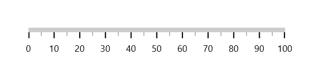
Setting style for minor ticks
The MinorTickStyle property allows you to define the style for the minor ticks, as shown in the following code example.
<Page.Resources>
    <Style x:Key="MinorTickLineStyle"
           TargetType="Line">
        <Setter Property="Stroke"
                Value="Black"></Setter>
        <Setter Property="StrokeThickness"
                Value="1.5"></Setter>
    </Style>
</Page.Resources>

<gauge:SfLinearGauge>
    <gauge:SfLinearGauge.Axis>
        <gauge:LinearAxis MinorTickStyle="{StaticResource MinorTickLineStyle}" />
    </gauge:SfLinearGauge.Axis>
</gauge:SfLinearGauge>
SfLinearGauge sfLinearGauge = new SfLinearGauge();
// The 'MinorTickLineStyle' resource is defined in XAML Resources and referenced here.
sfLinearGauge.Axis.MinorTickStyle = this.Resources["MinorTickLineStyle"] as Style;
this.Content = sfLinearGauge;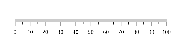
Setting dashed tick lines
By defining StrokeDashArray property in both the MajorTickStyle and MinorTickStyle, you can draw the dashed tick line.
<Page.Resources>
    <Style x:Key="MajorTickLineStyle"
           TargetType="Line">
        <Setter Property="Stroke"
                Value="Black"></Setter>
        <Setter Property="StrokeDashArray"
                Value="5,2.5"></Setter>
    </Style>

    <Style x:Key="MinorTickLineStyle"
           TargetType="Line">
        <Setter Property="Stroke"
                Value="Black"></Setter>
        <Setter Property="StrokeDashArray"
                Value="3,2.5"></Setter>
    </Style>
</Page.Resources>

<gauge:SfLinearGauge>
    <gauge:SfLinearGauge.Axis>
        <gauge:LinearAxis MajorTickLength="15"
                          MinorTickLength="10"
                          MajorTickStyle="{StaticResource MajorTickLineStyle}"
                          MinorTickStyle="{StaticResource MinorTickLineStyle}" />
    </gauge:SfLinearGauge.Axis>
</gauge:SfLinearGauge>
SfLinearGauge sfLinearGauge = new SfLinearGauge();
sfLinearGauge.Axis.MajorTickLength = 15;
sfLinearGauge.Axis.MinorTickLength = 10;
// The 'MajorTickLineStyle' resource is defined in XAML Resources and referenced here.
sfLinearGauge.Axis.MajorTickStyle = this.Resources["MajorTickLineStyle"] as Style;
// The 'MinorTickLineStyle' resource is defined in XAML Resources and referenced here.
sfLinearGauge.Axis.MinorTickStyle = this.Resources["MinorTickLineStyle"] as Style;
this.Content = sfLinearGauge;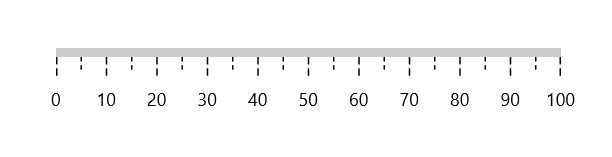
Setting minor ticks count
The major ticks are generated based on the Interval property. Similarly, the minor ticks are generated using the MinorTicksPerInterval property of the axis. By default, the count value of this property is 1.
<gauge:SfLinearGauge>
    <gauge:SfLinearGauge.Axis>
        <gauge:LinearAxis MinorTicksPerInterval="4" />
    </gauge:SfLinearGauge.Axis>
</gauge:SfLinearGauge>
SfLinearGauge sfLinearGauge = new SfLinearGauge();
sfLinearGauge.Axis.MinorTicksPerInterval = 4;
this.Content = sfLinearGauge;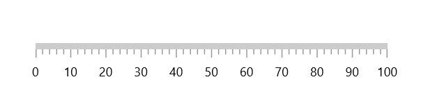
Tick line visibility
The ShowTicks property of the axis can be used to enable or disable the visibility of both the major and the minor ticks of the axis.
<gauge:SfLinearGauge>
    <gauge:SfLinearGauge.Axis>
        <gauge:LinearAxis ShowTicks="False" />
    </gauge:SfLinearGauge.Axis>
</gauge:SfLinearGauge>
SfLinearGauge sfLinearGauge = new SfLinearGauge();
sfLinearGauge.Axis.ShowTicks = false;
this.Content = sfLinearGauge;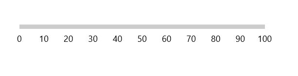
Tick placement
The Linear axis allows you to position the ticks either inside, outside, or center of the axis line using the TickPosition property. By default, ticks are positioned inside the axis line.
<gauge:SfLinearGauge>
    <gauge:SfLinearGauge.Axis>
        <gauge:LinearAxis TickPosition="Outside" />
    </gauge:SfLinearGauge.Axis>
</gauge:SfLinearGauge>
SfLinearGauge sfLinearGauge = new SfLinearGauge();
sfLinearGauge.Axis.LabelPosition = GaugeLabelsPosition.Outside;
this.Content = sfLinearGauge;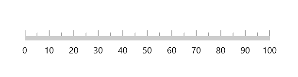
Tick position customization
The ticks can be moved near or far from the axis line using the TickOffset property. The default value of TickOffset is 0.
<gauge:SfLinearGauge>
    <gauge:SfLinearGauge.Axis>
        <gauge:LinearAxis TickOffset="50" />
    </gauge:SfLinearGauge.Axis>
</gauge:SfLinearGauge>
SfLinearGauge sfLinearGauge = new SfLinearGauge();
sfLinearGauge.Axis.TickOffset = 50;
this.Content = sfLinearGauge;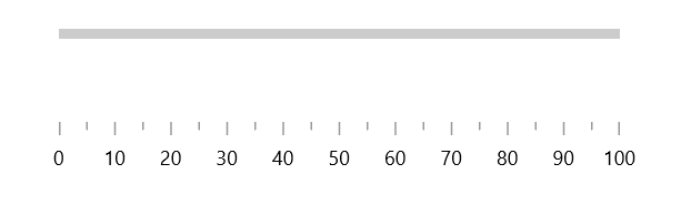
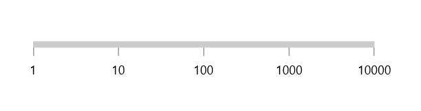
Custom scale range
Linear gauge allows you to define a custom scale range by extending the axis based on your business logic.
<gauge:SfLinearGauge>
    <gauge:SfLinearGauge.Axis>
        <local:LogarithmicAxis Minimum="1"
                               Maximum="10000" />
    </gauge:SfLinearGauge.Axis>
</gauge:SfLinearGauge>
public class LogarithmicAxis : LinearAxis
{
int labelsCount;
public override List<AxisLabelData> GenerateVisibleLabels()
{
List<AxisLabelData> labelInfos = new List<AxisLabelData>();
int minimum = (int)LogBase(this.Minimum, 10);
int maximum = (int)LogBase(this.Maximum, 10);
for (int i = minimum; i <= maximum; i++)
{
double value = Math.Floor(Math.Pow(10, i)); // logBase value is 10
AxisLabelData label = new AxisLabelData()
{
Value = value,
Text = value.ToString()
};
labelInfos.Add(label);
}
labelsCount = labelInfos.Count;
return labelInfos;
}
private double LogBase(double value, int baseValue)
{
return Math.Log(value) / Math.Log(baseValue);
}
public override double ValueToFactor(double value)
{
return LogBase(value, 10) / (labelsCount - 1);
}
public override double FactorToValue(double factor)
{
return Math.Pow(Math.E, factor * (labelsCount - 1) * Math.Log(10));
}
}