Data Label in WinUI Funnel Chart
18 Nov 201812 minutes to read
To improve the readability of data in the funnel chart, data points can be easily annotated with data labels.
Define Data Label
To define the data label in the chart, set the ShowDataLabels property to true. The default value of the ShowDataLabels property is false.
<chart:SfFunnelChart
    x:Name="chart"
    ShowDataLabels="True"
    ItemsSource="{Binding Data}"
    XBindingPath="Category"
    YBindingPath="Value">

    <!-- Configure additional chart elements -->
</chart:SfFunnelChart>
SfFunnelChart chart = new SfFunnelChart();
chart.ShowDataLabels = true;
chart.SetBinding(SfFunnelChart.ItemsSourceProperty, new Binding()
{
Path = new PropertyPath("Data")
});
chart.XBindingPath = "Category";
chart.YBindingPath = "Value";
// Configure additional chart elements
this.Content = chart;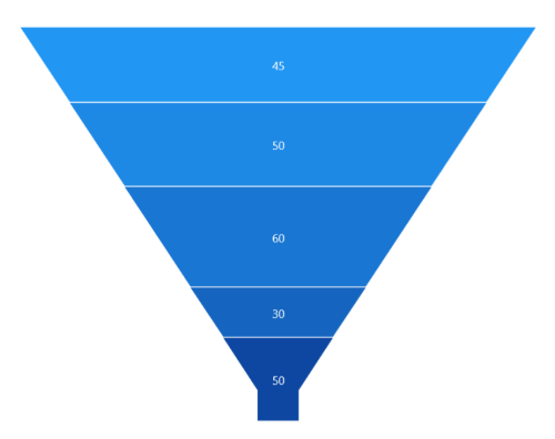
Context
To customize the content of data labels, define the DataLabelSettings of the chart and set the Context property of FunnelDataLabelSettings to change the data label content value.
<chart:SfFunnelChart
    x:Name="chart"
    ShowDataLabels="True"
    ItemsSource="{Binding Data}"
    XBindingPath="Category"
    YBindingPath="Value">

    <!-- Configure additional chart elements -->
    <chart:SfFunnelChart.DataLabelSettings>
        <chart:FunnelDataLabelSettings Context="Percentage"/>
    </chart:SfFunnelChart.DataLabelSettings>

    <!-- Configure additional chart elements -->
</chart:SfFunnelChart>
SfFunnelChart chart = new SfFunnelChart();
chart.ShowDataLabels = true;
// Configure additional chart elements
chart.DataLabelSettings = new FunnelDataLabelSettings()
{
Context = LabelContext.Percentage
};
this.Content = chart;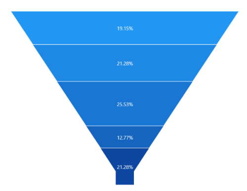
Customization
The following properties are used to customize the data label:
- BorderBrush - Used to change the border color.
- BorderThickness - Used to change the thickness of the border.
- Margin - Used to change the margin of the label.
- FontStyle - Used to change the font style of the label.
- FontSize - Used to change the font size of the label.
- Foreground - Used to change the text color of the label.
- FontFamily - Used to change the font family of the label.
- Background - Used to change the label background color.
<chart:SfFunnelChart
    x:Name="chart"
    ShowDataLabels="True"
    ItemsSource="{Binding Data}"
    XBindingPath="Category"
    YBindingPath="Value">

    <!-- Configure additional chart elements -->
    <chart:SfFunnelChart.DataLabelSettings>
        <chart:FunnelDataLabelSettings
            Foreground="White"
            FontSize="16"
            FontFamily="Calibri"
            BorderBrush="White"
            BorderThickness="1"
            Margin="1"
            FontStyle="Italic"
            Background="#1E88E5"/>
    </chart:SfFunnelChart.DataLabelSettings>

    <!-- Configure additional chart elements -->
</chart:SfFunnelChart>
SfFunnelChart chart = new SfFunnelChart();
chart.ShowDataLabels = true;
// Configure additional chart elements
chart.DataLabelSettings = new FunnelDataLabelSettings()
{
Foreground = new SolidColorBrush(Colors.White),
BorderBrush = new SolidColorBrush(Colors.White),
Background = new SolidColorBrush(Color.FromArgb(255, 30, 136, 229)),
BorderThickness = new Thickness(1),
Margin = new Thickness(1),
FontStyle = FontStyle.Italic,
FontFamily = new FontFamily("Calibri"),
FontSize = 16
};
this.Content = chart;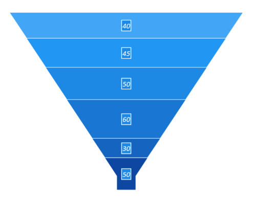
Template
The appearance of the data label can be customized by using the ContentTemplate property of FunnelDataLabelSettings as follows.
<Grid x:Name="grid">
    <Grid.Resources>
        <DataTemplate x:Key="dataLabelTemplate">
            <StackPanel Orientation="Vertical">
                <Path
                    Grid.Row="0"
                    Stretch="Uniform"
                    Fill="LightGreen"
                    Width="15"
                    Height="15"
                    Margin="0,0,0,0"
                    RenderTransformOrigin="0.5,0.5"
                    Data="M11.771002,1.993L5.0080013,14.284 10.752002,14.284 6.6450019,22.804 17.900003,
                          11.921 11.655003,11.921 18.472004,1.993z M10.593002,0L22.256004,0 15.440003,
                          9.9280005 22.827004,9.9280005 0,32 7.5790019,16.277 1.637001,16.277z">
                    <Path.RenderTransform>
                        <TransformGroup>
                            <TransformGroup.Children>
                                <RotateTransform Angle="0"/>
                                <ScaleTransform ScaleX="1" ScaleY="1"/>
                            </TransformGroup.Children>
                        </TransformGroup>
                    </Path.RenderTransform>
                </Path>

                <TextBlock
                    Grid.Row="1"
                    Text="{Binding}"
                    FontSize="12"
                    Foreground="White">
                </TextBlock>
            </StackPanel>
        </DataTemplate>
    </Grid.Resources>

    <chart:SfFunnelChart
        x:Name="chart"
        ShowDataLabels="True"
        ItemsSource="{Binding Data}"
        XBindingPath="Category"
        YBindingPath="Value">

        <chart:SfFunnelChart.DataLabelSettings>
            <chart:FunnelDataLabelSettings
        		Context="YValue"
        		ContentTemplate="{StaticResource dataLabelTemplate}"/>
        </chart:SfFunnelChart.DataLabelSettings>
    </chart:SfFunnelChart>
</Grid>
SfFunnelChart chart = new SfFunnelChart();
chart.ShowDataLabels = true;
// The 'dataLabelTemplate' resource is defined in XAML Resources and referenced here.
chart.DataLabelSettings = new FunnelDataLabelSettings()
{
Context = LabelContext.YValue,
ContentTemplate = this.grid.Resources["dataLabelTemplate"] as DataTemplate
};
this.Content = chart;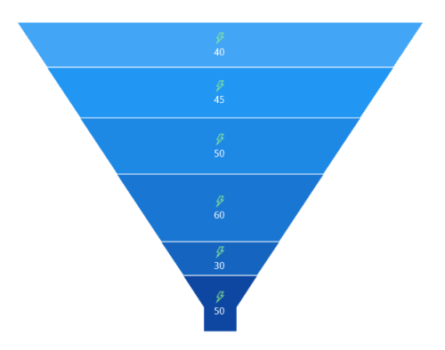
The binding context for the DataLabelSettings
ContentTemplateis Context property, which is used to customize the content of data labels. This property defines the value displayed in the data label, such as the X value or any other value from the underlying model object. By default, the value ofContextis YValue.
Format
The Format property can be used to format the data labels. The following code example demonstrates how to format data labels with three decimal digits.
<chart:SfFunnelChart
    x:Name="chart"
    ShowDataLabels="True"
    ItemsSource="{Binding Data}"
    XBindingPath="Category"
    YBindingPath="Value">
    <chart:SfFunnelChart.DataLabelSettings>
        <chart:FunnelDataLabelSettings Format="#.000" Foreground="White"/>
    </chart:SfFunnelChart.DataLabelSettings>
</chart:SfFunnelChart>
SfFunnelChart chart = new SfFunnelChart();
chart.ShowDataLabels = true;
// Configure additional chart elements
chart.DataLabelSettings = new FunnelDataLabelSettings()
{
Format = "#.000",
Foreground = new SolidColorBrush(Colors.White)
};
this.Content = chart;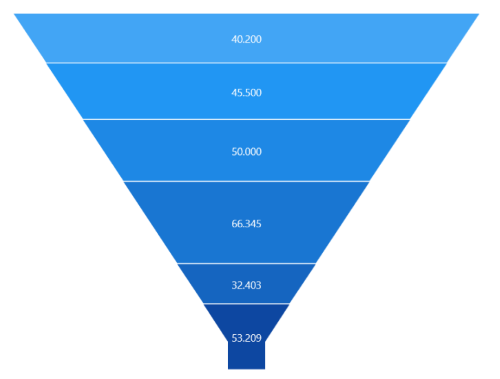
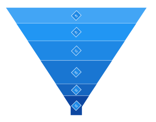
Rotation
The Rotation property is used to rotate the data labels based on the angle value.
<chart:SfFunnelChart
    x:Name="chart"
    ShowDataLabels="True"
    ItemsSource="{Binding Data}"
    XBindingPath="Category"
    YBindingPath="Value">
    <chart:SfFunnelChart.DataLabelSettings>
        <chart:FunnelDataLabelSettings
            Rotation="45"
            BorderBrush="White"
            BorderThickness="1"
            Background="#1E88E5"/>
    </chart:SfFunnelChart.DataLabelSettings>
</chart:SfFunnelChart>
SfFunnelChart chart = new SfFunnelChart();
chart.ShowDataLabels = true;
// Configure additional chart elements
chart.DataLabelSettings = new FunnelDataLabelSettings()
{
Rotation = 45,
BorderBrush = new SolidColorBrush(Colors.White),
Background = new SolidColorBrush(Color.FromArgb(255, 30, 136, 229)),
BorderThickness = new Thickness(1)
};
this.Content = chart;