Getting Started with WinUI DropDown Color Palette
14 Jul 20266 minutes to read
This section explains the steps required to add the WinUI DropDown Color Palette control and its color options such as theme, standard and more custom colors.
Control Structure
The following illustration shows the structure of the DropDown Color Palette control.
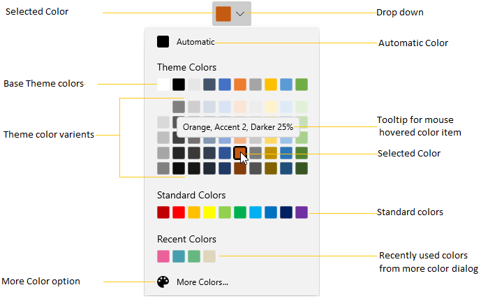
- The Selected Color represents the color that you select.
- The Automatic Color represents the default (automatic) color.
- The ToolTip with Color Details represents the
ToolTipshown when the mouse hovers over a color. - The Standard Colors stores the standard colors like
Red,Green,Blueand so on. - The Recently Used Colors stores the colors that were recently selected.
- The More Colors Option provides a wide range of colors in addition to the colors in the palette. Use the ShowMoreColorsButton property to show or hide this button.
- The Theme Variant Colors represents the theme colors with variants.
More Color Dialog
The following illustration shows the structure of the More Color dialog.
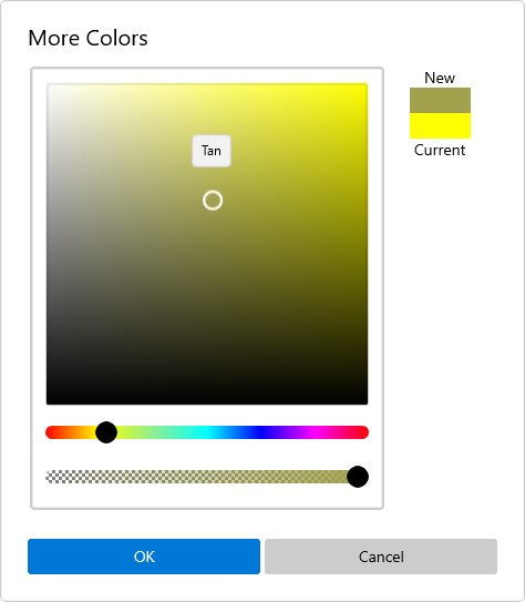
For more information, see the More Colors Dialog documentation.
Creating an application with WinUI DropDown Color Palette
In this walkthrough, you will create a WinUI application that contains the DropDown Color Palette control.
Adding control manually in XAML
To add the DropDown Color Palette control manually in XAML, follow the below steps.
- Create a WinUI 3 desktop app for C# and .NET 5.
- Download and refer to the following NuGet in the project.
- Import the control namespace
Syncfusion.UI.Xaml.Editorsin XAML or C# code. -
Initialize the
SfDropDownColorPalettecontrol.<Page x:Class="GettingStarted.MainPage" xmlns="http://schemas.microsoft.com/winfx/2006/xaml/presentation" xmlns:x="http://schemas.microsoft.com/winfx/2006/xaml" xmlns:local="using:GettingStarted" xmlns:d="http://schemas.microsoft.com/expression/blend/2008" xmlns:mc="http://schemas.openxmlformats.org/markup-compatibility/2006" xmlns:editors="using:Syncfusion.UI.Xaml.Editors" mc:Ignorable="d" Background="{ThemeResource ApplicationPageBackgroundThemeBrush}"> <Grid x:Name="grid"> <editors:SfDropDownColorPalette x:Name="sfDropDownColorPalette" /> </Grid> </Page>
Adding control manually in C#
To add the DropDown Color Palette control manually in C#, follow the below steps.
- Create a WinUI 3 desktop app for C# and .NET 5.
- Download and refer the following NuGet in the project.
- Import the
DropDown Color PalettenamespaceSyncfusion.UI.Xaml.Editorsin C# page. -
Initialize the
SfDropDownColorPalettecontrol.using Syncfusion.UI.Xaml.Editors; namespace GettingStarted { /// <summary> /// An empty page that can be used on its own or navigated to within a Frame. /// </summary> public sealed partial class MainPage : Page { public MainPage() { this.InitializeComponent(); SfDropDownColorPalette sfDropDownColorPalette = new SfDropDownColorPalette(); grid.Children.Add(sfDropDownColorPalette); } } }
NOTE
Download demo application from GitHub
Accessing a Color programmatically
You can set or change the selected color of the DropDown Color Palette programmatically by setting the value to SelectedBrush property. You can also get the selected color by using the SelectedBrush property. The default value of SelectedBrush property is Black.
NOTE
The
SelectedBrushproperty accepts aBrushvalue. In XAML, assigning a color name such asYellowis automatically converted to aSolidColorBrush.
<editors:SfDropDownColorPalette SelectedBrush="Yellow"
Name="sfDropDownColorPalette" />sfDropDownColorPalette.SelectedBrush = new SolidColorBrush(Colors.Yellow);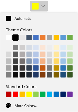
Here, Yellow is the selected color in the DropDown Color Palette.
NOTE
Download demo application from GitHub
Select Color from Dropdown Color Palette
You can select different colors from the Theme Colors and Standard Colors panels by clicking the desired color swatch.
<editors:SfDropDownColorPalette Name="sfDropDownColorPalette"/>SfDropDownColorPalette sfDropDownColorPalette = new SfDropDownColorPalette();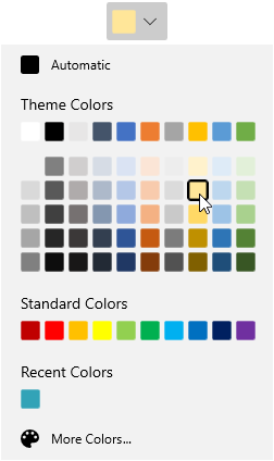
NOTE
Download demo application from GitHub
Select Automatic Color
By default automatic color brush is selected color brush. If you changed the selected color brush, then you can easily make the automatic color brush as selected color brush by clicking the automatic color panel. The automatic color brush value is Black.
<editors:SfDropDownColorPalette Name="sfDropDownColorPalette"/>SfDropDownColorPalette sfDropDownColorPalette = new SfDropDownColorPalette();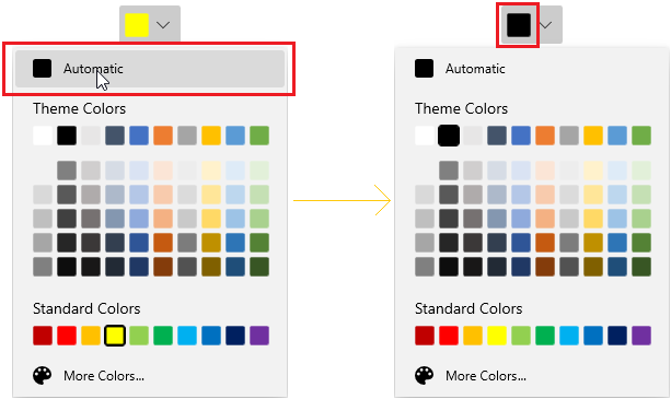
NOTE
Download demo application from GitHub
Selected brush changed notification
You will be notified when selected color brush changed in DropDown Color Palette by using SelectedBrushChanged event. The SelectedBrushChanged event contains the old and newly selected color values in the OldBrush, NewBrush properties.
<editors:SfDropDownColorPalette SelectedBrushChanged="sfDropDownColorPalette_SelectedBrushChanged"
Name="sfDropDownColorPalette" />sfDropDownColorPalette.SelectedBrushChanged += sfDropDownColorPalette_SelectedBrushChanged;You can handle the events as follows,
//Invoked when the selected color is changed
private void sfDropDownColorPalette_SelectedBrushChanged(object sender, SelectedBrushChangedEventArgs e) {
    var oldBrush = e.OldBrush;
    var newBrush = e.NewBrush;
}