Getting started with WinUI DropDownColorPicker
This section explains the steps required to add the DropDownColorPicker control and its color options such as RGB, HSV , HSL, CMYK and Hexadecimal color editor. This section covers only basic features needed to get started with Syncfusion DropDownColorPicker control.
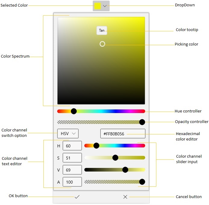
Control Structure
Creating an application with WinUI DropDownColorPicker
-
Create a simple project using the instructions given in the Getting Started with your first WinUI app documentation.
-
Add reference to Syncfusion.Editors.WinUI NuGet.
-
Import the control namespace
Syncfusion.UI.Xaml.Editorsin XAML or C# code. -
Initialize the
SfDropDownColorPickercontrol.
<Page
    x:Class="GettingStarted.MainPage"
    xmlns="http://schemas.microsoft.com/winfx/2006/xaml/presentation"
    xmlns:x="http://schemas.microsoft.com/winfx/2006/xaml"
    xmlns:local="using:GettingStarted"
    xmlns:d="http://schemas.microsoft.com/expression/blend/2008"
    xmlns:mc="http://schemas.openxmlformats.org/markup-compatibility/2006"
    xmlns:syncfusion="using:Syncfusion.UI.Xaml.Editors"
    mc:Ignorable="d"
    Background="{ThemeResource ApplicationPageBackgroundThemeBrush}">
    <Grid x:Name="grid">
    <syncfusion:SfDropDownColorPicker x:Name="sfDropDownColorPicker" />
    </Grid>
</Page>
using Syncfusion.UI.Xaml.Editors;
namespace GettingStarted
{
/// <summary>
/// An empty page that can be used on its own or navigated to within a Frame.
/// </summary>
public sealed partial class MainPage : Page
{
public MainPage()
{
this.InitializeComponent();
SfDropDownColorPicker sfDropDownColorPicker = new SfDropDownColorPicker();
grid.Children.Add(sfDropDownColorPicker);
}
}
}
Select solid color brush programmatically
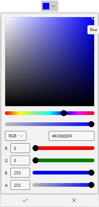
You can select the solid color brush programmatically by setting the solid color brush value to the SelectedBrush property. The default value of SelectedBrush property is Blue.
<syncfusion:SfDropDownColorPicker x:Name="sfDropDownColorPicker"
                                   SelectedBrush="Yellow"/>
SfDropDownColorPicker sfDropDownColorPicker = new SfDropDownColorPicker();
colorPicker.SelectedBrush = new SolidColorBrush(Colors.Yellow);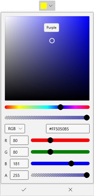
Select solid color brush from dropdown ColorPicker
You can select various solid color brush at runtime by selecting the color brush in color spectrum and clicking OK button.
<syncfusion:SfDropDownColorPicker Name="sfDropDownColorPicker"/>SfDropDownColorPicker sfDropDownColorPicker = new SfDropDownColorPicker();
Switch between solid color channels
You can switch between required RGB, HSV, HSL or CMYK color brush channels by choosing it from the Combobox options.
<syncfusion:SfDropDownColorPicker x:Name="sfDropDownColorPicker"/>SfDropDownColorPicker sfDropDownColorPicker = new SfDropDownColorPicker();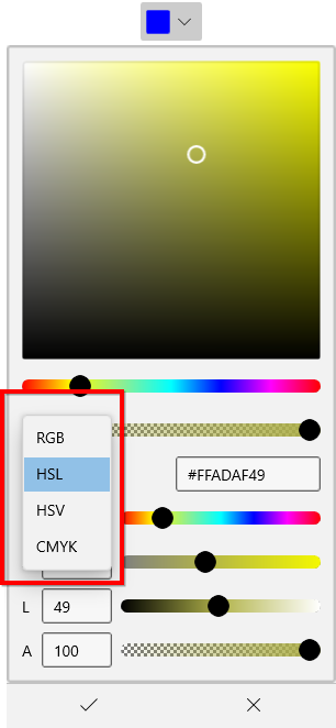
Change opacity of solid color brush
You can change opacity of the selected solid color brush by using the A-Alpha value editor or delicate slider in the DropDownColorPicker.
<syncfusion:SfDropDownColorPicker Name="SfDropDownColorPicker">SfDropDownColorPicker sfDropDownColorPicker new SfDropDownColorPicker();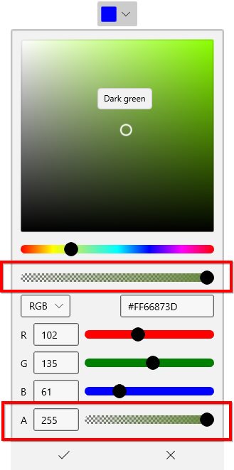
Hexadecimal solid color brush value editor
You can select a solid color brush by entering the hexadecimal color value to the hexadecimal value editor. You can also get the selected color hexadecimal value by using the hexadecimal value editor.
<syncfusion:SfDropDownColorPicker Name="sfDropDownColorPicker">SfDropDownColorPicker sfDropDownColorPicker new SfDropDownColorPicker();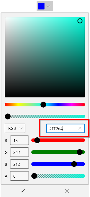
Color Picker as a command button
By default, DropDownColorPicker acts like a dropdown. It opening a color picker when clicking anywhere on the header. By setting the DropDownMode property value as Split, it acts like a button and dropdown as explained below.
-
When clicking on the dropdown arrow button, It acts like a dropdown.
-
When you click on the header area, it acts like a button and Command will be triggered. Using the
Command, you can do some action like applying the selected color anywhere you want.
For example, if you want to apply a last selected color as a background to a TextEditor’s selected text. You can direct click the button instead of opening the dropdown and selecting an already selected color again.
public sealed partial class MainPage : Page
{
    private ICommand selectionChangedCommand;
    public ICommand SelectionChangedCommand {
        get {
            return selectionChangedCommand;
        }
    }
    public void SelectionChangedMethod(object param) {
        richTextBox.Document.Selection.CharacterFormat.BackgroundColor
            = (sfDropDownColorPicker.SelectedBrush as SolidColorBrush).Color;

    }
    public MainPage() {
        this.InitializeComponent();
        selectionChangedCommand = new DelegateCommand<object>(SelectionChangedMethod);
    }
}<StackPanel Orientation="Vertical">
<RichEditBox Name="richTextBox" Margin="20"/>
<syncfusion:SfDropDownColorPicker DropDownMode="Split"
Command="{x:Bind SelectionChangedCommand}"
Name="sfDropDownColorPicker" />
</StackPanel>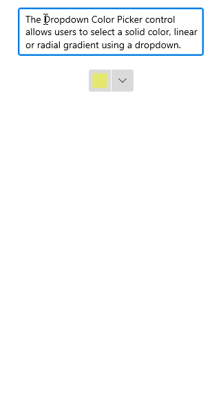
Customize the ColorPicker
You can customize the color picker by replacing the default ColorPicker with your own instance using DropDownContentTemplate property. You can load color picker with solid, linear gradient or gradient brush editors.
NOTE
The
DataContextofDropDownContentTemplateproperty is SfDropDownColorPicker.DropDownContent.
NOTE
You can refer the ColorPicker documentation page to know more about all customization available in the
ColorPickercontrol.
<syncfusion:SfDropDownColorPicker Name="sfDropDownColorPicker">
    <syncfusion:SfDropDownColorPicker.DropDownContentTemplate>
        <DataTemplate>
            <syncfusion:SfColorPicker BrushTypeOptions="LinearGradientBrush"
                                      Width="250" />
        </DataTemplate>
    </syncfusion:SfDropDownColorPicker.DropDownContentTemplate>
</syncfusion:SfDropDownColorPicker>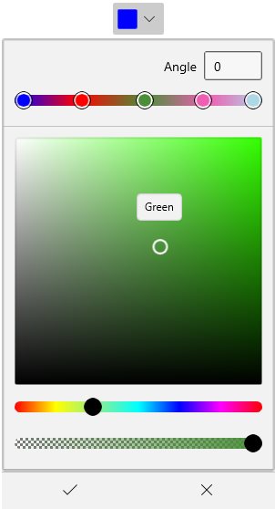
Custom UI of Dropdown Header
You can customize the appearance of the DropDownColorPicker header in both split mode and dropdown mode. You can customize the selected color button using ContentTemplate property and customize the dropdown button by using the DropDownButtonTemplate property.
NOTE
The
DataContextofDropDownButtonTemplateproperty andContentTemplateproperty isSfDropDownColorPicker.
NOTE
The
DropDownButtonTemplateis effective only on when drop down mode is split mode.
<syncfusion:SfDropDownColorPicker DropDownMode="Split"
                                   Name="sfDropDownColorPicker">

    <!--Custom UI for DropDown button-->
    <syncfusion:SfDropDownColorPicker.DropDownButtonTemplate>
        <DataTemplate>
            <Grid>
                <StackPanel Width="30">
                    <Grid VerticalAlignment="Center"
                          HorizontalAlignment="Center">
                        <Path Fill="Black"
                              Data="M 0 0 L 5 5 L 10 0 Z"/>
                    </Grid>
                </StackPanel>
            </Grid>
        </DataTemplate>
    </syncfusion:SfDropDownColorPicker.DropDownButtonTemplate>

    <!--Custom UI for Selected color button-->
    <syncfusion:SfDropDownColorPicker.ContentTemplate>
        <DataTemplate>
            <StackPanel Height="30"
                        Orientation="Vertical">
                <Path Data="M22.078048,10.524087C22.078048,10.524087,31.99999,12.1271,31.99999,19.644161L31.99999,27.061223C31.99999,33.475275 25.987026,29.266241 25.987026,25.55721 25.987026,20.64617 30.397001,18.842155 28.392012,16.838139z M12.757101,0C17.367075,0,20.073059,6.5150537,20.174059,11.325093L20.174059,11.626096 20.374058,11.826097C22.178047,13.631112 24.483034,15.936131 25.28503,16.737138 26.588022,18.040148 25.686028,19.544161 25.18503,20.045165 24.583034,20.64617 14.160093,31.070255 14.160093,31.070255 12.9571,32.272265 8.9481231,30.067247 5.1401448,26.259216 1.3311667,22.450185 -0.8738203,18.341151 0.32917213,17.239142L11.354109,6.2140512C11.354109,6.2140512 12.055105,5.5120449 13.0581,5.5120449 13.559097,5.5120449 14.160093,5.713047 14.76109,6.3140526L15.964083,7.6170626C16.666079,9.8220806 16.165082,11.626096 15.864083,12.528103 15.263087,12.929107 14.862089,13.631112 14.862089,14.332118 14.862089,15.535128 15.864083,16.537136 17.067077,16.537136 18.26907,16.537136 19.272064,15.535128 19.272064,14.332118 19.272064,13.530111 18.871066,12.929107 18.26907,12.528103 18.37007,12.027099 18.37007,11.025091 18.16907,9.7220802 18.16907,9.7220802 18.37007,9.9220819 18.770067,10.323085L18.770067,10.123083C18.26907,6.0130501 15.964083,1.3030109 12.657102,1.3030109 8.6481248,1.3030109 7.7461299,5.4120445 7.74613,6.9150572L6.5431371,6.9150572C6.5431368,4.2090359,8.2471271,0,12.757101,0z"
                      Stretch="Uniform"
                      Fill="Black"
                      Width="20" Height="18"
                      RenderTransformOrigin="0.5,0.5"/>
                <Border Margin="5"
                        Background="{Binding}"
                        Grid.Row="1"
                        Width="25"
                        Height="8">
                </Border>
            </StackPanel>
        </DataTemplate>
    </syncfusion:SfDropDownColorPicker.ContentTemplate>
</syncfusion:SfDropDownColorPicker>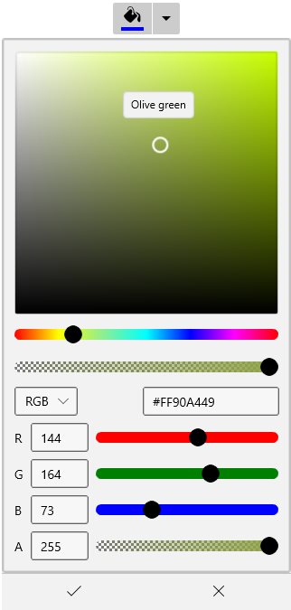
Change Dropdown alignment
You can change alignment of the drop down picker as full, center, left, right, top or bottom with edge of the dropdown header by using the DropDownPlacement property. The default value of DropDownPlacement property is Auto.
<syncfusion:SfDropDownColorPicker DropDownPlacement="BottomEdgeAlignedRight"
Name="sfDropDownColorPicker"/>sfDropDownColorPicker.DropDownPlacement = FlyoutPlacementMode.BottomEdgeAlignedRight;;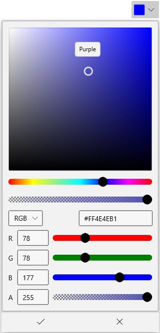
Selected brush changed notification
The selected brush changed in DropDownColorPicker can be examined by using SelectedBrushChanged events. You can get the old and newly selected brush by using the OldBrush and NewBrush properties.
<syncfusion:SfDropDownColorPicker SelectedBrushChanged="SfDropDownColorPicker_SelectedBrushChanged"
Name="sfDropDownColorPicker">sfDropDownColorPicker.SelectedBrushChanged += SfDropDownColorPicker_SelectedBrushChanged;You can handle the event as follows,
private void SfDropDownColorPicker_SelectedBrushChanged(object sender, SelectedBrushChangedEventArgs args) {
    var old_selectedBrush = args.OldBrush;
    var new_selectedBrush = args.NewBrush;
}
Dropdown Color Picker Open and Close notification
You can notified when drop-down opened and closed by using the DropDownOpened and DropDownClosed events.
<syncfusion:SfDropDownColorPicker DropDownOpened="SfDropDownColorPicker_DropDownOpened"
                                   DropDownClosed= "SfDropDownColorPicker_DropDownClosed"
Name="sfDropDownColorPicker" />sfDropDownColorPicker.DropDownOpened += SfDropDownColorPicker_DropDownOpened;
sfDropDownColorPicker.DropDownClosed += SfDropDownColorPicker_DropDownClosed;//Invoked when the drop down is opened
private void SfDropDownColorPicker_DropDownOpened(object sender, EventArgs e) {
}
//Invoked when the drop down is closed
private void SfDropDownColorPicker_DropDownClosed(object sender, EventArgs e) {
}