Customization of ColorPicker in WinUI Color Picker
14 Apr 2021 / 2 minutes to read
This section explains how to customize the color spectrum and switch to different modes in ColorPicker.
Switch between solid, linear and gradient brush mode interactively
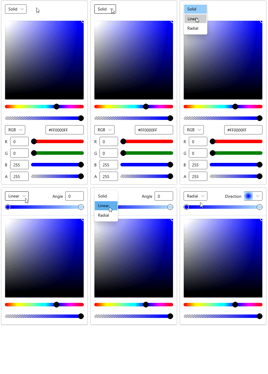
You can change the color selection mode directly at runtime by clicking on the corresponding Solid, Linear or Radial gradient brush mode drop down options which is placed in the top of the ColorPicker control.
NOTE
Download demo application from GitHub
Enable specific brush mode
You can enable the user to choose either Solid, Linear or Radial gradient brush or any combination of brush mode by using the BrushTypeOptions property.
<editors:SfColorPicker BrushTypeOptions="SolidColorBrush,RadialGradientBrush"
Name="colorPicker">colorPicker.BrushTypeOptions = BrushTypeOptions.SolidColorBrush | BrushTypeOptions.RadialGradientBrush;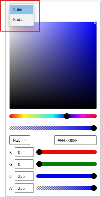
NOTE
Download demo application from GitHub
Change shape of Color Spectrum
By default, color spectrum is in box shapes. If you want to change the color spectrum shapes as circle, use the ColorSpectrumShape property value as Ring . The default value of ColorSpectrumShape property is Box.
<editors:SfColorPicker ColorSpectrumShape="Ring"
                       BrushTypeOptions="LinearGradientBrush"
Name="colorPicker">colorPicker.ColorSpectrumShape = ColorSpectrumShape.Ring;
colorPicker.BrushTypeOptions = BrushTypeOptions.LinearGradientBrush;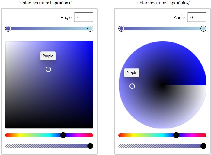
NOTE
Download demo application from GitHub
Change Color spectrum’s color components
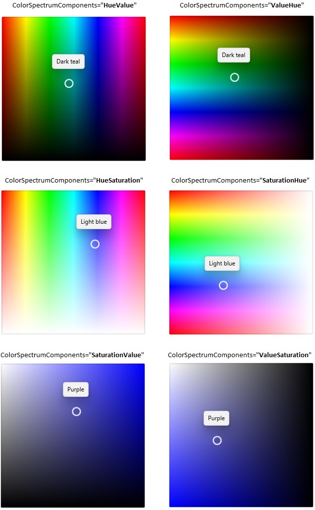
You can changes the color spectrum components as any combination of hue, saturation or value by using the ColorSpectrumComponents property. The default value of ColorSpectrumComponents property is SaturationValue.
<editors:SfColorPicker ColorSpectrumComponents = "HueSaturation"
                       BrushTypeOptions="LinearGradientBrush"
Name="colorPicker">colorPicker.ColorSpectrumComponents = ColorSpectrumComponents.HueSaturation;
colorPicker.BrushTypeOptions = BrushTypeOptions.LinearGradientBrush;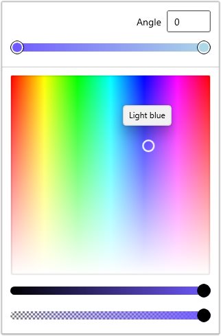
NOTE
Download demo application from GitHub