Pie and Doughnut in WinUI Chart
27 May 202215 minutes to read
Pie
PieSeries is divided into sectors, illustrating numerical proportion. The following code example illustrates the PieSeries.
<chart:PieSeries XBindingPath="Category" ItemsSource="{Binding Data}" YBindingPath="Value"/>PieSeries series = new PieSeries()
{
ItemsSource = new ViewModel().Data,
XBindingPath = "Category",
YBindingPath = "Value"
};
chart.Series.Add(series);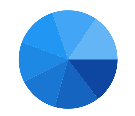
The rendering size of the PieSeries can be controlled using the CircularCoefficient property, as shown in the following code example.
<chart:PieSeries CircularCoefficient="0.9" XBindingPath="Category" ItemsSource="{Binding Data}" YBindingPath="Value"/>PieSeries series = new PieSeries()
{
ItemsSource = new ViewModel().Data,
XBindingPath = "Category",
YBindingPath = "Value",
CircularCoefficient = 0.9
};
chart.Series.Add(series);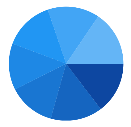
Group small data points into “others”
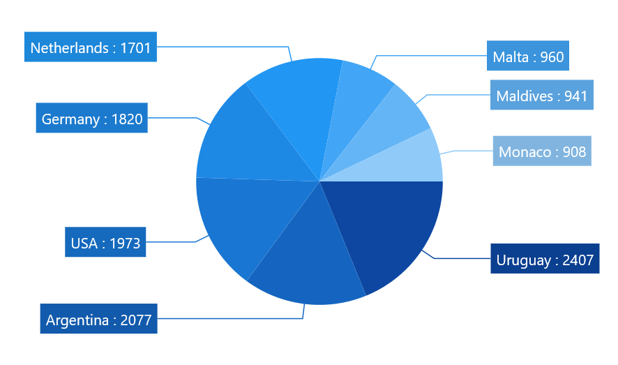
The small segments in the pie chart can be grouped into the “others” category using the GroupTo and GroupMode properties of PieSeries.
The GroupMode property is used to specify the grouping type based on slice Angle, actual data point Value, or Percentage, and the GroupTo property is used to set the limit to group data points into a single slice. The grouped segment is labeled as “Others” in the legend and toggled as other segment. The default value of the GroupTo and GroupMode properties is double.NAN and Value.
Pie series without grouping
Pie series with grouping (Mode - Value)
<chart:PieSeries ItemsSource="{Binding Data}" XBindingPath="Country" YBindingPath="Count" GroupMode="Value" GroupTo="1000">
    <chart:PieSeries.DataMarker>
        <chart:ChartDataMarker ShowConnectorLine="True"
                                  ConnectorHeight="80"
                                  ShowLabel="True"
                                  LabelTemplate="{StaticResource DataLabelTemplate}"
                                  SegmentLabelContent="LabelContentPath">
        </chart:ChartDataMarker>
    </chart:PieSeries.DataMarker>
</chart:PieSeries>pieSeries.GroupMode = PieGroupMode.Value;
pieSeries.GroupTo = 1000;
ChartDataMarker datamarker = new ChartDataMarker()
{
ShowConnectorLine = true,
ShowLabel = true,
ConnectorHeight = 80,
LabelTemplate = this.RootGrid.Resources["DataLabelTemplate"] as DataTemplate,
SegmentLabelContent = LabelContent.LabelContentPath,
pieSeries.DataMarker = datamarker;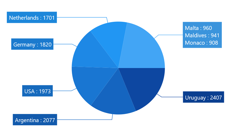
Pie series with grouping (Mode - Angle)
<chart:PieSeries ItemsSource="{Binding Data}" XBindingPath="Country" YBindingPath="Count" GroupMode="Angle" GroupTo="30">
    <chart:PieSeries.DataMarker>
        <chart:ChartDataMarker ShowConnectorLine="True"
                                  ConnectorHeight="80"
                                  ShowLabel="True"
                                  LabelTemplate="{StaticResource DataLabelTemplate}"
                                  SegmentLabelContent="LabelContentPath">
        </chart:ChartDataMarker>
    </chart:PieSeries.DataMarker>
</chart:PieSeries>pieSeries.GroupMode = PieGroupMode.Angle;
pieSeries.GroupTo = 30;
ChartDataMarker datamarker = new ChartDataMarker()
{
ShowConnectorLine = true,
ShowLabel = true,
ConnectorHeight = 80,
LabelTemplate = this.RootGrid.Resources["DataLabelTemplate"] as DataTemplate,
SegmentLabelContent = LabelContent.LabelContentPath,
};
pieSeries.DataMarker = datamarker;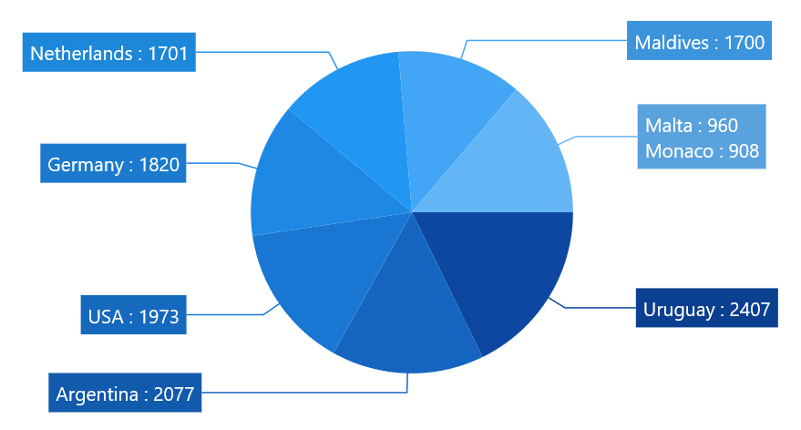
Pie series with grouping (Mode - Percentage)
<chart:PieSeries ItemsSource="{Binding Data}" XBindingPath="Country" YBindingPath="Count" GroupMode="Percentage" GroupTo="10">
    <chart:PieSeries.DataMarker>
        <chart:ChartDataMarker ShowConnectorLine="True"
                                  ConnectorHeight="80"
                                  ShowLabel="True"
                                  LabelTemplate="{StaticResource DataLabelTemplate}"
                                  SegmentLabelContent="LabelContentPath">
        </chart:ChartDataMarker>
    </chart:PieSeries.DataMarker>
</chart:PieSeries>pieSeries.GroupMode = PieGroupMode.Percentage;
pieSeries.GroupTo = 10;
ChartDataMarker datamarker = new ChartDataMarker()
{
ShowConnectorLine = true,
ShowLabel = true,
ConnectorHeight = 80,
LabelTemplate = this.RootGrid.Resources["DataLabelTemplate"] as DataTemplate,
SegmentLabelContent = LabelContent.LabelContentPath,
};
pieSeries.DataMarker = datamarker;
Doughnut
DoughnutSeries is similar to PieSeries. It is used to show the relationship between parts of data and whole data.
The DoughnutSeries can be added to the chart, as shown in the following code example.
<chart:DoughnutSeries XBindingPath="Category" ItemsSource="{Binding Data}" YBindingPath="Value"/>DoughnutSeries series = new DoughnutSeries()
{
ItemsSource = new ViewModel().Data,
XBindingPath = "Category",
YBindingPath = "Value"
};
chart.Series.Add(series);
The Doughnut also has a coefficient property, DoughnutCoefficient, which defines the inner circle. Also, it has DoughnutSize, which is used to define the size for this series like CircularCoefficient in PieSeries.
<chart:DoughnutSeries DoughnutCoefficient="0.7" XBindingPath="Category" ItemsSource="{Binding Data}" YBindingPath="Value"/>DoughnutSeries series = new DoughnutSeries()
{
ItemsSource = new ViewModel().Data,
XBindingPath = "Category",
YBindingPath = "Value",
DoughnutCoefficient = 0.7
};
chart.Series.Add(series);
Size
The size of doughnut series can be customized by using the DoughnutSize property. The following code illustrates how to use the property in series.
<syncfusion:SfChart>

<syncfusion:DoughnutSeries DoughnutSize="0.8"/>

<syncfusion:DoughnutSeries DoughnutSize="0.8"/>

</syncfusion:SfChart>
DoughnutSeries doughnut = new DoughnutSeries();
doughnut.DoughnutSize = 0.8;
chart.Series.Add(doughnut);
DoughnutSeries doughnut1 = new DoughnutSeries();
doughnut1.DoughnutSize = 0.8;
chart.Series.Add(doughnut1);
Hole Size
DoughnutHoleSize is an attachable property. It gets or sets the double value, which is used to customize the doughnut hole size. Its value ranges from 0 to 1, and it can be set as shown in the following code example.
<Chart:SfChart Chart:DoughnutSeries.DoughnutHoleSize="0.2">

</chart:SfChart>
SfChart chart = new SfChart();
DoughnutSeries.SetDoughnutHoleSize(chart, 0.2);
Semi Pie and Doughnut
By using the custom StartAngle and EndAngle properties, you can draw pie series in different shapes such as semicircular or quarter circular series.
<syncfusion:PieSeries StartAngle="180" EndAngle="360" XBindingPath="Utilization" YBindingPath="ResponseTime" ItemsSource="{Binding Data}"/>PieSeries series = new PieSeries()
{
ItemsSource = new ViewModel().Data,
XBindingPath = "Utilization",
YBindingPath = "ResponseTime",
StartAngle = 180,
EndAngle = 360
};
chart.Series.Add(series);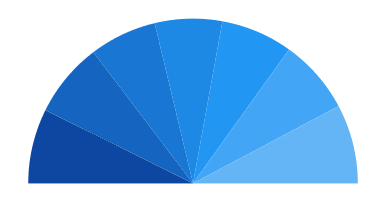
<syncfusion:DoughnutSeries StartAngle="180" EndAngle="360" XBindingPath="Utilization" YBindingPath="ResponseTime" ItemsSource="{Binding Data}"/>DoughnutSeries series = new DoughnutSeries()
{
ItemsSource = new ViewModel().Data,
XBindingPath = "Utilization",
YBindingPath = "ResponseTime",
StartAngle = 180,
EndAngle = 360
};
chart.Series.Add(series);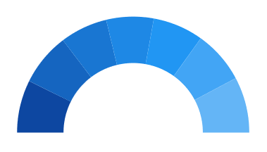
Stacked doughnut
Doughnut segments can be separated as individual circles using the IsStackedDoughnut property. The following properties are used to customize the stacked doughnut chart:
-
CapStyle- Specifies the shapes of the start and end points of a circular segment. The supported values areBothFlat,BothCurve,StartCurve, andEndCurve. The default value of this property is BothFlat. -
SegmentSpacing- Changes the spacing between two individual segments. The default value of spacing is 0, and the value ranges from 0 to 1. Here, 1 represents 100%, and 0 represents 0% of the available space. -
MaximumValue- Represents the entire span of an individual circle. The default value of this property is double.NaN. -
TrackColor- Changes the color of the track area. -
TrackBorderColor- Changes the color of the track border. -
TrackBorderWidth- Changes the width of the track border.
<chart:SfChart>
    …
    <chart:DoughnutSeries IsStackedDoughnut="True" CapStyle="BothCurve" SegmentSpacing="0.2" MaximumValue="100" XBindingPath="Category" YBindingPath="Expenditure" ItemsSource="{Binding ExpenditureData}">
    </chart:DoughnutSeries>

</chart:SfChart>
SfChart chart = new SfChart();
DoughnutSeries doughnutSeries = new DoughnutSeries()
{
IsStackedDoughnut = true,
CapStyle = DoughnutCapStyle.BothCurve,
SegmentSpacing = 0.2,
MaximumValue = 100,
XBindingPath = "Category",
YBindingPath = "Expenditure",
ItemsSource = new ViewModel().ExpenditureData
};
chart.Series.Add(doughnutSeries);
Explode Segments
The following properties are used to explode the individual segments in Pie and Doughnut.
-
ExplodeAll- Used to explode all the segments of these series. -
ExplodeIndex- Used to explode any specific segment. -
ExplodeRadius- Used to define the explode distance. -
ExplodeOnMouseClick- Used to explode the segment when the segment is clicked.
Explode Index
<syncfusion:PieSeries x:Name="PieSeries" ItemsSource="{Binding Data}"

ExplodeIndex="2" ExplodeRadius="10" XBindingPath="Utilization"

YBindingPath="ResponseTime" />
PieSeries series = new PieSeries()
{
ItemsSource = new ViewModel().Data,
XBindingPath = "Utilization",
YBindingPath = "ResponseTime",
ExplodeIndex = 2,
ExplodeRadius = 10
};
chart.Series.Add(series);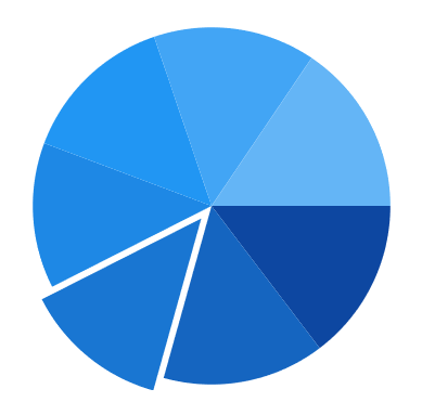
NOTE
ExplodeRadius has been defined as 30, by default its value is zero. So you need to define explode, when you set ExplodeIndex or ExplodeAll.
Explode All
<chart:PieSeries  ExplodeAll="True" ExplodeRadius="15"

XBindingPath="Category" ItemsSource="{Binding Data}"

YBindingPath="Value">
PieSeries series = new PieSeries()
{
ItemsSource = new ViewModel().Data,
XBindingPath = "Category",
YBindingPath = "Value",
ExplodeAll = true,
ExplodeRadius = 15
};
chart.Series.Add(series);