Data Label in WinUI Chart
24 May 202210 minutes to read
Data points can be easily annotated with labels to improve the readability of data.
Define Data Label
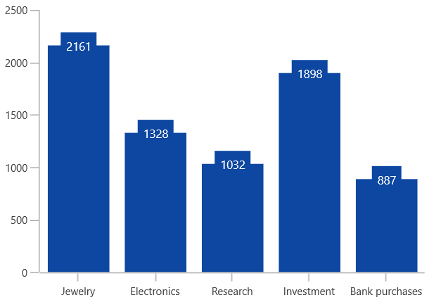
To enable the label in data markers, set the ShowDataLabels property of series.
To customize the content of data labels, define DataLabelSettings of series and set the Context property of CartesianDataLabelSettings to define the value to be displayed as label content.
<chart:SfChart>
. . .
<chart:ColumnSeries ShowDataLabels="True">
    <chart:ColumnSeries.DataLabelSettings>
        <chart:CartesianDataLabelSettings Context="YValue"/>
    </chart:ColumnSeries.DataLabelSettings>
</chart:ColumnSeries>

</chart:SfChart>
SfChart chart = new SfChart();
ColumnSeries series = new ColumnSeries();
. . .
series.DataLabelSettings = new CartesianDataLabelSettings()
{
Context = LabelContext.YValue
};
chart.Series.Add(series);Customization
The following properties are used to customize the data label:
- BorderBrush - used to change the border color.
- BorderThickness - used to change the thickness of the border.
- Margin - used to change the margin size for label.
- FontStyle - used to change font style of the label.
- FontSize - used to change font size of the label.
- Foreground - used to change the color of the label.
- FontFamily - used to change the font family of the label.
- Background - used to change the label background color.
The following code example demonstrates the customization of label using the above properties:
<chart:SfChart>
. . .
<chart:ColumnSeries ShowDataLabels="True">
<chart:ColumnSeries.DataLabelSettings>
    <chart:CartesianDataLabelSettings Position="Outer" Foreground="White"
                                      FontSize="11" FontFamily="Calibri"
                                      BorderBrush="Black" BorderThickness="1"
                                      Margin="1" FontStyle="Italic" Background="#1E88E5" />
</chart:ColumnSeries.DataLabelSettings>

</chart:ColumnSeries>
</chart:SfChart>
SfChart chart = new SfChart();
ColumnSeries series = new ColumnSeries();
. . .
series.DataLabelSettings = new CartesianDataLabelSettings()
{
Position = DataLabelPosition.Outer,
Foreground = new SolidColorBrush(Colors.White),
BorderBrush = new SolidColorBrush(Colors.Black),
Background = new SolidColorBrush(Colors.LightBlue),
BorderThickness = new Thickness(1),
Margin = new Thickness(1),
FontStyle = FontStyle.Italic,
FontFamily = new FontFamily("Calibri"),
FontSize = 11
};
chart.Series.Add(series);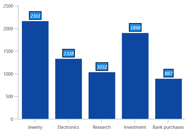
Content Template
The appearance of the label can be customized using the ContentTemplate property of CartesianDataLabelSettings, as shown in the following code example.
<chart:SfChart>
. . .
<chart:SfChart.Resources>
    <DataTemplate x:Key="dataLabelTemplate">
        <StackPanel Orientation="Vertical">
            <Path Grid.Row="0"  Stretch="Uniform" Fill="#1E88E5"
               Width="15" Height="15" Margin="0,0,0,0"
               RenderTransformOrigin="0.5,0.5"
               Data="M22.5,15.8899993896484L37.5,
               30.8899993896484 7.5,30.8899993896484 22.5,15.8899993896484z">
                <Path.RenderTransform>
                    <TransformGroup>
                        <TransformGroup.Children>
                            <RotateTransform Angle="0" />
                            <ScaleTransform ScaleX="1" ScaleY="1" />
                        </TransformGroup.Children>
                    </TransformGroup>
                </Path.RenderTransform>
            </Path>
            <TextBlock Grid.Row="1" Text="{Binding}" FontSize="11" Foreground="Black"></TextBlock>
        </StackPanel>
    </DataTemplate>
</chart:SfChart.Resources>
. . .
<chart:ColumnSeries ShowDataLabels="True">
    <chart:ColumnSeries.DataLabelSettings>
        <chart:CartesianDataLabelSettings Position="Outer" ContentTemplate="{StaticResource dataLabelTemplate}"/>
    </chart:ColumnSeries.DataLabelSettings>
. . .
</chart:ColumnSeries>

</chart:SfChart>
SfChart chart = new SfChart();
ColumnSeries series = new ColumnSeries();
. . .
series.DataLabelSettings = new CartesianDataLabelSettings()
{
Position = DataLabelPosition.Outer,
ContentTemplate = chart.Resources["dataLabelTemplate"] as DataTemplate
};
chart.Series.Add(series);
Format
Format property allows you to provide formatting for the labels.
The following code example demonstrates the y value with three decimal digits.
<chart:SfChart>
. . .
<chart:ColumnSeries ShowDataLabels="True">
    <chart:ColumnSeries.DataLabelSettings>
        <chart:CartesianDataLabelSettings Format="#.000" />
    </chart:ColumnSeries.DataLabelSettings>

</chart:ColumnSeries>
</chart:SfChart>
SfChart chart = new SfChart();
ColumnSeries series = new ColumnSeries();
. . .
series.DataLabelSettings = new CartesianDataLabelSettings()
{
Format = "#.000"
};
chart.Series.Add(series);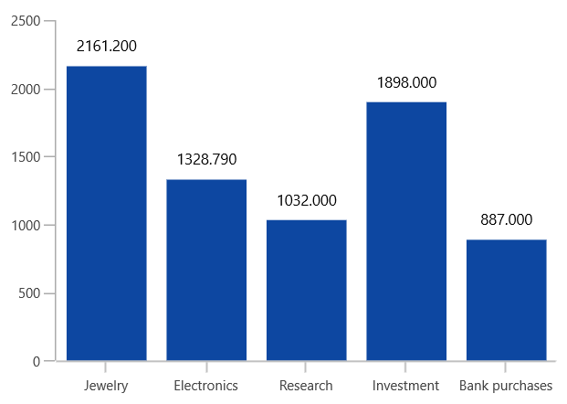
Rotation
Rotation property is used to define the angle at which the label must rotate. The following code demonstrates the label rotating angle.
<chart:SfChart>
. . .
<chart:ColumnSeries ShowDataLabels="True">
    <chart:ColumnSeries.DataLabelSettings>
        <chart:CartesianDataLabelSettings Rotation="45" Position="Outer" />
    </chart:ColumnSeries.DataLabelSettings>
</chart:ColumnSeries>
</chart:SfChart>
SfChart chart = new SfChart();
ColumnSeries series = new ColumnSeries();
. . .
series.DataLabelSettings = new CartesianDataLabelSettings()
{
Rotation = 45,
Position = DataLabelPosition.Outer,
};
chart.Series.Add(series);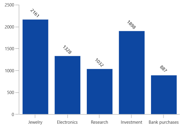
Connector Line
This feature is used to connect label and data point using a line. It can be enabled for any chart types but this is often used with Pie and Doughnut chart types. You can add connector line for the data markers using the ShowConnectorLine property.
The connector line can be customized using the following properties:
The following code example shows the customization options for connector line.
<chart:SfChart>
. . .

<chart:SfChart.Resources>
    <Style TargetType="Path" x:Key="lineStyle">
        <Setter Property="StrokeDashArray" Value="10,7,5"/>
        <Setter Property="Stroke" Value="Black"/>
    </Style>
</chart:SfChart.Resources>
. . .
<chart:PieSeries ShowDataLabels="True">
    <chart:PieSeries.DataLabelSettings>
        <chart:CircularDataLabelSettings Position="Outer"
                                         ShowConnectorLine="True"
                                         ConnectorLineStyle="{StaticResource lineStyle}" />
    </chart:PieSeries.DataLabelSettings>

</chart:PieSeries>

</chart:SfChart>
SfChart chart = new SfChart();
PieSeries series = new PieSeries();
. . .
series.DataLabelSettings = new CircularDataLabelSettings()
{
Position = DataLabelPosition.Outer,
ShowConnectorLine = true,
ConnectorLineStyle = chart.Resources["lineStyle"] as Style,
};
chart.Series.Add(series);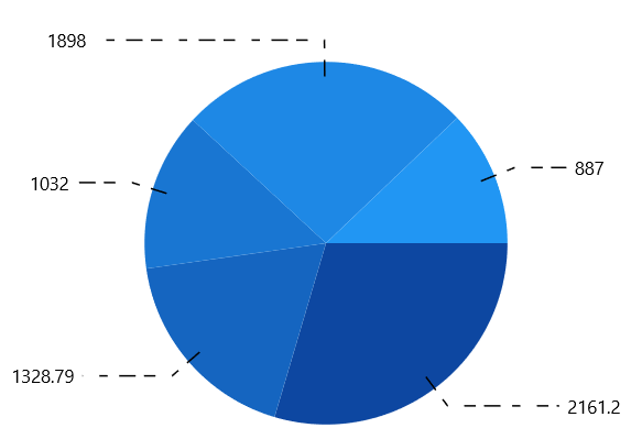
Applying Series Brush
UseSeriesPalette property is used to set the interior of the series to the data marker background.
<chart:SfChart>
. . .
<chart:ColumnSeries ShowDataLabels="True">
    <chart:ColumnSeries.DataLabelSettings>
        <chart:CartesianDataLabelSettings UseSeriesPalette="True"/>
    </chart:ColumnSeries.DataLabelSettings>
</chart:ColumnSeries>

</chart:SfChart>
SfChart chart = new SfChart();
ColumnSeries series = new ColumnSeries();
. . .
series.DataLabelSettings = new CartesianDataLabelSettings()
{
UseSeriesPalette = true,
};
chart.Series.Add(series);