Axis support in WinUI Chart
5 Apr 202224 minutes to read
ChartAxis is used to locate a data point inside the chart area. Charts typically have two axes that are used to measure and categorize data: a vertical (Y) axis, and a horizontal (X) axis.
Vertical(Y) axis always uses numerical scale. Horizontal(X) axis supports the following types of scale:
- Category
- Numeric
- Date time
The following are the API’s in ChartAxis:
-
ArrangeRect– Represents the bounds of chart axis size. -
VisibleRange– Represent the axis start and end values. -
VisibleLabels– Represents the axis label collection, which are visible in axis.
The following topics explain in detail about the axis and its parts:
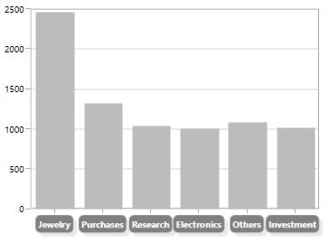
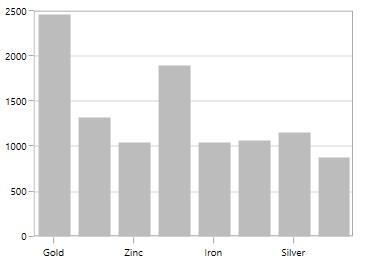
Header
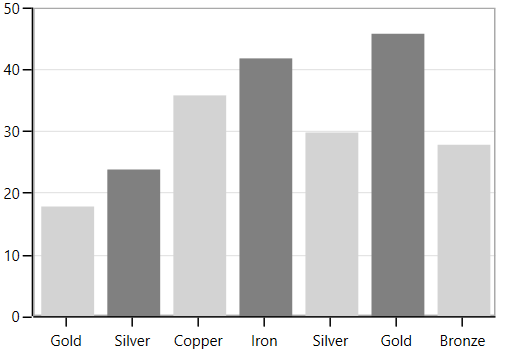
In ChartAxis, you can define any object as header using Header property. The following code example demonstrates how to define a header in primary and secondary axes.
<syncfusion:SfChart.PrimaryAxis>

<syncfusion:CategoryAxis Header="Metals"/>

</syncfusion:SfChart.PrimaryAxis>

<syncfusion:SfChart.SecondaryAxis>

<syncfusion:NumericalAxis Header="Values(In Tonnes)"/>

</syncfusion:NumericalAxis>

</syncfusion:SfChart.SecondaryAxis>chart.PrimaryAxis = new CategoryAxis() { Header = "Metals" };
chart.SecondaryAxis = new NumericalAxis() { Header = "Values(In Tonnes)" };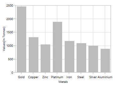
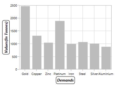
Header Customization
The default appearance of the header can be customized using the HeaderTemplate property. The following code sample demonstrates the header customization.
<syncfusion:SfChart x:Name="chart">

    <syncfusion:SfChart.Resources>

        <DataTemplate x:Key="headerTemplate1">

            <Border BorderBrush="Black" CornerRadius="5" BorderThickness="1">

                    <TextBlock Text="Demands" FontSize="12" FontStyle="Italic"

                               FontWeight="Bold" Margin="3"/>

            </Border>

        </DataTemplate>

        <DataTemplate x:Key="headerTemplate2">

            <Border BorderBrush="Black" CornerRadius="5" BorderThickness="1">

                    <TextBlock Text="Values(In Tonnes)" FontSize="12" FontStyle="Italic"

                               FontWeight="Bold" Margin="3"/>

            </Border>

        </DataTemplate>

    </syncfusion:SfChart.Resources>

    <syncfusion:SfChart.PrimaryAxis>

        <syncfusion:CategoryAxis HeaderTemplate="{StaticResource headerTemplate1}"/>

    </syncfusion:SfChart.PrimaryAxis>

    <syncfusion:SfChart.SecondaryAxis>

        <syncfusion:NumericalAxis HeaderTemplate="{StaticResource headerTemplate2}"/>

    </syncfusion:SfChart.SecondaryAxis>

</syncfusion:SfChart>chart.PrimaryAxis = new CategoryAxis()
{
HeaderTemplate = chart.Resources["headerTemplate1"] as DataTemplate
};
chart.SecondaryAxis = new NumericalAxis()
{
HeaderTemplate = chart.Resources["headerTemplate2"] as DataTemplate
};
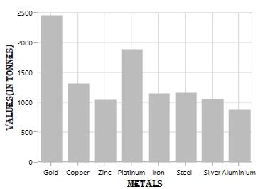
HeaderStyle
HeaderStyle property is used to provide style for the axis header. The following code example explains how to customize the header style.
<syncfusion:SfChart.PrimaryAxis>

<syncfusion:CategoryAxis Header="Metals">

<syncfusion:CategoryAxis.HeaderStyle>

<syncfusion:LabelStyle FontFamily="Algerian" FontSize="13" Foreground="Black">

</syncfusion:LabelStyle>

</syncfusion:CategoryAxis.HeaderStyle>

</syncfusion:CategoryAxis>

</syncfusion:SfChart.PrimaryAxis>

<syncfusion:SfChart.SecondaryAxis>

<syncfusion:NumericalAxis Header="Values(In Tonnes)"/>

<syncfusion:NumericalAxis.HeaderStyle>

<syncfusion:LabelStyle FontFamily="Algerian" FontSize="13" Foreground="Black">

</syncfusion:LabelStyle>

</syncfusion:NumericalAxis.HeaderStyle>

</syncfusion:NumericalAxis>

</syncfusion:SfChart.SecondaryAxis>
LabelStyle style = new LabelStyle()
{
FontFamily = new FontFamily("Algerian"),
FontSize = 13,
Foreground = new SolidColorBrush(Colors.Black)
};
chart.PrimaryAxis = new CategoryAxis()
{
Header = "Metals",
LabelStyle = style
};
chart.SecondaryAxis = new NumericalAxis()
{
Header = "Values(In Tonnes)",
LabelStyle = style
};
Axis Labels
Labels will be generated by the range and the values binded to XBindingPath or YBindingPath properties.
Positioning the Labels
The LabelPosition property is used to position the axis label either inside or outside the chart plotting area. By default, LabelPosition is Outside.
Inside
<syncfusion:SfChart.PrimaryAxis>

<syncfusion:NumericalAxis LabelPosition="Inside">

</syncfusion:NumericalAxis>

</syncfusion:SfChart.PrimaryAxis>chart.PrimaryAxis = new NumericalAxis()
{
LabelPosition = AxisElementPosition.Inside
};
LabelRotationAngle
LabelRotationAngle property allows you to define the angle for the label content. The following code example illustrates the LabelRotationAngle.
<syncfusion:SfChart.PrimaryAxis>

<syncfusion:DateTimeAxis LabelRotationAngle="90">

</syncfusion:DateTimeAxis>

</syncfusion:SfChart.PrimaryAxis>chart.PrimaryAxis = new DateTimeAxis()
{
LabelRotationAngle = 90
};
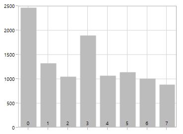
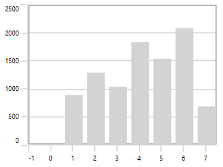
Custom Labels
SfChart allows the user to define the labels for the axis. For defining the axis label, you have to set the Content and Position properties. You can define the labels using CustomLabels property as shown in the following code sample.
<syncfusion:SfChart.PrimaryAxis>

<syncfusion:CategoryAxis >

<syncfusion:CategoryAxis.CustomLabels>

<syncfusion:ChartAxisLabel Position="0" Content="0-1"/>

<syncfusion:ChartAxisLabel Position="1" Content="1-2"/>

<syncfusion:ChartAxisLabel Position="2" Content="2-3"/>

<syncfusion:ChartAxisLabel Position="3" Content="3-4"/>

<syncfusion:ChartAxisLabel Position="4" Content="4-5"/>

<syncfusion:ChartAxisLabel Position="5" Content="5-5"/>

</syncfusion:CategoryAxis.CustomLabels>

</syncfusion:CategoryAxis>

</syncfusion:SfChart.PrimaryAxis>
CategoryAxis axis = new CategoryAxis();
axis.CustomLabels.Add(new ChartAxisLabel() { Position = 0, Content = "0-1" });
axis.CustomLabels.Add(new ChartAxisLabel() { Position = 1, Content = "1-2" });
axis.CustomLabels.Add(new ChartAxisLabel() { Position = 2, Content = "2-3" });
axis.CustomLabels.Add(new ChartAxisLabel() { Position = 3, Content = "3-4" });
axis.CustomLabels.Add(new ChartAxisLabel() { Position = 4, Content = "4-5" });
axis.CustomLabels.Add(new ChartAxisLabel() { Position = 5, Content = "5-5" });
chart.PrimaryAxis = axis;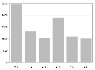
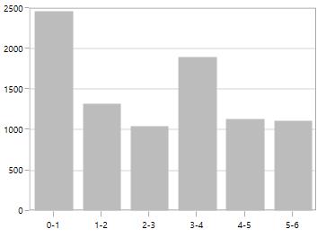
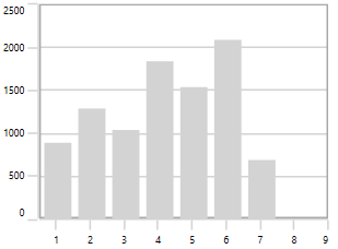
You can also directly bind the collection of labels to the LabelSource property for defining custom labels. The following code example demonstrates how to define the label collection in code behind and then bind the property in XAML page.
<syncfusion:SfChart.PrimaryAxis>

<syncfusion:CategoryAxis LabelSource="{Binding Labels}" ContentPath="Content" PositionPath="Position">

</syncfusion:CategoryAxis>

</syncfusion:SfChart.PrimaryAxis>chart.PrimaryAxis = new CategoryAxis()
{
ContentPath = "Content",
PositionPath = "Position",
LabelSource = Labels
};
public List<LabelItem> Labels { get; set; }
Labels = new List<LabelItem>
{
new LabelItem() {Position = 0, Content = "0-1"},
new LabelItem() {Position = 1, Content = "1-2"},
new LabelItem() {Position = 2, Content = "2-3"},
new LabelItem() {Position = 3, Content = "3-4"},
new LabelItem() {Position = 4, Content = "4-5"},
new LabelItem() {Position = 5, Content = "5-6"},
new LabelItem() {Position = 6, Content = "6-7"},
new LabelItem() {Position = 7, Content = "7-8"},
};
public class LabelItem
{
public string Content { get; set; }
public int Position { get; set; }
}
Label Formatting
Axis labels can be formatted using predefined formatting types based on the axis types.
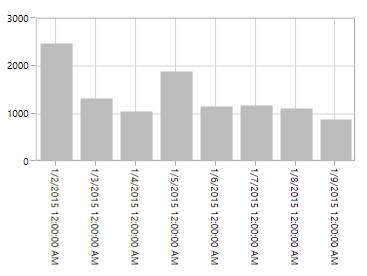
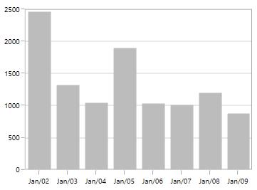
DateTimeAxis
<syncfusion:SfChart.PrimaryAxis>

<syncfusion:DateTimeAxis LabelFormat="MMM/dd" FontSize="12">

</syncfusion:DateTimeAxis>

</syncfusion:SfChart.PrimaryAxis>chart.PrimaryAxis = new DateTimeAxis()
{
LabelFormat = "MM/dd",
FontSize = 12
};
NumericalAxis
<syncfusion:SfChart.SecondaryAxis>

<syncfusion:NumericalAxis LabelFormat="0.00"/>

</syncfusion:SfChart.SecondaryAxis>chart.PrimaryAxis = new NumericalAxis()
{
LabelFormat = "0.00",
};
LabelTemplate
The LabelTemplate property allows you to define the appearance for the axis labels. The following code example illustrates the LabelTemplate property.
<syncfusion:SfChart x:Name="chart">

    <syncfusion:SfChart.Resources>

        <DataTemplate x:Key="labelTemplate">

            <Border Background="Gray" CornerRadius="5" >

                    <TextBlock Text="{Binding Content}" Foreground="White"

                                FontStyle="Normal" FontSize="10"

                                FontWeight="Bold" Margin="3"/>

                    <Border.Effect>

                        <DropShadowEffect ShadowDepth="6" Direction="315"

                                          Color="LightGray" Opacity="0.25"

                                          BlurRadius="0.8" />

                    </Border.Effect>

            </Border>

       </DataTemplate>

    </syncfusion:SfChart.Resources>

    <syncfusion:SfChart.PrimaryAxis>

        <syncfusion:CategoryAxis LabelTemplate="{StaticResource labelTemplate}"/>

    </syncfusion:SfChart.PrimaryAxis>

</syncfusion:SfChart>chart.PrimaryAxis = new CategoryAxis()
{
LabelTemplate = chart.Resources["labelTemplate"] as DataTemplate
};
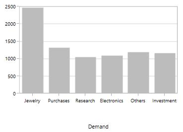
LabelExtent
This property allows us to set the distance between the axis header and the axis using the LabelExtent property. The following code sample defines the LabelExtent property.
<syncfusion:SfChart.PrimaryAxis>

<syncfusion:CategoryAxis Header="Demand" LabelExtent="50">

</syncfusion:CategoryAxis>chart.PrimaryAxis = new NumericalAxis()
{
Header = "Demand",
LabelExtent = 50
};
Smart Axis Labels
When there are more number of axis labels, they may overlap with each other. SfChart provides support to handle the overlapping labels using the LabelIntersectAction property. By default, the LabelIntersectAction value is Hide.
The following are the options for intersecting action.
- None
- Hide
- MultipleRows
- Auto
None
None option is used to display all the label, even if it intersects. The following code sample demonstrates the LabelIntersectAction as None option.
<syncfusion:SfChart.PrimaryAxis>

<syncfusion:CategoryAxis LabelIntersectAction="None"/>

</syncfusion:SfChart.PrimaryAxis>chart.PrimaryAxis = new CategoryAxis()
{
LabelIntersectAction = AxisLabelIntersectAction.None
};
Hide
Hide option is used to hide the labels if it intersects. You can define the hide as shown in the below code snippet.
<syncfusion:SfChart.PrimaryAxis>

<syncfusion:DateTimeAxis LabelIntersectAction="Hide"/>

</syncfusion:SfChart.PrimaryAxis>chart.PrimaryAxis = new DateTimeAxis()
{
LabelIntersectAction = AxisLabelIntersectAction.Hide
};
MultipleRows
This option is used to move the labels to next row if it intersects. The following code demonstrates the MultipleRows option in LabelIntersectAction.
<syncfusion:SfChart.PrimaryAxis>

<syncfusion:DateTimeAxis LabelIntersectAction="MultipleRows">

</syncfusion:DateTimeAxis>

</syncfusion:SfChart.PrimaryAxis>chart.PrimaryAxis = new DateTimeAxis()
{
LabelIntersectAction = AxisLabelIntersectAction.MultipleRows
};
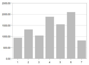
Auto
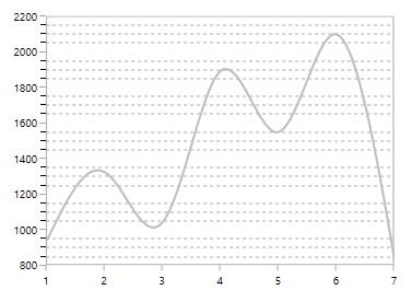
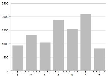
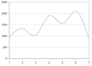
This option in LabelIntersectAction property is used to rotate the labels if they intersects. The following code sample and image demonstrate the rotate option in the LabelIntersectAction property.
<syncfusion:CategoryAxis LabelIntersectAction="Auto">

</syncfusion:CategoryAxis>chart.PrimaryAxis = new CategoryAxis()
{
LabelIntersectAction = AxisLabelIntersectAction.Auto
};
EdgeLabelsDrawingMode
SfChart provides support to customize the position of the edge labels in axis using the EdgeLabelsDrawingMode property. EdgeLabelsDrawingMode property default value is Center.
The following are the customizing options in EdgeLabelsDrawingMode.
- Center - Positions the label with tick line as center.
- Fit - Position the gridline inside based on the edge label size.
- Hide - Hides the edge labels.
- Shift - Shifts the edge labels to the left or right so that it comes inside the chart area.
Center
<syncfusion:SfChart.PrimaryAxis>

<syncfusion:DateTimeAxis EdgeLabelsDrawingMode="Center">

</syncfusion:DateTimeAxis>

</syncfusion:SfChart.PrimaryAxis>chart.PrimaryAxis = new DateTimeAxis()
{
EdgeLabelsDrawingMode = EdgeLabelsDrawingMode.Center
};
Shift
<syncfusion:SfChart.PrimaryAxis>

<syncfusion:DateTimeAxis EdgeLabelsDrawingMode="Shift">

</syncfusion:DateTimeAxis>

</syncfusion:SfChart.PrimaryAxis>chart.PrimaryAxis = new DateTimeAxis()
{
EdgeLabelsDrawingMode = EdgeLabelsDrawingMode.Shift
};
Hide
<syncfusion:SfChart.PrimaryAxis>

<syncfusion:DateTimeAxis EdgeLabelsDrawingMode="Hide">

</syncfusion:DateTimeAxis>

</syncfusion:SfChart.PrimaryAxis>chart.PrimaryAxis = new DateTimeAxis()
{
EdgeLabelsDrawingMode = EdgeLabelsDrawingMode.Hide
};
Fit
<syncfusion:SfChart.PrimaryAxis>

<syncfusion:DateTimeAxis EdgeLabelsDrawingMode="Fit">

</syncfusion:DateTimeAxis>

</syncfusion:SfChart.PrimaryAxis>chart.PrimaryAxis = new DateTimeAxis()
{
EdgeLabelsDrawingMode = EdgeLabelsDrawingMode.Fit
};
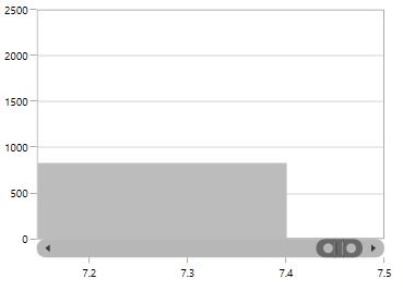
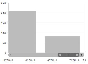
EdgeLabelsVisibilityMode
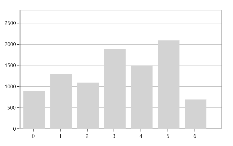
The visibility of the extreme labels of the axis can be controlled using EdgeLabelsVisibilityMode property. By default, the Default option in EdgeLabelsVisibilityMode is set, which displays the edge label based on auto interval calculations. The following image depicts the default option in EdgeLabelsVisibilityMode while zooming.
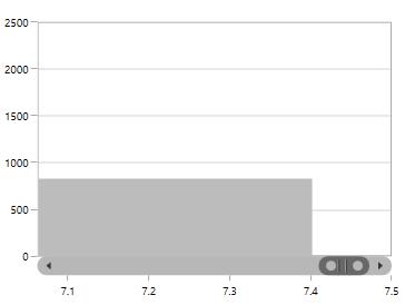
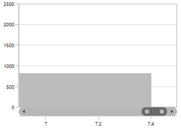
Always Visible
AlwaysVisible option in EdgeLabelsVisibilityMode is used to view the edge labels even while performing zooming.
The following code example and image demonstrate the AlwaysVisible option while zooming.
<syncfusion:SfChart.PrimaryAxis>

<syncfusion:NumericalAxis EdgeLabelsVisibilityMode="AlwaysVisible">

</syncfusion:NumericalAxis>

</syncfusion:SfChart.PrimaryAxis>chart.PrimaryAxis = new NumericalAxis()
{
EdgeLabelsVisibilityMode = EdgeLabelsVisibilityMode.AlwaysVisible
};
Visible
Visible option is used to display the edge labels (first and last label) irrespective of the auto-interval calculation until zooming (i.e., in normal state).
<syncfusion:SfChart.PrimaryAxis>

<syncfusion:NumericalAxis EdgeLabelsVisibilityMode="Visible">

</syncfusion:NumericalAxis>

</syncfusion:SfChart.PrimaryAxis>chart.PrimaryAxis = new NumericalAxis()
{
EdgeLabelsVisibilityMode = EdgeLabelsVisibilityMode.Visible
};
Grid lines
By default, gridlines are automatically added to the ChartAxis in its defined intervals. SfChart supports customization of gridline. The visibility of the gridlines can be controlled using the ShowGridLines property.
The following code example illustrates the ShowGridLines property as false in the primary axis.
<syncfusion:SfChart.PrimaryAxis>

<syncfusion:NumericalAxis ShowGridLines="False">

</syncfusion:NumericalAxis>

</syncfusion:SfChart.PrimaryAxis>chart.PrimaryAxis = new NumericalAxis()
{
ShowGridLines = false
};
Style can also be applied to Major and Minor gridlines using the MajorGridLineStyle and MinorGridLineStyle properties.
MajorGridLineStyle
<syncfusion:SfChart x:Name="chart">

     <syncfusion:SfChart.Resources>

         <Style TargetType="Line" x:Key="lineStyle">

                <Setter Property="StrokeThickness" Value="2"/>

                <Setter Property="Stroke" Value="Black"/>

                <Setter Property="StrokeDashArray" Value="3,3"/>

        </Style>

    </syncfusion:SfChart.Resources>

    <syncfusion:SfChart.PrimaryAxis>

            <syncfusion:NumericalAxis MajorGridLineStyle="{StaticResource lineStyle}"/>

    </syncfusion:SfChart.PrimaryAxis>

</syncfusion:SfChart>chart.PrimaryAxis = new NumericalAxis()
{
MajorGridLineStyle = chart.Resources["lineStyle"] as Style
};
MinorGridLineStyle
Minor gridlines will be added automatically when the small tick lines is defined inside the chart area.
<syncfusion:SfChart x:Name="chart">

      <syncfusion:SfChart.Resources>

            <Style TargetType="Line" x:Key="lineStyle">

                    <Setter Property="StrokeThickness" Value="1"/>

                    <Setter Property="Stroke" Value="DarkGray"/>

                    <Setter Property="StrokeDashArray" Value="3,3"/>

            </Style>

        </syncfusion:SfChart.Resources>

        <syncfusion:SfChart.SecondaryAxis>

                <syncfusion:NumericalAxis SmallTicksPerInterval="3"

                                          MinorGridLineStyle="{StaticResource lineStyle}"/>

       </syncfusion:SfChart.SecondaryAxis>

</syncfusion:SfChart>chart.PrimaryAxis = new NumericalAxis()
{
SmallTicksPerInterval = 3,
MinorGridLineStyle = chart.Resources["lineStyle"] as Style
};
Tick lines
Tick lines are the small lines, which is drawn on the axis line representing the axis labels. Tick lines will be drawn outside of the axis by default.
TickLineSize
Tick lines height can be customized using the TickLineSize property as shown in the following code sample.
<syncfusion:SfChart.PrimaryAxis>

<syncfusion:NumericalAxis TickLineSize="10">

</syncfusion:NumericalAxis>

</syncfusion:SfChart.PrimaryAxis>chart.PrimaryAxis = new NumericalAxis()
{
TickLineSize = 10
};
Positioning the Major Tick Lines
Tick lines can be positioned inside or outside of the chart area using the TickLinesPosition property. By default, the tick lines will be positioned outside of the chart area. The following code example demonstrates how to position the tick lines inside of the chart area.
<syncfusion:SfChart.PrimaryAxis>

<syncfusion:NumericalAxis TickLinesPosition="Inside">

</syncfusion:NumericalAxis>

</syncfusion:SfChart.PrimaryAxis>chart.PrimaryAxis = new NumericalAxis()
{
TickLinesPosition = AxisElementPosition.Inside
};
Customization
Style can be applied to major tick lines using the MajorTickLineStyle property. The following code sample demonstrates the styling of major tick lines.
<syncfusion:SfChart x:Name="chart">

    <syncfusion:SfChart.Resources>

        <Style TargetType="Line" x:Name="lineStyle">

            <Setter Property="StrokeThickness" Value="1"/>

            <Setter Property="Stroke" Value="Black"/>

            <Setter Property="StrokeDashArray" Value="3,3"/>

        </Style>

    </syncfusion:SfChart.Resources>

    <syncfusion:SfChart.SecondaryAxis>

                <syncfusion:NumericalAxis TickLineSize="10"

                                          MajorTickLineStyle="{StaticResource lineStyle}"/>

    </syncfusion:SfChart.SecondaryAxis>

</syncfusion:SfChart>chart.PrimaryAxis = new NumericalAxis()
{
TickLineSize = 10,
MajorTickLineStyle = chart.Resources["lineStyle"] as Style
};
MinorTickLines
Minor tick lines can be added by defining the SmallTicksPerInterval property. This property will add the tick lines to every interval.
The following code example demonstrates the small ticks set for every interval.
<syncfusion:SfChart.PrimaryAxis>

<syncfusion:NumericalAxis Interval="1" SmallTicksPerInterval="4" >

</syncfusion:NumericalAxis>

</syncfusion:SfChart.PrimaryAxis>chart.PrimaryAxis = new NumericalAxis()
{
Interval = 1,
SmallTicksPerInterval = 4
};
Positioning the minor tick lines
Minor tick lines can be positioned inside or outside using the SmallTickLinesPosition property. By default, the minor tick lines will be positioned outside.
The following code example demonstrates how to position the minor tick lines inside the chart area.
<syncfusion:SfChart.PrimaryAxis>

<syncfusion:NumericalAxis SmallTicksPerInterval="2" SmallTickLinesPosition="Inside">

</syncfusion:NumericalAxis>

</syncfusion:SfChart.PrimaryAxis>chart.PrimaryAxis = new NumericalAxis()
{
SmallTicksPerInterval = 2,
SmallTickLinesPosition = AxisElementPosition.Inside
};
Customization of Minor Ticklines
The height of the minor tick lines can be customized using the SmallTickLineSize property as shown in the following code sample.
<syncfusion:SfChart.PrimaryAxis>

<syncfusion:NumericalAxis Interval="1" SmallTicksPerInterval="3" SmallTickLineSize="10">

</syncfusion:NumericalAxis>

</syncfusion:SfChart.PrimaryAxis>chart.PrimaryAxis = new NumericalAxis()
{
Interval = 1,
SmallTicksPerInterval = 3,
SmallTickLineSize = 10
};
Styling customization of minor tick lines can be defined using the MinorTickLineStyle property. The following code example and image demonstrates the style for minor tick lines.
<syncfusion:SfChart x:Name="chart">

     <syncfusion:SfChart.Resources>

                <Style TargetType="Line" x:Name="lineStyle" >

                    <Setter Property="StrokeThickness" Value="0.5"/>

                    <Setter Property="Stroke" Value="Black"/>

                </Style>

     </syncfusion:SfChart.Resources>

     <syncfusion:SfChart.SecondaryAxis>

            <syncfusion:NumericalAxis FontSize="12"  Interval="1"

                                      SmallTicksPerInterval="3"

                                      TickLineSize="10" SmallTickLineSize="5"

                                      MinorTickLineStyle="{StaticResource lineStyle}"/>

    </syncfusion:SfChart.SecondaryAxis>

</syncfusion:SfChart>chart.PrimaryAxis = new NumericalAxis()
{
Interval = 1,
SmallTicksPerInterval = 3,
TickLineSize = 10,
SmallTickLineSize = 5
MinorTickLineStyle = chart.Resources["lineStyle"] as Style
};
NOTE
For category axis, small tick lines is not applicable since it is rendered based on index positions.
AxisLine
SfChart provides support to customize the style of the axis line by defining the AxisLineStyle property as shown in the following code sample.
<syncfusion:SfChart.PrimaryAxis>

<syncfusion:NumericalAxis Interval="1">

<syncfusion:NumericalAxis.AxisLineStyle>

<Style TargetType="Line"  >

<Setter Property="StrokeThickness" Value="2"/>

<Setter Property="Stroke" Value="Red"/>

<Setter Property="StrokeDashArray" Value="2,2"/>

</Style>

</syncfusion:NumericalAxis.AxisLineStyle>

</syncfusion:NumericalAxis>

</syncfusion:SfChart.PrimaryAxis>chart.PrimaryAxis = new NumericalAxis()
{
Interval = 1,
AxisLineStyle = chart.Resources["lineStyle"] as Style
};
Applying Padding to the Axis line
The padding to the axis line is defined using the AxisLineOffset property. The following code example demonstrates how to set AxisLineOffset for the x-axis.
<syncfusion:SfChart.PrimaryAxis>

<syncfusion:NumericalAxis AxisLineOffset="20">

</syncfusion:NumericalAxis>

</syncfusion:SfChart.PrimaryAxis>chart.PrimaryAxis = new NumericalAxis()
{
AxisLineOffset = 20
};
Types of Axis
ChartAxis supports the following types:
- NumericalAxis
- CategoryAxis
- DateTimeAxis
You can choose any type of ChartAxis such asDateTimeAxis, NumericalAxis, or CategoryAxis depending on the value type.
NumericalAxis
NumericalAxis is used to plot numerical values to the chart. NumericalAxis can be defined for both PrimaryAxis and SecondaryAxis. The following code sample shows how to define the NumericalAxis.
<syncfusion:SfChart.PrimaryAxis>

<syncfusion:NumericalAxis>

</syncfusion:NumericalAxis>

</syncfusion:SfChart.PrimaryAxis>

<syncfusion:SfChart.SecondaryAxis>

<syncfusion:NumericalAxis>

</syncfusion:NumericalAxis>

</syncfusion:SfChart.SecondaryAxis>chart.PrimaryAxis = new NumericalAxis();
chart.SecondaryAxis = new NumericalAxis();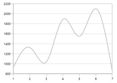
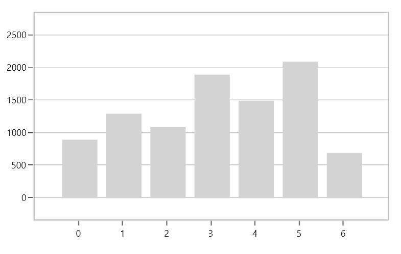
Customizing the NumericalAxis Range
The Maximum property is used for setting the maximum value for the axis range and Minimum property is used for setting the minimum value for the axis range.
<syncfusion:SfChart.SecondaryAxis>

<syncfusion:NumericalAxis Maximum="2750" Minimum="250" Interval="250">

</syncfusion:NumericalAxis>

</syncfusion:SfChart.SecondaryAxis>chart.SecondaryAxis = new NumericalAxis()
{
Maximum = 2750,
Minimum = 250,
Interval = 250
};
NOTE
If minimum or maximum value is set, the other value is calculated by default internally.
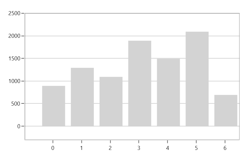
StartRangeFromZero
NumericalAxis will calculate the range based on the data points bound to the axis. To start the range from zero, set the StartRangeFromZero property to True. The following code example demonstrates the NumericalAxis range starting from zero.
<syncfusion:SfChart.SecondaryAxis>

<syncfusion:NumericalAxis StartRangeFromZero="True">

</syncfusion:NumericalAxis>

</syncfusion:SfChart.SecondaryAxis>chart.SecondaryAxis = new NumericalAxis()
{
StartRangeFromZero = true
};
NOTE
By default, Range is calculated between the minimum and maximum value of the data points.
CategoryAxis
CategoryAxis is an indexed based axis that plots values based on the index of the data point collection. The points are equally spaced here. The following code example initializes the CategoryAxis.
<syncfusion:SfChart.PrimaryAxis>

<syncfusion:CategoryAxis>

</syncfusion:CategoryAxis>

</syncfusion:SfChart.PrimaryAxis>chart.PrimaryAxis = new CategoryAxis();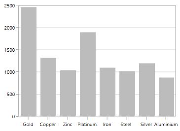
LabelPlacement
In CategoryAxis, labels are placed based on tick lines using the LabelPlacement property. By default, the labels are placed OnTicks. The following code example demonstrates how to place the label between ticks in CategoryAxis.
<syncfusion:SfChart.PrimaryAxis>

<syncfusion:CategoryAxis LabelPlacement="BetweenTicks">

</syncfusion:CategoryAxis>

</syncfusion:SfChart.PrimaryAxis>chart.PrimaryAxis = new CategoryAxis()
{
LabelPlacement = LabelPlacement.BetweenTicks
};
IsIndexed
By default, CategoryAxis plots the values based on the index of the data points. However, by disabling the IsIndexed property of the CategoryAxis, it is possible to make the CategoryAxis plot the data points based on their data rather than their index value, and it is shown in the following code example.
<syncfusion:SfChart.PrimaryAxis>

<syncfusion:CategoryAxis IsIndexed="False"/>

</syncfusion:SfChart.PrimaryAxis>chart.PrimaryAxis = new CategoryAxis()
{
IsIndexed = false,
};The following screenshot illustrates the series with the IsIndexed value as False.
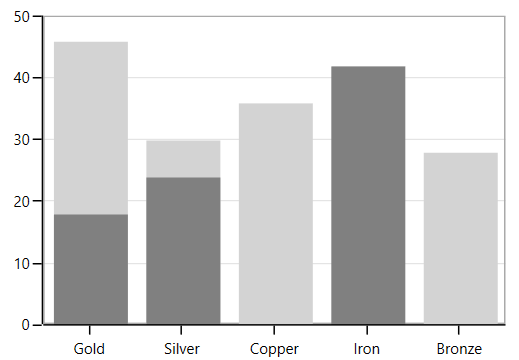
By default, the IsIndexed property value is true, and it is shown in the following screenshot.
NOTE
This feature is not applicable for AccumulationSeries, RadarSeries, and PolarSeries.
DateTimeAxis
DateTimeAxis is used to plot DateTime values. The DateTimeAxis is widely used to make financial charts in places, like the Stock Market, where index plotting is done on a daily basis.
<syncfusion:SfChart.PrimaryAxis>

<syncfusion:DateTimeAxis LabelFormat="MMM-dd">

</syncfusion:DateTimeAxis>

</syncfusion:SfChart.PrimaryAxis>chart.PrimaryAxis = new DateTimeAxis()
{
LabelFormat = "MMM-dd"
};
Customizing the Range
Minimum and Maximum properties behavior is same as in NumericalAxis, but instead of setting numerical values, you have to set date-time values.
<syncfusion:SfChart.PrimaryAxis>

<syncfusion:DateTimeAxis Minimum="2015/01/10" Maximum="2015/07/01" LabelFormat="MMM-dd" IntervalType="Months" Interval="1">

</syncfusion:DateTimeAxis>

</syncfusion:SfChart.PrimaryAxis>chart.PrimaryAxis = new DateTimeAxis()
{
Minimum = new DateTime(2015,01,10),
Maximum = new DateTime(2015,07,01),
LabelFormat = "MMM-dd",
IntervalType = DateTimeIntervalType.Months,
Interval = 1
};
Business Hours Range Calculation
SfChart provides support to plot only the business hours in DateTimeAxis. This support is enabled by setting the EnableBusinessHours property to true.
The following properties are used for business hour range calculation:
-
OpenTime- Represents the open working time of a day. -
CloseTime- Represents the close working time of a day. -
WorkingDays- Represents the workingdaysof a week.
The following code sample demonstrates the business hours support in DateTimeAxis.
<syncfusion:SfChart.PrimaryAxis>

<syncfusion:DateTimeAxis EnableBusinessHours="True" OpenTime="9"

CloseTime="24" WorkingDays="Friday,Saturday,Sunday,Monday,Tuesday,Wednesday,Sunday">

</syncfusion:DateTimeAxis>

</syncfusion:SfChart.PrimaryAxis>chart.PrimaryAxis = new DateTimeAxis()
{
EnableBusinessHours = true,
OpenTime = 9,
CloseTime = 24,
WorkingDays = Day.Friday | Day.Saturday | Day.Sunday |
Day.Monday | Day.Tuesday| Day.Wednesday| Day.Sunday
};
Inverting axis
Axis can be inverted using the IsInversed property. The default value of this property is False.
<chart:SfChart.SecondaryAxis>

<chart:NumericalAxis IsInversed="True"/>

</chart:SfChart.SecondaryAxis>this.Chart.SecondaryAxis.IsInversed = true;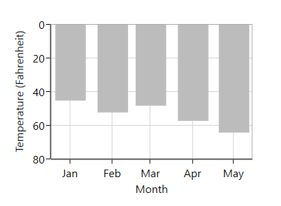
Customizing the Intervals
ChartAxis calculates the range and intervals automatically based on the data points. The axis range and interval can be defined using the Minimum, Maximum, and Interval properties.
NumericalAxis
The following code sample demonstrates the Interval customization in NumericalAxis.
<syncfusion:SfChart.SecondaryAxis>

<syncfusion:NumericalAxis Interval="250">

</syncfusion:NumericalAxis>

</syncfusion:SfChart.SecondaryAxis>chart.SecondaryAxis = new NumericalAxis()
{
Interval = 250
};
CategoryAxis
The following code sample demonstrates the Interval customization in CategoryAxis.
<syncfusion:SfChart.PrimaryAxis>

<syncfusion:CategoryAxis Interval="2">

</syncfusion:CategoryAxis>

</syncfusion:SfChart.PrimaryAxis>chart.PrimaryAxis = new CategoryAxis()
{
Interval = 2
};
DateTimeAxis
The DateTimeAxis Interval value corresponds to the type specified in the IntervalType property.
For instance, if the Interval is set to two and IntervalType is set to Days, the labels are plotted for every two days. The following are the options for IntervalType property.
- Auto
- Days
- Hours
- Milliseconds
- Minutes
- Months
- Seconds
- Years
The default IntervalType of a DateTimeAxis is Auto. It calculates the type and the interval automatically.
The following code snippet demonstrates the DateTimeAxis with a one-month interval.
<syncfusion:SfChart.PrimaryAxis>

<syncfusion:DateTimeAxis Interval="1" IntervalType="Months" LabelFormat="MMM-dd">

</syncfusion:DateTimeAxis>

</syncfusion:SfChart.PrimaryAxis>chart.PrimaryAxis = new DateTimeAxis()
{
Interval = 1,
IntervalType = DateTimeIntervalType.Months,
LabelFormat = "MMM-dd"
};
DesiredIntervalsCount
DesiredIntervalsCount property is used to specify the count of the axis labels between the first and last label. The following sample code defines the DesiredIntervalsCount property.
<syncfusion:SfChart.SecondaryAxis>

<syncfusion:NumericalAxis DesiredIntervalsCount="7">

</syncfusion:NumericalAxis>

</syncfusion:SfChart.SecondaryAxis>chart.SecondaryAxis = new NumericalAxis()
{
DesiredIntervalsCount = 7
};
Maximum Labels
MaximumLabels property defines the count of the axis labels in the 100 pixels.
<syncfusion:SfChart.SecondaryAxis>

<syncfusion:NumericalAxis MaximumLabels="2">

</syncfusion:NumericalAxis>

</syncfusion:SfChart.SecondaryAxis>

<syncfusion:ColumnSeries ItemsSource="{Binding Demands}" XBindingPath="Demand" YBindingPath="Year2010">

<syncfusion:ColumnSeries.YAxis>

<syncfusion:NumericalAxis MaximumLabels="2">

</syncfusion:NumericalAxis>

</syncfusion:ColumnSeries.YAxis>

</syncfusion:ColumnSeries>chart.SecondaryAxis = new NumericalAxis()
{
MaximumLabels = 2
};
NumericalAxis axis = new NumericalAxis() { MaximumLabels = 2 };
ColumnSeries series = new ColumnSeries()
{
ItemsSource = new ViewModel().Demands,
XBindingPath = "Demand",
YBindingPath = "Year2010",
YAxis = axis
};
chart.Series.Add(series);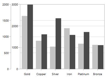
Apply Padding to the Range
The NumericalAxis and DateTimeAxis have a RangePadding property that can be used to add padding to the range of a chart’s axes.
DateTimeRangePadding
The RangePadding types available in the DateTimeAxis are:
- Auto
- Additional
- None
- Round
- RoundStart
- RoundEnd
- PrependInterval
- AppendInterval
Auto
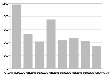
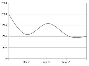
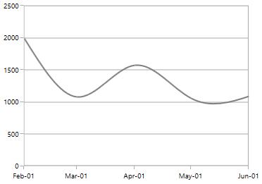
By default, the date-time range padding is Auto.
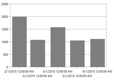
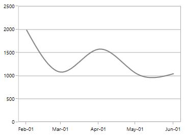
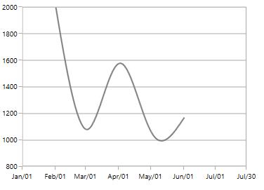
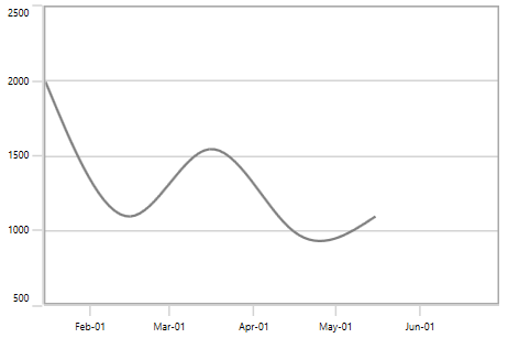
Additional
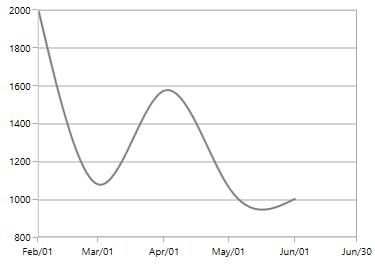
When you use RangePadding for DateTimeAxis, the DateTime interval of the axis is added as padding, as shown in the following screenshot.
<syncfusion:SfChart.PrimaryAxis>

<syncfusion:DateTimeAxis RangePadding="Additional">

</syncfusion:DateTimeAxis>

</syncfusion:SfChart.PrimaryAxis>chart.PrimaryAxis = new DateTimeAxis()
{
RangePadding = DateTimeRangePadding.Additional
};
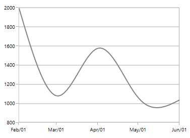
Round
When RangePadding for DateTimeAxis is set to Round, the range of the chart axis is rounded off to the nearest possible DateTime value, as shown in the following screenshot.
<syncfusion:SfChart.PrimaryAxis>

<syncfusion:DateTimeAxis RangePadding="Round">

</syncfusion:DateTimeAxis>

</syncfusion:SfChart.PrimaryAxis>chart.PrimaryAxis = new DateTimeAxis()
{
RangePadding = DateTimeRangePadding.Round
};
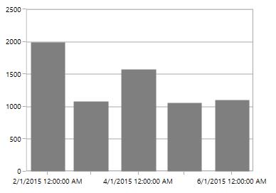
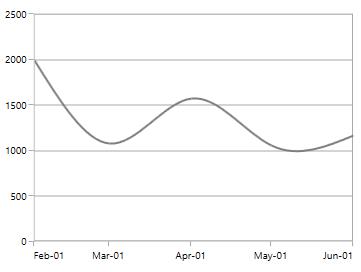
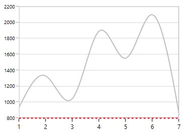
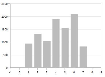
None
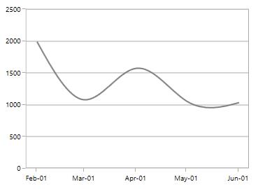
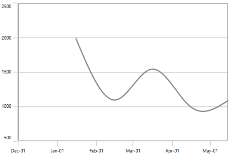
When the RangePadding for a DateTimeAxis is None.
The following screenshot demonstrates a chart’s x-axis with RangePadding set to None.
<syncfusion:SfChart.PrimaryAxis>

<syncfusion:DateTimeAxis RangePadding="None">

</syncfusion:DateTimeAxis>

</syncfusion:SfChart.PrimaryAxis>chart.PrimaryAxis = new DateTimeAxis()
{
RangePadding = DateTimeRangePadding.None
};
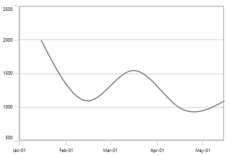
RoundStart
When RangePadding for DateTimeAxis is set to RoundStart, the range of the chart axis is rounded in the start off to the nearest possible DateTime value, as shown in the following screenshot.
<syncfusion:SfChart.PrimaryAxis>

<syncfusion:DateTimeAxis RangePadding="RoundStart">

</syncfusion:DateTimeAxis>

</syncfusion:SfChart.PrimaryAxis>chart.PrimaryAxis = new DateTimeAxis()
{
RangePadding = DateTimeRangePadding.RoundStart
};
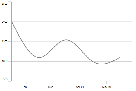
RoundEnd
When RangePadding for DateTimeAxis is set to RoundEnd, the range of the chart axis is rounded in the end off to the nearest possible DateTime value, as shown in the following screenshot.
<syncfusion:SfChart.PrimaryAxis>

<syncfusion:DateTimeAxis RangePadding="RoundEnd">

</syncfusion:DateTimeAxis>

</syncfusion:SfChart.PrimaryAxis>chart.PrimaryAxis = new DateTimeAxis()
{
RangePadding = DateTimeRangePadding.RoundEnd
};
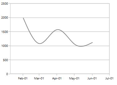
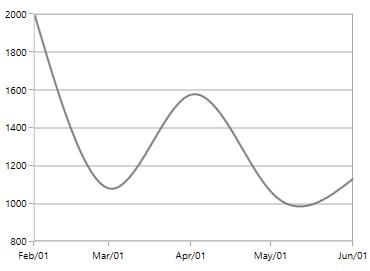
PrependInterval
When RangePadding for DateTimeAxis is set to PrependInterval, the DateTime interval of the axis is added in the start as padding, as shown in the following screenshot.
<syncfusion:SfChart.PrimaryAxis>

<syncfusion:DateTimeAxis RangePadding="PrependInterval">

</syncfusion:DateTimeAxis>

</syncfusion:SfChart.PrimaryAxis>chart.PrimaryAxis = new DateTimeAxis()
{
RangePadding = DateTimeRangePadding.PrependInterval
};
AppendInterval
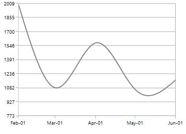
When RangePadding for DateTimeAxis is set to AppendInterval, the DateTime interval of the axis is added in the end as padding, as shown in the following screenshot.
<syncfusion:SfChart.PrimaryAxis>

<syncfusion:DateTimeAxis RangePadding="AppendInterval">

</syncfusion:DateTimeAxis>

</syncfusion:SfChart.PrimaryAxis>chart.PrimaryAxis = new DateTimeAxis()
{
RangePadding = DateTimeRangePadding.AppendInterval
};
NumericalRangePadding
The following types are available for NumericalAxis:
- Additional
- None
- Normal
- Round
- Auto
- RoundStart
- RoundEnd
- PrependInterval
- AppendInterval
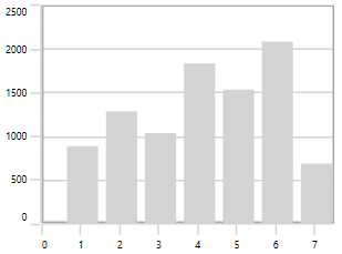
Round
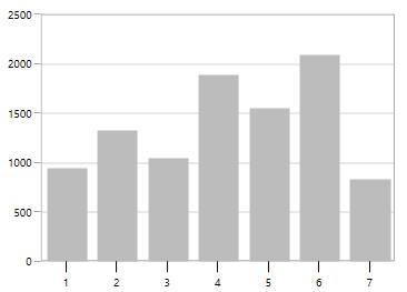
By default, the default RangePadding value for PrimaryAxis is Auto and for SecondaryAxis, the default value is Round.
The following screenshot illustrates a chart’s y-axis with RangePadding set to Round.
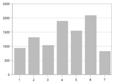
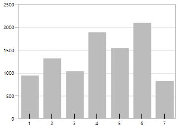
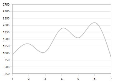
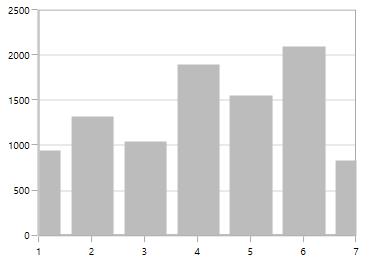
Normal
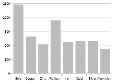
Normal RangePadding for a NumericalAxis is used mostly for the y-axis to have padding based on the Range calculation.
The following screenshot illustrates a chart’s y-axis with RangePadding set to Normal.
<syncfusion:SfChart.PrimaryAxis>

<syncfusion:NumericalAxis RangePadding="Normal">

</syncfusion:NumericalAxis>

</syncfusion:SfChart.PrimaryAxis>chart.PrimaryAxis = new NumericalAxis()
{
RangePadding = NumericalPadding.Additional
};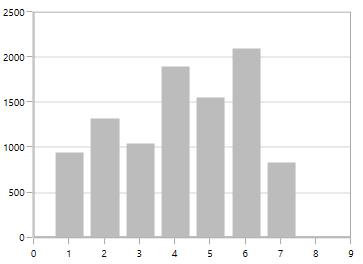
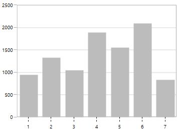
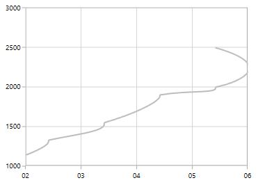
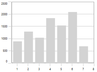
Additional
If RangePadding for NumericalAxis is set to Additional, the interval of the axis is added as padding.
The following screenshot demonstrates a chart’s x-axis with RangePadding set to Additional.
<syncfusion:SfChart.PrimaryAxis>

<syncfusion:NumericalAxis RangePadding="Additional">

</syncfusion:NumericalAxis>

</syncfusion:SfChart.PrimaryAxis>chart.PrimaryAxis = new NumericalAxis()
{
RangePadding = NumericalPadding.Additional
};
None
The following screenshot demonstrates RangePadding as None, where no padding is applied for the axis.
<syncfusion:SfChart.PrimaryAxis>

<syncfusion:NumericalAxis RangePadding="None">

</syncfusion:NumericalAxis>

</syncfusion:SfChart.PrimaryAxis>chart.PrimaryAxis = new NumericalAxis()
{
RangePadding = NumericalPadding.None
};
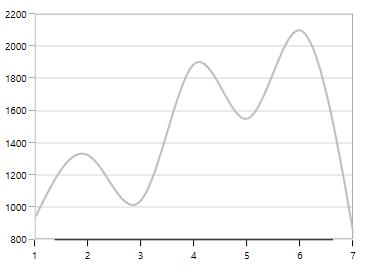
RoundStart
If RangePadding for NumericalAxis is set to RoundStart, the chart axis range is rounded to the nearest possible value.
The following screenshot demonstrates a chart’s x-axis with RangePadding set to RoundStart.
<syncfusion:SfChart.PrimaryAxis>

<syncfusion:NumericalAxis RangePadding="RoundStart">

</syncfusion:NumericalAxis>

</syncfusion:SfChart.PrimaryAxis>chart.PrimaryAxis = new NumericalAxis()
{
RangePadding = NumericalPadding.RoundStart
};
RoundEnd
If RangePadding for NumericalAxis is set to RoundEnd, the chart axis range is rounded to the nearest possible value at the end.
The following screenshot demonstrates a chart’s x-axis with RangePadding set to RoundEnd.
<syncfusion:SfChart.PrimaryAxis>

<syncfusion:NumericalAxis RangePadding="RoundEnd">

</syncfusion:NumericalAxis>

</syncfusion:SfChart.PrimaryAxis>chart.PrimaryAxis = new NumericalAxis()
{
RangePadding = NumericalPadding.RoundEnd
};
PrependInterval
If RangePadding for NumericalAxis is set to PrependInterval, the interval of the axis is added in the start as padding.
The following screenshot demonstrates a chart’s x-axis with RangePadding set to PrependInterval.
<syncfusion:SfChart.PrimaryAxis>

<syncfusion:NumericalAxis RangePadding="PrependInterval">

</syncfusion:NumericalAxis>

</syncfusion:SfChart.PrimaryAxis>chart.PrimaryAxis = new NumericalAxis()
{
RangePadding = NumericalPadding.PrependInterval
};
AppendInterval
If RangePadding for NumericalAxis is set to AppendInterval, the interval of the axis is added in the end as padding.
The following screenshot demonstrates a chart’s x-axis with RangePadding set to AppendInterval.
<syncfusion:SfChart.PrimaryAxis>

<syncfusion:NumericalAxis RangePadding="AppendInterval">

</syncfusion:NumericalAxis>

</syncfusion:SfChart.PrimaryAxis>chart.PrimaryAxis = new NumericalAxis()
{
RangePadding = NumericalPadding.AppendInterval
};
Applying Padding to the Axis
PlotOffset property is used to provide padding to the axis. The following code sample demonstrates the padding applied to both x and y axes.
<syncfusion:SfChart.PrimaryAxis>

<syncfusion:NumericalAxis PlotOffset="30">

</syncfusion:NumericalAxis>

</syncfusion:SfChart.PrimaryAxis>

<syncfusion:SfChart.SecondaryAxis>

<syncfusion:NumericalAxis PlotOffset="30">

</syncfusion:NumericalAxis>

</syncfusion:SfChart.SecondaryAxis>chart.PrimaryAxis = new NumericalAxis()
{
PlotOffset = 30
};
chart.SecondaryAxis = new NumericalAxis()
{
PlotOffset = 30
};
PlotOffsetStart
PlotOffsetStart property is used to provide padding to the axis at start position. The following code sample demonstrates the padding applied to start position for both x and y axes.
<syncfusion:SfChart.PrimaryAxis>

<syncfusion:NumericalAxis PlotOffsetStart="30">

</syncfusion:NumericalAxis>

</syncfusion:SfChart.PrimaryAxis>

<syncfusion:SfChart.SecondaryAxis>

<syncfusion:NumericalAxis PlotOffsetStart="30">

</syncfusion:NumericalAxis>

</syncfusion:SfChart.SecondaryAxis>chart.PrimaryAxis = new NumericalAxis()
{
PlotOffsetStart = 30
};
chart.SecondaryAxis = new NumericalAxis()
{
PlotOffsetStart = 30
};
PlotOffsetEnd
PlotOffsetEnd property is used to provide padding to the axis at end position. The following code sample demonstrates the padding applied to end position for both x and y axes.
<syncfusion:SfChart.PrimaryAxis>

<syncfusion:NumericalAxis PlotOffsetEnd="30">

</syncfusion:NumericalAxis>

</syncfusion:SfChart.PrimaryAxis>

<syncfusion:SfChart.SecondaryAxis>

<syncfusion:NumericalAxis PlotOffsetEnd="30">

</syncfusion:NumericalAxis>

</syncfusion:SfChart.SecondaryAxis>chart.PrimaryAxis = new NumericalAxis()
{
PlotOffsetEnd = 30
};
chart.SecondaryAxis = new NumericalAxis()
{
PlotOffsetEnd = 30
};
AutoScrollingDelta
AutoScrollingDelta is used to ensure whether the specified range of data is always visible in the chart. It always shows the recently added data points at the end, and the scrolling will be reset to the end of the range whenever a new point is added.
AutoScrollingDeltaType
In DateTimeAxis, you can apply auto scrolling delta value in Years, Months, Days, Hours, Minutes, Seconds, and Milliseconds by setting the AutoScrollingDeltaType property. The default value of this property is Auto, and the delta will be calculated automatically based on range.
<chart:SfChart.PrimaryAxis>

<chart:DateTimeAxis AutoScrollingDelta = "3" AutoScrollingDeltaType = "Days">

</chart:SfChart.PrimaryAxis>chart.PrimaryAxis = new DateTimeAxis()
{
AutoScrollingDelta = 3,
AutoScrollingDeltaType = DateTimeIntervalType.Days
};AutoScrollingMode
The AutoScrollingMode property is used to determine whether the axis should be scrolled from the start position or end position. The default value of this property is End.
<chart:SfChart.PrimaryAxis>

<chart:DateTimeAxis AutoScrollingDelta = "3" AutoScrollingMode = "Start">

</chart:SfChart.PrimaryAxis>chart.PrimaryAxis = new DateTimeAxis()
{
AutoScrollingDelta = 3,
AutoScrollingMode = ChartAutoScrollingMode.Start
};Auto Interval Calculation on Zooming
EnableAutoIntervalOnZooming property is used to maintain the interval, even if it is in a zooming state, only if we set the interval to the axis. The default value of this property is true. While zooming based on the auto-range padding the interval will be calculated.
If you set EnableAutoIntervalOnZooming as False, the intervals will be calculated on the interval based on the axis while zooming.
<syncfusion:SfChart.PrimaryAxis>

<syncfusion:NumericalAxis Interval="1" EnableAutoIntervalOnZooming="False">

</syncfusion:NumericalAxis>

</syncfusion:SfChart.PrimaryAxis>chart.PrimaryAxis = new NumericalAxis()
{
EnableAutoIntervalOnZooming = false,
Interval = 1
};
Multiple Axes
SfChart provides a way to arrange multiple series inside the same chart area, giving the chart more space than the x-axis and y-axis. These axes can be arranged in a stacking order or in a side by side pattern.
By default, all the series are plotted based on primary and secondary axis. You can add more axes by adding additional axis to the series. There are two properties XAxis and YAxis in all the series type, which is used to provide Multiple axes support, except CircularSeries, PyramidSeries, and FunnelSeries.
<syncfusion:ColumnSeries ItemsSource="{Binding Demands}"
         XBindingPath="Demand" YBindingPath="Year2011">

</syncfusion:ColumnSeries>

<syncfusion:LineSeries  ItemsSource="{Binding Demands}"
         XBindingPath="Date"  YBindingPath="Year2011">

<syncfusion:LineSeries.XAxis>

<syncfusion:DateTimeAxis />

</syncfusion:LineSeries.XAxis>

<syncfusion:LineSeries.YAxis>

<syncfusion:NumericalAxis/>

</syncfusion:LineSeries.YAxis>

</syncfusion:LineSeries>
ColumnSeries series1 = new ColumnSeries()
{
ItemsSource = new ViewModel().Demands,
XBindingPath = "Demand",
YBindingPath = "Year2011"
};
LineSeries series2 = new LineSeries()
{
ItemsSource = new ViewModel().Demands,
XBindingPath = "Date",
YBindingPath = "Year2011",
};
series2.XAxis = new DateTimeAxis()
{
Header = "Additional X Axis"
};
series2.YAxis = new NumericalAxis()
{
Header = "Additional Y Axis"
};
chart.Series.Add(series1);
chart.Series.Add(series2);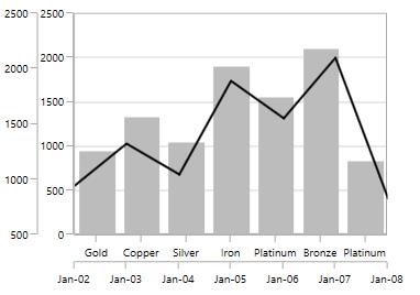
In the above screenshot, the LineSeries is plotted based on additional X and Y axes, and ColumnSeries (or remaining series) is plotted based on the primary and secondary axes.
Events
ActualRangeChanged
The ActualRangeChanged event occurs when an axis range is changed. This argument contains the following information.
-
ActualMinimum- Gets or sets the actual minimum value of axis. -
ActualMaximum- Gets or sets the actual maximum value of axis. -
VisibleMinimum- Gets or sets the visible minimum value of axis. -
VisibleMaximum- Gets or sets the visible maximum value of axis. -
ActualInterval- Gets the actual interval of axis.
LabelCreated
The LabelCreated event occurs when the axis label is created. This argument contains AxisLabel of ChartAxisLabel, which has the following properties:
AxisBoundsChanged
The AxisBoundsChanged event occurs when the bounds of the axis are changed. This argument contains the following information.
LabelClicked
The LabelClicked event is triggered when labels are clicked. The argument contains Label of ChartAxisLabel, which has the following properties.