Customization in WinUI BusyIndicator
26 Sep 20221 minute to read
This section explains the customization features available in the WinUI BusyIndicator control.
Size
The indicator size can be customized by using the SizeFactor property. Its default value is 0.5 and ranges from 0 to 1.
<notification:SfBusyIndicator IsActive="True"
    AnimationType="DottedCircularFluent"
    SizeFactor="0.2">
</notification:SfBusyIndicator>
SfBusyIndicator busyIndicator = new SfBusyIndicator();
busyIndicator.IsActive = true;
busyIndicator.AnimationType = BusyIndicatorAnimationType.DottedCircularFluent;
busyIndicator.SizeFactor = 0.2;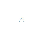
Duration
The indicator animation speed can be customized by using the DurationFactor property. Its default value is 0.5 and ranges from 0 to 1.
<notification:SfBusyIndicator IsActive="True"
    AnimationType="DottedCircularFluent"
    DurationFactor="0.9">
</notification:SfBusyIndicator>
SfBusyIndicator busyIndicator = new SfBusyIndicator();
busyIndicator.IsActive = true;
busyIndicator.AnimationType = BusyIndicatorAnimationType.DottedCircularFluent;
busyIndicator.DurationFactor = 0.9;
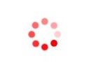
Color
The indicator color can be customized by using the Color property.
<notification:SfBusyIndicator IsActive="True"
    AnimationType="DottedCircle"
    Color="Red">
</notification:SfBusyIndicator>
SfBusyIndicator busyIndicator = new SfBusyIndicator();
busyIndicator.IsActive = true;
busyIndicator.AnimationType = BusyIndicatorAnimationType.DottedCircle;
busyIndicator.Color = new SolidColorBrush(Colors.Red);