Selection in WinUI AutoComplete (SfAutoComplete)
20 Sep 202211 minutes to read
The AutoComplete allows user to select single or multiple items. The selection mode can be set by using the SelectionMode property. There are two different selection modes: Single and Multiple.
Single selection
The AutoComplete allows user to select a single item by entering the value using keyboard, then selecting from the drop-down list and clicking the Enter key or Tab key. The selected item can be retrieved from the SelectedItem property.
//Model.cs
public class SocialMedia
{
    public string Name { get; set; }
    public int ID { get; set; }
}

//ViewModel.cs
public class SocialMediaViewModel
{
    public ObservableCollection<SocialMedia> SocialMedias { get; set; }
    public SocialMediaViewModel()
    {
        this.SocialMedias = new ObservableCollection<SocialMedia>();
        this.SocialMedias.Add(new SocialMedia() { Name = "Facebook", ID = 0 });
        this.SocialMedias.Add(new SocialMedia() { Name = "Google Plus", ID = 1 });
        this.SocialMedias.Add(new SocialMedia() { Name = "Instagram", ID = 2 });
        this.SocialMedias.Add(new SocialMedia() { Name = "LinkedIn", ID = 3 });
        this.SocialMedias.Add(new SocialMedia() { Name = "Skype", ID = 4 });
        this.SocialMedias.Add(new SocialMedia() { Name = "Telegram", ID = 5 });
        this.SocialMedias.Add(new SocialMedia() { Name = "Televzr", ID = 6 });
        this.SocialMedias.Add(new SocialMedia() { Name = "Tik Tok", ID = 7 });
        this.SocialMedias.Add(new SocialMedia() { Name = "Tout", ID = 8 });
        this.SocialMedias.Add(new SocialMedia() { Name = "Tumblr", ID = 9 });
        this.SocialMedias.Add(new SocialMedia() { Name = "Twitter", ID = 10 });
        this.SocialMedias.Add(new SocialMedia() { Name = "Vimeo", ID = 11 });
        this.SocialMedias.Add(new SocialMedia() { Name = "WhatsApp", ID = 12 });
        this.SocialMedias.Add(new SocialMedia() { Name = "YouTube", ID = 13 });
    }
}<editors:SfAutoComplete
SelectionMode="Single"
ItemsSource="{Binding SocialMedias}"
DisplayMemberPath="Name"
TextMemberPath="Name"
Width="250"
x:Name="autoComplete" />autoComplete.SelectionMode = AutoCompleteSelectionMode.Single;
Multiple selection
The AutoComplete allows user to select multiple values by beginning to enter the input and selecting items from the drop-down list. The multi-select AutoComplete mode can be enabled by setting the SelectionMode property as Multiple. Selected items will be displayed with a customizable token representation and each tokenized items can be removed by clicking their close button. The selected items can be retrieved from the SelectedItems property.
<editors:SfAutoComplete
    SelectionMode="Multiple"
    ItemsSource="{Binding SocialMedias}"
    DisplayMemberPath="Name"
    TextMemberPath="Name"
    Width="250"
x:Name="autoComplete" />autoComplete.SelectionMode = AutoCompleteSelectionMode.Multiple;
Auto-append UI
The AutoComplete control provides auto-append support with the selection of text as well as text alone. The auto-append UI can be defined by using the AppendType property. There are two types of auto-append UI: The TextWithSelection and Text. When the auto-append UI is set to Text, the appended text appears with a faded foreground, similar to Windows 11.
Auto-append UI as TextWithSelection
When entering a text in the text box selection area, if the AppendType property is TextWithSelection, the appended text appears with the selection.
<editors:SfAutoComplete AppendType="TextWithSelection">
</editors:SfAutoComplete>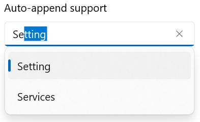
Auto-append UI as Text
When entering a text in the text box selection area, if the AppendType property is Text, the appended text appears in a fading foreground.
<editors:SfAutoComplete AppendType="Text">
</editors:SfAutoComplete>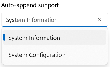
Selection changed notification
When an item is selected from the drop-down list, the SelectionChanged event is triggered. The SelectionChanged event contains the newly selected and removed items in the AddedItems and RemovedItems properties. The SelectionChanged contains the following properties:
- AddedItems - Contains the items that were selected.
- RemovedItems - Contains the items that were unselected.
<editors:SfAutoComplete
    SelectionChanged="OnSelectionChanged"
    TextMemberPath="Name"
    DisplayMemberPath="Name"
    ItemsSource="{Binding SocialMedias}"
    Width="250"
x:Name="autoComplete"/>autoComplete.SelectionChanged += OnSelectionChanged;The SelectionChanged event can be handled as follows.
private async void OnSelectionChanged(object sender, AutoCompleteSelectionChangedEventArgs e)
{
    var cd = new ContentDialog
    {
        Content = "Selected item was changed.",
        CloseButtonText = "Close"
    };

    cd.XamlRoot = this.Content.XamlRoot;
    var result = await cd.ShowAsync();
}
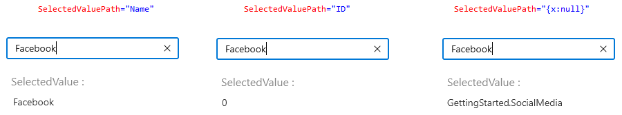
Get the selected value
The SelectedValuePath property allows you to specify a SelectedValue for a AutoComplete’s SelectedItem. The SelectedItem represents an object in the Items collection, and the AutoComplete displays the value of the selected item’s single property. The SelectedValuePath property specifies the path to the property that is used to determine the SelectedValue property’s value. The default value of SelectedValue and SelectedValuePath is null.
For example, when you select any SocialMedia.Name in the AutoComplete, the SelectedItem property returns the SocialMedia data item that corresponds to the selected SocialMedia.Name. However, because the SelectedValuePath of this AutoComplete is set to SocialMedia.ID, the SelectedValue is set to the SocialMedia.ID.
<editors:SfAutoComplete
    SelectedValuePath="ID"
    x:Name="autoComplete"
    TextMemberPath="Name"
    DisplayMemberPath="Name"
    ItemsSource="{Binding SocialMedias}"
    SelectionChanged="OnSelectionChanged"/>

<TextBlock Text="SelectedValue :"/>
<TextBlock x:Name="selectedValue"/>autoComplete.SelectedValuePath = "ID";
autoComplete.SelectionChanged += OnSelectionChanged;private void OnSelectionChanged(object sender, AutoCompleteSelectionChangedEventArgs e)
{
selectedValue.Text = autoComplete.SelectedValue.ToString();
}
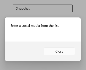
Handle invalid input
When entered text that does not correspond to a drop-down list item is submitted, the InputSubmitted event is triggered. The members of AutoCompleteInputSubmittedEventArgs provide information about the entered text.
Text - Gets the text entered in AutoComplete.
Item - This property can be used to add the item to the selected item(s) or set to selected item which gets assigned.
If no item is assigned, then in single selection, entered text gets assigned to selected item. In multiple selection, no text will be added to selected items.
Handled - When set to true, the framework will not automatically update the selected item or selected item(s) of the AutoComplete to the new value.
By using the following code sample, you will display a dialogue box when submitting input (Snap chat) that does not match the assigned ItemsSource.
<editors:SfAutoComplete
    InputSubmitted="OnAutoCompleteInputSubmitted"
    ItemsSource="{Binding SocialMedias}"
    DisplayMemberPath="Name"
    TextMemberPath="Name"
    x:Name="autoComplete"
    Width="250">
</editors:SfAutoComplete>autoComplete.InputSubmitted += OnAutoCompleteInputSubmitted;The InputSubmitted event can be handled as follows.
/// <summary>
/// Occurs when the user submits some text that does not correspond to an item in the `AutoComplete` drop-down list.
/// </summary>
private async void OnAutoCompleteInputSubmitted(object sender, Syncfusion.UI.Xaml.Editors.AutoCompleteInputSubmittedEventArgs e)
{
    var cd = new ContentDialog
    {
        Content = "Enter a social media from the list.",
        CloseButtonText = "Close"
    };

    cd.XamlRoot = this.Content.XamlRoot;
    var result = await cd.ShowAsync();
}
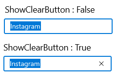
Hide clear button in the editor
By default, the clear button X will be displayed in the editor of the AutoComplete control, which can be used to clear the entered input. Hide the clear button in AutoComplete control using the ShowClearButton property. The default value of ShowClearButton property value is true.
<editors:SfAutoComplete
    ShowClearButton="false"
    ItemsSource="{Binding SocialMedias}"
    DisplayMemberPath="Name"
    TextMemberPath="Name"
    x:Name="autoComplete"
    Width="250">
</editors:SfAutoComplete>autoComplete.ShowClearButton = false;