Leading and Trailing View in WinUI AutoComplete
18 Nov 20185 minutes to read
This section explains the leading and trailing view support available in SfAutoComplete. The LeadingView appears before the AutoComplete selection area, and TrailingView appears after the AutoComplete selection area. Any content, such as an icon, image, button, or control, can be displayed in the LeadingView and TrailingView.
Both LeadingView and TrailingView are of type object and accept any UIElement as content. For best alignment of icons, wrap them in a View box and set an explicit Height and Width.
Leading view
The following code shows how to include the LeadingView in the AutoComplete control.
<editors:SfAutoComplete Header="AutoComplete with Leading View"
                         PlaceholderText="Search a country">
         <editors:SfAutoComplete.LeadingView>
                <Viewbox Height="16"
                         Width="16"
                         Margin="4,0,0,0">
                    <SymbolIcon Symbol="Find" />
                </Viewbox>
         </editors:SfAutoComplete.LeadingView>
 </editors:SfAutoComplete>
Trailing view
The following code shows how to include the TrailingView in the AutoComplete control. The AlternateCloseButtonStyle gives the button a chromeless appearance, and AllowFocusOnInteraction="False" prevents focus from leaving the AutoComplete when the button is pressed.
<editors:SfAutoComplete Header="AutoComplete with Trailing View"
PlaceholderText="Search a country">
<editors:SfAutoComplete.TrailingView>
<Button Style="{ThemeResource AlternateCloseButtonStyle}"
Height="30"
AllowFocusOnInteraction="False">
<Viewbox Height="16"
Width="16">
<FontIcon Glyph="" />
</Viewbox>
</Button>
</editors:SfAutoComplete.TrailingView>
</editors:SfAutoComplete>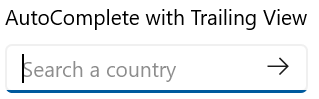
Leading and trailing view
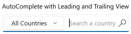
Use both properties together when you need content on both sides of the selection area. The following code shows how to include both LeadingView and TrailingView in the AutoComplete control.
<editors:SfAutoComplete Header="AutoComplete with Leading and Trailing View"
                        PlaceholderText="Search a country">
    <editors:SfAutoComplete.LeadingView>
        <editors:SfComboBox Margin="0,4,0,4">
            <editors:SfComboBoxItem Content="Asia" />
            <editors:SfComboBoxItem Content="Africa" />
            <editors:SfComboBoxItem Content="North America" />
            <editors:SfComboBoxItem Content="South America" />
            <editors:SfComboBoxItem Content="Europe" />
            <editors:SfComboBoxItem Content="All Countries"
                                    IsSelected="True" />
        </editors:SfComboBox>
    </editors:SfAutoComplete.LeadingView>
    <editors:SfAutoComplete.TrailingView>
        <Viewbox Height="16"
                 Width="16"
                 Margin="0,0,8,0">
            <SymbolIcon Symbol="Find" />
        </Viewbox>
    </editors:SfAutoComplete.TrailingView>
</editors:SfAutoComplete>