How can I help you?
Features in Windows Forms TrackBar (TrackBarEx)
4 Feb 20255 minutes to read
The TrackBarEx is a new Office2007 control, which has a track bar or a pointer which slides between the minimum value and maximum value specified. The user can drag the track bar along the line and also, the pointer can be placed at a particular point by clicking a position inside this TrackBar.
Various Features and Customization options are discussed in the following topics.
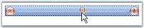
Button, Slider and Channel Settings
The properties which controls the size of various components of the TrackBarEx are as follows.
| Property | Description |
|---|---|
| IncreaseButtonSize | Gets or sets the size of Increase button. Default value is (18, 18) |
| DecreaseButtonSize | Gets or sets the size of Decrease button. Default value is (18, 18) |
| SliderSize | Gets or sets the size of the slider. Default value is (11, 14). |
| ChannelHeight | Gets or sets height of the channel. Default value is 4. |
Button Appearance
The below properties will let you control the appearance of the Increase, Decrease and slider buttons.
| Property | Description |
|---|---|
| ShowButton | Gets or sets a value indicating whether to show the Increase and Decrease buttons. |
| ButtonColor | Gets or sets the color for the Increase and Decrease buttons. |
| HighlightedButtonColor | Gets or sets the color for the buttons, when they are highlighted. |
| PushedButtonEndColor | Gets or sets the color of the buttons, when they are pushed. |
this.trackBarEx1.ShowButtons = true;

this.trackBarEx1.ButtonColor = System.Drawing.Color.DodgerBlue;

this.trackBarEx1.HighlightedButtonColor = System.Drawing.Color.AliceBlue;

this.trackBarEx1.PushedButtonEndColor = System.Drawing.Color.OrangeRed;Me.trackBarEx1.ShowButtons = True
Me.trackBarEx1.ButtonColor = System.Drawing.Color.DodgerBlue
Me.trackBarEx1.HighlightedButtonColor = System.Drawing.Color.AliceBlue
Me.trackBarEx1.PushedButtonEndColor = System.Drawing.Color.OrangeRed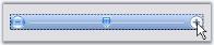
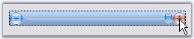
TrackBar Appearance
FocusRectangle
A focus rectangle for the TrackBarEx control can be shown or hidden using ShowFocusRect property.
Gradient Start and End Color
By default, the TrackBarEx control has a gradient appearance. The start color and end color for this gradient appearance can be specified using TrackBarGradientStart and TrackBarGradientEnd properties.
this.trackBarEx1.TrackBarGradientEnd = System.Drawing.Color.CadetBlue;

this.trackBarEx1.TrackBarGradientStart = System.Drawing.Color.MintCream;Me.trackBarEx1.TrackBarGradientEnd = System.Drawing.Color.CadetBlue
Me.trackBarEx1.TrackBarGradientStart = System.Drawing.Color.MintCream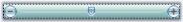
The control can be given a transparent background by enabling the Transparent property.
this.trackBarEx1.Transparent = true;Me.trackBarEx1.Transparent = True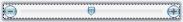
TrackBarEx Orientation
This control has options for vertical and horizontal orientation.
//To set the control to be vertically oriented

this.trackBarEx1.Orientation = Orientation.Vertical;

//To set the control to be horizontally oriented

this.trackBarEx1.Orientation = Orientation.Horizontal;'To set the control to be vertically oriented
Me.trackBarEx1.Orientation = Orientation.Vertical
'To set the control to be horizontally oriented
Me.trackBarEx1.Orientation = Orientation.Horizontal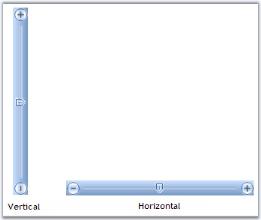
TrackBar Value
The TrackBarEx control slides between the minimum and maximum values, which are specified in Minimum and Maximum properties. The properties with description are listed in the below table.
| Property | Description |
|---|---|
| Minimum | Gets or sets minimum value of TrackBarEx. Default is 10. |
| Maximum | Gets or sets the maximum value of TrackBarEx. Default is 20. |
| Value | Gets or sets value of TrackBarEx position i.e. slider position. Default is 5. |
| SmallChange | Gets or sets small change of TrackBarEx value while changing. Default is 1. |
| LargeChange | Gets or sets large change of TrackBarEx value while changing. Default is 5. |
| TimerInterval | Gets or sets interval for timer while increasing/decreasing the value using Increase/Decrease button. Default is 100. |
this.trackBarEx1.Minimum = 10;

this.trackBarEx1.Maximum = 25;

this.trackBarEx1.Value = 5;

this.trackBarEx1.SmallChange = 5;

this.trackBarEx1.LargeChange = 15;

this.trackBarEx1.TimerInterval = 50;Me.trackBarEx1.Minimum = 10
Me.trackBarEx1.Maximum = 30
Me.trackBarEx1.Value = 5
Me.trackBarEx1.SmallChange = 5
Me.trackBarEx1.LargeChange = 15
Me.trackBarEx1.TimerInterval = 50Following are the methods for the TrackBarEx control which gives the respective results based on SmallChange and LargeChange properties.
| Methods | Description |
|---|---|
| LargeIncrease | Increases the value by large change specified in LargeChange property. |
| LargeDecrease | Decreases the value by large change specified in LargeChange property. |
| SmallDecrease | Decreases the value by small change specified in SmallChange property. |
| SmallIncrease | Increases the value by small change specified in SmallChange property. |
TrackBarEx Event
Scroll event of the TrackBarEx will be handled whenever the user moves the slider.
private void trackBarEx1_Scroll(object sender, EventArgs e)

{

    this.trackBarEx1.ButtonColor = System.Drawing.Color.OrangeRed;

}Private Sub trackBarEx1_Scroll(ByVal sender As Object, ByVal e As EventArgs)
Me.trackBarEx1.ButtonColor = System.Drawing.Color.OrangeRed
End Sub