Appearance in Windows Forms Tooltip (SfToolTip)
21 Jan 20259 minutes to read
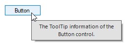
ToolTip Control
The border color and its thickness of the SfToolTip can be customized by using the BorderColor and BorderThickness properties.
ToolTipInfo toolTipInfo1 = new ToolTipInfo();
toolTipInfo1.BorderColor = Color.Gray;
toolTipInfo1.BorderThickness = 5;
ToolTipItem toolTipItem1 = new ToolTipItem();
toolTipItem1.Text = "The ToolTip information of the Button control.";
toolTipInfo1.Items.AddRange(new ToolTipItem[] { toolTipItem1 });
sfToolTip1.SetToolTipInfo(this.button1, toolTipInfo1);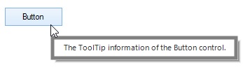
ToolTip Item
The appearance of ToolTipItem can be customized by setting the ToolTipStyleInfo property. The ToolTipStyleInfo property contains all the settings for the ToolTipItem appearance customization.
ToolTipInfo toolTipInfo1 = new ToolTipInfo();
ToolTipItem toolTipItem1 = new ToolTipItem();
toolTipItem1.Text = "The ToolTip information of the Button control.";
toolTipItem1.Style.BackColor = Color.LightSkyBlue;
toolTipItem1.Style.ForeColor = Color.Black;
toolTipItem1.Style.TextAlignment = ContentAlignment.MiddleCenter;
toolTipItem1.Style.Font = new Font("Arial", 10.5f, FontStyle.Bold);
toolTipInfo1.Items.AddRange(new ToolTipItem[] { toolTipItem1 });
sfToolTip1.SetToolTipInfo(this.button1, toolTipInfo1);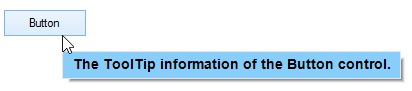
Gradient Color
Gradient background drawing for the ToolTipItem can be done by enabling the EnableGradientBackground property and initializing a GradientBrush property for the ToolTipItem.
ToolTipItem toolTipItem1 = new ToolTipItem();
toolTipItem1.Text = "The ToolTip information of the Button control.";
toolTipItem1.EnableGradientBackground = true;
toolTipItem1.Style.GradientBrush = new BrushInfo(GradientStyle.ForwardDiagonal, new Color[] { Color.LightSkyBlue, Color.LightGreen, Color.Orange });
toolTipInfo1.Items.AddRange(new ToolTipItem[] { toolTipItem1 });
sfToolTip1.SetToolTipInfo(this.button2, toolTipInfo1);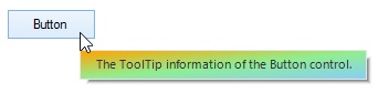
NOTE
The GradientBrush property will be considered only when the EnableGradientBackground property is set to true.
ToolTipItem Separator
The separator of the ToolTipItem can be customized using the SeparatorColor and SeparatorStyle properties.
ToolTipItem toolTipItem1 = new ToolTipItem();
toolTipItem1.Text = "ToolTipItem1 Text";
toolTipItem1.EnableSeparator = true;
toolTipItem1.Style.SeparatorColor = Color.Gray;
toolTipItem1.Style.SeparatorStyle = DashStyle.DashDot;
ToolTipItem toolTipItem2 = new ToolTipItem();
toolTipItem2.Text = "ToolTipItem2 Text";
toolTipInfo1.Items.AddRange(new ToolTipItem[] { toolTipItem1, toolTipItem2 });
sfToolTip1.SetToolTipInfo(this.button2, toolTipInfo1);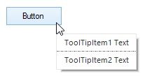
Customizing Appearance based on Control
The appearance of the ToolTipItem can be customized before showing the tooltip based on the control in which it is configured using the ToolTipShowing event.
this.sfToolTip1.ToolTipShowing += SfToolTip1_ToolTipShowing;
private void SfToolTip1_ToolTipShowing(object sender, ToolTipShowingEventsArgs e)
{
    if (e.Control is Button)
    {
        e.ToolTipInfo.Items[0].Style.BackColor = Color.LightSkyBlue;
        e.ToolTipInfo.Items[0].Style.ForeColor = Color.Black;
    }
}
Enabling the Shadow
The shadow of the tooltip can be enabled by setting the ShadowVisible property to true.
SfToolTip sfToolTip1 = new SfToolTip();
sfToolTip1.ShadowVisible = true;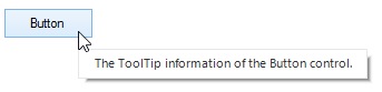
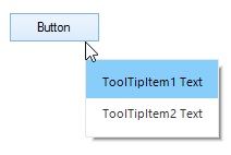
ToolTipItem Separator
The enabled separator of the ToolTipItem can be customized by setting the EnableSeparator property to true.
ToolTipItem toolTipItem1 = new ToolTipItem();
toolTipItem1.Text = "ToolTipItem1 Text";
toolTipItem1.EnableSeparator = true;
ToolTipItem toolTipItem2 = new ToolTipItem();
toolTipItem2.Text = "ToolTipItem2 Text";
toolTipInfo1.Items.AddRange(new ToolTipItem[] { toolTipItem1, toolTipItem2 });
sfToolTip1.SetToolTipInfo(this.button2, toolTipInfo1);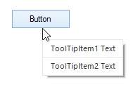
NOTE
The separator line cannot be drawn for the last
ToolTipItemin the collection, even the separator is enabled.
Right to Left
The elements of the tooltip can be aligned from right to left and vice versa using the RightToLeft property.
ToolTipInfo toolTipInfo1 = new ToolTipInfo();
toolTipInfo1.RightToLeft = RightToLeft.Yes;
ToolTipItem toolTipItem1 = new ToolTipItem();
toolTipItem1.Text = "David Carter\r\nPhone : +1 919.494.1974\r\nEmail : [email protected]";
toolTipItem1.Style.TextAlignment = ContentAlignment.MiddleLeft;
toolTipItem1.Image = global::GettingStarted.Properties.Resources.MORGK;
toolTipItem1.Style.ImageSize = new Size(100, 100);
toolTipInfo1.Items.AddRange(new ToolTipItem[] { toolTipItem1 });
sfToolTip1.SetToolTipInfo(this.button2, toolTipInfo1);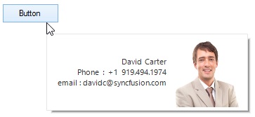
Themes
The SfToolTip offers four built-in themes for professional representation as follows:
- Office2016Colorful
- Office2016White
- Office2016DarkGray
- Office2016Black
Themes can be applied to the SfToolTip by using the following steps:
Load theme assembly
The Syncfusion.Office2016Theme.WinForms assembly should be added as reference to set theme for the SfToolTip in any application.
Before applying theme to the SfToolTip, required theme assembly should be loaded.
using Syncfusion.WinForms.Controls;

         static class Program
    {
        /// <summary>
        /// The main entry point for the application.
        /// </summary>

        static void Main()
        {
            SfSkinManager.LoadAssembly(typeof(Office2016Theme).Assembly);
            Application.EnableVisualStyles();
            Application.SetCompatibleTextRenderingDefault(false);
            Application.Run(new Form1());
        }
    }
Imports Syncfusion.WinForms.Controls
Friend Module Program
''' <summary>
''' The main entry point for the application.
''' </summary>
Sub Main()
SfSkinManager.LoadAssembly(GetType(Office2016Theme).Assembly)
Application.EnableVisualStyles()
Application.SetCompatibleTextRenderingDefault(False)
Application.Run(New Form1())
End Sub
End ModuleApply theme
Appearance of the SfToolTip can be changed by using the ThemeName.
Office2016Colorful
This option helps to set the Office2016Colorful Theme.
// Office2016Colorful

 this.SfToolTip.ThemeName = "Office2016Colorful";
' Office2016Colorful
Me.SfToolTip.ThemeName = "Office2016Colorful"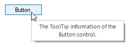
Office2016White
This option helps to set the Office2016White Theme.
// Office2016White

 this.SfToolTip.ThemeName = "Office2016White";
' Office2016White
Me.SfToolTip.ThemeName = "Office2016White"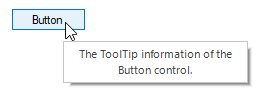
Office2016DarkGray
This option helps to set the Office2016DarkGray Theme.
// Office2016DarkGray

 this.SfToolTip.ThemeName = "Office2016DarkGray";
' Office2016DarkGray
Me.SfToolTip.ThemeName = "Office2016DarkGray"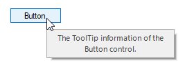
Office2016Black
This option helps to set the Office2016Black Theme.
// Office2016Black

 this.SfToolTip.ThemeName = "Office2016Black";
' Office2016Black
Me.SfToolTip.ThemeName = "Office2016Black"