Text Visualization in Windows Forms Syntax Editor
13 Jul 202124 minutes to read
Various text visualization features of EditControl is elaborated under the following topics.
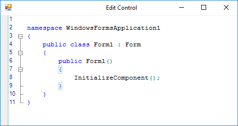
Outlining
Sections of code form outlining blocks can be specified by using the Configuration Settings. The EditControl defines different brackets for highlighting different languages.
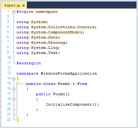
Configure outline
Outlining blocks can be specified for code as well as for plain text. By Setting the ShowOutliningCollapsers property to true, you can enable or disable automatic outlining in the EditControl.
// Enabling Automatic Outlining.

this.editControl1.ShowOutliningCollapsers = true;
' Enabling Automatic Outlining.
Me.editControl1.ShowOutliningCollapsers = TrueToggle outline visibility
You can toggle the outline visibility in the EditControl by using the following functions.
| Functions | Description |
|---|---|
| Turns on collapse and collapse all options. | |
| Turns off collapse option. | |
| Toggles collapse option for the current line. |
// Turns on collapse and collapse all option.

this.editControl1.SwitchCollapsingOff();

// Turns off collapse option.

this.editControl1.SwitchCollapsingOn();

// Toggles collapse option for current line.

this.editControl1.ToggleLineCollapsing();
' Turns on collapse and collapse all option.
Me.editControl1.SwitchCollapsingOff()
' Turns off collapse option.
Me.editControl1.SwitchCollapsingOn()
' Toggles collapse option for current line.
Me.editControl1.ToggleLineCollapsing()Programmatically expand or collapse outline state
Programmatically provides support like Visual Studio for collapsing and expanding blocks of code.
| Functions | Description |
|---|---|
| Collapses all regions in the currently selected area or in the current line. | |
| Expands all the collapsed regions in currently selected area or in the current line. | |
| Collapses all regions. | |
| Expands all collapsed regions. |
// Collapses all regions in currently selected area or in the current line.

this.editControl1.Collapse();

// Expands all collapsed regions in currently selected area or in the current line.

this.editControl1.Expand();

// Collapses all regions.

this.editControl1.CollapseAll();

// Expands all collapsed regions.

this.editControl1.ExpandAll();
' Collapses all regions in currently selected area or in the current line.
Me.editControl1.Collapse()
' Expands all collapsed regions in currently selected area or in the current line.
Me.editControl1.Expand()
' Collapses all regions.
Me.editControl1.CollapseAll()
' Expands all collapsed regions.
Me.editControl1.ExpandAll()The EditControl supports the following events to handle various outlining operations.
| Events | Description |
|---|---|
| Occurs before the region is about to collapse. | |
| Occurs before the region is about to expand. | |
| Occurs when the region collapses. | |
| Occurs when the region expands. | |
| Occurs when CollapseAll the function was called. | |
| Occurs when ExpandedAll the function was called. | |
| Occurs when CollapseAll the function is called. | |
| Occurs when ExpandAll the function is called. |
These events can be canceled and can be used to optionally cancel the outlining collapse and expand operations respectively. They are discussed in detail in the EditControl events section.
Outlining tooltip
The EditControl provides Tooltip support for Outlining. Outlining Tooltip is displayed for each collapsed outlining block. It shows the contents of the collapsed block. The Outlining Tooltip can be optionally shown or hidden by using the ShowOutliningTooltip property in EditControl. Its default value is true.
// Show the tooltip for outlining block.

this.editControl1.ShowOutliningTooltip = true;
` Show the tooltip for outlining block.
Me.editControl1.ShowOutliningTooltip = True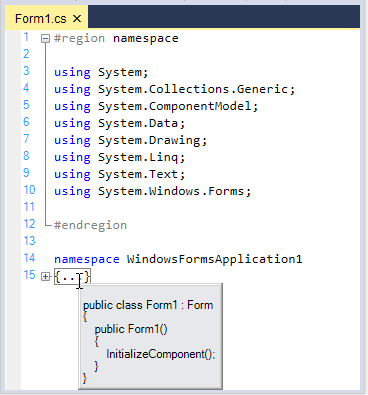
The EditControl supports the following outlining tooltip events.
| Events | Description |
|---|---|
| Occurs when outlining tooltip is to be shown. | |
| Occurs when outlining tooltip is shown. | |
| Occurs when outlining tooltip is closed. |
The OutliningTooltipBeforePopup event is used to control the visibility of the outlining tooltip. The ShowMode property of the OutliningTooltipBeforePopupEventArgs is used for this purpose. By default, the ShowMode property is set to On.
private void editControl1_OutliningTooltipBeforePopup(object sender, Syncfusion.Windows.Forms.Edit.OutliningTooltipBeforePopupEventArgs e)

{

   // To display the outlining tooltip

   e.ShowMode = OutliningTooltipShowMode.On;

   // To hide the outlining tooltip

   e.ShowMode = OutliningTooltipShowMode.Off;

}
Private Sub editControl1_OutliningTooltipBeforePopup(sender As Object, e As Syncfusion.Windows.Forms.Edit.OutliningTooltipBeforePopupEventArgs) Handles editControl1.OutliningTooltipBeforePopup
' To display the outlining tooltip
e.ShowMode = OutliningTooltipShowMode.On
' To hide the outlining tooltip
e.ShowMode = OutliningTooltipShowMode.Off
End SubWord wrap
Supports text wrapping to next line when it exceeds the control bounds. WordWrap functionality in the EditControl can be enabled or disabled by using the WordWrap property. Its default value is false. To enable wrapping functionality in the EditControl, turn on its value to true.
Word wrap by bounds
Provides extensive support for different modes of wrapping. Types of available wrapping modes in the EditControl are:
- Control
- SpecifiedColumn
- WordWrapMargin
Provided options wraps the text at boundary between text area and word wrap margin of the EditControl. The area beyond the text area in the EditControl is referred to as the WordWrapMargin. Hence, the width of the word wrap margin is the difference between EditControls width and the TextArea width. Column mode wraps the text at the edge of the EditControl. SpecifiedColumn mode wraps the text at the specified column specified in the WordWrapColumn property. The default WordWrapMode is Control. The following properties are associated with setting the mode of word wrapping.
| Properties | Description |
|---|---|
| Specifies the state of the word wrapping mode. | |
| Specifies the font used while calculating the position of WordWrapColumn. | |
| Specifies the column for wrapping text. Used when WordWrapMode is set to SpecifiedColumn. The default value is 100. | |
| Specifies the width of the text area of the EditControl. The default value is 600. | |
| Specifies offset of wrapped lines. |
// Sets the WordWrap mode.

this.editControl1.WordWrapMode = Syncfusion.Windows.Forms.Edit.Enums.WordWrapMode.WordWrapMargin;

// Sets font that is used while calculating the position of the WordWrap column.

this.editControl1.WordWrapColumnMeasuringFont = new System.Drawing.Font("Arial", 9.75F, System.Drawing.FontStyle.Regular, System.Drawing.GraphicsUnit.Point, ((byte)(0)));

// Specifies column for wrapping text.

this.editControl1.WordWrapColumn = 125;

// Set the width of the EditControl's text area.

this.editControl1.TextAreaWidth = 300;

// Specifies offset for the wrapped lines.

this.editControl1.WrappedLinesOffset = 10;
' Sets the WordWrap mode.
Me.editControl1.WordWrapMode = Syncfusion.Windows.Forms.Edit.Enums.WordWrapMode.WordWrapMargin
' Sets font that is used while calculating the position of the WordWrap column.
Me.editControl1.WordWrapColumnMeasuringFont = New System.Drawing.Font("Arial", 9.75F, System.Drawing.FontStyle.Regular, System.Drawing.GraphicsUnit.Point, (CType((0), Byte)))
' Specifies column for wrapping text.
Me.editControl1.WordWrapColumn = 125
' Set the width of the EditControl's text area.
Me.editControl1.TextAreaWidth = 300
' Specifies offset for the wrapped lines.
Me.editControl1.WrappedLinesOffset = 10Word wrap by content
By using the WordWrapType property, you can set different types for wrapping words in the EditControl. The two types of word wrapping in the EditControl are:
- Wrapping by character
- Wrapping by word
Its default value is WrapByWord. The following table explains the same.
| Properties | Description |
|---|---|
| Specifies the state of word wrapping mode. | |
|
Specifies the type of word wrapping. The options provided are * WrapByChar - wraps the text by individual characters*WrapByWord : wraps the text by individual words.The default value is WrapByWord. |
// WordWrap property set.

this.editControl1.WordWrap = true;

// WordWrapType property set.

this.editControl1.WordWrapType = Syncfusion.Windows.Forms.Edit.Enums.WordWrapType.WrapByChar;
' WordWrap property set.
Me.editControl1.WordWrap = True
' WordWrapType property set.
Me.editControl1.WordWrapType = Syncfusion.Windows.Forms.Edit.Enums.WordWrapType.WrapByChar
// WordWrap property set.

this.editControl1.WordWrap = true;

// WordWrapType property set.

this.editControl1.WordWrapType = Syncfusion.Windows.Forms.Edit.Enums.WordWrapType.WrapByWord;
' WordWrap property set.
Me.editControl1.WordWrap = True
' WordWrapType property set.
Me.editControl1.WordWrapType = Syncfusion.Windows.Forms.Edit.Enums.WordWrapType.WrapByWord
WordWrap margin customization
WordWrap margin can be enabled or disabled by using the WordWrapMarginVisible property in the EditControl. Its default value is false. WordWrap margin of the EditControl can be set and customized by using the following given properties.
| Properties | Description |
|---|---|
|
Specifies style of line drawn at the border of the word wrap margin. The options provided are* Solid* Dash* Dot* DashDot* DashDotDot* Custom. The default value is Solid . |
|
| Sets custom color for the line drawn at the border of the word wrap margin. | |
| Specifies the BrushInfo object used when the area situated after the text area is drawn. |
// Specifies whether the word wrap margin should be visible.

this.editControl1.WordWrapMarginVisible = true;

// Specifies the line style of the word wrap margin.

this.editControl1.WordWrapMarginLineStyle = DashStyle.Dash;

// Specifies the line color of the word wrap margin.

this.editControl1.WordWrapMarginLineColor = Color.Green;

// Specifies the BrushInfo object that is used when the area situated after the text area is drawn.

this.editControl1.WordWrapMarginBrush = new Syncfusion.Drawing.BrushInfo(Syncfusion.Drawing.GradientStyle.Horizontal, System.Drawing.Color.White, System.Drawing.Color.LightSalmon);
' Specifies whether the word wrap margin should be visible.
Me.editControl1.WordWrapMarginVisible = True
// Specifies the line style of the word wrap margin.
Me.editControl1.WordWrapMarginLineStyle = System.Drawing.Drawing2D.DashStyle.Dash
// Specifies the line color of the word wrap margin.
Me.editControl1.WordWrapMarginLineColor = System.Drawing.Color.Green
// Specifies the BrushInfo object that is used when the area situated after the text area is drawn.
Me.editControl1.WordWrapMarginBrush = New Syncfusion.Drawing.BrushInfo(Syncfusion.Drawing.GradientStyle.Horizontal, System.Drawing.Color.White, System.Drawing.Color.LightSalmon)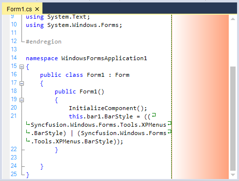
Line wrapping images
In the EditControl, it is possible to associate images to indicate line wrapping. This feature can be turned on by setting the MarkLineWrapping property to true. There are two types of image indicators:
- Images that indicates the line being wrapped. These are displayed at the beginning of the line being wrapped. This can be set by using the CustomWrappedLinesMarkingImage property.
- Images that indicates the point at which the line is being wrapped. This can be set by using the CustomLineWrappingMarkingImage property.
The MarkWrappedLines property in the EditControl is used to indicate whether the wrapped lines should be marked or not.
// Enable images to indicate line wrapping.

this.editControl1.MarkLineWrapping = true;

// Images that indicate the line that is being wrapped.

this.editControl1.CustomWrappedLinesMarkingImage = ((System.Drawing.Image)(resources.GetObject("$this.CustomWordWrap_image")));

// Images that indicate the point at which the line is being wrapped.

this.editControl1.CustomLineWrappingMarkingImage = ((System.Drawing.Image)(resources.GetObject("$this.CustomWordWrap_image")));

// Indicate wrapped lines.

this.editControl1.MarkWrappedLines = true;
' Enable images to indicate line wrapping.
Me.editControl1.MarkLineWrapping = True
' Images that indicate the line that is being wrapped.
Me.editControl1.CustomWrappedLinesMarkingImage = (CType((resources.GetObject("$this.CustomWordWrap_image")), System.Drawing.Image))
' Images that indicate the point at which the line is being wrapped.
Me.editControl1.CustomLineWrappingMarkingImage = (CType((resources.GetObject("$this.CustomWordWrap_image")), System.Drawing.Image))
' Indicate wrapped lines.
Me.editControl1.MarkWrappedLines = True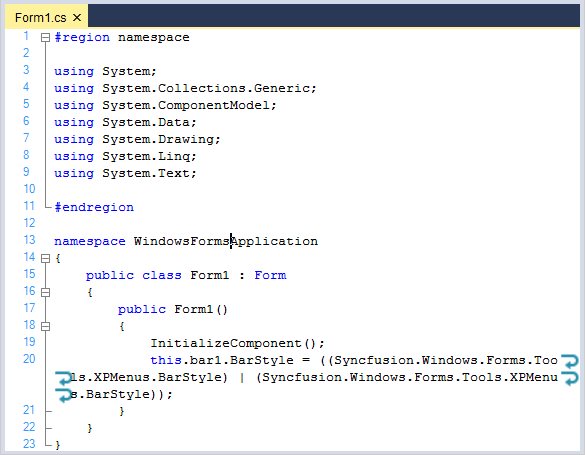
NOTE
Refer to the following sample link that demonstrates the
WordWrapfunctionalities in the EditControl:
C:\Users\<User>\AppData\Syncfusion\EssentialStudio\Version Number\Windows\Edit.Windows\Samples\Text Operations\Word Wrap
Line number
Displays the line number at the start position of line. Line numbers can be automatically assigned to the contents of the EditControl by enabling the ShowLineNumbers property. Its default value is true. The number of lines in the EditControl can be obtained by using the PhysicalLineCount property.
// Assigning Line Numbers to the contents of the EditControl.

this.editControl1.ShowLineNumbers = true;

// Specifies the number of lines in the EditControl.

int actualLineCount = this.editControl1.PhysicalLineCount;
' Assigning Line Numbers to the contents of the EditControl.
Me.editControl1.ShowLineNumbers = True
' Specifies the number of lines in the EditControl.
Dim actualLineCount As Integer = Me.editControl1.PhysicalLineCountCustomize line number appearance
Provides options to customize the foreground, background, and font of line number.
| Properties | Description |
|---|---|
| Specifies the alignment of line numbers. | |
| Specifies the color of line numbers. | |
| Specifies the font of line numbers | |
| Specifies a value indicating whether click on line numbers performs selection. |
// Specify the alignment of line numbers.

this.editControl1.LineNumbersAlignment = Syncfusion.Windows.Forms.Edit.Enums.LineNumberAlignment.Right;

// Assign any color to the line numbers.

this.editControl1.LineNumbersColor = Color.IndianRed;

// Assign any font to the line numbers.

this.editControl1.LineNumbersFont = new Font("Verdana", 9);

// Enabling SelectOnLineNumberClick property to perform selection on clicking the line numbers.

this.editControl1.SelectOnLineNumberClick = true;
' Specify the alignment of line numbers.
Me.editControl1.LineNumbersAlignment = Syncfusion.Windows.Forms.Edit.Enums.LineNumberAlignment.Right
' Assign any color to the line numbers.
Me.editControl1.LineNumbersColor = Color.IndianRed
' Assign any font to the line numbers.
Me.editControl1.LineNumbersFont = new Font("Verdana", 9)
' Enabling SelectOnLineNumberClick property to perform selection on clicking the line numbers.
Me.editControl1.SelectOnLineNumberClick = True
Custom draw line number
Line number can be drawn by using the BeforeLineNumberPaint event. This event comprises with built-in properties to customize bounds, foreground color, graphics, line number, line numbers alignment, and font.
// declare the event

this.editControl1.BeforeLineNumberPaint += EditControl1_BeforeLineNumberPaint;

// event definition

private void EditControl1_BeforeLineNumberPaint(object sender, LineNumberPaintEventArgs e)
{

   if (e.LineNumber % 5 == 0)
   {

      e.Graphics.DrawString(e.LineNumber.ToString(), new Font("Bernard MT Condensed", 15), new SolidBrush(Color.Red), new RectangleF(e.Bounds.Left + 3, e.Bounds.Top + 3, e.Bounds.Width + 20, e.Bounds.Height + 20));
   }
   else
   {
       e.Graphics.DrawString(e.LineNumber.ToString(), new Font("Bernard MT Condensed", 15), new SolidBrush(Color.Blue), new RectangleF(e.Bounds.Left + 3, e.Bounds.Top + 3, e.Bounds.Width + 20, e.Bounds.Height + 20));
   }
       e.Handled = true;
}Me.editControl1.BeforeLineNumberPaint += EditControl1_BeforeLineNumberPaint
// event definition
private Sub EditControl1_BeforeLineNumberPaint(ByVal sender As Object, ByVal e As System.ComponentModel.CancelEventArgs) Handles editControl1.BeforeLineNumberPaint
{
If e.LineNumber % 5 == 0 Then
{
e.Graphics.DrawString(e.LineNumber.ToString(), new Font("Bernard MT Condensed", 15), new SolidBrush(Color.Red), new RectangleF(e.Bounds.Left + 3, e.Bounds.Top + 3, e.Bounds.Width + 20, e.Bounds.Height + 20))
}
Else
{
e.Graphics.DrawString(e.LineNumber.ToString(), new Font("Bernard MT Condensed", 15), new SolidBrush(Color.Blue), new RectangleF(e.Bounds.Left + 3, e.Bounds.Top + 3, e.Bounds.Width + 20, e.Bounds.Height + 20))
}
e.Handled = True
}
Line backcolor
Background format of a line can be customized by using the SetLineBackColor function where line number, fill complete line, or text area and format can be specified.
// Register a backcolor format with EditControl.

IBackgroundFormat format = this.editControl1.RegisterBackColorFormat(Color.Aquamarine, Color.Beige, System.Drawing.Drawing2D.HatchStyle.Cross, true);

// Set the background for the entire line of text.

this.editControl1.SetLineBackColor(5, true, format);
' Register a backcolor format with EditControl.
Dim IBackgroundFormat As format = Me.editControl1.RegisterBackColorFormat(Color.Aquamarine, Color.Beige, System.Drawing.Drawing2D.HatchStyle.Cross, True)
' Set the background for the entire line of text.
Me.editControl1.SetLineBackColor(5, True, format)Background fill formats
Background formats for a line can be defined by using the IBackgroundFormat interface and RegisterBackColorFormat function where format attributes can be specified.
// Register a backcolor format with EditControl.

IBackgroundFormat format = this.editControl1.RegisterBackColorFormat(Color.Aquamarine, Color.Beige, System.Drawing.Drawing2D.HatchStyle.Cross, true);
' Register a backcolor format with EditControl.
Dim IBackgroundFormat As format = Me.editControl1.RegisterBackColorFormat(Color.Aquamarine, Color.Beige, System.Drawing.Drawing2D.HatchStyle.Cross, True)Set line background for current line
Background format can be customized for the current line by using the SetSelectionBackColor function where format for the line can be specified.
// Register a backcolor format with EditControl.

IBackgroundFormat format = this.editControl1.RegisterBackColorFormat(Color.Aquamarine, Color.Beige, System.Drawing.Drawing2D.HatchStyle.Cross, true);

// Set the background for the entire line of text.

this.editControl1.SetLineBackColor(editControl1.CurrentLine, true, format);

// Set the background for the selected block of text.

this.editControl1.SetSelectionBackColor(format);
' Register a backcolor format with EditControl.
Dim IBackgroundFormat As format = Me.editControl1.RegisterBackColorFormat(Color.Aquamarine, Color.Beige, System.Drawing.Drawing2D.HatchStyle.Cross, True)
' Set the background for the entire line of text.
Me.editControl1.SetLineBackColor(editControl1.CurrentLine, True, format)
' Set the background for the selected block of text.
Me.editControl1.SetSelectionBackColor(format)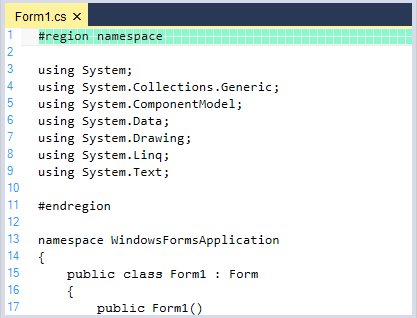
Remove applied line background color
Background format for a line can be removed by using the RemoveLineBackColor function where the line whose format should be removed will be specified.
this.editControl1.RemoveLineBackColor(5);Me.editControl1.RemoveLineBackColor(5)Highlighting current line
You can highlight the current line where the mouse pointer is present by setting the HighlightCurrentLine property to true. Its default value is false. By using the CurrentLineHighlightColor property, you can set color for the highlighted line.
this.editControl1.HighlightCurrentLine = true;

this.editControl1.CurrentLineHighlightColor = Color.Orange;Me.editControl1.HighlightCurrentLine = True
Me.editControl1.CurrentLineHighlightColor = Color.Orange
Underline
The EditControl allows you to underline any desired text in its contents.
Underline formats
Underlines can be of different styles, colors, and weights with each of them being used to convey a different meaning. You can also specify the weight of the underlines to be single or double. The EditControl supports underlines of the following styles:
- Solid
- Dot
- Dash
- Wave
- DashDot
Before applying underlining to the selected text, a custom underlining format has to be defined. The RegisterUnderlineFormat function of ISnippetFormat, registers the custom underline format to be used while underlining a region. Parameters passed in the RegisterUnderlineFormat function are:
The SelectedColor value can be set to any desired color. The SelectedStyle value is specified by using the UnderlineStyle enumerator. The SelectedWeight value is specified by using the UnderlineWeight enumerator.
| EditControl underline enumerator | Description |
|---|---|
| UnderlineStyle | UnderlineStyle.Solid(default),UnderlineStyle.Dot, UnderlineStyle.Dash, UnderlineStyle.Wave, and UnderlineStyle.DashDot |
| UnderlineWeight | UnderlineWeight.Thick(default) and UnderlineWeight.Double |
// Registers the custom underline format.

ISnippetFormat format = editControl1.RegisterUnderlineFormat(Color.Red, UnderlineStyle.Wave, UnderlineWeight.Bold);
' Registers the custom underline format.
Dim format As ISnippetFormat = editControl1.RegisterUnderlineFormat(Color.Red, UnderlineStyle.Wave, UnderlineWeight.Bold)Set up underline for current line
The SetUnderline function is used to set underlining for the selected text region.
// Sets underlining of the specified text region

this.editControl1.SetUnderline(new Point(1, 1), new Point(8, 8), format);
' Sets underlining of the specified text region
Me.editControl1.SetUnderline(New Point(1, 1), New Point(8, 8), format)
Remove applied underline
You can remove the applied underlining region by using the RemoveUnderline function in the EditControl.
// Removes underlining in the specified region

this.editControl1.RemoveUnderline(new Point(1, 1), new Point(8, 8));
' Removes underlining in the specified region
Me.editControl1.RemoveUnderline(New Point(1, 1), New Point(8, 8))Underlining using configuration file
You can also set the underlining from the configuration file.
<formats>
  <format name="Error" Font="Courier New, 10pt" FontColor="Black" underline="Wave" LineColor="Red" />
</formats>

<lexems>
<lexem BeginBlock="#endregion" Type="Error" Priority="-10" />
<lexem BeginBlock="#endif" Type="Error" Priority="-10" />
<lexem BeginBlock="#else" Type="Error" Priority="-10" />
</lexems>
Strike out
The StrikeThrough function helps to draw horizontal line through the vertical center of text. This is a very useful feature in denoting text that was deleted from the original document or highlighting offending code. You can also specify any custom color for the strikethrough line.
// Strikeout the current line.

this.editControl1.StrikeThrough(this.editControl1.CurrentLine, Color.IndianRed);

// Strikeout the text in the specified text range.

this.editControl1.StrikeThrough(new Point(1, 1), new Point(8, 8), Color.Orange);
' Strikeout the current line.
Me.editControl1.StrikeThrough(Me.editControl1.CurrentLine, Color.IndianRed)
' Strikeout the text in the specified text range.
Me.editControl1.StrikeThrough(New Point(1, 1), New Point(8, 8), Color.Orange)To remove the strikethrough line, just call one of the above mentioned functions and specify the Color parameter as Color.Empty.
Bookmark indicators
The EditControl enables user to locate a section or a line of a document for quick access to any part of the contents. This can be enabled or disabled by using the ShowIndicatorMargin property. Its default value is true. To hide the indicator margin turn on its value to false. The MarkerAreaWidth property in the EditControl sets the width of marker area.
// Displays the Indicator margin.

this.editControl1.ShowIndicatorMargin = true;

// Sets the width of the Indicator margin.

this.editControl1.MarkerAreaWidth = 20;
' Displays the Indicator margin.
Me.editControl1.ShowIndicatorMargin = True
' Sets the width of the Indicator margin.
Me.editControl1.MarkerAreaWidth = 20You can either display the default bookmark image (like in Visual Studio.NET) or custom indicator by making use of the following functions of the EditControl.
| Functions | Description |
|---|---|
| Sets bookmark to the current line. | |
| Sets bookmark at the specified line. | |
| Removes bookmark at the specified line. | |
| Specifies the bookmark at the specified line. | |
| Goes to the next bookmark. | |
| Goes to the previous bookmark. | |
| Clears all the bookmarks. |
// Sets bookmark at the specified line.

this.editControl1.BookmarkAdd(this.editControl1.CurrentLine);

// Removes bookmark at the specified line.

this.editControl1.BookmarkRemove(this.editControl1.CurrentLine);

// Draw the bookmark with custom look and feel specified in the BrushInfo object.

BrushInfo brushInfo = new BrushInfo(GradientStyle.ForwardDiagonal, Color.IndianRed, Color.Ivory);

this.editControl1.BookmarkAdd(this.editControl1.CurrentLine, brushInfo);

// Get the Bookmark object of the current line.

IBookmark bookmark = this.editControl1.BookmarkGet(this.editControl1.CurrentLine);
' Sets bookmark at the specified line.
Me.editControl1.BookmarkAdd(Me.editControl1.CurrentLine)
' Removes bookmark at the specified line.
Me.editControl1.BookmarkRemove(Me.editControl1.CurrentLine)
' Draw the bookmark with custom look and feel specified in the BrushInfo object.
Dim brushInfo As BrushInfo = new BrushInfo(GradientStyle.ForwardDiagonal, Color.IndianRed, Color.Ivory)
Me.editControl1.BookmarkAdd(Me.editControl1.CurrentLine, brushInfo)
' Get the Bookmark object of the current line.
Dim bookmark As IBookmark = Me.EditControl1.BookmarkGet(Me.EditControl1.CurrentLine)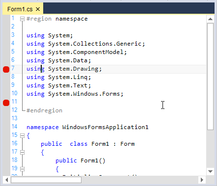
Custom bookmark indicator
The SetCustomBookmark function is used to set Bookmarks. It can also be removed by using the RemoveCustomBookmark function in the EditControl.
Bookmarks can be set by using the SetCustomBookmark function which do not respond to the BookmarkNext and BookmarkPrevious functions automatically. To enable this, set the UseInBookmarkSearch property of the custom bookmark to true.
Color borderColor;

 private void CustomBookmarkPainter(object sender, BookmarkPaintEventArgs e)
 {
      borderColor = ColorTranslator.FromHtml("#f6f6f6");
      SolidBrush brush = new SolidBrush(Color.Red);
      e.Graphics.FillEllipse(brush, e.ClipRectangle.X,e.ClipRectangle.Y,e.ClipRectangle.Width-2,e.ClipRectangle.Height-2);
      e.Graphics.DrawEllipse(new Pen(borderColor,3), e.ClipRectangle.X, e.ClipRectangle.Y, e.ClipRectangle.Width - 2, e.ClipRectangle.Height - 2);
}

// Sets custom bookmarks and enables it to respond to BookmarkNext and BookmarkPrevious functions.

ICustomBookmark customBookmark = this.editControl1.SetCustomBookmark(this.editControl1.CurrentLine, new BookmarkPaintEventHandler(CustomBookmarkPainter));

customBookmark.UseInBookmarkSearch = true;

// Removes the bookmark of the current line.

ICustomBookmark customBookmark = this.editControl1.RemoveCustomBookmark(this.editControl1.CurrentLine, BookmarkPaintEventHandler(CustomBookmarkPainter));
Private Sub CustomBookmarkPainter(ByVal sender As Object, ByVal e As Syncfusion.Windows.Forms.Edit.BookmarkPaintEventArgs)
borderColor = ColorTranslator.FromHtml("#f6f6f6")
SolidBrush brush = new SolidBrush(Color.Red)
e.Graphics.FillEllipse(brush, e.ClipRectangle.X,e.ClipRectangle.Y,e.ClipRectangle.Width-2,e.ClipRectangle.Height-2)
e.Graphics.DrawEllipse(new Pen(borderColor, 3), e.ClipRectangle.X, e.ClipRectangle.Y, e.ClipRectangle.Width - 2, e.ClipRectangle.Height - 2)
End Sub
' Sets custom bookmarks and enables it to respond to BookmarkNext and BookmarkPrevious functions.
Dim customBookmark As ICustomBookmark = Me.editControl1.SetCustomBookmark(Me.editControl1.CurrentLine, New BookmarkPaintEventHandler(CustomBookmarkPainter))
customBookmark.UseInBookmarkSearch = True
' Removes the bookmark of the current line.
Dim customBookmark As ICustomBookmark = Me.editControl1.RemoveCustomBookmark(Me.editControl1.CurrentLine, BookmarkPaintEventHandler(CustomBookmarkPainter))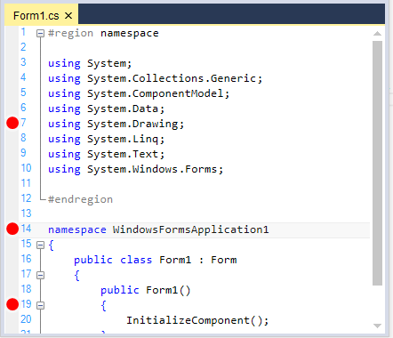
Setting tooltips for bookmarks
Tooltips can be set for bookmarks by using the UpdateBookmarkToolTip event. Tooltips of the bookmarks can be enabled or disabled by using the ShowBookmarkTooltip property.
this.editControl1.UpdateBookmarkToolTip += EditControl1_UpdateBookmarkToolTip;

private void EditControl1_UpdateBookmarkToolTip(object sender, UpdateBookmarkTooltipEventArgs e)
{
   // Tooltip will not be shown, when this text is empty.
    e.Text = "Bookmark Tooltip";
}
AddHandler Me.editControl1.UpdateBookmarkToolTip, AddressOf EditControl1_UpdateBookmarkToolTip
Private Sub editControl1_ConfigurationChanged(ByVal sender As Object, ByVal e As UpdateBookmarkTooltipEventArgs)
' Tooltip will not be shown, when this text is empty.
e.Text = "Bookmark Tooltip"
End Sub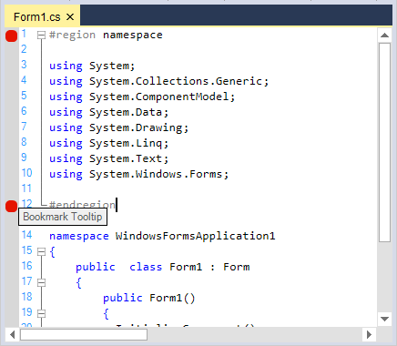
Tooltip background and border color can be customized by using the BookmarkTooltipBackgroundBrush and BookmarkTooltipBorderColor properties in the EditControl.
// Shows the tooltip of the bookmark.

this.editControl1.ShowBookmarkTooltip = true;

// Specifies brush for bookmark tooltip background.

this.editControl1.BookmarkTooltipBackgroundBrush = new Syncfusion.Drawing.BrushInfo(Syncfusion.Drawing.PatternStyle.Percent05, System.Drawing.SystemColors.WindowText, System.Drawing.Color.Violet);

// Specify the color of the bookmark tooltip form border.

this.editControl1.BookmarkTooltipBorderColor = System.Drawing.Color.Red;
' Shows the tooltip of the bookmark.
Me.editControl1.ShowBookmarkTooltip = True
' Specifies brush for bookmark tooltip background.
Me.editControl1.BookmarkTooltipBackgroundBrush = New Syncfusion.Drawing.BrushInfo(Syncfusion.Drawing.PatternStyle.Percent05, System.Drawing.SystemColors.WindowText, System.Drawing.Color.Violet)
' Specify the color of the bookmark tooltip form border.
Me.editControl1.BookmarkTooltipBorderColor = System.Drawing.Color.Red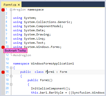
NOTE
Refer to the following sample link that demonstrates the bookmark functionalities in the EditControl:
C:\Users\<User>\AppData\Syncfusion\EssentialStudio\Version Number\Windows\Edit.Windows\Samples\Product Showcase\VisualStudioDemo
Content dividers
Supports content dividers similar to Visual Studio code editor that clearly distinguish content sections with line dividers to improve the code readability. Content Dividers can be enabled or disabled by using the ShowContentDividers property in the EditControl. Its default value is true.
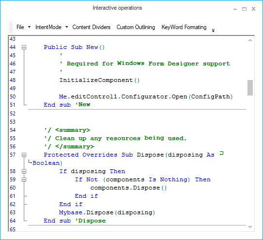
This feature can be enabled for sections of the EditControl contents by setting the ContentDivider field to true within its lexem definition in the configuration file.
// Enable content dividers within its lexem definition in the configuration file.

<lexem BeginBlock="Function" EndBlock="End Function" Type="KeyWord" IsComplex="true" IsCollapsable="true" Indent="true"

        CollapseName="{Function...End Function}" AutoNameExpression='.*Function.*\s+(?<text>\w+)\s*\(' AutoNameTemplate="Function [${text}]"

        IsCollapseAutoNamed="true" ContentDivider="true" >

        <References>

          <reference RefID="777"/>

        </References>

        <SubLexems>

          <lexem BeginBlock="\n" IsBeginRegex="true" />

        </SubLexems>

</lexem>
NOTE
Refer to the following sample link that demonstrates the Content dividers functionalities in the EditControl:
C:\Users\<User>\AppData\Syncfusion\EssentialStudio\Version Number\Windows\Edit.Windows\Samples\Text Operations\Interactive operations
Column guides
Provides support to draw a vertical lines based on the specified column positions that helps to ensure whether the lines do not go beyond a certain length. This can be enabled or hidden by setting the ShowColumnGuides property. Its default value is true. To hide the column guides, turn on its value to false. By using the ColumnGuideItem Collection Editor, specifies the color and the location of the column guides. The font used to calculate the column location is customized by using the ColumnGuidesMeasuringFont property.
// Enable Column Guides.

this.editControl1.ShowColumnGuides = true;

// Specify the color and the location of the Column Guides.

ColumnGuideItem[] columnGuideItem = new ColumnGuideItem[5];

columnGuideItem[0] = new ColumnGuideItem(5, Color.Red);

columnGuideItem[1] = new ColumnGuideItem(10, Color.Red);

columnGuideItem[2] = new ColumnGuideItem(15, Color.Red);

columnGuideItem[3] = new ColumnGuideItem(20, Color.Red);

columnGuideItem[4] = new ColumnGuideItem(25, Color.Red);

this.editControl1.ColumnGuideItems = columnGuideItem;

// Font used to calculate the column location.

this.editControl1.ColumnGuidesMeasuringFont = new Font("Microsoft Sans Serif", 12);
' Enable Column Guides.
Me.editControl1.ShowColumnGuides = True
' Specify the color and the location of the Column Guides.
Dim columnGuideItem As ColumnGuideItem() = New ColumnGuideItem(5) {}
columnGuideItem(0) = New ColumnGuideItem(5, Color.Red)
columnGuideItem(1) = New ColumnGuideItem(10, Color.Red)
columnGuideItem(2) = New ColumnGuideItem(15, Color.Red)
columnGuideItem(3) = New ColumnGuideItem(20, Color.Red)
columnGuideItem(4) = New ColumnGuideItem(25, Color.Red)
Me.editControl1.ColumnGuideItems = columnGuideItem
' Font used to calculate the column location.
Me.editControl1.ColumnGuidesMeasuringFont = New Font("Microsoft Sans Serif",12)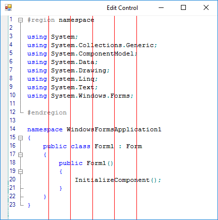
Bracket highlighting
The EditControl has one of the most powerful and intelligent bracket highlighting features. If the cursor is positioned on the end curly brace, most editors will match to the open curly brace in the string. On the contrary, the EditControl matches to the open curly brace for the function. The bracket highlighting feature can be turned on by enabling the ShowIndentationGuidelines or OnlyHighlightMatchingBraces property. Setting the OnlyHighlightMatchingBraces property to true, enables bracket highlighting whereas the indentation guidelines are not displayed.
this.editControl1.ShowIndentationGuidelines = true;

this.editControl1.OnlyHighlightMatchingBraces = true;Me.editControl1.ShowIndentationGuidelines = True
Me.editControl1.OnlyHighlightMatchingBraces = True