How can I help you?
Appearance Settings in Windows Forms Status Bar (StatusBarAdv)
29 Apr 20212 minutes to read
You can enhance the appearance of the StatusBarAdv control by using the following properties.
Style
StatusBarAdv supports Office2016 styles such as Office2016Colorful,Office2016White,Office2016Black and Office2016DarkGray.
//Sample code for setting “Office2016 Colorful” style for StatusBarAdv
this.statusBarAdv1.Style = Syncfusion.Windows.Forms.Tools.StatusbarStyle.Office2016White;Me.statusBarAdv1.Style = Syncfusion.Windows.Forms.Tools.StatusbarStyle.Office2016White;
Background settings
You can customize the StatusBarAdv control’s background by using the various options provided in the BackgroundColor property as follows.
Property Table
| StatusBarAdv Property | Description |
|---|---|
| BackgroundColor | Gets or sets the background gradient and other styles. |
| Style | Specifies the brush style.Solid,Pattern andGradient. |
| BackColor | Specifies the back color of the control. |
| ForeColor | Specifies the fore color for any text or graphics in the control. |
| PatternStyle | Specifies the pattern style of the control. |
| GradientBackground | Indicates whether the background will be drawn with the gradient. |
| GradientStyle | Specifies the gradient style of the background.ForwardDiagonal,BackwardDiagonal,Horizontal,Vertical,PathRectangle andPathEllipse. |
| VerticalGradient | Indicates whether the gradient is vertical. |
| GradientColors | Specifies the gradient colors.The first entry in this list is same as the BackColor property, the last entry is same as the ForeColor property. |
| MetroColor | Gets or sets the Metro color of the StatusBarAdv |
| UseMetroColorAsBorder | Gets or sets whether to set MetroColor as its Border color. |
//To set the Background color of the StatusBarAdv
this.statusBarAdv1.BackgroundColor = new Syncfusion.Drawing.BrushInfo(Syncfusion.Drawing.GradientStyle.PathRectangle, Color.NavajoWhite, Color.IndianRed);

//To set the MetroColor in StatusBarAdv
this.statusBarAdv1.MetroColor = ColorTranslator.FromHtml("#16a5dc");

//To set the MetroColor as Border of the StatusBarAdv
this.statusBarAdv1.UseMetroColorAsBorder = true;
'To set the Background color of the StatusBarAdv
Me.statusBarAdv1.BackgroundColor = New Syncfusion.Drawing.BrushInfo(Syncfusion.Drawing.GradientStyle.PathRectangle, Color.NavajoWhite, Color.IndianRed)
'To set the MetroColor in StatusBarAdv
Me.statusBarAdv1.MetroColor = ColorTranslator.FromHtml("#16a5dc")
'To set the MetroColor as Border of the StatusBarAdv
Me.statusBarAdv1.UseMetroColorAsBorder = True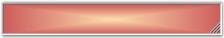

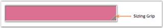
Sizing grip
A sizing grip can be displayed for the StatusBarAdv control using the property given below.
Property Table
| StatusBarAdv Property | Description |
|---|---|
| SizingGrip | Indicates if the sizing grip is visible. |
this.statusBarAdv1.SizingGrip = true;Me.statusBarAdv1.SizingGrip = TrueSizingGrip property when set will display a grip at the bottom right of the control as displayed in the below image.