How can I help you?
Windows Forms Navigation Pane (GroupBar) Control Overview
2 Oct 20233 minutes to read
The GroupBar and GroupView controls abide by the container-client model and are designed to work in perfect synchronization with each other.
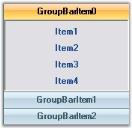
The GroupBar class implements a tab-type container control similar to the Windows Forms TabControl that can serve as a host for other Windows Forms controls. Each control in the GroupBar is represented by a GroupBar Item and navigation between the different controls is accomplished by selecting the corresponding GroupBar Item. Only the selected control is displayed at any particular time.
The GroupBar may be used in combination with the GroupView control to implement clones of some of the popular UI components such as the Microsoft OutlookBar and the Visual Studio .NET toolbox window.
The Essential ToolsGroupBar control displays multiple groups or tabs, each of which represents a client control that is hosted within the GroupBar.
The primary function of the GroupBar is to serve as a container for a group of functionally related controls while allowing only one selected control to be visible at any given time. Groups are implemented as instances of the GroupBarItem class and the collection can be accessed through the GroupBar.GroupBarItems property.
Features
- Custom Colors can be applied for GroupBar control. See Visual Styles topic.
- Appearance and Behavior Settings.
- Settings can be applied to change the look and feel of the GroupBar control and Items.
- Full Appearance support including Alpha-Blending, Gradient Rendering, etc., is provided.
- Various options are provided for customizing the border of the GroupBar and GroupBar Items, scrolling through the GroupBar client controls, highlighting GroupBar Items, etc.
- Provides Flat look and feel of the GroupBar.
- Provides Localization support.
- Link Selection Support:
You can either have a single selected link or several selected links in each individual GroupBar Item. - Text Settings:
Provides options to align the text of the GroupBar Items to the Left , Right, or Center. GroupBar control provides options for renaming the GroupBar Items at run-time. This is described as the In place Renaming feature of the GroupBar control. - Image settings:
Large images can be displayed on the header of the GroupBar. Images can also be displayed on the header of the Stacked GroupBar. - Header Customization:
Different colors can be applied to the header and header text of the GroupBar Items. The font and height of the header of the GroupBar control can also be customized. - Stacked GroupBar:
The GroupBar Items can be displayed in a Stack like fashion. Stacked GroupBar provides a Navigation Pane that can be viewed at the bottom of the Groupbar, which helps one to navigate to different sections of the GroupBar. It displays the selected GroupBar Item’s image on the header of the Stacked GroupBar. - Nested GroupBar:
A GroupBar Control can be added as a Child control to another GroupBar Control. In fact any .NET control can be hosted in a GroupBar for maximum flexibility. Thus the GroupBar control can be deployed as a Generic Control Container. - Visual Styles:
Visual Styles like the Office XP Style, Office 2003 Style and Office 2007 Style are provided. The new Office2007Theme property provides the Office 2007 Visual Style with the color themes Blue, Black, and Silver. - Themes Support:
Using the ThemesEnabled property, themed appearance can be provided for the GroupBar control. - Serialization Support:
Serialization allows the user to save and restore the State information of the GroupBar Items when a GroupBar is in the Stacked Mode.