How can I help you?
Appearance Customization in Windows Forms Menu (Menus)
9 Oct 202315 minutes to read
In this section the appearance customization of the menu and child menu items is discussed.
Customizing images in menu items
The images associated with a menu item can be customized depending upon its state either it is enabled, disabled, highlighted or performed an action upon it.
Adding normal state images
Images can be added to menu items directly via the property Image. The following code snippet shows the image added to a bar item.
barItem1.Image = new ImageExt(Image.FromFile(Application.ExecutablePath + @"\..\..\..\Resources\Copy.ico"));barItem1.Image = New ImageExt(Image.FromFile(Application.ExecutablePath & "\..\..\..\Resources\Copy.ico"))Properties
The below table discuss the image properties of customizing the image associated with a menu item.
| Properties | Description |
|---|---|
ImageList |
Gets or sets the image list associated with a menu a item instance. |
ImageListAdv |
Gets or sets the image list associated with a menu item instance. |
ImageSize |
Gets or sets the size of an image. |
LargeImageList |
Gets or sets the ImageList that contains the images to display in the disabled state, if the bar manager is loaded with large icons mode. |
LargeImageListAdv |
Gets or sets the ImageList that contains the images to display in the disabled state, if the bar manager is loaded with large icons mode. |
ImageIndex |
Gets or sets the index of the image list collections. |
NOTE
By default, the
ImageIndexis set to -1, the corresponding image in the list should be specified with a proper index value.
Adding disabled state images
When a menu item tends to be in a disabled state, a different image can be associated with that menu item via the property DisabledImage. The following code snippet shows the image associated with a disabled state menu item.
barItem1.DisabledImage = new ImageExt(Image.FromFile(Application.ExecutablePath + @"\..\..\..\Resources\New.ico"));barItem1.DisabledImage = New ImageExt(Image.FromFile(Application.ExecutablePath & "\..\..\..\Resources\New.ico"))Properties
The below table discuss the image properties of customizing the disabled state image associated with a menu item.
| Properties | Description |
|---|---|
DisabledImageList |
Gets or sets the ImageList that contains the images to display in the disabled menu item. |
DisabledImageListAdv |
Gets or sets the ImageList that contains the images to display in the disabled menu item. |
DisabledLargeImageList |
Gets or sets the ImageList that contains the images to display in the disabled state, if the bar manager is loaded with large icons mode. |
DisabledLargeImageListAdv |
Gets or sets the ImageList that contains the images to display in the disabled state, if the bar manager is loaded with large icons mode. |
DisabledImageIndex |
Gets or sets the index of the image collections. |
NOTE
By default, the
DisabledImageIndexis set to -1, the corresponding image in the list should be specified with a proper index value.
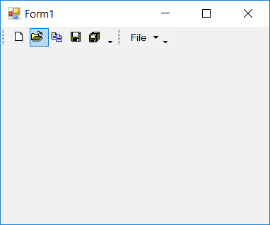
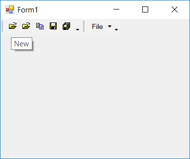
Adding highlighted state images
When a menu item is selected or highlighted, the image associated to the menu item can be set via the HighlightedImage property. The following code snippet shows the image associated with a highlighted state menu item.
barItem1.HighlightedImage = new ImageExt(Image.FromFile(Application.ExecutablePath + @"\..\..\..\Resources\Cut.ico"));barItem1.HighlightedImage = New ImageExt(Image.FromFile(Application.ExecutablePath & "\..\..\..\Resources\Cut.ico"))Properties
The below table discuss the image properties of customizing the selected state image associated with a menu item.
| Properties | Description |
|---|---|
HighlightedImageList |
Gets or sets the ImageList that contains the images to display in the disabled menu item. |
HighlightedImageListAdv |
Gets or sets the ImageList that contains the images to display in the disabled menu item. |
HighlightedLargeImageList |
Gets or sets the ImageList that contains the images to display in the disabled state, if the bar manager is loaded with large icons mode. |
HighlightedImageLargeListAdv |
Gets or sets the ImageList that contains the images to display in the disabled state, if the bar manager is loaded with large icons mode. |
HighlightedImageIndex |
Gets or sets the index of the image collections. |
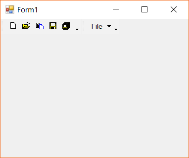
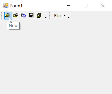
NOTE
By default, the
HighlightedImageIndexis set to -1, the corresponding image in the list should be specified with a proper index value.
Adding pressed state images
When a menu item is pressed, the image associated to the menu item can be set via the PressedImageListAdv property. The following code snippet shows the image associated with a pressed state menu item.
ImageListAdv pressedStateImages = new ImageListAdv();
barItem1.PressedImageIndex = 2;
pressedStateImages.Images.AddRange(new Image[]
{
    Image.FromFile(Application.ExecutablePath + @"\..\..\..\Resources\Cut.ico"),
    Image.FromFile(Application.ExecutablePath + @"\..\..\..\Resources\SaveAll.ico"),
    Image.FromFile(Application.ExecutablePath + @"\..\..\..\Resources\New.ico"),
    Image.FromFile(Application.ExecutablePath + @"\..\..\..\Resources\Save.ico")
});
barItem1.PressedImageListAdv = pressedStateImages;
Dim pressedStateImages As New ImageListAdv()
barItem1.PressedImageIndex = 2
pressedStateImages.Images.AddRange(New Image()
{
Image.FromFile(Application.ExecutablePath & "\..\..\..\Resources\Cut.ico"),
Image.FromFile(Application.ExecutablePath & "\..\..\..\Resources\SaveAll.ico"),
Image.FromFile(Application.ExecutablePath & "\..\..\..\Resources\New.ico"),
Image.FromFile(Application.ExecutablePath & "\..\..\..\Resources\Save.ico")
})
barItem1.PressedImageListAdv = pressedStateImagesProperties
The below table discuss the image properties of customizing the pressed state image associated with a menu item.
| Properties | Description |
|---|---|
PressedLargeImageList |
Gets or sets the ImageList that contains the images to display in the disabled state, if the bar manager is loaded with large icons mode. |
PressedLargeImageListAdv |
Gets or sets the ImageList that contains the images to display in the disabled state, if the bar manager is loaded with large icons mode. |
Customizing bar styles
The menu bar appearance can be customized with the usage scenario depending upon the menu items it holds. The following are the bar styles supported in menu control.
- None
- AllowQuickCustomizing
- IsMainMenu
- MultiLine
- RotateWhenVertical
- Visible
- UseWholeRow
- DrawDragBorder
- IsStatusBar
- TextBelowImage
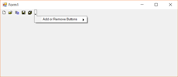
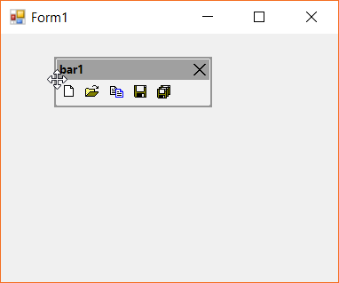
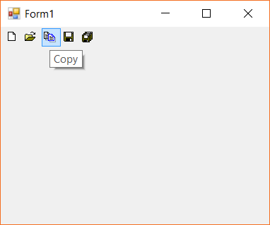
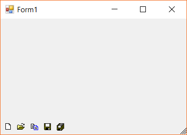
The enum value of BarStyle cam also be adjoined to represent the bar with combined applied styles. The below image shows the bar items are combined with the Visible value.
The below code snippet shows the bar style is being applied with IsMainMenu style.
this.bar1.BarStyle = BarStyle.IsMainMenu | BarStyle.Visible;Me.bar1.BarStyle = BarStyle.IsMainMenu | BarStyle.VisibleCustomizing paint styles
The menu items rendering mode can be customized with the PaintStyle property. The following modes are supported to customize the rendering mode.
- Default mode
- Text only mode
- Text only in menu mode
- Image and text mode
Default mode
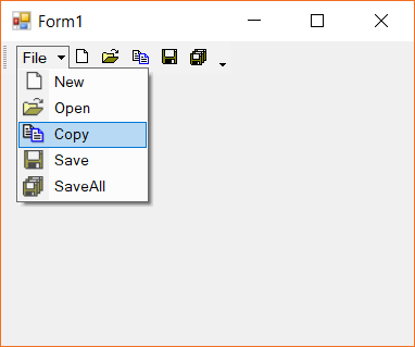
As the name indicates it is the default rendering mode of PaintStyle property. Images are drawn only in the child-menus like drop down menu or from parent menu. Otherwise all the bar will be drawn only with its respective image.
The below image shows that the drop-down menu is rendered with both image and text where as the main menu items are rendered only with images.
Text only mode
This mode ignores the images associated with the menu items. This applies only to the tool bar menu items. The below code snippet shows the menu item is being applied with TextOnly mode.
barItem1.PaintStyle = PaintStyle.TextOnly;barItem1.PaintStyle = PaintStyle.TextOnly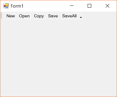
Text only in menu mode
The menu items can be represented as text only specific to the child-menus either from drop down menu or parent menu. The below code snippet shows the menu items are applied with TextOnlyInMenus mode.
barItem1.PaintStyle = PaintStyle.TextOnlyInMenus;barItem1.PaintStyle = PaintStyle.TextOnlyInMenus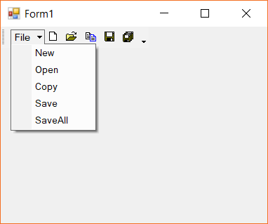
Image and text only mode
Both the image and text are applied to all the menu items either from main menu or child menu. The below code snippet shows the menu items are applied with ImageAndText mode.
barItem1.PaintStyle = PaintStyle.ImageAndText;barItem1.PaintStyle = PaintStyle.ImageAndText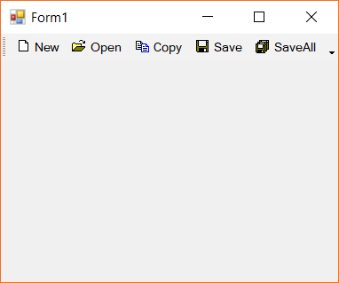
Customizing customize dialog
The Customize Dialog style can be customized with required colors by using the ForeColor, BackColor and Font properties. The below code snippet shows the modified Customize dialog.
this.mainFrameBarManager1.CustomizationDialog.ForeColor = Color.Red;
this.mainFrameBarManager1.CustomizationDialog.BackColor = Color.Black;
this.mainFrameBarManager1.CustomizationDialog.Font = new Font("Times New Roman", 8.5f);Me.mainFrameBarManager1.CustomizationDialog.ForeColor = Color.Red
Me.mainFrameBarManager1.CustomizationDialog.BackColor = Color.Black
this.mainFrameBarManager1.CustomizationDialog.Font = New Font("Times New Roman", 8.5f)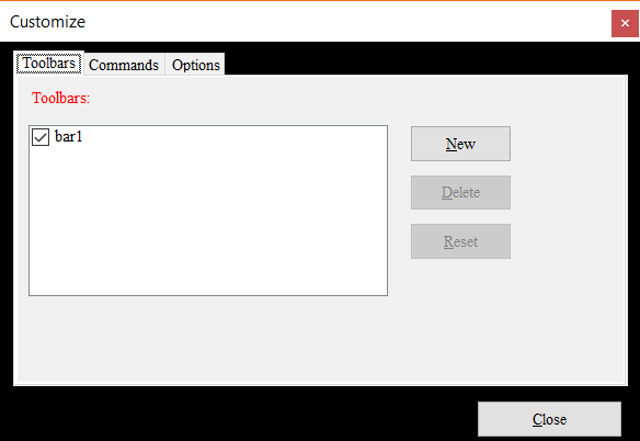
Customizing menu items
The menu items of a tool bar in menu control can be customized. This can be done both design-time and on-demand initialization. This can be done by using the EnableCustomizing property. By default, this is enabled to promote on-demand customization. The below code shows the menu items customization is being disabled.
this.mainFrameBarManager1.EnableCustomizing = false;Me.mainFrameBarManager1.EnableCustomizing = False
The above code could disable the customization to all the bars of the menu control collectively. In order to disable the customize option for a specific bar, the respective bar instance’s AllowCustomizing property should be set to false. The below image shows the customization to bar1 is being disabled while bar2 is not.
this.bar1.AllowCustomizing = false;Me.bar1.AllowCustomizing = False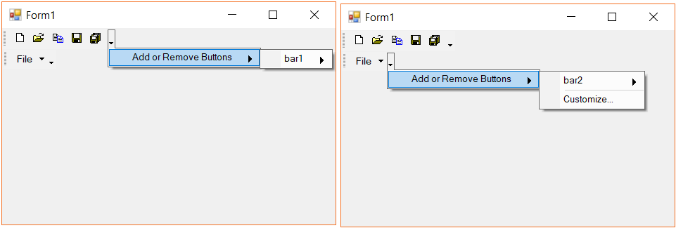
Customizing events
There are two events associated while customizing the menu items. The CustomizingItem property holds the current customizing item.
-
CustomizationBegin- Occurs when the customization of a menu item of a tool bar begins. -
CustomizationDone- Occurs when the customization of a menu item gets completed.
Grouping menu items
The menu items of a tool bar can be grouped together using the SeparatorIndices property. The specific tool bar instance is used to specific the grouping items. The below code snippet shows the menu items are grouped in a tool bar.
this.bar1.SeparatorIndices.Add(3);Me.bar1.SeparatorIndices.Add(3)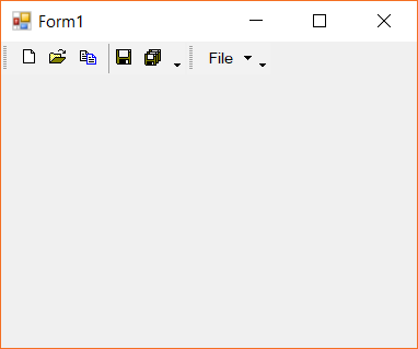
NOTE
The index value represents the menu items incremental value for grouping. Its not likely to be the bar item index value in a tool bar.
Grouping methods
| Method | Description |
|---|---|
BeginGroupAt |
Begins the grouping of menu items from the bar item instance specified. |
RemoveGroupAt |
Removes the grouping of menu items from the bar item instance specified. |
IsGroupBeginning |
Returns a boolean value whether the specified bar item instance is at the begining of the grouping or not. |
ClearSeparators |
Removes every grouping of menu items in a given tool bar. |
Backward compatibility
The menu control supports to customize the appearance and scale modes similar to the older version of the menu control. This can be used by enabling the UseBackwardCompatiblity property.
The color schemes can be modified by applying and customizing the theme colors.