How can I help you?
ComboBoxAdv Options in Windows Forms ComboBoxAdv(Classic)
26 Apr 20215 minutes to read
ComboBoxAdv control has a textbox, that is the edit portion of the control, and a dropdown.
TextBox
ComboBoxAdv control has properties that change the appearance and behavior of the textbox or the edit portion of the control.
Text Appearance
The following properties customize the text in the ComboBoxAdv control.
| ComboBoxAdv TextBox Properties | Description |
|---|---|
| Text | Sets text for the textbox. The text can be set to null to clear the text in the textbox. |
| TextAlign | Sets the alignment of the text in the textbox. |
| ForeColor | Sets the fore color for the text entered in the edit portion of the control. |
//TextBox appearance properties.
this.comboBoxAdv1.TextBox.Text = "Simple text in ComboBoxAdv";
this.comboBoxAdv1.TextBox.TextAlign = HorizontalAlignment.Center;
this.comboBoxAdv1.TextBox.ForeColor = Color.Red;
'TextBox appearance properties.
Me.comboBoxAdv1.TextBox.Text = "Simple text in ComboBoxAdv"
Me.comboBoxAdv1.TextBox.TextAlign = HorizontalAlignment.Center
Me.comboBoxAdv1.TextBox.ForeColor = Color.RedText Selection
The selection of text during runtime can be controlled through the following properties.
| ComboBoxAdv TextBox Properties | Description |
|---|---|
| SelectedText | Sets the currently selected text at runtime. |
| SelectionLength | Sets the number of characters selected in textbox. |
| SelectionStart | Sets the starting point of the text selection. |
//Text selection properties
this.comboBoxAdv1.TextBox.SelectedText = "Combo";
this.comboBoxAdv1.TextBox.SelectionLength = 5;
this.comboBoxAdv1.TextBox.SelectionStart = 2;
'Text selection properties
Me.comboBoxAdv1.TextBox.SelectedText = "Combo"
Me.comboBoxAdv1.TextBox.SelectionLength = 5
Me.comboBoxAdv1.TextBox.SelectionStart = 2ReadOnly Settings
The following properties deal with read-only settings for the ComboBoxAdv control.
| ComboBoxAdv TextBox Properties | Description |
|---|---|
| ReadOnly | Specifies whether the control can be made read-only. By default it is set to false. |
| DropDownStyle | Specifies the dropdown style of the ComboBoxAdv control. Based on its options, it specifies whether the text in the control is editable or not. The styles are,Simple - The text portion is editable. The list portion is always visible.DropDown (default style) - The text portion is editable. Clicking the arrow button displays the list portion.DropDownList - The text portion is not editable. Clicking the arrow button displays the list portion. |
//Read only settings
this.comboBoxAdv1.ReadOnly = true;
this.comboBoxAdv1.DropDownStyle = System.Windows.Forms.ComboBoxStyle.Simple;
'Read only settings
Me.comboBoxAdv1.ReadOnly = True
Me.comboBoxAdv1.DropDownStyle = System.Windows.Forms.ComboBoxStyle.SimpleBehavior Settings
The following properties control the behavior of the text typed in the Textbox.
| ComboBoxAdv Properties | Description |
|---|---|
| NumberOnly | Specifies whether you can enter only numbers in the edit portion of the ComboBoxAdv. |
| CharacterCasing | Specifies the case of the characters that are entered in the textbox. The options are, Normal - Characters are left unchanged,UpperCase - Changes the case of the characters to UPPERCASE andLowerCase - Changes the case of the characters to LOWERCASE. |
| TextBox.HideSelection | When it is set to false, it highlights the selected text in the edit portion, even if the control losses focus. |
| TextBox.WordWrap | Indicates whether the textbox automatically wraps words to the beginning of the next line. Note that the multiline property should be set to true, to make the word wrap feature effective. |
| AllowNewText | Indicates whether you are allowed to enter new text at run time. |
| MaxLength | Specifies the maximum number of characters allowed in the edit portion of the ComboBoxAdv control. Default (32767). |
//TextBox behavior settings
this.comboBoxAdv1.NumberOnly = true;
this.comboBoxAdv1.CharacterCasing = CharacterCasing.Upper;
this.comboBoxAdv1.TextBox.HideSelection = false;
this.comboBoxAdv1.TextBox.WordWrap = true;
this.comboBoxAdv1.AllowNewText = true;
this.comboBoxAdv1.MaxLength = 32766;
'TextBox behavior settings
Me.comboBoxAdv1.NumberOnly = True
Me.comboBoxAdv1.CharacterCasing = CharacterCasing.Upper
Me.comboBoxAdv1.TextBox.HideSelection = False
Me.comboBoxAdv1.TextBox.WordWrap = True
Me.comboBoxAdv1.AllowNewText = True
Me.comboBoxAdv1.MaxLength = 32766Banner Text Support
You can set banner text for the ComboBoxAdv control. Refer to BannerTextProvider Component topic for more details.

DropDown Settings
Dropdown for the ComboBoxAdv control can be customized using the following properties.
| ComboBoxAdv Properties | Description |
|---|---|
| DropDownWidth | Specifies the width of the dropdown. Default value is 100. |
| IntegralHeight | Indicates whether the list portion has complete items only, that is when this property is set to true, it displays only those items that are fully visible in terms of height. |
| MaxDropDownItems | Maximum number of entries that can be displayed in the dropdown. Set image for the dropdown items. Refer Image Settings topic. |
| Sorted | When set to true, it sorts the dropdown items in the alphabetical order. |
//DropDown settings
this.comboBoxAdv1.DropDownWidth = 200;
this.comboBoxAdv1.IntegralHeight = true;
this.comboBoxAdv1.MaxDropDownItems = 5;
this.comboBoxAdv1.Sorted = true;
'DropDown settings
Me.comboBoxAdv1.DropDownWidth = 200
Me.comboBoxAdv1.IntegralHeight = True
Me.comboBoxAdv1.MaxDropDownItems = 5
Me.comboBoxAdv1.Sorted = True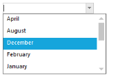
NOTE
Data for the dropdown can be set using Items property.
Refer Data Settings for details. To know about different dropdown styles available for the control, see ReadOnly Settings section in TextBox topic.