Tooltip
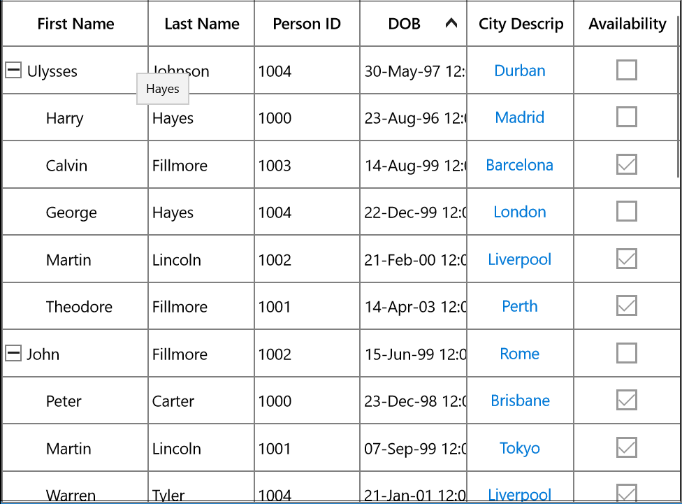
Tooltip supports showing the pop-up window that displays the information when the mouse hovers over a cell of the SfTreeGrid.
Record cell tooltip
You can enable tooltip for the TreeGridCell by setting the [SfTreeGrid.ShowToolTip](https://help.syncfusion.com/cr/uwp/Syncfusion.UI.Xaml.Grid.SfGridBase.html#Syncfusion_UI_Xaml_Grid_SfGridBase_ShowToolTip “”) property to true.
<syncfusion:SfTreeGrid Name="treeGrid"
                       AutoExpandMode="RootNodesExpanded"
                       AutoGenerateColumns="False"
                       ShowToolTip="True"
                       ChildPropertyName="Children"
                       ColumnSizer="Star"
ItemsSource="{Binding EmployeeDetails}">this.treeGrid.ShowToolTip = true;You can enable the tooltip of a particular column by setting the [TreeGridColumn.ShowToolTip](https://help.syncfusion.com/cr/uwp/Syncfusion.UI.Xaml.Grid.GridColumnBase.html#Syncfusion_UI_Xaml_Grid_GridColumnBase_ShowToolTip “”) property to true.
<syncfusion:SfTreeGrid.Columns>
        <syncfusion:TreeGridTextColumn HeaderText="First Name"
                                       MappingName="FirstName"
                                       ShowHeaderToolTip="True" />
</syncfusion:SfTreeGrid.Columns>this.treeGrid.Columns["FirstName"].ShowToolTip = true;
this.treeGrid.Columns["LastName"].ShowToolTip = true;NOTE
It has higher priority than [SfTreeGrid.ShowToolTip](https://help.syncfusion.com/cr/uwp/Syncfusion.UI.Xaml.Grid.SfGridBase.html#Syncfusion_UI_Xaml_Grid_SfGridBase_ShowToolTip “”)
Header tooltip
You can enable the tooltip of a header cell by setting the TreeGridColumn.ShowHeaderToolTip property to true.
<syncfusion:SfTreeGrid.Columns>
                <syncfusion:TreeGridTextColumn
                                     HeaderText="First Name"
                                     MappingName="FirstName"
                                     ShowHeaderToolTip="True" />
</syncfusion:SfTreeGrid.Columns>this.treeGrid.Columns["FirstName"].ShowHeaderToolTip = true;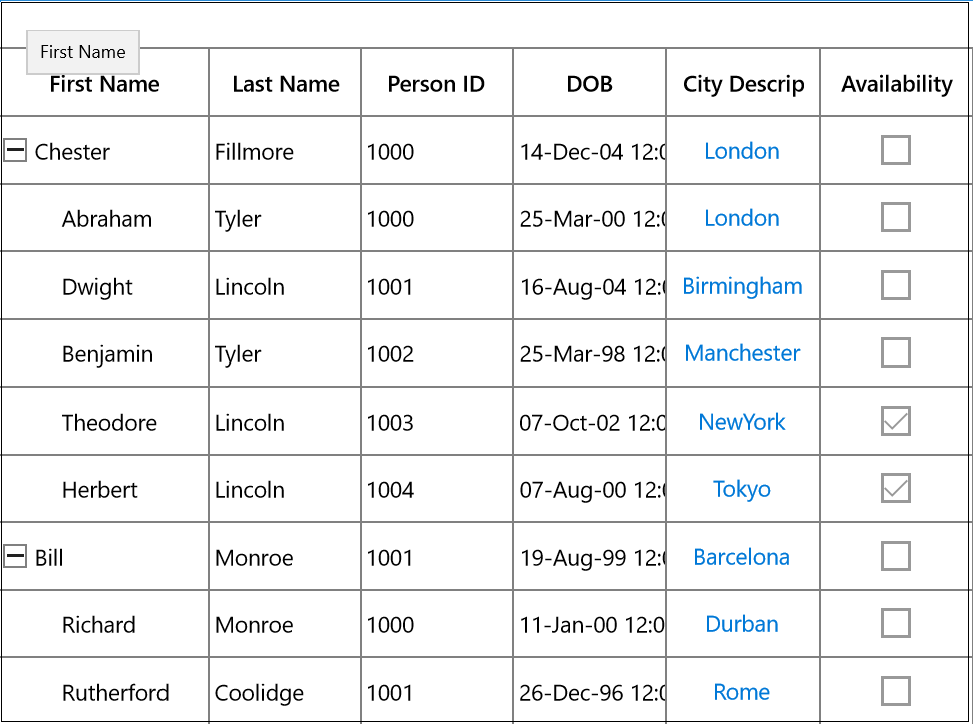
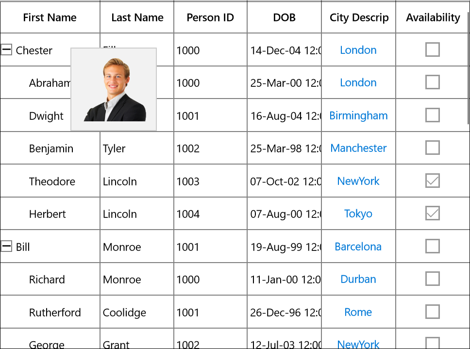
Tooltip customization
You can customize the template of ToolTip by using the TreeGridColumn.ToolTipTemplate and TreeGridColumn.ToolTipTemplateSelector properties.
Customize the tooltip using ToolTipTemplate
You can customize appearance of the tooltip of a particular column by setting the TreeGridColumn.ToolTipTemplate. You can also customize appearance of the header tooltip of a particular column by using the TreeGridColumn.HeaderToolTipTemplate has the following properties to reuse the same template for all the columns:
- Record: Gets the underlying data record of a row which has the cell.
- Value: Gets the underlying value of a cell.
<Page.Resources>
        <local:StringToImageConverter x:Key="ImageConverter" />
        <DataTemplate x:Key="TemplateToolTip">
            <Image Height="100" Width="100" Source="{Binding LastName, Converter= {StaticResource ImageConverter}}" />
        </DataTemplate>
 </Page.Resources>

<syncfusion:TreeGridTextColumn HeaderText="Last Name"
                               MappingName="LastName"
                               ShowToolTip="True"
                               ToolTipTemplate="{StaticResource TemplateToolTip}"/>
public class StringToImageConverter : IValueConverter
{
public object Convert(object value, Type targetType, object parameter, string language)
{
string image = value.ToString();
return @"Assets\" + image + @".png";
}
public object ConvertBack(object value, Type targetType, object parameter, string language)
{
return value;
}
}
You can get the sample [here](http://www.syncfusion.com/downloads/support/directtrac/general/ze/ToolTipTemplateDemo298673222.zip# “”).
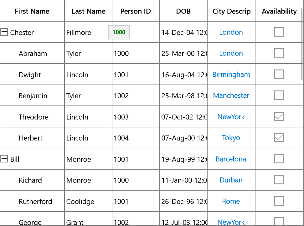
Customize the ToolTip with ToolTipTemplateSelector
Different tooltip templates can be loaded conditionally in same column based on the data by setting the [TreeGridColumn.ToolTipTemplateSelector ](https://help.syncfusion.com/cr/uwp/Syncfusion.UI.Xaml.Grid.GridColumnBase.html#Syncfusion_UI_Xaml_Grid_GridColumnBase_ToolTipTemplateSelector ““)property.
<Page.Resources>
<DataTemplate x:Key="ToolTip1">
<Grid>
<TextBlock Text="{Binding Record.Id}" FontWeight="Bold" Foreground="Red" />
</Grid>
</DataTemplate>
<DataTemplate x:Key="ToolTip2">
<Grid>
<TextBlock Text="{Binding Record.Id}" FontWeight="Bold" Foreground="Green"/>
</Grid>
</DataTemplate>
</Page.Resources>
<syncfusion:TreeGridTextColumn HeaderText="Person ID"
MappingName="Id"
ShowToolTip="True"
SetCellBoundToolTip="True" >
<syncfusion:TreeGridTextColumn.ToolTipTemplateSelector>
<local:ToolTipTemplateSelector AlternateTemplate="{StaticResource ToolTip2}"
DefaultTemplate="{StaticResource ToolTip1}" />
</syncfusion:TreeGridTextColumn.ToolTipTemplateSelector>
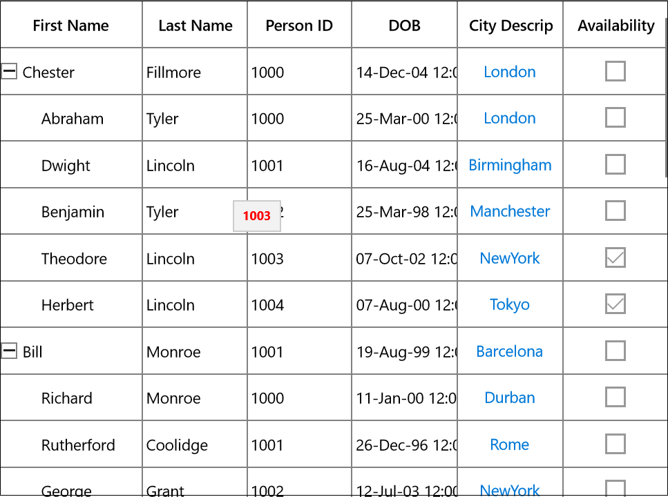
</syncfusion:TreeGridTextColumn>The following image shows the DefaultTemplate applied through ToolTipTemplateSelector.
The following image shows the AlternateTemplate applied through ToolTipTemplateSelector.
You can get the sample [here](http://www.syncfusion.com/downloads/support/directtrac/general/ze/ToolTipTemplateSelectorDemo-651257281.zip# “”).
Events
CellToolTipOpening event
The CellToolTipOpening event occurs when any tooltip of the cell is opened. The CellToolTipOpening event receives the [TreeGridCellToolTipOpeningEventArgs ](https://help.syncfusion.com/cr/uwp/Syncfusion.UI.Xaml.TreeGrid.TreeGridCellToolTipOpeningEventArgs.html# ““)as argument which has the following properties:
- Column: Gets the hovered cell column in the SfTreeGrid.
- Node: Gets the hovered cell node.
- Record: Gets the data context of hovered cell.
- RowColumnIndex: Gets the row and column index of the hovered cell.
- ToolTip: Gets the tooltip of the hovered cells.
<syncfusion:SfTreeGrid Name="treeGrid"
                       AutoExpandMode="RootNodesExpanded"
                       CellToolTipOpening="TreeGrid_CellToolTipOpening"
                       AutoGenerateColumns="False"
                       ChildPropertyName="Children"
                       ColumnSizer="Star"
ItemsSource="{Binding EmployeeDetails}">this.treeGrid.CellToolTipOpening += TreeGrid_CellToolTipOpening;
private void TreeGrid_CellToolTipOpening(object sender, Syncfusion.UI.Xaml.TreeGrid.TreeGridCellToolTipOpeningEventArgs e)
{
}