How can I help you?
Rows in UWP TreeGrid (SfTreeGrid)
28 Feb 202524 minutes to read
This section explains about various row types in treegrid and its customizations.
Rows in UWP TreeGrid (SfTreeGrid)
28 Feb 202524 minutes to read
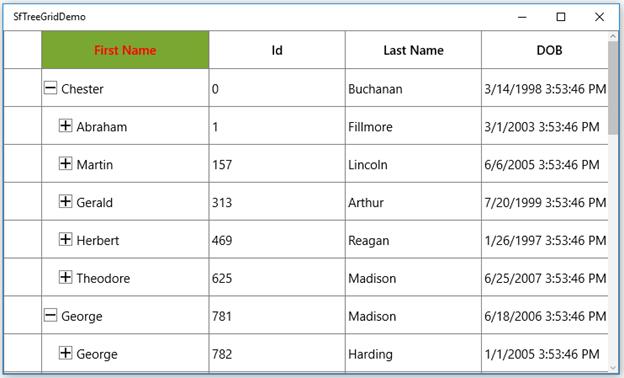
RowHeader is a special column used to indicate the status of row (current row, editing status, errors in row, etc.) which is placed as first cell of each row. You can show or hide the row header by setting SfTreeGrid.ShowRowHeader property.
<syncfusion:SfTreeGrid Name="treeGrid"
                                       AutoExpandMode="AllNodesExpanded"
                                       AutoGenerateColumns="False"
                                       ShowRowHeader="True"
                                       ChildPropertyName="Children"
                                       ColumnSizer="Star"
                                       ItemsSource="{Binding PersonDetails}"/>
Row indicators and its description
| Row Indicator | Description |
|---|---|

|
Denotes the row which has current cell or selected item. |

|
Denotes row is being edited. |

|
Denotes the row has errors. |

|
Denotes that the current row which has errors. |
Show row index in row header
You can display the row index value in row header by customizing the TreeGridRowHeaderCell style with the binding of RowIndex to TextBlock.Text property.
<Style TargetType="syncfusion:TreeGridRowHeaderCell">
            <Setter Property="Background" Value="Transparent" />
            <Setter Property="BorderBrush" Value="Gray" />
            <Setter Property="BorderThickness" Value="0,0,1,1" />
            <Setter Property="Padding" Value="0" />
            <Setter Property="IsTabStop" Value="False" />
            <Setter Property="Template">
                <Setter.Value>
                    <ControlTemplate TargetType="syncfusion:TreeGridRowHeaderCell">
                        <Border x:Name="PART_RowHeaderCellBorder"
                            Background="{TemplateBinding Background}"
                            BorderBrush="{TemplateBinding BorderBrush}"
                            BorderThickness="{TemplateBinding BorderThickness}">

                           <Grid>
                                <!--RowIndex is displayed here -->
                                <TextBlock HorizontalAlignment="Center"
                                        VerticalAlignment="Center"
                                        Text="{Binding RowIndex,
                                                          RelativeSource={RelativeSource TemplatedParent}}"
                                        TextAlignment="Center" />
                            </Grid>

                        </Border>
                    </ControlTemplate>
                </Setter.Value>
            </Setter>
        </Style>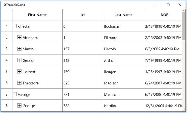
Rows in UWP TreeGrid (SfTreeGrid)
28 Feb 202524 minutes to read
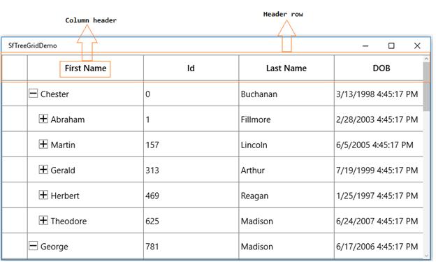
Header row is present in top of the treegrid which has column headers in it. Column header describes the caption to identify the column content.
Hiding header row
You can hide the header row by setting SfTreeGrid.HeaderRowHeight as 0 (zero).
<syncfusion:SfTreeGrid Name="treeGrid"
                                       AutoExpandMode="AllNodesExpanded"
                                       AutoGenerateColumns="False"
                                       ShowRowHeader="True"
                                       HeaderRowHeight="0"
                                       ChildPropertyName="Children"
                                       ColumnSizer="Star"
                                       ItemsSource="{Binding PersonDetails}">
Change the position of sort icon in header cell
By default, the sort icon appears at the right of the header text. You can change the default position to left of the header text by customizing the TreeGridHeaderCell style.
<Style TargetType="syncfusion:TreeGridHeaderCell">
            <Setter Property="Background" Value="{StaticResource HeaderBackgroundBrush}" />
            <Setter Property="Foreground" Value="{StaticResource HeaderForegroundBrush}" />
            <Setter Property="BorderBrush" Value="{StaticResource HeaderBorderBrush}" />
            <Setter Property="BorderThickness" Value="0,0,1,1" />
            <Setter Property="HorizontalContentAlignment" Value="Center" />
            <Setter Property="Padding" Value="5,3,5,3" />
            <Setter Property="FontSize" Value="14" />
            <Setter Property="FontWeight" Value="Normal" />
            <Setter Property="IsTabStop" Value="False" />
            <Setter Property="Template">
                <Setter.Value>
                                          <ControlTemplate TargetType="syncfusion:TreeGridHeaderCell">
                        <Grid>
                            <Grid.LayoutTransform>
                                <RotateTransform Angle="90"/>
                            </Grid.LayoutTransform>
                            <Border x:Name="PART_FooterCellBorder"
                                Background="{TemplateBinding Background}"
                                BorderBrush="{TemplateBinding BorderBrush}" />
                            <Border x:Name="PART_HeaderCellBorder"
                                Background="{TemplateBinding Background}"
                                BorderBrush="{TemplateBinding BorderBrush}"
                                BorderThickness="{TemplateBinding BorderThickness}"
                                SnapsToDevicePixels="True">
                                               <Grid Margin="{TemplateBinding Padding}" SnapsToDevicePixels="True">
                                    <Grid.ColumnDefinitions>
                                        <ColumnDefinition Width="*" />
                                        <ColumnDefinition Width="Auto" />
                                    </Grid.ColumnDefinitions>
                                    <ContentPresenter    Grid.Column="1"
 HorizontalAlignment="{TemplateBinding HorizontalContentAlignment}"
                                                  VerticalAlignment="Center"
                                                  Focusable="False" />
                                    <Grid x:Name="PART_SortButtonPresenter"
                                      SnapsToDevicePixels="True">
                                        <Grid.ColumnDefinitions>
                                            <ColumnDefinition Width="0" MinWidth="{Binding Path=SortDirection, Mode=OneWay, RelativeSource={RelativeSource TemplatedParent}, Converter={StaticResource sortDirectionToWidthConverter}}" />
                                            <ColumnDefinition Width="*" />
                                        </Grid.ColumnDefinitions>

                                        <Path Width="8.938"
                                          Height="8.138"
                                          HorizontalAlignment="Center"
                                          VerticalAlignment="Center"
                                          Data="F1M753.644,-13.0589L753.736,-12.9639 753.557,-12.7816 732.137,8.63641 732.137,29.7119 756.445,5.40851 764.094,-2.24384 764.275,-2.42352 771.834,5.1286 796.137,29.4372 796.137,8.36163 774.722,-13.0589 764.181,-23.5967 753.644,-13.0589z"
                                          Fill="{TemplateBinding Foreground}"
                                          SnapsToDevicePixels="True"
                                          Stretch="Fill"
                                          Visibility="{Binding Path=SortDirection,
                                                               RelativeSource={RelativeSource TemplatedParent},
                                                               ConverterParameter=Ascending,
                                                               Converter={StaticResource sortDirectionToVisibilityConverter}}">
                                            <Path.RenderTransform>
                                                <TransformGroup>
                                                    <TransformGroup.Children>
                                                        <RotateTransform Angle="0" />
                                                        <ScaleTransform ScaleX="1" ScaleY="1" />
                                                    </TransformGroup.Children>
                                                </TransformGroup>
                                            </Path.RenderTransform>
                                        </Path>

                                        <Path Width="8.938"
                                          Height="8.138"
                                          HorizontalAlignment="Center"
                                          VerticalAlignment="Center"
                                          Data="F1M181.297,177.841L181.205,177.746 181.385,177.563 202.804,156.146 202.804,135.07 178.497,159.373 170.847,167.026 170.666,167.205 163.107,159.653 138.804,135.345 138.804,156.42 160.219,177.841 170.76,188.379 181.297,177.841z"
                                          Fill="{TemplateBinding Foreground}"
                                          SnapsToDevicePixels="True"
                                          Stretch="Fill"
                                          Visibility="{Binding Path=SortDirection,
                                                               RelativeSource={RelativeSource TemplatedParent},
                                                               ConverterParameter=Decending,
                                                               Converter={StaticResource sortDirectionToVisibilityConverter}}">
                                            <Path.RenderTransform>
                                                <TransformGroup>
                                                    <TransformGroup.Children>
                                                        <RotateTransform Angle="0" />
                                                        <ScaleTransform ScaleX="1" ScaleY="1" />
                                                    </TransformGroup.Children>
                                                </TransformGroup>
                                            </Path.RenderTransform>
                                        </Path>

                                        <TextBlock Grid.Column="1"
                                               Margin="0,-4,0,0"
                                               VerticalAlignment="Center"
                                               FontSize="10"
                                               Foreground="{TemplateBinding Foreground}"
                                               SnapsToDevicePixels="True"
                                               Text="{TemplateBinding SortNumber}"
                                               Visibility="{TemplateBinding SortNumberVisibility}" />

                                    </Grid>
                                </Grid>
                            </Border>
</Grid>
                    </ControlTemplate>
                </Setter.Value>
            </Setter>
        </Style>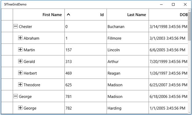
Customize style of header row
You can change the header cell background and foreground for specific column or an entire grid by using HeaderStyle property.
<syncfusion:Window.Resources>
        <Style TargetType="syncfusion:TreeGridHeaderCell" x:Key="headerStyle">
            <Setter Property="Background" Value="#FF7AA732"/>
            <Setter Property="Foreground" Value="Red"/>
        </Style>
</syncfusion:Window.Resources>

<syncfusion:SfTreeGrid Name="treeGrid"
                                       AutoExpandMode="AllNodesExpanded"
                                       AutoGenerateColumns="False"
                                       HeaderStyle="{StaticResource headerStyle}"
                                       ChildPropertyName="Children"
                                       ColumnSizer="Star"
                                       ItemsSource="{Binding PersonDetails}">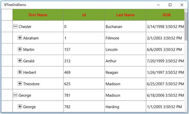
You can change the style of the particular column header by using the HeaderStyle property in column,
<syncfusion:TreeGridTextColumn HeaderText="First Name" HeaderStyle="{StaticResource headerStyle}" MappingName="FirstName" />