ColumnTypes in UWP TreeGrid (SfTreeGrid)
17 Jul 202624 minutes to read
SfTreeGrid provides support for various built-in column types. Each column has its own properties and renderer to handle different types of data.
You can also add or override existing columns and renderers as you need.
| Column Type | Renderer | Description |
|---|---|---|
| Use to display the string data. | ||
| Use to display the numeric data. | ||
| Use to display the date time value. | ||
| Use to display the IEnumerable data using ComboBox. | ||
| Use to display the boolean type data. | ||
| Use to display the URI data. | ||
| Use to display the custom template-specified content. |
TreeGridColumn
TreeGridColumn is an abstract class provides base functionalities for all the column types in SfTreeGrid.
Mapping column to particular property
Column can be bound to a property in data object using TreeGridColumn.MappingName property. In addition, it supports to format or bind different property for display and edit mode separately via TreeGridColumn.DisplayBinding and TreeGridColumn.ValueBinding.
When you set MappingName, DisplayBinding and ValueBinding are created based on MappingName, if these properties are not defined explicitly.
You can use DisplayBinding property to format the column in display, by setting Converter property of Binding.
<syncfusion:TreeGridTextColumn DisplayBinding="{Binding Salary,
                                                        Converter={StaticResource converter}}"
                                HeaderText="Salary"
                                MappingName="Salary" />
public class DisplayBindingConverter : IValueConverter
{
public object Convert(object value, Type targetType, object parameter, string language)
{
return string.Format("{0:C2}", value);
}
public object ConvertBack(object value, Type targetType, object parameter, string language)
{
return value;
}
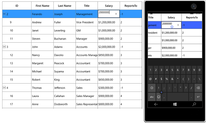
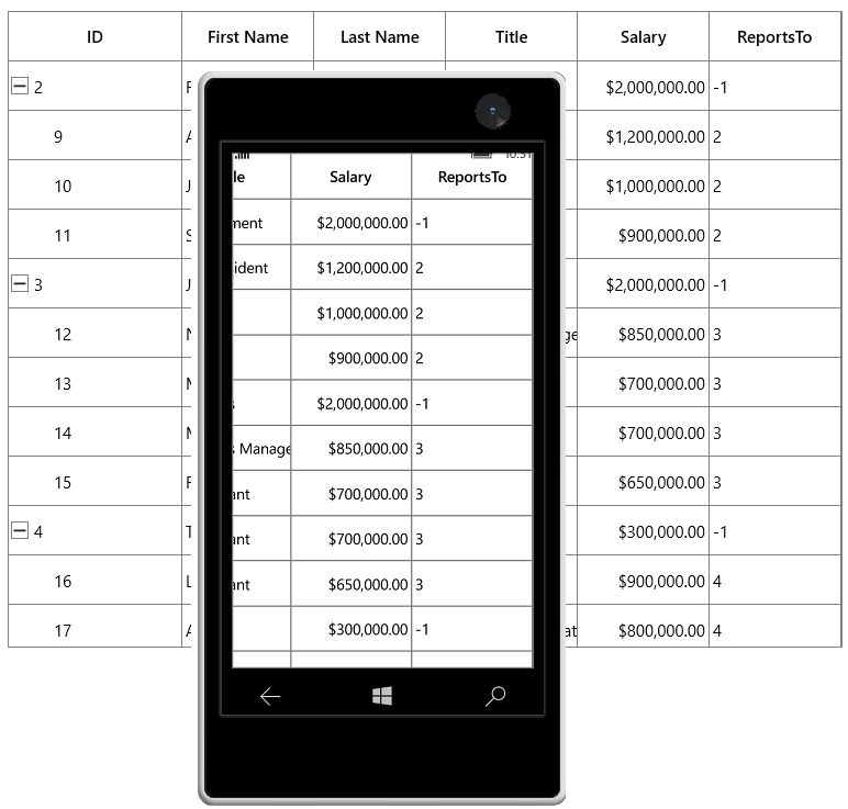
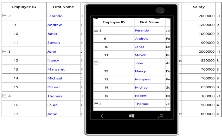
}In the below screenshot, Salary column display value is formatted to currency by setting DisplayBinding property.
By default, Columns handling the data operations (sorting) based on MappingName property.
CellTemplate in TreeGridColumn
You can load any UWP control in the display mode for all columns by setting TreeGridColumn.CellTemplate property. In edit mode, corresponding editor will be loaded based on column type.
In the below code snippet, TreeGridNumericColumn is loaded with ProgressBar and TextBlock. When you start editing DoubleTextBox will be loaded as Editor.
<syncfusion:SfTreeGrid Name="treeGrid"
                AllowEditing="True"
                AutoExpandMode="AllNodesExpanded"
                AutoGenerateColumns="False"
                ChildPropertyName="ReportsTo"
                ItemsSource="{Binding Employees}"
                ParentPropertyName="ID">
    <syncfusion:SfTreeGrid.Columns>
        <syncfusion:TreeGridNumericColumn MappingName="Salary">
            <syncfusion:TreeGridNumericColumn.CellTemplate>
                <DataTemplate>
                    <Grid>
                        <ProgressBar x:Name="progressBar"
                                Height="50"
                                Background="Transparent"
                                BorderThickness="0"
                                Maximum="5000000"
                                Minimum="0"
                                Visibility="Visible"
                                Value="{Binding Path=Salary}" />
                        <TextBlock HorizontalAlignment="Right"
                            VerticalAlignment="Center"
                            Text="{Binding Path=Salary}"
                            TextAlignment="Center" />
                    </Grid>
                </DataTemplate>
            </syncfusion:TreeGridNumericColumn.CellTemplate>
        </syncfusion:TreeGridNumericColumn>
    </syncfusion:SfTreeGrid.Columns>
</syncfusion:SfTreeGrid>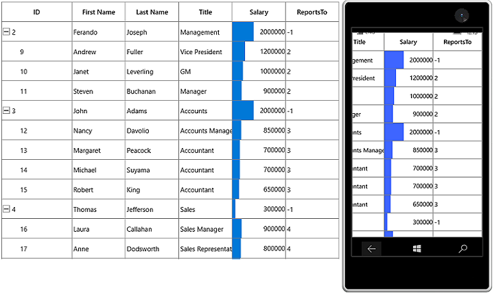
CellTemplate is not support by TreeGridHyperlinkColumn and TreeGridCheckboxColumn columns.
Reusing same DataTemplate for multiple columns
By default, underlying record is DataContext for CellTemplate. So you have to define, template for each column to display values based on MappingName.
You can use the same DataTemplate for all columns to display value based on MappingName by setting TreeGridColumn.SetCellBoundValue property to true. Setting SetCellBoundValue to true, changes the DataContext for CellTemplate to DataContextHelper which has the following members,
-
Value- Return the value base onMappingName. -
Record- Returns the underlying data object.
<Page.Resources>
    <DataTemplate x:Key="cellTemplate">
        <TextBlock Margin="3,0,0,0"
                    Foreground="Red"
                    Text="{Binding Path=Value}" />
    </DataTemplate>
</Page.Resources>
<syncfusion:SfTreeGrid Name="treeGrid"
                        AutoExpandMode="AllNodesExpanded"
                        ChildPropertyName="ReportsTo"
                        ItemsSource="{Binding Employees}"
                        ParentPropertyName="ID">
    <syncfusion:SfTreeGrid.Columns>
        <syncfusion:TreeGridTextColumn CellTemplate="{StaticResource cellTemplate}"
                                        HeaderText="ID"
                                        MappingName="ID"
                                        SetCellBoundValue="True"
                                        TextAlignment="Left" />
        <syncfusion:TreeGridTextColumn HeaderText="First Name" MappingName="FirstName" />
        <syncfusion:TreeGridTextColumn CellTemplate="{StaticResource cellTemplate}"
                                        HeaderText="Last Name"
                                        MappingName="LastName"
                                        SetCellBoundValue="True" />
    </syncfusion:SfTreeGrid.Columns>
</syncfusion:SfTreeGrid>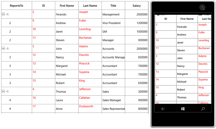
Setting CellTemplate based on custom logic using TemplateSelector
TreeGridColumn provides support to choose differentDataTemplate based on underlying data object using TreeGridColumn.CellTemplateSelector property.
For example, two different templates loaded alternatively in Salary column.
<Application.Resources>
    <local:CustomCellTemplateSelector x:Key="cellTemplateSelector" />

    <DataTemplate x:Key="DefaultTemplate">
        <TextBlock Foreground="Red"
                    Text="{Binding Path=Salary}"
                    TextAlignment="Center" />
    </DataTemplate>

    <DataTemplate x:Key="AlternateTemplate">
        <TextBlock Foreground="Green"
                    Text="{Binding Path=Salary}"
                    TextAlignment="Center" />
    </DataTemplate>

</Application.Resources>
Below code returns the DefaultTemplate and AlternateTemplate based on Salary’s value.
public class CustomCellTemplateSelector:DataTemplateSelector
{

    protected override DataTemplate SelectTemplateCore(object item, DependencyObject container)
    {

        if (item == null)
            return null;
        var data = item as EmployeeInfo;

        if (data.Salary < 1000000)
            return App.Current.Resources["AlternateTemplate"] as DataTemplate;

        else
            return App.Current.Resources["DefaultTemplate"] as DataTemplate;
    }
}
In the below code, the custom template selector set to TreeGridColumn.CellTemplateSelector.
<syncfusion:SfTreeGrid Name="treeGrid"
                        AutoExpandMode="AllNodesExpanded"
                        ChildPropertyName="ReportsTo"
                        ItemsSource="{Binding Employees}"
                        ParentPropertyName="ID">
    <syncfusion:SfTreeGrid.Columns>
        <syncfusion:TreeGridNumericColumn CellTemplateSelector="{StaticResource cellTemplateSelector}"
                                          MappingName="Salary"/>
    </syncfusion:SfTreeGrid.Columns>
</syncfusion:SfTreeGrid>
NOTE
Non-Editable columns does not support
CellTemplate.

Binding ViewModel properties with CellTemplate
You can bind properties in ViewModel with the controls in CellTemplate.
Below command defined in ViewModel is bound to Button inside CellTemplate. Below code, denote the base command.
public class BaseCommand : ICommand
{
    #region Fields
    readonly Action<object> _execute;
    readonly Predicate<object> _canExecute;
    public event EventHandler CanExecuteChanged;
    #endregion

    #region Constructors
    /// <summary>
    /// Creates a new command that always execute.
    /// </summary>
    /// <param name="execute">The execution logic.</param>

    public BaseCommand(Action<object> execute)
        : this(execute, null)
    {
    }
    /// <summary>
    /// Creates a new command.
    /// </summary>
    /// <param name="execute">The execution logic.</param>
    /// <param name="canExecute">The execution status logic.</param>

    public BaseCommand(Action<object> execute, Predicate<object> canExecute)
    {

        if (execute == null)
            throw new ArgumentNullException("execute");
        _execute = execute;
        _canExecute = canExecute;
    }

    #endregion
    bool ICommand.CanExecute(object parameter)
    {
        return _canExecute == null ? true : _canExecute(parameter);
    }

    void ICommand.Execute(object parameter)
    {
        _execute(parameter);
    }
}
Below code, defines the command for Button in ViewModel.
public class ViewModel
{
    private BaseCommand deleteRecord;

    public BaseCommand DeleteRecord
    {
        get
        {

            if (deleteRecord == null)
                deleteRecord = new BaseCommand(OnDeleteRecordClicked, OnCanDelete);
            return deleteRecord;
        }
    }

    private static bool OnCanDelete(object obj)
    {
        return true;
    }

    private void OnDeleteRecordClicked(object obj)
    {

        //TODO ACTION.
    }
}
In the below code, Button inside CellTemplate bound to the command in ViewModel.
<syncfusion:SfTreeGrid Name="treeGrid"
                        AutoExpandMode="AllNodesExpanded"
                        ChildPropertyName="ReportsTo"
                        ItemsSource="{Binding Employees}"
                        ParentPropertyName="ID">

    <syncfusion:SfTreeGrid.Columns>
        <syncfusion:TreeGridTextColumn HeaderText="ID" MappingName="ID">
            <syncfusion:TreeGridTextColumn.CellTemplate>
                <DataTemplate>
                    <Button Command="{Binding DeleteRecord,
                                        Source={StaticResource viewModel}}"
                            CommandParameter="{Binding}"
                            HorizontalAlignment="Stretch"
                            VerticalAlignment="Stretch"
                            Content="Delete" />
                                   <!--or-->
                     <Button Command="{Binding DataContext.DeleteRecord,
                                              ElementName=treeGrid}"
                                     CommandParameter="{Binding}"
                                     Content="Delete" />
                </DataTemplate>
            </syncfusion:TreeGridTextColumn.CellTemplate>
        </syncfusion:TreeGridTextColumn>
    </syncfusion:SfTreeGrid.Columns>
</syncfusion:SfTreeGrid>
Data Formatting
TreeGridColumn supports to format the data using[Converter](https://msdn.microsoft.com/en-us/library/windows/apps/windows.ui.xaml.data.binding.converter.aspx# “”) properties, by defining TreeGridColumn.DisplayBinding and TreeGridColumn.ValueBinding. TreeGridColumn.DisplayBinding formats the data in display mode. TreeGridColumn.ValueBinding formats the data in edit mode.
Format column using Converter
You can format the column using Converter property by defining DisplayBinding.
<Page.Resources>
    <local:CurrencyFormatConverter x:Key="converter" />
</Page.Resources>

<syncfusion:SfTreeGrid Name="treeGrid"
                AutoExpandMode="AllNodesExpanded"
                ChildPropertyName="ReportsTo"
                ItemsSource="{Binding Employees}"
                ParentPropertyName="ID">

    <syncfusion:SfTreeGrid.Columns>
        <syncfusion:TreeGridTextColumn DisplayBinding="{Binding Salary,
                                                                Converter={StaticResource converter}}"
                                        HeaderText="Salary"
                                        MappingName="Salary" />
    </syncfusion:SfTreeGrid.Columns>
</syncfusion:SfTreeGrid>public class CurrencyFormatConverter : IValueConverter
{
public object Convert(object value, Type targetType, object parameter, string language)
{
return string.Format("{0:C2}", value);
}
public object ConvertBack(object value, Type targetType, object parameter, string language)
{
return value;
}
}When column is auto-generated, you can set the Converter by handling AutoGeneratingColumn event
treeGrid.AutoGeneratingColumn += TreeGrid_AutoGeneratingColumn;

private void TreeGrid_AutoGeneratingColumn(object sender, TreeGridAutoGeneratingColumnEventArgs e)
{

    if (e.Column.MappingName == "Salary")
    {

        if (e.Column is TreeGridNumericColumn)
        {
            e.Column = new TreeGridTextColumn() { MappingName = "Salary" };
        }
        e.Column.DisplayBinding = new Binding() { Path = new PropertyPath(e.Column.MappingName), Converter = new CurrencyFormatConverter() };
    }
}
Styling TreeGridColumn
TreeGridColumn support to customize the style of particular column using TreeGridColumn.CellStyle property.
Change the font setting
You can change the font settings such as FontSize, FontFamily, FontWeight etc. by writing style of TargetType TreeGridCell or TreeGridColumn.CellStyle property.
<syncfusion:SfTreeGrid Name="treeGrid"
                        AutoExpandMode="AllNodesExpanded"
                        AutoGenerateColumns="True"
                        ChildPropertyName="ReportsTo"
                        ItemsSource="{Binding Employees}"
                        ParentPropertyName="ID">

    <syncfusion:SfTreeGrid.Columns>
        <syncfusion:TreeGridTextColumn HeaderText="First Name" MappingName="FirstName">
            <syncfusion:TreeGridTextColumn.CellStyle>
                <Style TargetType="syncfusion:TreeGridCell">
                    <Setter Property="FontSize" Value="12" />
                    <Setter Property="FontFamily" Value="Segoe UI" />
                    <Setter Property="FontWeight" Value="Bold" />
                    <Setter Property="FontStyle" Value="Italic" />
                    <Setter Property="FontStretch" Value="Condensed" />
                </Style>
            </syncfusion:TreeGridTextColumn.CellStyle>
        </syncfusion:TreeGridTextColumn>
    </syncfusion:SfTreeGrid.Columns>
</syncfusion:SfTreeGrid>
When column is auto-generated, you can style the column by handling AutoGeneratingColumn event
<Page.Resources>

    <Style x:Key="cellStyle" TargetType="syncfusion:TreeGridCell">
        <Setter Property="FontSize" Value="12" />
        <Setter Property="FontFamily" Value="Segoe UI" />
        <Setter Property="FontWeight" Value="Bold" />
        <Setter Property="FontStyle" Value="Italic" />
        <Setter Property="FontStretch" Value="Condensed" />
    </Style>
</Page.Resources>treeGrid.AutoGeneratingColumn += TreeGrid_AutoGeneratingColumn;
private void TreeGrid_AutoGeneratingColumn(object sender, TreeGridAutoGeneratingColumnEventArgs e)
{
if (e.Column.MappingName == "FirstName")
{
e.Column.CellStyle=this.Resources["cellStyle"] as Style;
}
}
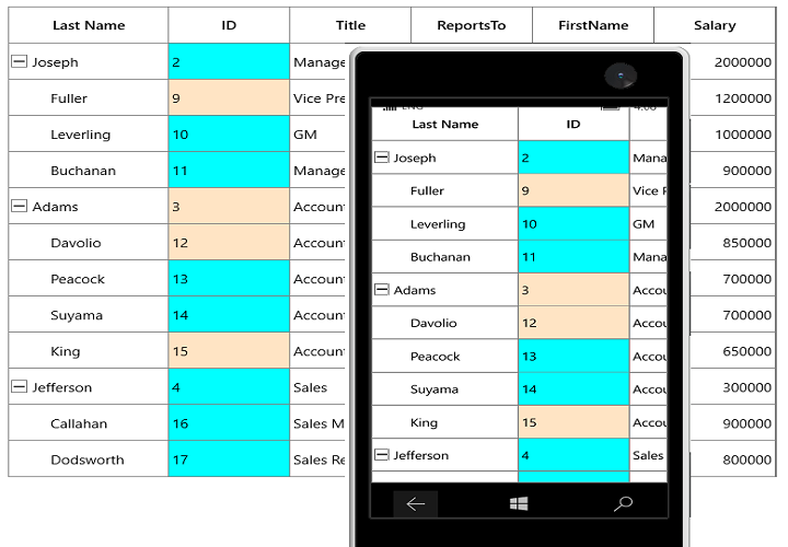
Styles based on custom logic
You can apply the styles to columns based on certain condition using TreeGridColumn.CellStyleSelector property.
Below code creates two different styles by TargetType TreeGridCell.
<Application.Resources>
    <Style x:Key="cellStyle1" TargetType="syncfusion:TreeGridCell">
        <Setter Property="Background" Value="Bisque" />
    </Style>
    <Style x:Key="cellStyle2" TargetType="syncfusion:TreeGridCell">
        <Setter Property="Background" Value="Aqua" />
    </Style>
</Application.Resources>
In the below code, returns the style based on ID value. Using Container you can format the columns data based on TreeGridCell.
public class CustomCellStyleSelector : StyleSelector
{
    protected override Style SelectStyleCore(object item, DependencyObject container)
    {
        var treeGridCell = container as TreeGridCell;
        var mappingName = treeGridCell.ColumnBase.TreeGridColumn.MappingName;
        var record = treeGridCell.DataContext;
        var cellValue = record.GetType().GetProperty(mappingName).GetValue(record);

        if (mappingName.Equals("ID"))
        {

            if (Convert.ToInt16(cellValue)%3==0)
                return App.Current.Resources["cellStyle1"] as Style;

            else
                return App.Current.Resources["cellStyle2"] as Style;
        }
        return base.SelectStyle(item, container);
    }
}
Below code, sets the customized style selector to TreeGridColumn.CellStyleSelector property.
<Page.Resources>
    <local:CustomCellStyleSelector x:Key="cellStyleSelector"/>
</Page.Resources>
<syncfusion:SfTreeGrid Name="treeGrid"
                        AutoExpandMode="AllNodesExpanded"
                        AutoGenerateColumns="True"
                        ChildPropertyName="ReportsTo"
                        ItemsSource="{Binding Employees}"
                        ParentPropertyName="ID">
    <syncfusion:SfTreeGrid.Columns>
        <syncfusion:TreeGridTextColumn MappingName="ID"
                                       CellStyleSelector="{StaticResource cellStyleSelector}" />
    </syncfusion:SfTreeGrid.Columns>
</syncfusion:SfTreeGrid>
When column is auto-generated, you can style the column by handling AutoGeneratingColumn event
treeGrid.AutoGeneratingColumn += TreeGrid_AutoGeneratingColumn;

private void TreeGrid_AutoGeneratingColumn(object sender, TreeGridAutoGeneratingColumnEventArgs e)
{

    if (e.Column.MappingName == "ID")
    {
        e.Column.CellStyleSelector = new CustomCellStyleSelector();
    }
}
UI Interaction
Hide Column
You can hide or unhide the particular column programmatically by setting TreeGridColumn.IsHidden property. For allowing end-user to hide or unhide column in UI refer Resizing Columns section.
Disable column
You can disable column by setting TreeGridColumn.AllowFocus property. Therefore, that column can’t be selected or edited.
Width, alignment and padding settings
Width
The width of TreeGridColumn can be changed by setting Width property. Column width set based on TreeGridColumn.MinimumWidth and TreeGridColumn.MaximumWidth properties.
NOTE
If the
TreeGridColumn.Widthis defined explicitly takes priority thanTreeGridColumn.ColumnSizer.
Padding
TreeGridColumn allows you to the change the padding of cell content by setting Padding property.
Alignment
TreeGridColumn allows you to change the alignment of TreeGridCell and TreeGridHeaderCellControl content using TextAlignment, VerticalAlignment and HorizontalHeaderContentAlignment properties.
TreeGridTextColumnBase
TreeGridTextColumnBase is the abstract class derived from TreeGridColumn. The following columns are derived from the TreeGridTextColumnBase.
-
TreeGridTextColumn
-
TreeGridDateTimeColumn
-
TreeGridNumericColumn
-
TreeGridTemplateColumn
TreeGridTextColumnBase properties
-
Text trimming - You can trim the column’s data using TextTrimming property.
-
Text wrapping - You can wrap the column’s data using TextWrapping property.
<syncfusion:SfTreeGrid Name="treeGrid"
                AutoExpandMode="AllNodesExpanded"
                AutoGenerateColumns="True"
                ChildPropertyName="ReportsTo"
                ItemsSource="{Binding Employees}"
                ParentPropertyName="ID">

    <syncfusion:SfTreeGrid.Columns>
        <syncfusion:TreeGridTextColumn HeaderText="First Name"
                                       MappingName="FirstName"
                                       Width="60"
                                       TextTrimming="CharacterEllipsis"
                                       TextWrapping="Wrap"/>
    </syncfusion:SfTreeGrid.Columns>
</syncfusion:SfTreeGrid>
TreeGridTextColumn
TreeGridTextColumn derived from TreeGridTextColumnBase which hosts TextBox in edit mode.
<syncfusion:SfTreeGrid Name="treeGrid"
                AutoGenerateColumns="False"
                ChildPropertyName="ReportsTo"
                ItemsSource="{Binding Employees}"
                ParentPropertyName="ID">

    <syncfusion:SfTreeGrid.Columns>
        <syncfusion:TreeGridTextColumn HeaderText="First Name"
                                       MappingName="FirstName"
                                      />
    </syncfusion:SfTreeGrid.Columns>
</syncfusion:SfTreeGrid>treeGrid.Columns.Add(new TreeGridTextColumn()
{
MappingName = "FirstName",
HeaderText = "First Name"
});Spell check while editing
You can enable spell check in TreeGridTextColumn using IsSpellCheckEnabled property.
<syncfusion:TreeGridTextColumn HeaderText="First Name"
                               IsSpellCheckEnabled="True"
MappingName="FirstName" />this.treeGrid.Columns.Add(new TreeGridTextColumn() { MappingName = "FirstName", HeaderText = "First Name", IsSpellCheckEnabled = true });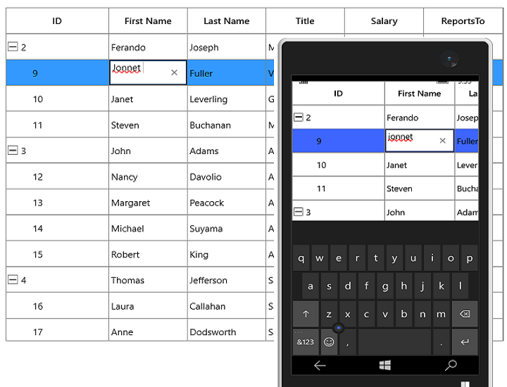
TreeGridNumericColumn
TreeGridNumericColumn derived from TreeGridTextColumnBase which displays columns data as numeric. It hosts SfNumericTextBox in editing mode.
<syncfusion:SfTreeGrid Name="treeGrid"
                       AutoGenerateColumns="False"
                       ChildPropertyName="ReportsTo"
                       ItemsSource="{Binding Employees}"
                       ParentPropertyName="ID">

    <syncfusion:SfTreeGrid.Columns>
        <syncfusion:TreeGridNumericColumn MappingName="Salary" />
    </syncfusion:SfTreeGrid.Columns>
</syncfusion:SfTreeGrid>treeGrid.Columns.Add(new TreeGridNumericColumn() { MappingName = "Salary" });
Data formatting
TreeGridNumericColumn allows you to format the numeric data by specifying thepredefined format specifier or custom numeric format strings into TreeGridNumericColumn.FormatString property.
<syncfusion:TreeGridNumericColumn  MappingName="Salary"
FormatString="C" />treeGrid.Columns.Add(new TreeGridNumericColumn()
{
MappingName = "Salary", FormatString = "C"
});
Null value support
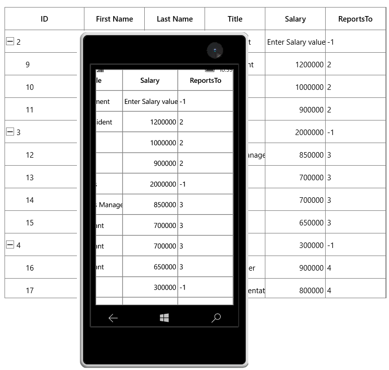
TreeGridNumericColumn provides support to restrict or allow null value in columns based on AllowNull property. Instead of displaying null values, you can display hint text using Watermark property.
The Watermark property won’t work, when the ` AllowNull is false`.
<syncfusion:TreeGridNumericColumn  MappingName="Salary"
                                   AllowNull="True"
WaterMark="Enter Salary value" />treeGrid.Columns.Add(new TreeGridNumericColumn()
{
MappingName = "Salary",
AllowNull = true,
WaterMark="Enter Salary value"
});
Parsing Mode
You can bind either Decimal or Double values with TreeGridNumericColumn by using ParsingMode property. The default parsing mode is Double.
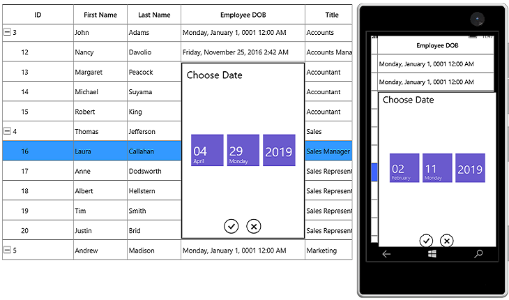
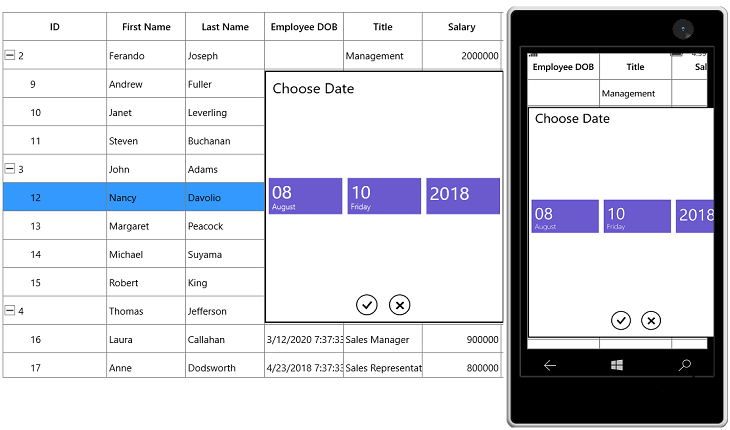
TreeGridDateTimeColumn
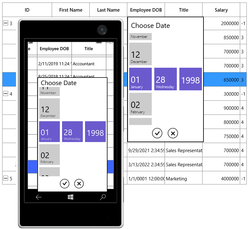
TreeGridDateTimeColumn derived from TreeGridTextColumnBase and it displays columns data as date time. It hosts SfDatePicker element in editing mode.
<syncfusion:SfTreeGrid Name="treeGrid"
                        ChildPropertyName="ReportsTo"
                        ItemsSource="{Binding Employees}"
                        ParentPropertyName="ID">

    <syncfusion:SfTreeGrid.Columns>
        <syncfusion:TreeGridDateTimeColumn MappingName="DOB"
                            HeaderText="Employee DOB"/>
    </syncfusion:SfTreeGrid.Columns>
</syncfusion:SfTreeGrid>treeGrid.Columns.Add(new TreeGridDateTimeColumn()
{
MappingName = "DOB",
HeaderText = "Employee DOB"
});
Formatting date time value
You can format the date time value by specifying the predefined format specifier into TreeGridDateTimeColumn.FormatString property.
<syncfusion:TreeGridDateTimeColumn MappingName="DOB"
                                   HeaderText="Employee DOB"
FormatString="f"/>treeGrid.Columns.Add(new TreeGridDateTimeColumn()
{
MappingName = "DOB",
HeaderText = "Employee DOB",
FormatString="f"
});
When the predefined format specifier does not meet your requirement, you can set the custom date and time format strings into FormatString property.
<syncfusion:TreeGridDateTimeColumn HeaderText="Employee DOB"
                                   MappingName="DOB"
                                   FormatString="yyyy/dd/MM"
SelectorFormatString="yyyy/dd/MM" />treeGrid.Columns.Add(new TreeGridDateTimeColumn()
{
MappingName = "DOB",
HeaderText = "Employee DOB",
FormatString = "yyyy/dd/MM",
SelectorFormatString = "yyyy/dd/MM"
});
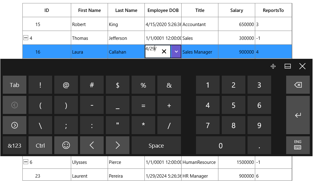
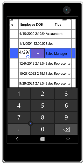
Editing support
By default, the user can input the date time value by selecting through date selector. You can allow users to input or delete the date time value from the keyboard by setting AllowInlineEditing to true.
Setting input scope for On-Screen Keyboard
You can set the input scope for On-Screen Keyboard using InputScope property when AllowInlineEditing is set to true.
<syncfusion:TreeGridDateTimeColumn HeaderText="Employee DOB"
                                   MappingName="DOB"
                                   InputScope="Number"
AllowInlineEditing="True"/>treeGrid.Columns.Add(new TreeGridDateTimeColumn()
{
MappingName = "DOB",
HeaderText = "Employee DOB",
AllowInlineEditing=true,
InputScope=InputScopeNameValue.Number
});
Null value support
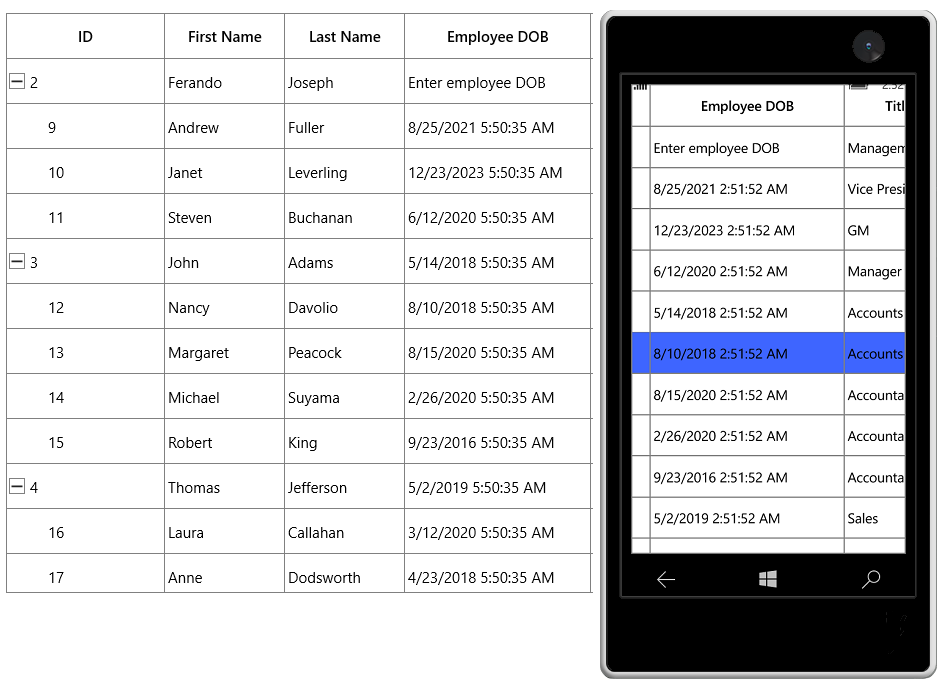
TreeGridDateTimeColumn provides support to restrict or allow null value in columns based on AllowNullValue property. Instead of displaying null values, you can display hint text using Watermark property.
The Watermark property won’t work, when the AllowNullValue is false.
<syncfusion:TreeGridDateTimeColumn HeaderText="Employee DOB"
                                   MappingName="DOB"
                                   AllowNullValue="True"
WaterMark="Enter employee DOB"/>treeGrid.Columns.Add(new TreeGridDateTimeColumn()
{
MappingName = "DOB",
HeaderText = "Employee DOB",
AllowNullValue=true,
WaterMark="Enter employee DOB"
});
Setting date time value range
You can restrict and display the input value with in the range using MinDate and MaxDate properties.
DateTime minDate = new DateTime(2015 , 2 , 2);
public DateTime MinDate
{
    get { return minDate; }
    set { minDate = value; RaisePropertyChanged("MinDate"); }
}

DateTime maxDate = new DateTime(2015 , 5 , 5);
public DateTime MaxDate
{
    get { return maxDate; }
    set { maxDate = value; RaisePropertyChanged("MaxDate"); }
}
<Page.Resources>
<local:ViewModel x:Key="viewModel" />
</Page.Resources>
<syncfusion:TreeGridDateTimeColumn HeaderText="Employee DOB"
MappingName="DOB"
MinDate="{Binding MinDate,Source={StaticResource viewModel}}"
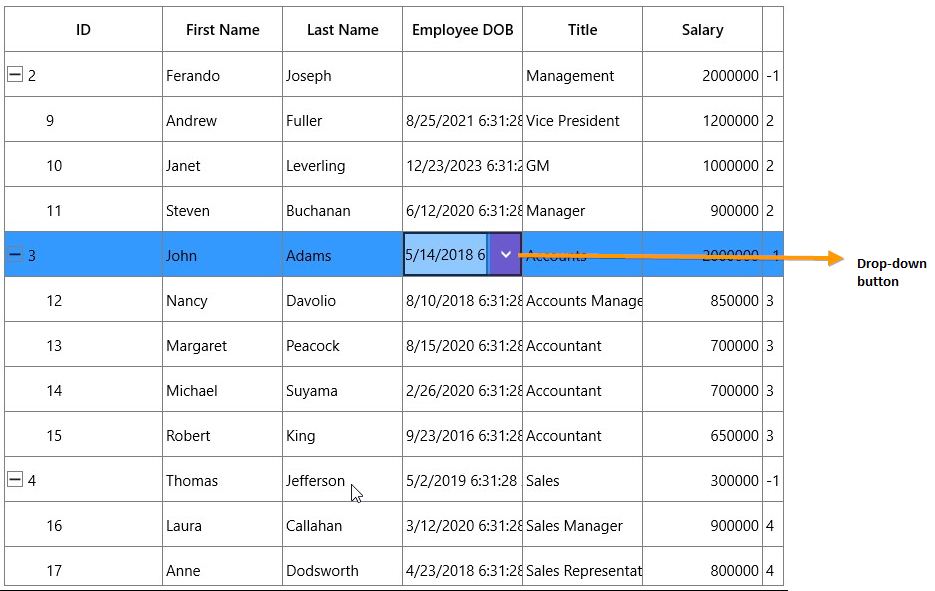
MaxDate="{Binding MaxDate,Source={StaticResource viewModel}}"/>Dropdown customization
You can hide or unhide the dropdown button by using ShowDropDownButton property. The height of dropdown can be changed using DropDownHeight property.
<syncfusion:TreeGridDateTimeColumn HeaderText="Employee DOB"
                                   MappingName="DOB"
                                   ShowDropDownButton="False"
DropDownHeight="200"/>treeGrid.Columns.Add(new TreeGridDateTimeColumn()
{
MappingName = "DOB",
ShowDropDownButton = false,
DropDownHeight = 200
});
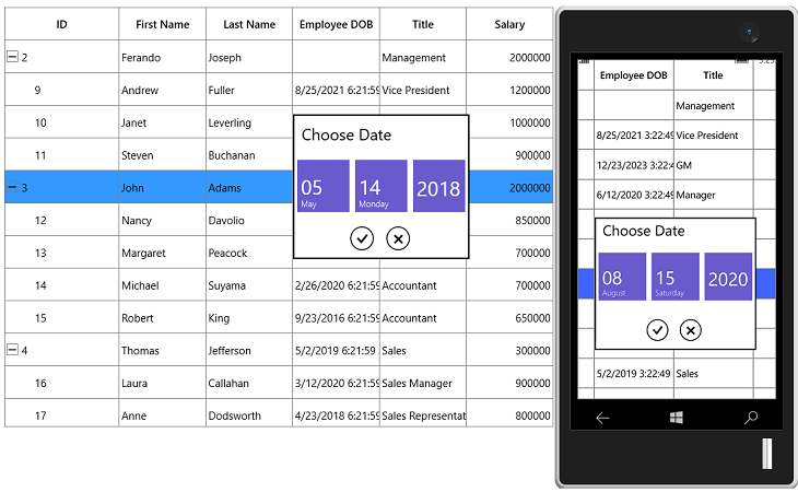
Styling
You can style the SelectorItem with solid color using [AccentBrush](https://help.syncfusion.com/cr/uwp/Syncfusion.UI.Xaml.TreeGrid.TreeGridDateTimeColumn.html#Syncfusion_UI_Xaml_TreeGrid_TreeGridDateTimeColumn_AccentBrush) property.
<syncfusion:TreeGridDateTimeColumn HeaderText="Employee DOB"
                                   MappingName="DOB"
AccentBrush="LawnGreen"/>treeGrid.Columns.Add(new TreeGridDateTimeColumn()
{
MappingName = "DOB",
HeaderText = "Employee DOB",
AccentBrush = new SolidColorBrush(Colors.LawnGreen)
});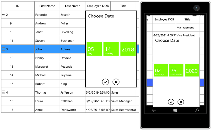
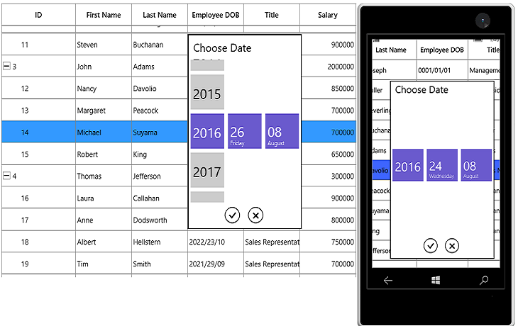
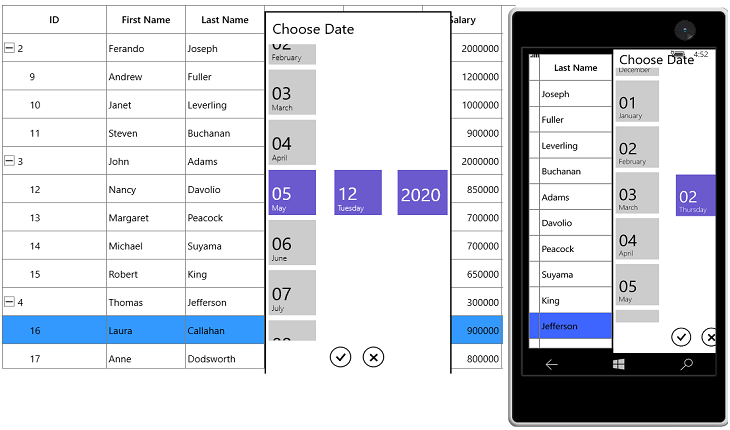
SelectorItem customization
Height and width customization
The height and width of SelectorItem can be customized using SelectorItemWidth and SelectorItemHeight property.
<syncfusion:TreeGridDateTimeColumn HeaderText="Employee DOB"
                                   MappingName="DOB"
                                   SelectorItemHeight="65"
SelectorItemWidth="120"/>treeGrid.Columns.Add(new TreeGridDateTimeColumn()
{
MappingName = "DOB",
HeaderText = "Employee DOB",
SelectorItemHeight = 65,
SelectorItemWidth = 120
});
SelectorItem formatting
you can specify the format for the selector using SelectorFormatString property.
<syncfusion:TreeGridDateTimeColumn HeaderText="Employee DOB"
                                   MappingName="DOB"
SelectorFormatString="yyyy/dd/MM" />treeGrid.Columns.Add(new TreeGridDateTimeColumn()
{
MappingName = "DOB",
HeaderText = "Employee DOB",
SelectorFormatString = "yyyy/dd/MM"
});
Spacing and count customization
You can customize the space between date, month and year selector items using SelectorItemSpacing property.
You can restrict the number of item to displayed in selector using SelectorItemCount property and
<syncfusion:TreeGridDateTimeColumn HeaderText="Employee DOB"
                                   MappingName="DOB"
                                   SelectorItemSpacing="20"
SelectorItemCount="5"/>treeGrid.Columns.Add(new TreeGridDateTimeColumn()
{
MappingName = "DOB",
HeaderText = "Employee DOB",
SelectorItemSpacing=20,
SelectorItemCount=5
});
TreeGridCheckBoxColumn
TreeGridCheckBoxColumn derived from TreeGridColumn and it used display and edit Boolean type data. It hosts CheckBox element as TreeGridCell content.
<syncfusion:SfTreeGrid Name="treeGrid"
                        ChildPropertyName="ReportsTo"
                        ItemsSource="{Binding Employees}"
                        ParentPropertyName="ID">

    <syncfusion:SfTreeGrid.Columns>
        <syncfusion:TreeGridCheckBoxColumn MappingName="AvailabilityStatus"/>
    </syncfusion:SfTreeGrid.Columns>
</syncfusion:SfTreeGrid>treeGrid.Columns.Add(new TreeGridCheckBoxColumn()
{
MappingName = "AvailabilityStatus",
HeaderText = "Available Status"
});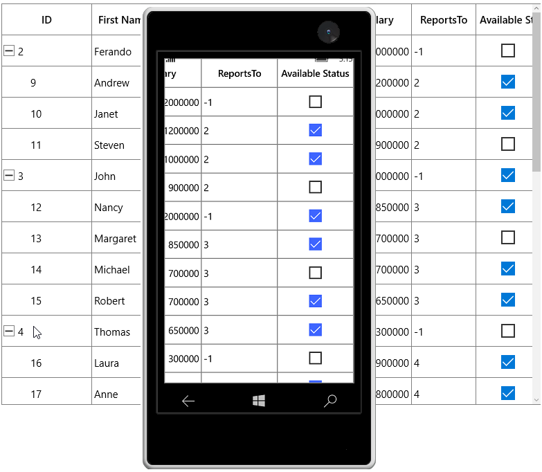
TreeGridCheckBoxColumn allows you to customize check box state and its alignment.
-
IsThreeState - By default, the
TreeGridCheckBoxColumnhasCheckedandUnchecked**** state. You can enable anotherIntermediatestate settingIsThreeStateproperty totrue. -
HorizontalAlignment - You can change the horizontal alignment of CheckBox using
HorizontalAlignmentproperty.
TreeGridTemplateColumn
TreeGridTemplateColumn derived from TreeGridTextColumnBase and it displays the template-specified cell content. You can load any UWP control in the display mode for all columns by setting CellTemplate and EditTemplate properties.
xmlns:sync="using:Syncfusion.UI.Xaml.Grid"
xmlns:syncfusion="using:Syncfusion.UI.Xaml.TreeGrid"

<syncfusion:SfTreeGrid Name="treeGrid"
                ChildPropertyName="ReportsTo"
                ItemsSource="{Binding Employees}"
                ParentPropertyName="ID">

    <syncfusion:SfTreeGrid.Columns>
        <syncfusion:TreeGridTemplateColumn MappingName="FirstName" HeaderText="First Name">
            <syncfusion:TreeGridTemplateColumn.CellTemplate>
                <DataTemplate>
                    <TextBlock Text="{Binding FirstName}"/>
                </DataTemplate>
            </syncfusion:TreeGridTemplateColumn.CellTemplate>
            <syncfusion:TreeGridTemplateColumn.EditTemplate>
                <DataTemplate>
                    <TextBox Text="{Binding FirstName}"
                                sync:FocusManagerHelper.FocusedElement="True"/>
                </DataTemplate>
            </syncfusion:TreeGridTemplateColumn.EditTemplate>
        </syncfusion:TreeGridTemplateColumn>
    </syncfusion:SfTreeGrid.Columns>
</syncfusion:SfTreeGrid>
StringBuilder sb1 = new StringBuilder();
sb1.Append("<DataTemplate xmlns=\"http://schemas.microsoft.com/winfx/2006/xaml/presentation\">");
sb1.Append("<TextBlock Text=\"{Binding FirstName}\" />");
sb1.Append("</DataTemplate>");
DataTemplate cellTemplate = (DataTemplate)XamlReader.Load(sb1.ToString());
StringBuilder sb2 = new StringBuilder();
sb2.Append("<DataTemplate xmlns=\"http://schemas.microsoft.com/winfx/2006/xaml/presentation\">");
sb2.Append("<TextBox Text=\"{Binding FirstName, Mode=TwoWay}\" />");
sb2.Append("</DataTemplate>");
DataTemplate editTemplate = (DataTemplate)XamlReader.Load(sb2.ToString());
this.treeGrid.Columns.Add(new TreeGridTemplateColumn()
{
MappingName = "FirstName",
CellTemplate = cellTemplate,
EditTemplate = editTemplate
});Keyboard interaction for UIElement loaded inside CellTemplate
You can allow UIElement loaded inside CellTemplate to handle keyboard interaction by setting [FocusManagerHelper.WantsKeyInput](https://help.syncfusion.com/cr/uwp/Syncfusion.UI.Xaml.Grid.FocusManagerHelper.html#Syncfusion_UI_Xaml_Grid_FocusManagerHelper_WantsKeyInputProperty) attached property to TreeGridColumn. You can use this when loading edit element in CellTemplate.
In this case SfTreeGrid handles the below key operations and other keys are handled by UIElement loaded inside CellTemplate.
<syncfusion:TreeGridTemplateColumn MappingName="FirstName"
                                    sync:FocusManagerHelper.WantsKeyInput="True"
                                    HeaderText="First Name">
    <syncfusion:TreeGridTemplateColumn.CellTemplate>
        <DataTemplate>
            <TextBlock Text="{Binding FirstName}"/>
        </DataTemplate>
    </syncfusion:TreeGridTemplateColumn.CellTemplate>
</syncfusion:TreeGridTemplateColumn>
Setting focus to particular element inside Template when cell gets activated or edited
You can allow logical focus to specific UIElement loaded inside EditTemplate or CellTemplate by setting [FocusManagerHelper.FocusedElement](https://help.syncfusion.com/cr/uwp/Syncfusion.UI.Xaml.Grid.FocusManagerHelper.html#Syncfusion_UI_Xaml_Grid_FocusManagerHelper_FocusedElementProperty) attached property.
You can use this property to start editing the template column value as like normal column when the user gets into edit mode.
xmlns:sync="using:Syncfusion.UI.Xaml.Grid"
xmlns:syncfusion="using:Syncfusion.UI.Xaml.TreeGrid"

<syncfusion:SfTreeGrid Name="treeGrid"
                ChildPropertyName="ReportsTo"
                ItemsSource="{Binding Employees}"
                ParentPropertyName="ID">

    <syncfusion:SfTreeGrid.Columns>
        <syncfusion:TreeGridTemplateColumn MappingName="FirstName" HeaderText="First Name">
            <syncfusion:TreeGridTemplateColumn.CellTemplate>
                <DataTemplate>
                    <TextBlock Text="{Binding FirstName}"/>
                </DataTemplate>
            </syncfusion:TreeGridTemplateColumn.CellTemplate>
            <syncfusion:TreeGridTemplateColumn.EditTemplate>
                <DataTemplate>
                    <TextBox Text="{Binding FirstName}"
                                sync:FocusManagerHelper.FocusedElement="True"/>
                </DataTemplate>
            </syncfusion:TreeGridTemplateColumn.EditTemplate>
        </syncfusion:TreeGridTemplateColumn>
    </syncfusion:SfTreeGrid.Columns>
</syncfusion:SfTreeGrid>
Binding CellTemplate and EditTemplate based on MappingName
By default, underlying record is DataContext for CellTemplate. So you have to define, template for each column to display values based on MappingName.
You can use the same DataTemplate for all columns to display value based on MappingName by setting SetCellBoundValue property to true. Setting SetCellBoundValue to true, changes the DataContext for CellTemplate to DataContextHelper which has the following members,
-
Value- Return the value base onMappingName. -
Record- Returns the underlying data object.
NOTE
EditTemplate support available only for TreeGridTemplateColumn.
<syncfusion:SfTreeGrid Name="treeGrid"
                        AllowEditing="True"
                        AutoExpandMode="RootNodesExpanded"
                        AutoGenerateColumns="False"
                        ChildPropertyName="ReportsTo"
                        ItemsSource="{Binding Employees}"
                        ParentPropertyName="ID">

    <syncfusion:SfTreeGrid.Columns>
        <syncfusion:TreeGridTemplateColumn HeaderText="First Name"
                                        MappingName="FirstName"
                                        SetCellBoundValue="True">
            <syncfusion:TreeGridTemplateColumn.CellTemplate>
                <DataTemplate>
                    <Grid>
                        <TextBlock Text="{Binding FirstName}" />
                    </Grid>
                </DataTemplate>
            </syncfusion:TreeGridTemplateColumn.CellTemplate>
            <syncfusion:TreeGridTemplateColumn.EditTemplate>
                <DataTemplate>
                    <Grid>
                        <TextBox sync:FocusManagerHelper.FocusedElement="True" Text="{Binding FirstName}" />
                    </Grid>
                </DataTemplate>
            </syncfusion:TreeGridTemplateColumn.EditTemplate>
        </syncfusion:TreeGridTemplateColumn>
    </syncfusion:SfTreeGrid.Columns>
</syncfusion:SfTreeGrid>
Sets EditTemplate based on custom logic
TreeGridTemplateColumn provides support to load different edit elements based on underlying data object using TreeGridTemplateColumn.EditTemplateSelector property.
Below code returns the DefaultTemplate and AlternateTemplate based on ID’s value.
<DataTemplate x:Key="DefaultCellTemplate">
    <TextBlock VerticalAlignment="Center"
               Foreground="Red"
               Text="{Binding Path=ID}"
               TextAlignment="Center" />
</DataTemplate>

<DataTemplate x:Key="AlternateCellTemplate">
    <TextBlock VerticalAlignment="Center"
               Foreground="Green"
               Text="{Binding Path=ID}"
               TextAlignment="Center" />
</DataTemplate>

<DataTemplate x:Key="DefaultEditTemplate">
    <TextBox Height="45"
             VerticalAlignment="Center"
             Foreground="Red"
             Text="{Binding Path=ID}"
             TextAlignment="Center" />
</DataTemplate>

<DataTemplate x:Key="AlternateEditTemplate">
    <TextBox Height="45"
             VerticalAlignment="Center"
             Foreground="Green"
             Text="{Binding Path=ID}"
             TextAlignment="Center" />
</DataTemplate>
public class CustomCellTemplateSelector : DataTemplateSelector
{
protected override DataTemplate SelectTemplateCore(object item, DependencyObject container)
{
if (item == null)
return null;
var data = item as EmployeeInfo;
if (data.ID % 2 == 0)
return App.Current.Resources["AlternateCellTemplate"] as DataTemplate;
else
return App.Current.Resources["DefaultCellTemplate"] as DataTemplate;
}
}
public class CustomEditTemplateSelector : DataTemplateSelector
{
protected override DataTemplate SelectTemplateCore(object item, DependencyObject container)
{
if (item == null)
return null;
var data = item as EmployeeInfo;
if (data.ID % 2 == 0)
return App.Current.Resources["AlternateEditTemplate"] as DataTemplate;
else
return App.Current.Resources["DefaultEditTemplate"] as DataTemplate;
}
}In the below code, custom template selector set to TreeGridTemplateColumn.EditTemplateSelector.
<Page.Resources>
    <local:ViewModel x:Key="viewModel" />
    <local:CustomCellTemplateSelector x:Key="cellTemplateSelector" />
    <local:CustomEditTemplateSelector x:Key="editTemplateSelector" />
</Page.Resources>

<syncfusion:SfTreeGrid Name="treeGrid"
            AllowEditing="True"
            AutoExpandMode="RootNodesExpanded"
            AutoGenerateColumns="False"
            ChildPropertyName="ReportsTo"
            ItemsSource="{Binding Employees}"
            ParentPropertyName="ID">

    <syncfusion:SfTreeGrid.Columns>
        <syncfusion:TreeGridTemplateColumn CellTemplateSelector="{StaticResource cellTemplateSelector}"
                                EditTemplateSelector="{StaticResource editTemplateSelector}"
                                HeaderText="Employee ID"
                                MappingName="ID" />
    </syncfusion:SfTreeGrid.Columns>
</syncfusion:SfTreeGrid>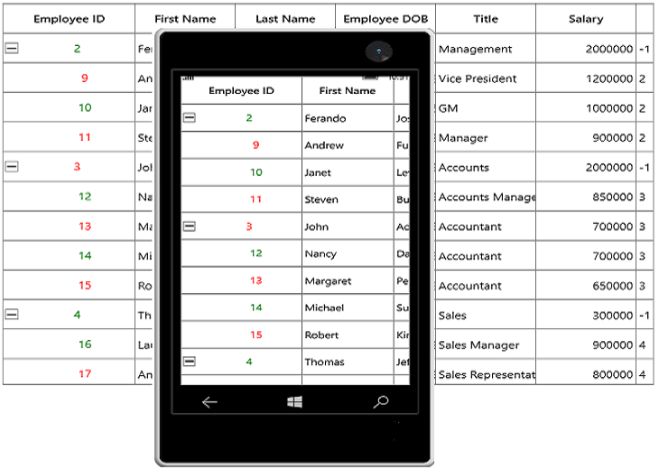
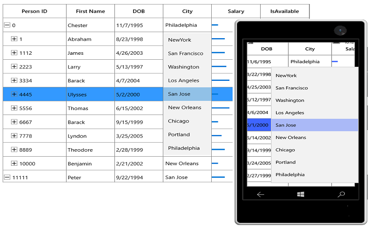
TreeGridComboBoxColumn
TreeGridComboBoxColumn derived from TreeGridColumn which hosts ComboBox as edit element. The data source to ComboBox can be set by using `TreeGridComboBoxColumn.ItemsSource property.
By default, TreeGridComboBoxColumn displays the value using MappingName property. You can set DisplayMemberPath which denotes the path to a value on the source object (TreeGridComboBoxColumn.ItemsSource) to serve as the visual representation of object. You can set the SelectedValuePath which denotes the path to get the SelectedValue from the SelectedItem.
<syncfusion:SfTreeGrid x:Name="treeGrid"
                        AutoGenerateColumns="False"
                        ChildPropertyName="Children"
                        ItemsSource="{Binding EmployeeDetails}">
    <syncfusion:SfTreeGrid.Columns>
        <syncfusion:TreeGridComboBoxColumn ItemsSource="{Binding CityCollection, Source={StaticResource viewModel}}"
                                            MappingName="City" />
    </syncfusion:SfTreeGrid.Columns>
</syncfusion:SfTreeGrid>treeGrid.Columns.Add(new TreeGridComboBoxColumn()
{
MappingName = "City",
ItemsSource = viewModel.CityCollection
});SfTreeGrid triggers, CurrentCellDropDownSelectionChanged event, when the SelectedValue is changed. CurrentCellDropDownSelectionChangedEventArgs of CurrentCellDropDownSelectionChanged event provides the information about the changed cell value.
SelectedIndex property returns the index of selected item.
SelectedItem**** property returns the selected item from drop down list.
Improving dropdown opening time
You can improve the drop-down opening time on loading by setting VirtualizingStackPanel as ItemsPanelTemplate of ComboBox, when the large number of items loaded in it.
<Page.Resources>
    <Style TargetType="ComboBox">
        <Setter Property="ItemsPanel">
            <Setter.Value>
                <ItemsPanelTemplate>
                    <VirtualizingStackPanel />
                </ItemsPanelTemplate>
            </Setter.Value>
        </Setter>
    </Style>
</Page.Resources>
Opening dropdown popup in single-click
You can open the drop down within single click by setting ComboBox.IsDropDownOpen property to true in OnInitializeEditElementmethod by overriding existing renderer.
Below code, creates TreeGridCellComboBoxRendererExt to set IsDropDownOpen property. Replace the default renderer with created renderer in SfTreeGrid.CellRenderers collection.
treeGrid.CellRenderers.Remove("ComboBox");
treeGrid.CellRenderers.Add("ComboBox", new TreeGridCellComboBoxRendererExt());

public class TreeGridCellComboBoxRendererExt : TreeGridCellComboBoxRenderer
{

    public override void OnInitializeEditElement(TreeDataColumnBase dataColumn, ComboBox uiElement, object dataContext)
    {
        base.OnInitializeEditElement(dataColumn, uiElement, dataContext);
        uiElement.IsDropDownOpen = true;
    }
}
NOTE
This is applicable when
SfTreeGrid.EditTriggerisOnTap
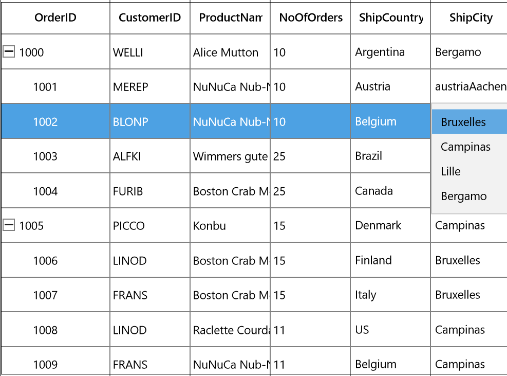
Loading Different ItemSource for each row of TreeGridComboBoxColumn
You can load the different ItemsSource to each row of TreeGridComboBoxColumn by setting SfTreeGrid.ItemsSourceSelector property.
Implementing IItemsSourceSelector
ItemsSourceSelector needs to implement IItemsSourceSelector interface which requires you to implement GetItemsSource method which receives the below parameters,
- Record – data object associated with row.
- Data Context – Data context of data grid.
In the below code, ItemsSource for ShipCity column returned based on ShipCountry column value using the record and data context of data grid passed to GetItemsSource method.
<Page.Resources>
    <local:ItemsSourceSelector x:Key="itemsSourceSelector"/>
</Page.Resources>

<syncfusion:SfTreeGrid x:Name="treeGrid"
						AllowEditing="True"
						AutoGenerateColumns="False"
						ChildPropertyName="Children"
						ItemsSource="{Binding OrderDetails}"
						ColumnSizer="Star">
    <syncfusion:SfTreeGrid.Columns>
        <syncfusion:TreeGridComboBoxColumn MappingName="ShipCountry"  ItemsSource="{Binding Path=DataContext.CountryList, ElementName=treeGrid}"/>
        <syncfusion:TreeGridComboBoxColumn  HeaderText="ShipCity" DisplayMemberPath="ShipCityName"
                                        ItemsSourceSelector="{StaticResource itemSourceSelector}"
                                        MappingName="ShipCityID" SelectedValuePath="ShipCityID"/>
    </syncfusion:SfTreeGrid.Columns>
</syncfusion:SfTreeGrid>
/// <summary>
/// Implementation class for ItemsSourceSelector interface
/// </summary>
public class ItemsSourceSelector : IItemsSourceSelector
{
public IEnumerable GetItemsSource(object record, object dataContext)
{
if (record == null)
return null;
var orderDetails = record as OrderDetails;
var countryName = orderDetails.ShipCountry;
var viewModel = dataContext as ViewModel;
//Returns ShipCity collection based on ShipCountry.
if (viewModel.ShipCities.ContainsKey(countryName))
{
ObservableCollection<ShipCityDetails> shipCities = null;
viewModel.ShipCities.TryGetValue(countryName, out shipCities);
return shipCities.ToList();
}
return null;
}
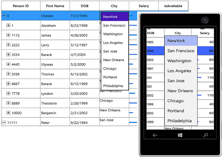
}The following screenshot illustrates the different ShipCity ItemsSource bound to each row of the ComboBox based on the Country Name.

You can download the sample from here.
TreeGridHyperlinkColumn
TreeGridHyperlinkColumn derived from TreeGridTextColumn and it displays columns data as hyperlink. It hosts HyperlinkButton element as TreeGridCell content.
<syncfusion:SfTreeGrid x:Name="treeGrid"
                        AutoExpandMode="RootNodesExpanded"
                        AllowEditing="True"
                        AutoGenerateColumns="False"
                        ChildPropertyName="Children"
                        ItemsSource="{Binding EmployeeDetails}">
    <syncfusion:SfTreeGrid.Columns>
        <syncfusion:TreeGridHyperlinkColumn MappingName="City" />
    </syncfusion:SfTreeGrid.Columns>
</syncfusion:SfTreeGrid>treeGrid.Columns.Add(new TreeGridHyperlinkColumn()
{
MappingName = "City",
HeaderText ="City"
});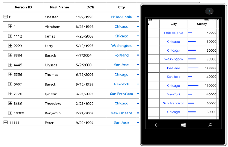
You can allow end-user to navigate the Uri when the cell value contains valid Uri address or using CurrentCellRequestNavigate event. The CurrentCellRequestNavigate occurs when the current cell in TreeGridHyperLinkColumn is clicked for navigation.
CurrentCellRequestNavigateEventArgs of CurrentCellRequestNavigate event provide information about the hyperlink triggered this event. CurrentCellRequestNavigateEventArgs.NavigateText returns the value using ValueBinding or MappingName to navigate.
treeGrid.CurrentCellRequestNavigate += TreeGrid_CurrentCellRequestNavigate;

private async void TreeGrid_CurrentCellRequestNavigate(object sender, Syncfusion.UI.Xaml.Grid.CurrentCellRequestNavigateEventArgs args)
{
    var URI = string.Format("https://en.wikipedia.org/wiki/" + args.NavigateText);
    Windows.System.Launcher.LaunchUriAsync(new Uri(URI));
}
Cancel the navigation
You can cancel the navigation when clicking hyperlink by setting CurrentCellRequestNavigateEventArgs.Handled to false.
treeGrid.CurrentCellRequestNavigate += TreeGrid_CurrentCellRequestNavigate;

private async void TreeGrid_CurrentCellRequestNavigate(object sender, Syncfusion.UI.Xaml.Grid.CurrentCellRequestNavigateEventArgs args)
{
   args.Handled = true;
}
Customize Hyperlink
Change the alignment
You can change the horizontal alignment of TreeGridHyperlinkColumn using HorizontalAlignment property.
Change the foreground color
You can change the foreground color of TreeGridHyperlinkColumn by writing the style with target type HyperlinkButton.
<Style TargetType="HyperlinkButton">
    <Setter Property="Foreground" Value="Green" />
</Style>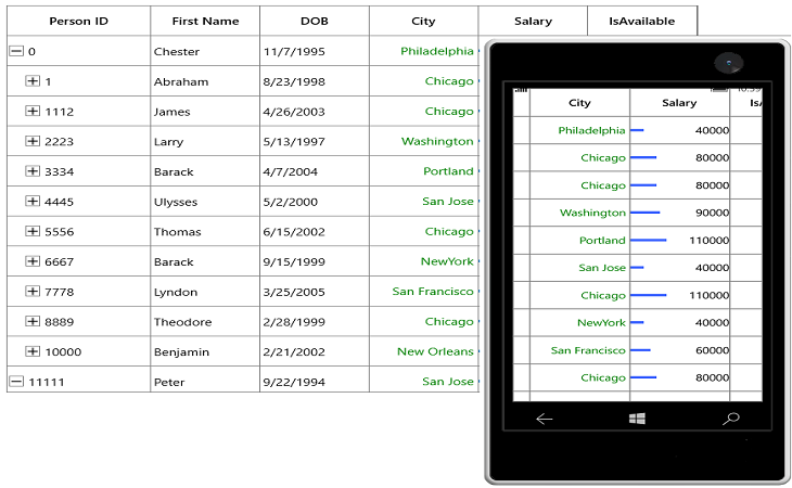
Custom column support
SfTreeGrid allows you to create your own column by overriding predefined column type or creating a new custom column.
Creating column from existing column
You can create your own column by overriding the predefined column types in SfTreeGrid.
For example, the TreeGridDateTimeColumn loads the DateTime value by default. If you want to display DateTimeOffset value, you can create a new column by overriding the TreeGridDateTimeColumn class.
In the below code snippet, converter created to format the DateTimeOffSet value to DateTime by defining ValueBinding (edit) and DisplayBinding (non-edit).
public class DateTimeOffsetFormatConverter : IValueConverter
{
    private TreeGridDateTimeOffsetColumn cachedColumn;

    public DateTimeOffsetFormatConverter(TreeGridDateTimeOffsetColumn column)
    {
        cachedColumn = column;
    }

    public object Convert(object value, Type targetType, object parameter, string language)
    {
        value = ((DateTimeOffset)value).DateTime;
        var column = cachedColumn as TreeGridDateTimeColumn;

        if (value == null || DBNull.Value == value)
        {

            if (column.AllowNullValue && column.MaxDate != System.DateTime.MaxValue && column.WaterMark == string.Empty)
                return column.MaxDate;

            if (column.AllowNullValue && column.WaterMark != string.Empty)
                return column.WaterMark;

            if (column.MaxDate != System.DateTime.MaxValue)
                return column.MaxDate;
        }
        DateTime _columnValue;

        _columnValue = (DateTime)value;

        if (_columnValue < column.MinDate)
            _columnValue = column.MinDate;

        if (_columnValue > column.MaxDate)
            _columnValue = column.MaxDate;

        return _columnValue.ToString(column.FormatString, CultureInfo.CurrentUICulture);
    }

    public object ConvertBack(object value, Type targetType, object parameter, string language)
    {
        throw new NotImplementedException();
    }
}

public class DateTimeOffsetToDateTimeConverter : IValueConverter
{

    public object Convert(object value, Type targetType, object parameter, string language)
    {

        if (value == null)
            return null;

        return value != null ? ((DateTimeOffset)value).DateTime : DateTime.Now;

    }

    public object ConvertBack(object value, Type targetType, object parameter, string language)
    {

        if (value == null)
            return null;

        return value != null ? (new DateTimeOffset((DateTime)value)) : new DateTimeOffset(DateTime.Now);

    }
}
In the below code snippet, TreeGridDateTimeOffsetColumn column created from TreeGridDateTimeColumn.
public class TreeGridDateTimeOffsetColumn : TreeGridDateTimeColumn
{

    protected override void SetDisplayBindingConverter()
    {

        if ((DisplayBinding as Binding).Converter == null)
            (DisplayBinding as Binding).Converter = new DateTimeOffsetFormatConverter(this);

        if ((ValueBinding as Binding).Converter == null)
            (ValueBinding as Binding).Converter = new DateTimeOffsetToDateTimeConverter();
    }
}
In the below code snippet, created TreeGridDateTimeOffsetColumn added to SfTreeGrid.Columns collection and specify the full date-time pattern in FormatString as F. Since the ShortDate is the default pattern of TreeGridDateTimeColumn.
<local:TreeGridDateTimeOffsetColumn HeaderText="Employee DOB"
                                    MappingName="DOB"
                                    FormatString="F" />
Customize column renderer
SfTreeGrid allows you to customize the column related operations like key navigation and UI related interactions by overriding the corresponding renderer associated with the column. Each column has its own renderer with set of virtual methods for handling the column level operations.
Below table lists the available cell types for unbound row and its renderers.
| Column Name | Renderer | Cell Type |
|---|---|---|
| TextBox | ||
| Numeric | ||
| CheckBox | ||
| Template | ||
| ComboBox | ||
| DateTime | ||
| HyperlinkButton |
Below code, creates the TreeGridCellTextBoxRendererExt to change the fore ground of FirstName column and replacing created renderer to CellRenderers.
treeGrid.CellRenderers.Remove("TextBox");
treeGrid.CellRenderers.Add("TextBox",new TreeGridCellTextBoxRendererExt());

public class TreeGridCellTextBoxRendererExt : TreeGridCellTextBoxRenderer
{

    public override void OnInitializeDisplayElement(TreeDataColumnBase dataColumn, TextBlock uiElement, object dataContext)
    {
        base.OnInitializeDisplayElement(dataColumn, uiElement, dataContext);

        if (dataColumn.TreeGridColumn.MappingName.Equals("FirstName"))
            uiElement.Foreground = new SolidColorBrush(Colors.Blue);
    }

    public override void OnUpdateDisplayBinding(TreeDataColumnBase dataColumn, TextBlock uiElement, object dataContext)
    {
        base.OnUpdateDisplayBinding(dataColumn, uiElement, dataContext);

        if (dataColumn.TreeGridColumn.MappingName.Equals("FirstName"))
            uiElement.Foreground = new SolidColorBrush(Colors.Blue);
    }
}
Create the renderer of existing column
You can change the renderer of existing column by removing the predefined cell type value from CellRenderers collection and add the newly derived renderer from TreeGridVirtualizingCellRenderer.
Below code creates the new TreeGridComboBoxRenderer with SfComboBox as edit element for TreeGridComboBoxColumn and replacing created renderer to CellRenderers.
treeGrid.CellRenderers.Remove("ComboBox");
treeGrid.CellRenderers.Add("ComboBox", new TreeGridComboBoxRendererExt());

public class TreeGridComboBoxRendererExt : TreeGridVirtualizingCellRenderer<ContentControl, SfComboBox>
{

    public TreeGridComboBoxRendererExt()
    {
    }

    /// <summary>
    /// Create new display element.
    /// </summary>
    /// <returns></returns>

    protected override ContentControl OnCreateDisplayUIElement()
    {
        return new ContentControl();
    }

    /// <summary>
    /// Create new edit element.
    /// </summary>
    /// <returns></returns>

    protected override SfComboBox OnCreateEditUIElement()
    {
        return new SfComboBox();
    }

    /// <summary>
    /// Initialize binding for display element.
    /// </summary>
    /// <param name="dataColumn"></param>
    /// <param name="uiElement"></param>
    /// <param name="dataContext"></param>

    public override void OnInitializeDisplayElement(TreeDataColumnBase dataColumn, ContentControl uiElement, object dataContext)
    {
        SetDisplayBinding(uiElement, dataColumn.TreeGridColumn, dataContext);
    }

    /// <summary>
    /// custom binding for display element.
    /// </summary>
    /// <param name="element"></param>
    /// <param name="column"></param>
    /// <param name="dataContext"></param>

    private static void SetDisplayBinding(ContentControl element, TreeGridColumn column, object dataContext)
    {
        var comboBoxColumn = (TreeGridComboBoxColumn)column;
        var binding = new Binding
        {
            Path = new PropertyPath(comboBoxColumn.MappingName),
            Mode = BindingMode.TwoWay,
            UpdateSourceTrigger = UpdateSourceTrigger.PropertyChanged,
            Converter = (comboBoxColumn.DisplayBinding as Binding).Converter,
        };
        element.SetBinding(ContentControl.ContentProperty, binding);
    }

    /// <summary>
    /// Update binding for display element.
    /// </summary>
    /// <param name="dataColumn"></param>
    /// <param name="uiElement"></param>
    /// <param name="dataContext"></param>

    public override void OnUpdateDisplayBinding(TreeDataColumnBase dataColumn, ContentControl uiElement, object dataContext)
    {
        SetDisplayBinding(uiElement, dataColumn.TreeGridColumn, dataContext);
    }

    /// <summary>
    /// Initialize binding for edit element.
    /// </summary>
    /// <param name="dataColumn"></param>
    /// <param name="uiElement"></param>
    /// <param name="dataContext"></param>

    public override void OnInitializeEditElement(TreeDataColumnBase dataColumn, SfComboBox uiElement, object dataContext)
    {
        SetEditBinding(uiElement, dataColumn.TreeGridColumn, dataContext);
    }

    /// <summary>
    /// Update binding for edit element.
    /// </summary>
    /// <param name="dataColumn"></param>
    /// <param name="uiElement"></param>
    /// <param name="dataContext"></param>

    public override void OnUpdateEditBinding(TreeDataColumnBase dataColumn, SfComboBox element, object dataContext)
    {
        SetEditBinding(element, dataColumn.TreeGridColumn, dataContext);
    }

    /// <summary>
    /// custom binding for display element.
    /// </summary>
    /// <param name="element"></param>
    /// <param name="column"></param>
    /// <param name="dataContext"></param>

    private static void SetEditBinding(SfComboBox element, TreeGridColumn column, object dataContext)
    {
        var comboboxColumn = (TreeGridComboBoxColumn)column;
        var binding = new Binding
        {
            Source = dataContext,
            Path = new PropertyPath(comboboxColumn.MappingName),
            Mode = BindingMode.TwoWay,
            UpdateSourceTrigger = UpdateSourceTrigger.PropertyChanged,
        };
        element.SetBinding(SfComboBox.SelectedValueProperty, binding);

        var itemsSourceBinding = new Binding { Path = new PropertyPath("ItemsSource"), Mode = BindingMode.TwoWay, Source = comboboxColumn };
        element.SetBinding(SfComboBox.ItemsSourceProperty, itemsSourceBinding);

        var displayMemberBinding = new Binding { Path = new PropertyPath("DisplayMemberPath"), Mode = BindingMode.TwoWay, Source = comboboxColumn };
        element.SetBinding(SfComboBox.DisplayMemberPathProperty, displayMemberBinding);

        var selectedValuePathBinding = new Binding { Path = new PropertyPath("SelectedValuePath"), Mode = BindingMode.TwoWay, Source = comboboxColumn };
        element.SetBinding(SfComboBox.SelectedValuePathProperty, selectedValuePathBinding);

        var itemTemplateBinding = new Binding { Path = new PropertyPath("ItemTemplate"), Mode = BindingMode.TwoWay, Source = comboboxColumn };
        element.SetBinding(SfComboBox.ItemTemplateProperty, itemTemplateBinding);
        }

    /// <summary>
    /// Let Renderer decide whether the parent grid should be allowed to handle keys and prevent
    /// the key event from being handled by the visual UIElement for this renderer.
    /// </summary>
    /// <param name="e">A <see cref="KeyRoutedEventArgs" /> object.</param>
    /// <returns>
    /// True if the parent grid should be allowed to handle keys; false otherwise.
    /// </returns>

    protected override bool ShouldGridTryToHandleKeyDown(KeyRoutedEventArgs e)
    {

        if (!HasCurrentCellState || !IsInEditing)
            return true;

        switch (e.Key)
        {
            case VirtualKey.End:
            case VirtualKey.Home:
            case VirtualKey.Enter:
            case VirtualKey.Escape:
                return !((SfComboBox)CurrentCellRendererElement).IsDropDownOpen;

            case VirtualKey.Down:
            case VirtualKey.Up:
            case VirtualKey.Left:
            case VirtualKey.Right:
                return !((SfComboBox)CurrentCellRendererElement).IsDropDownOpen;
        }
        return base.ShouldGridTryToHandleKeyDown(e);
    }

    /// <summary>
    /// Gets the control value.
    /// </summary>

    public override object GetControlValue()
    {

        if (!HasCurrentCellState)
            return base.GetControlValue();

        return CurrentCellRendererElement.GetValue(IsInEditing ? SfComboBox.SelectedValueProperty : ContentControl.ContentProperty);
    }

    /// <summary>
    /// Sets the control value.
    /// </summary>
    /// <param name="value">The value.</param>

    public override void SetControlValue(object value)
    {

        if (!HasCurrentCellState)
            return;

        if (IsInEditing)
            ((SfComboBox)CurrentCellRendererElement).SelectedValue = value;

        else
            throw new Exception("Value cannot be Set for Unloaded Editor");
    }
}
How To
Restrict the input content length
You can restrict the range of input using MaxLength property on TreeGridColumn in below ways.
-
Using Converter property in DisplayBinding and ValueBinding
-
Using control style
-
Overriding existing cell types
Using Converter
You can restrict the length of user input in both display and edit element using Converter using DisplayBinding and ValueBinding.
<Page.Resources>
    <local:MaxLengthConverter x:Key="maxLengthConverter"/>
</Page.Resources>

<syncfusion:SfTreeGrid x:Name="treeGrid"
                AutoExpandMode="RootNodesExpanded"
                AllowEditing="True"
                AutoGenerateColumns="False"
                ChildPropertyName="Children"
                ItemsSource="{Binding EmployeeDetails}">
    <syncfusion:SfTreeGrid.Columns>
        <syncfusion:TreeGridTextColumn HeaderText="First Name"
                                        MappingName="FirstName"
                                        DisplayBinding="{Binding FirstName,Converter={StaticResource maxLengthConverter}}"
                                        ValueBinding="{Binding FirstName,Converter={StaticResource maxLengthConverter}}" />
    </syncfusion:SfTreeGrid.Columns>
</syncfusion:SfTreeGrid>
public class MaxLengthConverter : IValueConverter
{
public object Convert(object value, Type targetType, object parameter, string language)
{
// Define max length for column.
int maxLength = 5;
// Get the ColumnValue
var columnValue = System.Convert.ToString(value);
if (columnValue.Length < maxLength)
return columnValue;
else
return columnValue.Substring(0, maxLength);
}
public object ConvertBack(object value, Type targetType, object parameter, string language)
{
return value;
}
}Using control style
You can set the MaxLength property in edit mode by writing style of TargetType edit element of the corresponding column.
N> TextBlock does not have the MaxLength property. Therefore, you can use the converter to format in display.
<Page.Resources>
    <Style TargetType="TextBox">
        <Setter Property="MaxLength" Value="7" />
    </Style>
</Page.Resources>

<syncfusion:SfTreeGrid x:Name="treeGrid"
        AutoExpandMode="RootNodesExpanded"
        AllowEditing="True"
        AutoGenerateColumns="False"
        ChildPropertyName="Children"
        ItemsSource="{Binding EmployeeDetails}">
    <syncfusion:SfTreeGrid.Columns>
        <syncfusion:TreeGridTextColumn HeaderText="First Name" MappingName="FirstName" />
    </syncfusion:SfTreeGrid.Columns>
</syncfusion:SfTreeGrid>
Overriding existing cell types
You can set the MaxLength property to the edit element of the particular column by overriding existing cell types.
Below code, overrides the OnInitializeEditElement method of the corresponding renderer and set the MaxLength to the UIElement and add the renderer to STreeGrid.CellRenderers collection.
treeGrid.CellRenderers.Remove("TextBox");
treeGrid.CellRenderers.Add("TextBox", new TreeGridCellTextBoxRendererExt());

public class TreeGridCellTextBoxRendererExt : TreeGridCellTextBoxRenderer
{

    public override void OnInitializeEditElement(TreeDataColumnBase dataColumn, TextBox uiElement, object dataContext)
    {

        if (dataColumn.TreeGridColumn != null && dataColumn.TreeGridColumn.MappingName == "FirstName")
        {
            uiElement.MaxLength = 7;
        }

        else
        {
            uiElement.MaxLength = 0;
        }
        base.OnInitializeEditElement(dataColumn, uiElement, dataContext);
    }
}