How can I help you?
SfTimeSelector in UWP TimePicker (SfTimePicker)
18 Feb 202519 minutes to read
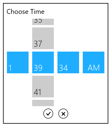
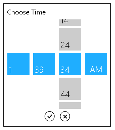
The SfTimeSelector control opens inside the popup window.
The visual elements of the time selector can be customized using the property SelectorStyle.
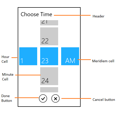
Header
The header property defines the top part of the time selector.
<syncfusion:SfTimePicker VerticalAlignment="Center"

                       HorizontalAlignment="Center"

                       Width="200">

       <syncfusion:SfTimePicker.SelectorStyle>

                <Style TargetType="syncfusion:SfTimeSelector">

                    <Setter Property="Header" Value="Set your alarm"/>

                </Style>

       </syncfusion:SfTimePicker.SelectorStyle>

</syncfusion:SfTimePicker >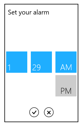
HeaderTemplate
The HeaderTemplate property is used to decorate the header.
<syncfusion:SfTimePicker VerticalAlignment="Center"
HorizontalAlignment="Center"
Width="200">
<syncfusion:SfTimePicker.SelectorStyle>
<Style TargetType="syncfusion:SfTimeSelector">
<Setter Property="HeaderTemplate">
<Setter.Value>
<DataTemplate>
<StackPanel Orientation="Horizontal">
<TextBlock Text=""
VerticalAlignment="Top"
Margin="5"
FontSize="22"
FontFamily="Segoe UI Symbol"/>
<TextBlock Text="Set your alarm"
VerticalAlignment="Top"
Margin="5"
FontSize="22"
/>
</StackPanel>
</DataTemplate>
</Setter.Value>
</Setter>
</Style>
</syncfusion:SfTimePicker.SelectorStyle> </syncfusion:SfTimePicker>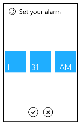
Cell template
The cell template property is used to decorate the selection box with custom visuals.
NOTE
The DataContext of Selection box is Syncfusion.UI.Xaml.Primitives.DateTimeWrapper.
HourCellTemplate
The HourCellTemplate property is used to decorate the hour cell selection box.
<syncfusion:SfTimePicker VerticalAlignment="Center"
HorizontalAlignment="Center"
Width="200">
<syncfusion:SfTimePicker.SelectorStyle>
<Style TargetType="syncfusion:SfTimeSelector">
<Setter Property="HourCellTemplate">
<Setter.Value>
<DataTemplate>
<Grid>
<TextBlock VerticalAlignment="Top"
HorizontalAlignment="Right"
Margin="5"
FontSize="22"
FontFamily="Segoe UI Symbol"
Text=""/>
<TextBlock Text="{Binding HourNumber}"
VerticalAlignment="Bottom"
Margin="5"
FontSize="22"/>
</Grid>
</DataTemplate>
</Setter.Value>
</Setter>
</Style>
</syncfusion:SfTimePicker.SelectorStyle> </syncfusion:SfTimePicker>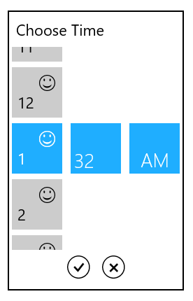
MinuteCellTemplate
The MinuteCellTemplate property is used to decorate the minute cell selection box
<syncfusion:SfTimePicker VerticalAlignment="Center"
HorizontalAlignment="Center"
Width="200">
<syncfusion:SfTimePicker.SelectorStyle>
<Style TargetType="syncfusion:SfTimeSelector">
<Setter Property="MinuteCellTemplate">
<Setter.Value>
<DataTemplate>
<Grid>
<TextBlock VerticalAlignment="Top"
HorizontalAlignment="Right"
Margin="5"
FontSize="22"
FontFamily="Segoe UI Symbol"
Text=""/>
<TextBlock Text="{Binding MinuteNumber}"
VerticalAlignment="Bottom"
Margin="5"
FontSize="22"/>
</Grid>
</DataTemplate>
</Setter.Value>
</Setter>
</Style>
</syncfusion:SfTimePicker.SelectorStyle> </syncfusion:SfTimePicker>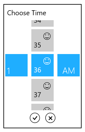
MeridiemCellTemplate
The MeridiemCellTemplate property is used to decorate the meridiem cell selection box.
<syncfusion:SfTimePicker VerticalAlignment="Center"
HorizontalAlignment="Center"
Width="200">
<syncfusion:SfTimePicker.SelectorStyle>
<Style TargetType="syncfusion:SfTimeSelector">
<Setter Property="MeridiemCellTemplate">
<Setter.Value>
<DataTemplate>
<Grid>
<TextBlock VerticalAlignment="Top"
HorizontalAlignment="Right"
Margin="5"
FontSize="22"
FontFamily="Segoe UI Symbol"
Text=""/>
<TextBlock Text="{Binding AmPmString}"
VerticalAlignment="Bottom"
Margin="5"
FontSize="22"/>
</Grid>
</DataTemplate>
</Setter.Value>
</Setter>
</Style>
</syncfusion:SfTimePicker.SelectorStyle> </syncfusion:SfTimePicker>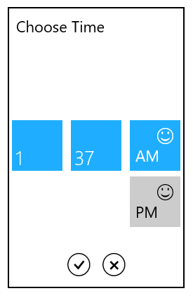
Setting Incremental values
To set minute and second values in SfTimeSelector with incremental values, use MinuteInterval and SecondsInterval properties respectively.
MinuteInterval
MinuteInterval property is used to set interval for minute values in SfTimeSelector.
SecondsInterval
SecondsInterval property is used to set interval for second values in SfTimeSelector.
<syncfusion:SfTimeSelector FormatString="hh:MM:ss tt" MinuteInterval="2" SecondsInterval="10"/>SfTimeSelector timeSelector = new SfTimeSelector();
timeSelector.FormatString= "hh:MM:ss tt";
timeSelector.MinuteInterval=2;
timeSelector.SecondsInterval=10;SfTimeSelector timeSelector = new SfTimeSelector()
timeSelector.FormatString= "hh:MM:ss tt"
timeSelector.MinuteInterval=2
timeSelector.SecondsInterval=10