How can I help you?
Appearance and Styling
8 Nov 201924 minutes to read
Date and TimeLine Customization
The Schedule date and time is used to specify the particular day to be identified and those date and time can be customized.
Header Date Background Customization
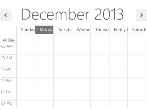
In Schedule, header is used to displays the date within Schedule.
Note:-Header date background customization is only applicable for windows.
Day/Week/TimeLine header date background customization
The Header date background can be changed by HeaderBackground property.
<Schedule:SfSchedule  ScheduleType="Week"
    HeaderBackground="Red" >
    </Schedule:SfSchedule>
SfSchedule schedule = new SfSchedule();
schedule.ScheduleType = ScheduleType.Week;
schedule.HeaderBackground = new SolidColorBrush(Colors.Red);
this.grid.Children.Add(schedule);
Month header date format customization
By default the date format in month cells will be displayed as date (for example: 22), the default date format of month view can be customized by using the MonthHeaderDateFormat property.
<Schedule:SfSchedule  ScheduleType="Month"
    MonthHeaderDateFormat="dd MM" >
    </Schedule:SfSchedule>
Time Line Customization
In Schedule MajorTick Lines are used to displays the time as the hours, similarly MinorTick lines in Schedule are used to displays the time as the minutes. Major and Minor tick line can be customized by using the following properties.
Note:-TimeLine customization is only applicable in day, week , workweek and timeline views in windows and for Windows Phone it is applicable for day and timeline views.
Time Format
The default timespan format in Day, Week and Timeline view can be customized by using the MajorTickTimeFormat and MinorTickTimeFormat properties.
Interval Height
The height between the intervals can be set using IntervalHeight property and its default value is 40.
Time Interval
Time interval can be customized using the TimeInterval property. The default interval is One hour.
Major and Minor Tick Visibility
The major and minor tick visibility can be customized by MajorTickVisibility and MinorTickVisibility which is used to set the Visibility of Major and Minor ticks in day, Week and TimeLine view.
<Schedule:SfSchedule  ScheduleType="Day"
                              MajorTickTimeFormat="hh tt"
                              MinorTickTimeFormat=":mm tt"
                              TimeInterval="ThirtyMin"
                              IntervalHeight="40"
                              MajorTickVisibility="Visible"
                              MinorTickVisibility="Visible"/>
SfSchedule schedule = new SfSchedule();
schedule.ScheduleType = ScheduleType.Week;
schedule.MajorTickTimeFormat = "hh tt";
schedule.MinorTickTimeFormat = ":mm tt";
schedule.TimeInterval = TimeInterval.ThirtyMin;
schedule.IntervalHeight = 40;
schedule.MajorTickVisibility = Visibility.Visible;
schedule.MinorTickVisibility = Visibility.Visible;
this.grid.Children.Add(schedule);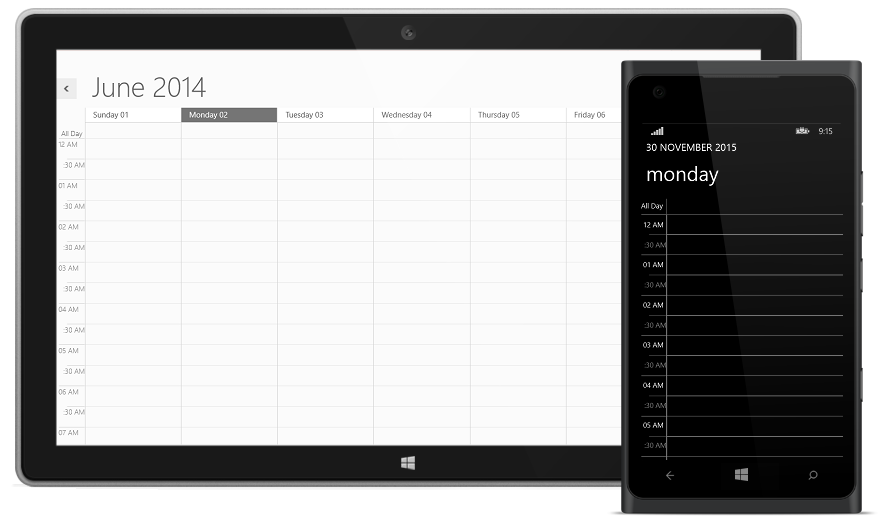
TimeMode
TimeMode property is used to displays the Time mode in Twelve hours or twenty four hours format. The default value of TimeMode property in twelve-hour in Schedule.
<Schedule:SfSchedule TimeMode="TwelveHours" TimeInterval="OneHour" >
    </Schedule:SfSchedule>
SfSchedule schedule = new SfSchedule();
schedule.ScheduleType = ScheduleType.Week;
schedule.TimeMode = TimeModes.TwelveHours;
schedule.TimeInterval = TimeInterval.OneHour;
this.grid.Children.Add(schedule);
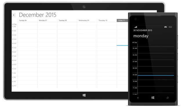
Current Date and Time Highlighting
You can highlight the Current date and time which is used to differentiate the current date with rest of dates.
Highlighting Current Date Background
The current date of Schedule can be highlighted by using CurrentDateBackground property.
<Schedule:SfSchedule x:Name="schedule" ScheduleType="Week"
    CurrentDateBackground=" LightSkyBlue " />
SfSchedule schedule = new SfSchedule();
schedule.ScheduleType = ScheduleType.Week;
schedule.CurrentDateBackground = new SolidColorBrush(Colors.LightSkyBlue);
this.grid.Children.Add(schedule);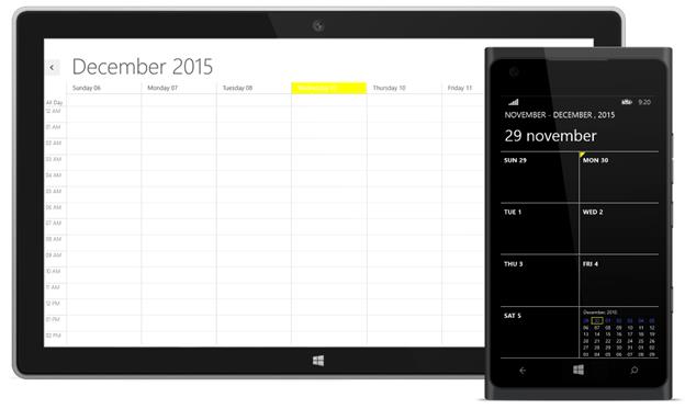
Highlighting Current Date Foreground
The current date of Schedule foreground can be highlighted by using CurrentDateForeground property.
Note:-Highlighting current date foreground is only applicable for windows.
<Schedule:SfSchedule x:Name="schedule" ScheduleType="Week"
    CurrentDateForeground="Yellow" />
SfSchedule schedule = new SfSchedule();
schedule.ScheduleType = ScheduleType.Week;
schedule.CurrentDateForeground = new SolidColorBrush(Colors.Yellow);
this.grid.Children.Add(schedule);Windows
Indicating Current Day and Time
The current time/Day can be indicated by setting CurrentTimeIndicatorVisibility property. you can point the indicator location on current day or current time using CurrentTimeIndicatorLocation property,in default CurrentTimeIndicatorLocation is positioned on current time.
The CurrentTimeIndicator is displayed only when the CurrentTimeIndicatorVisibility property is set to true. The default value of CurrentTimeIndicatorVisibility property is collapsed.
Note:-CurrentTimeIndicator is only applicable in day,week,workweek and timeline views in windows,and for Windows Phone it is applicable for day and timeline views.
<Schedule:SfSchedule ScheduleType="Week"
    CurrentTimeIndicatorVisibility="Visible"
    CurrentTimeIndicatorLocation="OnTimeLine"/>
SfSchedule schedule = new SfSchedule();
schedule.CurrentTimeIndicatorVisibility = Visibility.Visible;
schedule.CurrentTimeIndicatorLocation = CurrentTimeIndicatorLocation.OnTimeLine;
this.grid.Children.Add(schedule);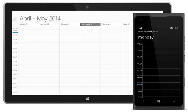
Non-Working Hours and Days
Schedule allows you to differentiate the Business hours with non-Working hour’s timeslot by highlighting with different colors.
Note:-Non-Working Hour TimeSlot customization is only applicable in day,week,workweek and timeline views in windows and for Windows Phone it is applicable for day and timeline views.
Enabling Non-Working Hours and Days
IsHighLightWorkingHours property is used to indicating whether the working hours should be highlighted with Non-business hours. The default value of IsHighLightWorkingHours property is false.
Non-Working Hour Brush
The Non-Working hour’s background brush can be customized using the NonWorkingHourBrush property.
Non-Working Hours
The Work start and end hour of day can be declared by using the WorkStartHour and WorkEndHour properties respectively.
<Schedule:SfSchedule IsHighLightWorkingHours="True" WorkStartHour="9"
    WorkEndHour="18" ScheduleType="Week"  NonWorkingHourBrush="LightBlue"/>
SfSchedule schedule = new SfSchedule();
schedule.IsHighLightWorkingHours = true;
schedule.ScheduleType = ScheduleType.Week;
schedule.WorkStartHour = 9;
schedule.WorkEndHour = 18;
schedule.NonWorkingHourBrush = new SolidColorBrush(Colors.LightBlue);
this.grid.Children.Add(schedule);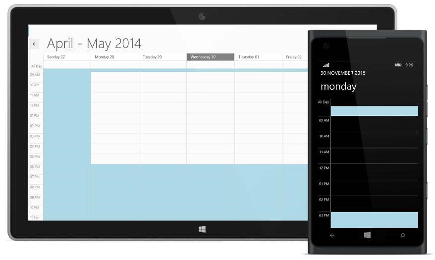
Non-Working Days of Week
The Non-Working Days of the Week can be set using the property NonWorkingDays. The NonWorkingDays is string type, the default value of this property is “Sunday,Saturday”.
Note:-Non-Working days customization is only applicable in day,week,workweek and timeline views in windows and for Windows Phone it is applicable for day and timeline views.
<Schedule:SfSchedule IsHighLightWorkingHours="True"
    ScheduleType="Week"  NonWorkingHourBrush="LightBlue"/>
SfSchedule schedule = new SfSchedule();
schedule.IsHighLightWorkingHours = true;
schedule.ScheduleType = ScheduleType.Week;
schedule.NonWorkingHourBrush = new SolidColorBrush(Colors.LightBlue);
this.grid.Children.Add(schedule);NonWorkingDateCollection:
NonWorkingDateCollection property allows you to add the Non-Working Days of the week.
SfSchedule schedule = new SfSchedule();
    schedule.IsHighLightWorkingHours = true;
    schedule.ScheduleType = ScheduleType.Week;
    schedule.NonWorkingDays = "Tuesday,Thursday,Friday";
    schedule.NonWorkingHourBrush = new SolidColorBrush(Colors.LightBlue);
    schedule.NonWorkingDateCollection.Add(DayOfWeek.Tuesday);
    schedule.NonWorkingDateCollection.Add(DayOfWeek.Thursday);
    this.grid.Children.Add(schedule);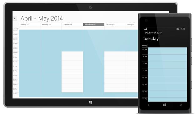
Hiding Non-Working Hours
To hide non-working hours in the schedule, the ShowNonWorkingHours property in the schedule must be set as false. The working hours specified using the WorkStartHour and WorkEndHour properties are simply shown in the schedule without showing non-working hours.
Note:-Hiding-Non-Working _hour is only applicable in day,week,workweek and timeline views in windows and for Windows Phone it is applicable for day and timeline views.
<syncfusion:SfSchedule x:Name="schedule" Background="White"
                               ScheduleType="Week"
                               WorkStartHour="9" WorkEndHour="18"
                               ShowNonWorkingHours="False">
        </syncfusion:SfSchedule>
SfSchedule schedule = new SfSchedule();
schedule.ScheduleType = ScheduleType.Week;
schedule.WorkStartHour=9;
schedule.WorkEndHour=18;
schedule.ShowNonWorkingHours=false;
this.grid.Children.Add(schedule);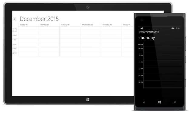
CollapsedHours
For a particular Start and End time the selected Timeslot can be hidden by using CollapsedHours property of SfSchedule and you can differentiated Collapsed Hour Timeslot by using its Background property.
Note:-Hiding TimeSlot customization is only applicable in day,week,workweek and timeline views in windows and for Windows Phone it is applicable for day and timeline views.
<schedule:SfSchedule Background="White" x:Name="schedule" ScheduleType="Week">
    <schedule:SfSchedule.CollapsedHours>
                <schedule:ScheduleCollapsedHour StartHour="1" EndHour="5"  Background="Red"/>
            </schedule:SfSchedule.CollapsedHours>
    </schedule:SfSchedule>
SfSchedule schedule = new SfSchedule();
schedule.ScheduleType = ScheduleType.Week;
schedule.CollapsedHours.Add(new ScheduleCollapsedHour()
{
StartHour = 10,
EndHour = 11,
Background = new SolidColorBrush(Colors.Red)
});
this.grid.Children.Add(schedule);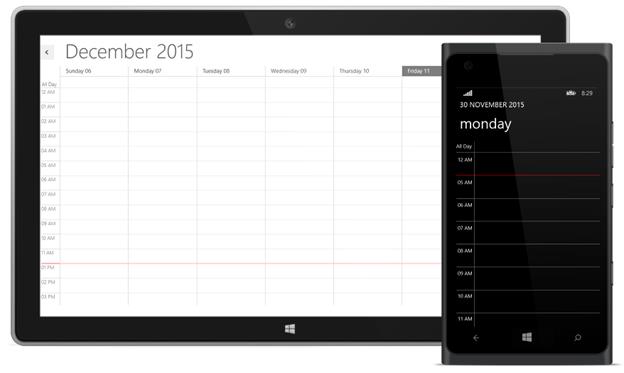
NonAccessibleBlocks
A particular Start and End timeslot can be blocked by setting the NonAccessibleBlocks property collection. And the corresponding block can be highlighted with different color and label by using Background and Label property of NonAccessibleBlock correspondingly.
Note:-NonAccessible block is only applicable in day,week,workweek and timeline views in windows and for Windows Phone it is applicable for day and timeline views.
<Schedule:SfSchedule ScheduleType="Week"  IntervalHeight="30">
            <Schedule:SfSchedule.NonAccessibleBlocks>
                <Schedule:NonAccessibleBlock Background="LightPink" StartHour="6.00" EndHour="8.00" Label="Non Accessible Block">
                </Schedule:NonAccessibleBlock>
            </Schedule:SfSchedule.NonAccessibleBlocks>
        </Schedule:SfSchedule>
SfSchedule schedule = new SfSchedule();
schedule.ScheduleType = ScheduleType.Week;
schedule.NonAccessibleBlocks.Add(new NonAccessibleBlock()
{
Background = new SolidColorBrush(Colors.LightPink),
StartHour = 6.00,
EndHour = 8.00,
Label = "Non Accessible Block"
});
this.grid.Children.Add(schedule);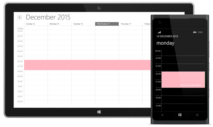
Stroke Customization
In the SfSchedule control, major, minor, and horizontal lines drawn in the day and week views, and horizontal and vertical lines drawn in the month view can be customized.
In the day, week, work week, and time line views, the color of major lines can be customized by setting the Brush property MajorTickStroke, and a dashed line pattern can be set for major lines through MajorTickStrokeDashArray, a double collection property. Similarly, the color of minor lines and a dashed line pattern can be set through MinorTickStroke and MinorTickStrokeDashArray, respectively.The color of the vertical lines that separate dates in the week view can be customized through the DayViewVerticalLineStroke property. Major and minor tick labels can also be customized using MajorTickLabelStroke and MinorTickLabelStroke.
In the month view, the horizontal and vertical line strokes can be customized by using the MonthViewLineStroke property.
Note:-Stroke customization is only applicable in day,week,workweek and timeline views in windows and for Windows Phone it is applicable for day and timeline views.
Property Table
| API Name | Data Type | Description |
| MajorTickStroke | Brush | Used to customize the major line stroke of the day and time line views. |
|
MinorTickStroke |
Brush | Used to customize the minor line stroke of the day and time line views. |
|
MajorTickLabelStroke |
Brush | Used to customize the major line label stroke in the day and time line views. |
| MinorTickLabelStroke | Brush | Used to customize the minor line label stroke of the day and time line views. |
| MajorTickStrokeDashArray | DoubleCollection | Used to customize the major line stroke dash array of the day and time line views. |
|
MinorTickStrokeDashArray |
DoubleCollection | Used to customize the minor line stroke dash array of the day and time line views. |
|
DayViewVerticalLineStroke |
Brush |
Used to customize the vertical line stroke of the day view. |
|
MonthViewLineStroke |
Brush |
Used to customize the line stroke of month view. |
<syncfusion:SfSchedule x:Name="Schedule1" TimeInterval="ThirtyMin"IntervalHeight="40"
          ScheduleType="WorkWeek"
          MajorTickStroke="Red"
          MinorTickStroke="Green"
          MajorTickLabelStroke="Red"
          MinorTickLabelStroke="Green"
          DayViewVerticalLineStroke="Blue"
          MonthViewLineStroke="Orange"
          MajorTickStrokeDashArray="5,10"
          MinorTickStrokeDashArray="5,5">  </syncfusion:SfSchedule>
SfSchedule schedule = new SfSchedule();
schedule.TimeInterval = TimeInterval.ThirtyMin;
schedule.IntervalHeight = 40;
schedule.ScheduleType = ScheduleType.WorkWeek;
schedule.MajorTickStroke = new SolidColorBrush(Colors.Red);
schedule.MinorTickStroke = new SolidColorBrush(Colors.Green);
schedule.MajorTickLabelStroke = new SolidColorBrush(Colors.Red);
schedule.MinorTickLabelStroke = new SolidColorBrush(Colors.Green);
schedule.DayViewVerticalLineStroke = new SolidColorBrush(Colors.Blue);
schedule.MonthViewLineStroke = new SolidColorBrush(Colors.Orange);
schedule.MajorTickStrokeDashArray = new DoubleCollection() { 5,10};
schedule.MinorTickStrokeDashArray = new DoubleCollection() {10,10 };
this.grid.Children.Add(schedule);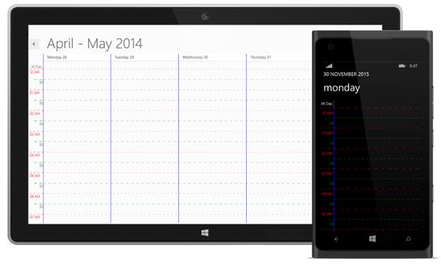
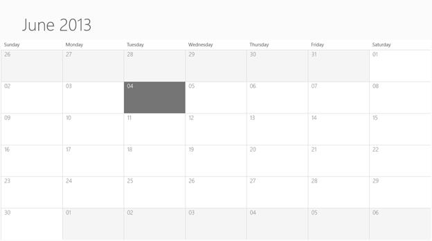
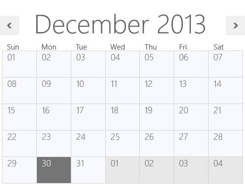
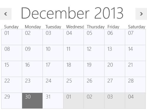
Focused and Non-Focused Month Brush
In Schedule month view, date of the current selected month and date of previous/next months can be differentiated using the FocusedMonth and NonFocusedMonth properties respectively.
Note:-Focused and Non Focused Month Brush is only applicable for windows.
<Schedule:SfSchedule x:Name="schedule" FocusedMonth="White"
    NonFocusedMonth="WhiteSmoke" ScheduleType="Month" />
SfSchedule schedule = new SfSchedule();
schedule.ScheduleType = ScheduleType.Month;
schedule.FocusedMonth = new SolidColorBrush(Colors.White);
schedule.NonFocusedMonth = new SolidColorBrush(Colors.WhiteSmoke);
this.grid.Children.Add(schedule);Windows
Selection Brush
Cell Selection
The Default cell selection brush can be customized by using CellSelectionBrush property and its default brush is Gray.
<Schedule:SfSchedule x:Name="schedule" CellSelectionBrush="Pink"/>SfSchedule schedule = new SfSchedule();
schedule.CellSelectionBrush = new SolidColorBrush(Colors.Pink);
this.grid.Children.Add(schedule);
Appointment Selection
The appointment selection brush can be customized by using AppointmentSelectionBrush property.
<Schedule:SfSchedule x:Name="schedule" AppointmentSelectionBrush="LimeGreen"/>SfSchedule schedule = new SfSchedule();
schedule.AppointmentSelectionBrush = new SolidColorBrush(Colors.LimeGreen);
this.grid.Children.Add(schedule);
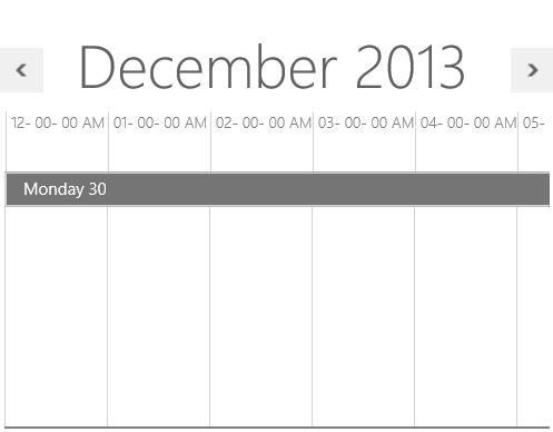
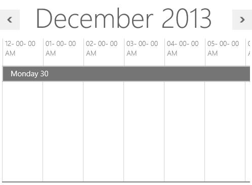
Enabling Auto Formatting
When reducing the size of the schedule in week and month views, headers may be only partially shown. To avoid incompletely displayed headers, automatic formatting can be enabled by setting the EnableAutoFormat property of the SfSchedule control as true.
Note:-EnableAutoFormat is only applicable for windows.
<syncfusion:SfSchedule x:Name="schedule" Background="White"
                               Height="400" Width="500"
                               EnableAutoFormat="True"
                               ScheduleType="Week">
        </syncfusion:SfSchedule>
SfSchedule schedule = new SfSchedule();
schedule.Background = new SolidColorBrush(Colors.White);
schedule.Height = 400;
schedule.Width = 500;
schedule.EnableAutoFormat = true;
schedule.ScheduleType = ScheduleType.Week;
this.grid.Children.Add(schedule);
Hours in time line view can be automatically adjusted by enabling EnableAutoFormat. To automatically adjust size IntervalHeight should not be specified with a particular value. If IntervalHeight is specified for the SfSchedule control, then the width of the hours in the time line view will be sized with the specified IntervalHeight.
<syncfusion:SfSchedule x:Name="schedule" Background="White"
                               Height="400" Width="500"
                               MajorTickTimeFormat="hh- mm- ss tt"
                               EnableAutoFormat="True"
                              ScheduleType="TimeLine">
        </syncfusion:SfSchedule>
SfSchedule schedule = new SfSchedule();
schedule.Background = new SolidColorBrush(Colors.White);
schedule.Height = 400;
schedule.Width = 500;
schedule.MajorTickTimeFormat = "hh- mm- ss tt";
schedule.EnableAutoFormat = true;
schedule.ScheduleType = ScheduleType.TimeLine;
this.grid.Children.Add(schedule);