How can I help you?
Progress Animations in UWP Progress Bar (SfProgressBar)
18 Feb 20253 minutes to read
The built-in progress bar shapes are circular and linear. However, any custom object can be used for fill animation. ProgressType property is used to choose the progress type(shape) and the enumeration values are
- SolidCircular
- SolidLinear
- SegmentedCircular
- SegmentedLinear
- Custom
Circular Progress Animations
In SolidCircular and SegmentedCircular progress types, the arc segments are animated to show the progress. The default progress type is SolidCircular.
<notification:SfProgressBar x:Name="progressBar" ProgressType="SolidCircular" />progressBar.ProgressType = Syncfusion.UI.Xaml.Controls.Notification.ProgressTypes.SolidCircular;
progressBar.Value = 35.0;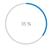
<notification:SfProgressBar x:Name="progressBar" ProgressType="SegmentedCircular" />progressBar.ProgressType = Syncfusion.UI.Xaml.Controls.Notification.ProgressTypes.SegmentedCircular;
progressBar.Value = 35.0;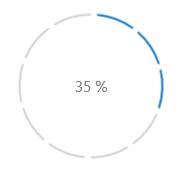
Linear Progress Animations
In SolidLinear and SegmentedLinear progress types, the line segments is animated to show the progress.
<notification:SfProgressBar ProgressType="SolidLinear" Value="35" Width="500"/>progressBar.ProgressType = Syncfusion.UI.Xaml.Controls.Notification.ProgressTypes.SolidLinear;
progressBar.Value = 35.0;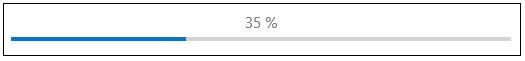
<notification:SfProgressBar ProgressType="SegmentedLinear" Value="35" Width="500"/>progressBar.ProgressType = Syncfusion.UI.Xaml.Controls.Notification.ProgressTypes.SegmentedLinear;
progressBar.Value = 35.0;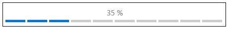
Animating Fill in Custom Object
Set the property ProgressType to Custom for animating a custom object with fill animation.
<notification:SfProgressBar x:Name="progressBar" ProgressType="Custom" />progressBar.ProgressType = Syncfusion.UI.Xaml.Controls.Notification.ProgressTypes.Custom;
progressBar.Value = 35.0;
The above code displays only the display content. The custom object can be set using Template and FillPath property. FillPath property holds the name of the element in template that is to be animated.
<notification:SfProgressBar ProgressType="Custom" FillPath="CloudFillPath" Value="35">

<notification:SfProgressBar.Template>

<ControlTemplate TargetType="notification:SfProgressBar">

<Viewbox>

<Grid>

<Path Data="F1M88.6366,20.4367C104.1566,20.4367,117.9286,29.6127,123.7326,43.2487C124.4526,44.9407,126.0886,46.1447,128.0046,46.5567C141.9406,49.5567,152.4046,61.6487,152.4046,76.0887C152.4046,92.7767,138.4526,106.3527,121.2846,106.3527L47.1966,106.3527C34.6246,106.3527,24.4046,96.3967,24.4046,84.1807C24.4046,71.9487,34.6246,62.0127,47.1966,62.0127C47.3606,62.0127,47.5206,62.0127,47.6846,62.0167C49.3766,62.0607,50.8006,60.8127,50.7006,59.2567C50.6646,58.6327,50.6446,58.0087,50.6446,57.3847C50.6446,37.0087,67.6886,20.4367,88.6366,20.4367" Fill="White" Stroke="#FF1196CD" StrokeThickness="1.5" Height="85.916" Stretch="Fill" Width="128" HorizontalAlignment="Center" VerticalAlignment="Center"/>

<Path x:Name="CloudFillPath" Data="F1M88.6366,20.4367C104.1566,20.4367,117.9286,29.6127,123.7326,43.2487C124.4526,44.9407,126.0886,46.1447,128.0046,46.5567C141.9406,49.5567,152.4046,61.6487,152.4046,76.0887C152.4046,92.7767,138.4526,106.3527,121.2846,106.3527L47.1966,106.3527C34.6246,106.3527,24.4046,96.3967,24.4046,84.1807C24.4046,71.9487,34.6246,62.0127,47.1966,62.0127C47.3606,62.0127,47.5206,62.0127,47.6846,62.0167C49.3766,62.0607,50.8006,60.8127,50.7006,59.2567C50.6646,58.6327,50.6446,58.0087,50.6446,57.3847C50.6446,37.0087,67.6886,20.4367,88.6366,20.4367" Fill="#FF1196CD" Height="85.916" Stretch="Fill" Width="128" HorizontalAlignment="Center" VerticalAlignment="Center"/>

</Grid>

</Viewbox>

</ControlTemplate>

</notification:SfProgressBar.Template>

</notification:SfProgressBar>