How can I help you?
Appearance and Styling in UWP Progress Bar (SfProgressBar)
18 Feb 20252 minutes to read
Customizing the Hot Spots
The brush of animating element (except Custom progress type) in the control can be changed using the FillColor property. It can set as given below:
<notification:SfProgressBar x:Name="progressBar" FillColor="Green"/>progressBar.FillColor = new SolidColorBrush(Colors.Green);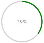
The brush of background element (except Custom progress type) in the control can be changed using BackRimFillColor property. It can be set as given below:
<notification:SfProgressBar x:Name="progressBar" BackRimillColor="PaleVioletRed"/>progressBar.BackRimFillColor = new SolidColorBrush(Colors.PaleVioletRed);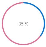
Customizing the Circular Progress Types
Increasing Radius of the ArcSegment
The Radius of ArcSegments in SolidCircular progress type can be increased using Radius and BackRimRadius properties. It can be set as given below:
<notification:SfProgressBar ProgressType="SolidCircular" Height="210" Width="210" Radius="100" BackRimRadius="100" Value="35"/>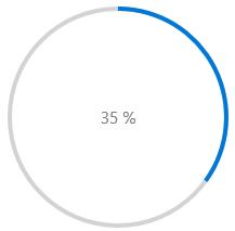
Increasing the StrokeThickness of ArcSegment
The StrokeThickness of ArcSegments in SolidCircular progress type can be increased using StrokeThickness and BackRimStrokeThickness properties. It can be set as given below:
<notification:SfProgressBar ProgressType="SolidCircular" Height="210" Width="210" StrokeThickness="20" BackRimStrokeThickness="20" Value="35"/>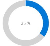
Customizing the SegmentedLinear Progress Type
The SegmentedLinear progress type can be customized as given below:
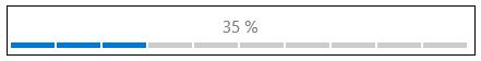
Changing the Segment Counts
SegmentCount property is used to increase or decrease the segment count.
<notification:SfProgressBar ProgressType="SegmentedLinear" Height="38" Width="900" SegmentCount="20" Value="35"/>
Increasing the Width of Progress Line Segment
<notification:SfProgressBar ProgressType="SegmentedLinear" Height="38" Width="900" SegmentWidth="20" Value="35">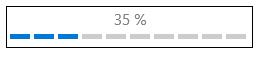
Increasing the Height of Progress Line Segment
<notification:SfProgressBar ProgressType="SegmentedLinear" Height="38" Width="900" SegmentHeight="20" Value="35">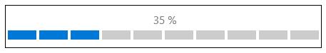
Adjusting the Spacing between Line Segments
<notification:SfProgressBar ProgressType="SegmentedLinear" Height="38" Width="900" SegmentSpacing="2" Value="35">