How can I help you?
Populating Items in UWP Picker (SfPicker)
10 May 202124 minutes to read
This section explains about the ways of populating items for SfPicker control
Binding Data Source
SfPicker is bound the external data source to display the data’s. It supports any collections that’s implements the IEnumerable interface.
To bind the data source in SfPicker, set the SfPicker.ItemsSource property as show in below code.
<Page
        x:Class="PopulatingItems.MainPage"
        xmlns="http://schemas.microsoft.com/winfx/2006/xaml/presentation"
        xmlns:x="http://schemas.microsoft.com/winfx/2006/xaml"
        xmlns:local="using:PopulatingItems"
        xmlns:syncfusion="using:Syncfusion.UI.Xaml.Controls.Input">

      <Grid>

        <syncfusion:SfPicker x:Name="picker" Header="Select a Color" ItemsSource="{Binding Colors}" />

      </Grid>

    </Page>
using Syncfusion.UI.Xaml.Controls.Input;
using Windows.UI.Xaml;
namespace PopulatingItems
{
public sealed partial class MainPage : Page
{
public MainPage()
{
this.InitializeComponent();
SfPicker picker = new SfPicker();
ColorInfo color info = new ColorInfo();
this.DataContext = color info;
picker.ItemsSource = color info.Colors;
this.Content = picker;
}
}
}Multi-Column Items
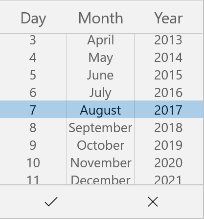
The SfPicker automatically populate the items as Multi-Column based on the Data Source.
Collection of items can be created and assigned to a Collection and each item Collection is a column of SfPicker.
The following code example illustrates about to populate Month, Day and Year values in each column of SfPicker.
<Page
    x:Class="MultiColumn.MainPage"
    xmlns="http://schemas.microsoft.com/winfx/2006/xaml/presentation"
    xmlns:x="http://schemas.microsoft.com/winfx/2006/xaml"
    xmlns:local="using:MultiColumn"
    xmlns:syncfusion="using:Syncfusion.UI.Xaml.Controls.Input">

      <Grid>

          <syncfusion:SfPicker x:Name="picker" Header="Select a Color" ItemsSource="{Binding Dates}" />

      </Grid>

    </Page>
using Syncfusion.UI.Xaml.Controls.Input;
using Windows.UI.Xaml;
namespace MultiColumn
{
public sealed partial class MainPage : Page
{
public MainPage()
{
this.InitializeComponent();
DatesInfo dates info = new DatesInfo();
this.DataContext = dates info;
}
public class DatesInfo
{
public ObservableCollection<object> Dates { get; set; }
//Day is the collection of day numbers
private ObservableCollection<string> Day { get; set; }
// Month is the collection of Month Names
private ObservableCollection<string> Month { get; set; }
//Year is the collection of Years from 1990 to 2050
private ObservableCollection<string> Year { get; set; }
public ObservableCollection<string> Headers { get; set; }
public DatesInfo()
{
Dates = new ObservableCollection<object>();
Headers = new ObservableCollection<string>();
//Populate Day, Month and Year values of each collection
PopulateDates();
//first column of SfPicker
Dates.Add(Day);
//second column of SfPicker
Dates.Add(Month);
//third column of SfPicker
Dates.Add(Year);
//first column header of SfPicker
Headers.Add("Day");
//second column header of SfPicker
Headers.Add("Month");
//third column header of SfPicker
Headers.Add("Year");
}
private void PopulateDates()
{
Day = new ObservableCollection<string>();
Month = new ObservableCollection<string>();
Year = new ObservableCollection<string>();
for (int i = 1; i <= 31; i++)
Day.Add(i.ToString());
for (int i = 1; i <= 12; i++)
Month.Add(System.Globalization.CultureInfo.CurrentCulture.DateTimeFormat.GetMonthName(i));
for (int i = 1990; i <= 2050; i++)
Year.Add(i.ToString());
}
}
}MultiColumn sample from the following link
Sample link: MultiColumn
Screen shot for the above code.
Set Items Colors and Font Attributes customization
In SfPicker, items text color and font both selected and unselected item of SfPicker control can be customized as shown below.
Selected Item Customization
Text Color
Selected item text color can be customized by setting SfPicker.SelectedItemForeground property of SfPicker.
<Page
        x:Class="PopulatingItems.MainPage"
        xmlns="http://schemas.microsoft.com/winfx/2006/xaml/presentation"
        xmlns:x="http://schemas.microsoft.com/winfx/2006/xaml"
        xmlns:local="using:PopulatingItems"
        xmlns:syncfusion="using:Syncfusion.UI.Xaml.Controls.Input">

        <Grid>

            <syncfusion:SfPicker x:Name="picker" SelectedItemForeground="Green" />

        </Grid>

    </Page>
using Syncfusion.UI.Xaml.Controls.Input;
using Windows.UI.Xaml;
namespace PopulatingItems
{
public sealed partial class MainPage : Page
{
public MainPage()
{
this.InitializeComponent();
SfPicker picker = new SfPicker();
picker.SelectedItemForeground = new SolidColorBrush(Windows.UI.Colors.Green);
this.Content = picker;
}
}
}Font
This section explains about the customization of Selected Item Font.
FontFamily
Selected item text FontFamily can be customized by setting SfPicker.SelectedItemFontFamily property of SfPicker.
<Page
        x:Class="PopulatingItems.MainPage"
        xmlns="http://schemas.microsoft.com/winfx/2006/xaml/presentation"
        xmlns:x="http://schemas.microsoft.com/winfx/2006/xaml"
        xmlns:local="using:PopulatingItems"
        xmlns:syncfusion="using:Syncfusion.UI.Xaml.Controls.Input"

        <Grid>

            <syncfusion:SfPicker x:Name="picker" SelectedItemFontFamily="Arial" />

        </Grid>

    </Page>
using Syncfusion.UI.Xaml.Controls.Input;
using Windows.UI.Xaml;
namespace PopulatingItems
{
public sealed partial class MainPage : Page
{
public MainPage()
{
this.InitializeComponent();
SfPicker picker = new SfPicker();
picker.SelectedItemFontFamily = new FontFamily("Ariel");
this.Content = picker;
}
}
}FontSize
Selected item text FontSize can be customized by setting SfPicker.SelectedItemFontSize property of SfPicker.
<Page
        x:Class="PopulatingItems.MainPage"
        xmlns="http://schemas.microsoft.com/winfx/2006/xaml/presentation"
        xmlns:x="http://schemas.microsoft.com/winfx/2006/xaml"
        xmlns:local="using:PopulatingItems"
        xmlns:syncfusion="using:Syncfusion.UI.Xaml.Controls.Input"

        <Grid>

            <syncfusion:SfPicker x:Name="picker" SelectedItemFontSize="25" />

        </Grid>

    </Page>
using Syncfusion.UI.Xaml.Controls.Input;
using Windows.UI.Xaml;
namespace PopulatingItems
{
public sealed partial class MainPage : Page
{
public MainPage()
{
this.InitializeComponent();
SfPicker picker = new SfPicker();
picker.SelectedItemFontSize = 25;
this.Content = picker;
}
}
}FontAttribute
Selected item text FontAttribute can be customized by setting SfPicker.SelectedItemFontStyle property of SfPicker.
<Page
        x:Class="PopulatingItems.MainPage"
        xmlns="http://schemas.microsoft.com/winfx/2006/xaml/presentation"
        xmlns:x="http://schemas.microsoft.com/winfx/2006/xaml"
        xmlns:local="using:PopulatingItems"
        xmlns:syncfusion="using:Syncfusion.UI.Xaml.Controls.Input">

        <Grid>

            <syncfusion:SfPicker x:Name="picker" SelectedItemFontStyle="Italic" />

        </Grid>

    </Page>
using Syncfusion.UI.Xaml.Controls.Input;
using Windows.UI.Xaml;
namespace PopulatingItems
{
public sealed partial class MainPage : Page
{
public MainPage()
{
this.InitializeComponent();
SfPicker picker = new SfPicker();
picker.SelectedItemFontStyle = Windows.UI.Text.FontStyle.Italic;
this.Content = picker;
}
}
}UnSelected Item Customization
Text Color
Unselected item text color can be customized by setting SfPicker.UnSelectedItemTextColor property of SfPicker.
<Page
        x:Class="PopulatingItems.MainPage"
        xmlns="http://schemas.microsoft.com/winfx/2006/xaml/presentation"
        xmlns:x="http://schemas.microsoft.com/winfx/2006/xaml"
        xmlns:local="using:PopulatingItems"
        xmlns:syncfusion="using:Syncfusion.UI.Xaml.Controls.Input"

        <Grid>

            <syncfusion:SfPicker x:Name="picker"  Foreground="Gray" />

        </Grid>

    </Page>
using Syncfusion.UI.Xaml.Controls.Input;
using Windows.UI.Xaml;
namespace PopulatingItems
{
public sealed partial class MainPage : Page
{
public MainPage()
{
this.InitializeComponent();
SfPicker picker = new SfPicker();
picker.Foreground = new SolidColorBrush(Windows.UI.Colors.Gray);
this.Content = picker;
}
}
}Font
This section explains about the customization of unselected items Font.
FontFamily
Unselected item text FontFamily can be customized by setting SfPicker.UnSelectedItemFontFamily property of SfPicker.
<Page
        x:Class="PopulatingItems.MainPage"
        xmlns="http://schemas.microsoft.com/winfx/2006/xaml/presentation"
        xmlns:x="http://schemas.microsoft.com/winfx/2006/xaml"
        xmlns:local="using:PopulatingItems"
        xmlns:syncfusion="using:Syncfusion.UI.Xaml.Controls.Input"

        <Grid>

            <syncfusion:SfPicker x:Name="picker"  FontFamily="Consolas" />

        </Grid>

    </Page>
using Syncfusion.UI.Xaml.Controls.Input;
using Windows.UI.Xaml;
namespace PopulatingItems
{
public sealed partial class MainPage : Page
{
public MainPage()
{
this.InitializeComponent();
SfPicker picker = new SfPicker();
picker.FontFamily = new FontFamily("Ariel");
this.Content = picker;
}
}
}FontSize
Unselected item text FontSize can be customized by setting SfPicker.UnSelectedItemTextSize property of SfPicker.
<Page
        x:Class="PopulatingItems.MainPage"
        xmlns="http://schemas.microsoft.com/winfx/2006/xaml/presentation"
        xmlns:x="http://schemas.microsoft.com/winfx/2006/xaml"
        xmlns:local="using:PopulatingItems"
        xmlns:syncfusion="using:Syncfusion.UI.Xaml.Controls.Input"

        <Grid>

            <syncfusion:SfPicker x:Name="picker" FontSize="20" />

        </Grid>

    </Page>
using Syncfusion.UI.Xaml.Controls.Input;
using Windows.UI.Xaml;
namespace PopulatingItems
{
public sealed partial class MainPage : Page
{
public MainPage()
{
this.InitializeComponent();
SfPicker picker = new SfPicker();
picker.FontSize = 20;
this.Content = picker;
}
}
}FontAttribute
Unselected item text FontAttribute can be customized by setting SfPicker.UnSelectedItemFontStyle property of SfPicker.
<Page
        x:Class="PopulatingItems.MainPage"
        xmlns="http://schemas.microsoft.com/winfx/2006/xaml/presentation"
        xmlns:x="http://schemas.microsoft.com/winfx/2006/xaml"
        xmlns:local="using:PopulatingItems"
        xmlns:syncfusion="using:Syncfusion.UI.Xaml.Controls.Input">

        <Grid>

            <syncfusion:SfPicker x:Name="picker" FontStyle="Normal" />

        </Grid>

    </Page>
using Syncfusion.UI.Xaml.Controls.Input;
using Windows.UI.Xaml;
namespace PopulatingItems
{
public sealed partial class MainPage : Page
{
public MainPage()
{
this.InitializeComponent();
SfPicker picker = new SfPicker();
picker.FontStyle = Windows.UI.Text.FontStyle.Normal;
this.Content = picker;
}
}
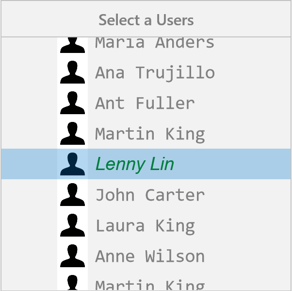
}Adding Custom View Items
In SfPicker, the items can be customized with custom view of each item by adding all the item with custom view.
<Page
        x:Class="PopulatingItems.MainPage"
        xmlns="http://schemas.microsoft.com/winfx/2006/xaml/presentation"
        xmlns:x="http://schemas.microsoft.com/winfx/2006/xaml"
        xmlns:local="using:PopulatingItems"
        xmlns:syncfusion="using:Syncfusion.UI.Xaml.Controls.Input">

      <Grid>

        <Button Click="Button_Click" HorizontalAlignment="Center"  VerticalAlignment="Center" Height="60" Width="200" Content="Open picker"/>

        <syncfusion:SfPicker x:Name="picker" ItemsSource="{Binding Users}" VerticalAlignment="Center" HorizontalAlignment="Center" Height="400" Width="400" FontStyle="Normal" FontSize="25" FontFamily="Consolas" Foreground="Gray" SelectedItemFontStyle="Italic" SelectedItemForeground="Green"     SelectedItemFontSize="25" SelectedItemFontFamily="Arial" ShowHeader="True"  Header="Select a Users" ShowColumnHeader="True" ColumnHeaderText="Users" PickerMode="Dialog" >

            <syncfusion:SfPicker.ItemTemplate>

                    <DataTemplate>

                        <Grid>

                            <Grid.ColumnDefinitions>

                                <ColumnDefinition Width="50" />

                                <ColumnDefinition Width="*" />

                            </Grid.ColumnDefinitions>

                            <Image Margin="8,0,0,0" Name="image" Source="user.png"  />

                            <TextBlock Grid.Column="1" Height="50" Width="200" Text="{Binding}" />

                        </Grid>

                    </DataTemplate>

                </syncfusion:SfPicker.ItemTemplate>

            </syncfusion:SfPicker>

     </Grid>

    </Page>
using Syncfusion.UI.Xaml.Controls.Input;
using Windows.UI.Xaml;
namespace PopulatingItems
{
public sealed partial class MainPage : Page
{
public MainPage()
{
this.InitializeComponent();
UsersInfo userInfo = new UsersInfo();
this.DataContext = userInfo;
}
private void Button_Click(object sender, RoutedEventArgs e)
{
picker.IsOpen = true;
}
}
public class UserInfo
{
private ObservableCollection<string> _user;
public ObservableCollection<string> Users
{
get { return _user; }
set { _user = value; }
}
public UserInfo()
{
Users = new ObservableCollection<string>();
Users.Add("Maria Anders");
Users.Add("Ana Trujillo");
Users.Add("Ant Fuller");
Users.Add("Martin King");
Users.Add("Lenny Lin");
Users.Add("John Carter");
Users.Add("Laura King");
Users.Add("Anne Wilson");
Users.Add("Martin King");
Users.Add("Gina Irene");
}
}
}Screen shot for the above code.