How can I help you?
Getting Started with UWP Picker (SfPicker)
25 May 202116 minutes to read
This section explains you the steps to configure a SfPicker control in a real-time scenario and provides a walk-through on some of the customization features available in SfPicker control.
Adding SfPicker Control
Create a Universal Windows Platform project in Visual Studio and refer to the following assemblies.
-
Syncfusion. SfInput.UWP
-
Syncfusion.SfShared.UWP
Create a simple SfPicker
This section explains how to create simple SfPicker control and configure it. SfPicker can configure using C# code.
Create the UWP project
Create new blank project (Universal Windows) using Visual Studio for UWP project.
Adding SfPicker in UWP project
- Add the required assembly reference in UWP and other renderer projects as discussed in Adding SfPicker reference section.
- Add SfPicker control two way XAML and C#.
- XAML Page
- Set SfPicker control namespace as
xmlns:syncfusion=using:Syncfusion.UI.Xaml.Controls.Input;assembly=Syncfusion.SfInput.UWP;in XAML Content page. - Set the SfPicker control in Content property of ContentPage.
- Set SfPicker control namespace as
- C# Page
- Import SfPicker control namespace as
using Syncfusion.UI.Xaml.Controls.Input;in C# ContentPage. - Create new SfPicker instance in ContentPage constructor and assign SfPicker instance to ContentPage Content property.
- Import SfPicker control namespace as
- XAML Page
<Page
    x:Class="GettingStartedSample.MainPage"
    xmlns="http://schemas.microsoft.com/winfx/2006/xaml/presentation"
    xmlns:x="http://schemas.microsoft.com/winfx/2006/xaml"
    xmlns:local="using:GettingStartedSample"
    xmlns:syncfusion="using:Syncfusion.UI.Xaml.Controls.Input">

        <Grid>

        <syncfusion:SfPicker x:Name="picker" />

        </Grid>

    </Page>
using Syncfusion.UI.Xaml.Controls.Input;
using Windows.UI.Xaml;
namespace GettingStartedSample
{
public sealed partial class MainPage : Page
{
public MainPage()
{
this.InitializeComponent();
SfPicker picker = new SfPicker();
this.Content = picker;
}
}
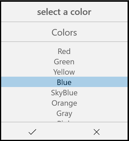
}Set Header to the SfPicker
SfPicker allows you to define header text by setting the SfPicker.ColumnHeaderText and enable SfPicker header by setting SfPicker.ShowColumnHeader property to true. Default value of SfPicker.ShowColumnHeader is True.
<Page
    x:Class="GettingStartedSample.MainPage"
    xmlns="http://schemas.microsoft.com/winfx/2006/xaml/presentation"
    xmlns:x="http://schemas.microsoft.com/winfx/2006/xaml"
    xmlns:local="using:GettingStartedSample"
    xmlns:syncfusion="using:Syncfusion.UI.Xaml.Controls.Input">

        <Grid>

            <syncfusion:SfPicker x:Name="picker" Header="select a color"/>

        </Grid>

    </Page>
using Syncfusion.UI.Xaml.Controls.Input;
using Windows.UI.Xaml;
namespace GettingStartedSample
{
public sealed partial class MainPage : Page
{
public MainPage()
{
this.InitializeComponent();
SfPicker picker = new SfPicker();
picker.Header = "Select a Color";
this.Content = picker;
}
}
}Adding SfPicker Items
SfPicker control is a data bounded control. Hence you must create collection of data’s and bind it to SfPicker control.
- Create simple Observable Collection with string type of Data’s for the SfPicker
using Syncfusion.UI.Xaml.Controls.Input;
    using Windows.UI.Xaml;

    namespace GettingStartedSample

    {

      public class ColorInfo

      {

        private ObservableCollection<string> _color;

        //update the Colors

        public ObservableCollection<string> Colors

        {

            get { return _color; }

            set { _color = value; }

        }

        public ColorInfo()

        {

            Colors = new ObservableCollection<string>();

            Colors.Add("Red");

            Colors.Add("Green");

            Colors.Add("Yellow");

            Colors.Add("Blue");

            Colors.Add("SkyBlue");

            Colors.Add("Orange");

            Colors.Add("Gray");

            Colors.Add("Pink");

        }

      }

}- Binding the Collection to SfPicker
SfPicker allow you to bind collection of data’s by setting SfPicker.ItemsSource property. You can bind the collection of data’s in C#.
<Page
        x:Class="GettingStartedSample.MainPage"
        xmlns="http://schemas.microsoft.com/winfx/2006/xaml/presentation"
        xmlns:x="http://schemas.microsoft.com/winfx/2006/xaml"
        xmlns:local="using:GettingStartedSample"
        xmlns:syncfusion="using:Syncfusion.UI.Xaml.Controls.Input">

      <Grid>

        <syncfusion:SfPicker x:Name="picker" Header="Select a Color" ItemsSource="{Binding Colors}" />

      </Grid>

    </Page>
using Syncfusion.UI.Xaml.Controls.Input;
using Windows.UI.Xaml;
namespace GettingStartedSample
{
public sealed partial class MainPage : Page
{
public MainPage()
{
this.InitializeComponent();
SfPicker picker = new SfPicker();
ColorInfo color info = new ColorInfo();
this.DataContext = color info;
picker.ItemsSource = color info.Colors;
this.Content = picker;
}
}
}Set title to the Items
SfPicker allows you to define title to the SfPicker items by setting SfPicker.ColumnHeaderText and enable title of the SfPicker items by setting SfPicker.ShowColumnHeader property to True. Default value of SfPicker.ShowColumnHeader is False.
<Page
        x:Class="GettingStartedSample.MainPage"
        xmlns="http://schemas.microsoft.com/winfx/2006/xaml/presentation"
        xmlns:x="http://schemas.microsoft.com/winfx/2006/xaml"
        xmlns:local="using:GettingStartedSample"
        xmlns:syncfusion="using:Syncfusion.UI.Xaml.Controls.Input">

        <Grid>

            <syncfusion:SfPicker x:Name="picker" ColumnHeaderText="Colors" ShowColumnHeader="True" />

        </Grid>

    </Page>
using Syncfusion.UI.Xaml.Controls.Input;
using Windows.UI.Xaml;
namespace GettingStartedSample
{
public sealed partial class MainPage : Page
{
public MainPage()
{
this.InitializeComponent();
SfPicker picker = new SfPicker();
picker.ColumnHeaderText = "Colors";
picker.ShowColumnHeader = true;
this.Content = picker;
}
}
}Enable Validation button in Footer
In SfPicker validation button (Ok and Cancel) can be enabled by setting SfPicker.ShowFooter property to True. Default value of SfPicker.ShowFooter property is False
<Page
        x:Class="GettingStartedSample.MainPage"
        xmlns="http://schemas.microsoft.com/winfx/2006/xaml/presentation"
        xmlns:x="http://schemas.microsoft.com/winfx/2006/xaml"
        xmlns:local="using:GettingStartedSample"
        xmlns:syncfusion="using:Syncfusion.UI.Xaml.Controls.Input">

        <Grid>

            <syncfusion:SfPicker x:Name="picker" ShowFooter="True" />

        </Grid>

    </Page>
using Syncfusion.UI.Xaml.Controls.Input;
using Windows.UI.Xaml;
namespace GettingStartedSample
{
public sealed partial class MainPage : Page
{
public MainPage()
{
this.InitializeComponent();
SfPicker picker = new SfPicker();
picker.ShowFooter = true;
this.Content = picker;
}
}
}Open as Dialog
In SfPickerSfPicker can be rendered as a dialog by setting SfPicker.PickerMode property to Dialog. Default value of SfPicker.PickerMode property is Default.
<Page
        x:Class="GettingStartedSample.MainPage"
        xmlns="http://schemas.microsoft.com/winfx/2006/xaml/presentation"
        xmlns:x="http://schemas.microsoft.com/winfx/2006/xaml"
        xmlns:local="using:GettingStartedSample"
        xmlns:syncfusion="using:Syncfusion.UI.Xaml.Controls.Input">

        <Grid>

            <syncfusion:SfPicker x:Name="picker" PickerMode="Dialog" />

        </Grid>

    </Page>
using Syncfusion.UI.Xaml.Controls.Input;
using Windows.UI.Xaml;
namespace GettingStartedSample
{
public sealed partial class MainPage : Page
{
public MainPage()
{
this.InitializeComponent();
SfPicker picker = new SfPicker();
picker.PickerMode = PickerMode.Dialog;
this.Content = picker;
}
}
}The picker can be opened programmatically by setting by setting SfPicker.IsOpen property to True. Default value of SfPicker.IsOpen is False.
Note: This property automatically changed to False when close the dialog by clicking outside of dialog SfPicker.
<Page
        x:Class="GettingStartedSample.MainPage"
        xmlns="http://schemas.microsoft.com/winfx/2006/xaml/presentation"
        xmlns:x="http://schemas.microsoft.com/winfx/2006/xaml"
        xmlns:local="using:GettingStartedSample"
        xmlns:syncfusion="using:Syncfusion.UI.Xaml.Controls.Input">

        <Grid>

             <syncfusion:SfPicker x:Name="picker" IsOpen="True" PickerMode="Dialog" />

        </Grid>

    </Page>
using Syncfusion.UI.Xaml.Controls.Input;
using Windows.UI.Xaml;
namespace GettingStartedSample
{
public sealed partial class MainPage : Page
{
public MainPage()
{
this.InitializeComponent();
SfPicker picker = new SfPicker();
picker.IsOpen = true;
this.Content = picker;
}
}
}Screen shot for the above code
We have attached sample for reference. please download the sample from the below link.
Sample link: GettingStarted