How can I help you?
Timescale in UWP Gantt (SfGantt)
10 May 20219 minutes to read
This section provides an overview on the features of timescale. The following properties are used for configuring the timescale in the TimescaleSettings class:
-
TopTier: Represents the top tier of the timescale. -
BottomTier: Represents the bottom tier of the timescale.
<Gantt:SfGantt.TimescaleSettings>
      <Gantt:TimescaleSettings>
         <Gantt:TimescaleSettings.TopTier>
             <Gantt:TimescaleTier></Gantt:TimescaleTier>
          </Gantt:TimescaleSettings.TopTier>
         <Gantt:TimescaleSettings.BottomTier>
              <Gantt:TimescaleTier IntervalType="Days"></Gantt:TimescaleTier>
          </Gantt:TimescaleSettings.BottomTier>
      </Gantt:TimescaleSettings>
</Gantt:SfGantt.TimescaleSettings>this.Gantt.TimescaleSettings.TopTier = new TimescaleTier();
this.Gantt.TimescaleSettings.BottomTier = new TimescaleTier();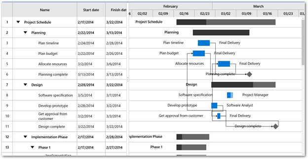
By default, the interval type is set to Auto. You can change the interval type and interval using the following properties in TimescaleTier class:
-
IntervalType: Defines the type of the interval as minutes, hours, days, weeks, quarter, and year. -
Interval: Sets a value that determines the interval between the timescale tier cells.
The following code sample demonstrates displaying the timescale as years and days.
<Gantt:SfGantt.TimescaleSettings>
    <Gantt:TimescaleSettings>
       <Gantt:TimescaleSettings.TopTier>
          <Gantt:TimescaleTier Interval="1" IntervalType="Years"></Gantt:TimescaleTier>
       </Gantt:TimescaleSettings.TopTier>
       <Gantt:TimescaleSettings.BottomTier>
          <Gantt:TimescaleTier Interval="4" IntervalType="Days"></Gantt:TimescaleTier>
       </Gantt:TimescaleSettings.BottomTier>
    </Gantt:TimescaleSettings>
</Gantt:SfGantt.TimescaleSettings>this.Gantt.TimescaleSettings.TopTier = new TimescaleTier()
{
Interval = 1,
IntervalType = IntervalType.Years
};
this.Gantt.TimescaleSettings.BottomTier = new TimescaleTier()
{
Interval = 4,
IntervalType = IntervalType.Days
};
NOTE
The top tier’s interval and interval type must be greater than the bottom tier’s interval and interval type.
Display formats
The display formats can be defined for each interval type. You can set the default date-time format strings as display formats. The display formats can be defined using the following properties:
-
YearsLabelFormat: Sets the the label format for year interval type. -
QuarterLabelFormat: Sets the the label format for quarter interval type. -
WeeksLabelFormat: Sets the the label format for week interval type. -
DaysLabelFormat: Sets the label format for days interval type. -
HoursLabelFormat: Sets the the label format for hours interval type.
Visual customization
The default view of the timescale can be customized using the following properties:
-
Background: Sets the background color for timescale. -
BorderBrush: Sets the color for the border for every timescale cell. -
Foreground: Sets the color for the text in timescale. -
LabelAlignment: Changes the alignment of the label in timescale cell.
The following code sample demonstrates how to customize a timescale.
<Gantt:SfGantt x:Name="Gantt" ItemsSource="{Binding TaskCollection}" ProjectResources="{Binding ResourceCollection}">

     <Gantt:SfGantt.TimescaleSettings>

        <Gantt:TimescaleSettings  Background="LightBlue" BorderBrush="DarkBlue" Foreground="Blue">

           <Gantt:TimescaleSettings.TopTier>

               <Gantt:TimescaleTier LabelAlignment="Left"  IntervalType="Years" >

            </Gantt:TimescaleTier>

            </Gantt:TimescaleSettings.TopTier>

            <Gantt:TimescaleSettings.BottomTier>

                <Gantt:TimescaleTier LabelAlignment="Left" IntervalType="Days">

                </Gantt:TimescaleTier>

           </Gantt:TimescaleSettings.BottomTier>

       </Gantt:TimescaleSettings>

   </Gantt:SfGantt.TimescaleSettings>

</Gantt:SfGantt>this.Gantt.TimescaleSettings.Background = new SolidColorBrush(Colors.LightBlue);
this.Gantt.TimescaleSettings.BorderBrush = new SolidColorBrush(Colors.DarkBlue);
this.Gantt.TimescaleSettings.Foreground = new SolidColorBrush(Colors.Blue);
this.Gantt.TimescaleSettings.TopTier.LabelAlignment = TextAlignment.Left;
this.Gantt.TimescaleSettings.BottomTier.LabelAlignment = TextAlignment.Left;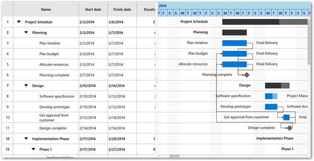
Label template
The default appearance of the label in timescale cell can be customized using the LabelTemplate property in TimescaleTier class.
<Gantt:SfGantt x:Name="Gantt" ItemsSource="{Binding TaskCollection}" AllowEditing="True" ProjectResources="{Binding ResourceCollection}">

      <Gantt:SfGantt.TimescaleSettings>

          <Gantt:TimescaleSettings >

             <Gantt:TimescaleSettings.TopTier>

                 <Gantt:TimescaleTier  IntervalType="Years" >

                     <Gantt:TimescaleTier.LabelTemplate>

                        <DataTemplate>

                            <TextBlock Text="{Binding Content}" Foreground="Red" FontSize="24"></TextBlock>

                         </DataTemplate>

                    </Gantt:TimescaleTier.LabelTemplate>

                  </Gantt:TimescaleTier>

               </Gantt:TimescaleSettings.TopTier>

         <Gantt:TimescaleSettings.BottomTier>

         <Gantt:TimescaleTier IntervalType="Days">

              <Gantt:TimescaleTier.LabelTemplate>

                   <DataTemplate>

                       <TextBlock Text="{Binding Content}" Width="30" Foreground="Black" FontSize="20"></TextBlock>

                   </DataTemplate>

                 </Gantt:TimescaleTier.LabelTemplate>

              </Gantt:TimescaleTier>

           </Gantt:TimescaleSettings.BottomTier>

       </Gantt:TimescaleSettings>

    </Gantt:SfGantt.TimescaleSettings>

</Gantt:SfGantt>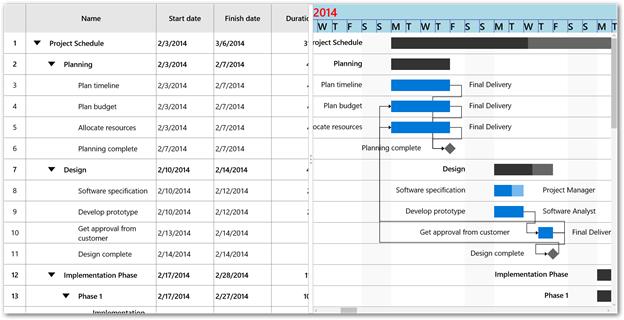
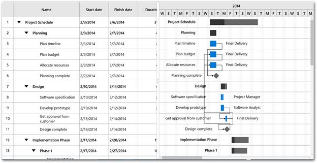
Cell width customization
The width for the timescale cell in the bottom tier can be set using the CellSize property in TimescaleSettings.
The following code sample demonstrates how to increase the width of a timescale cell.
<Gantt:SfGantt x:Name="Gantt" ItemsSource="{Binding TaskCollection}" ProjectResources="{Binding ResourceCollection}">

     <Gantt:SfGantt.TimescaleSettings>

        <Gantt:TimescaleSettings CellSize="350" >

        </Gantt:TimescaleSettings>

     </Gantt:SfGantt.TimescaleSettings>

</Gantt:SfGantt>this.Gantt.TimescaleSettings.CellSize = 350;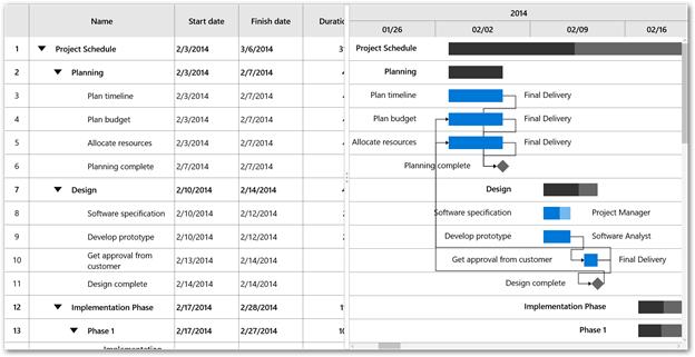
NOTE
The value for the cell width ranges between 25 and 1000.
Range customization
The start or end range of a timescale can be explicitly defined using the TimescaleStartDate and TimescaleEndDate properties in SfGantt class.
The following code sample demonstrates how to customize the range of a timescale.
<Gantt:SfGantt x:Name="Gantt" TimescaleStartDate="2014/1/1"
               TimescaleEndDate="2014/4/1"
               ItemsSource="{Binding TaskCollection}"
               ProjectResources="{Binding ResourceCollection}">

</Gantt:SfGantt>this.Gantt.TimescaleStartDate = new DateTime(2014, 1, 1);
this.Gantt.TimescaleEndDate = new DateTime(2014, 5, 1);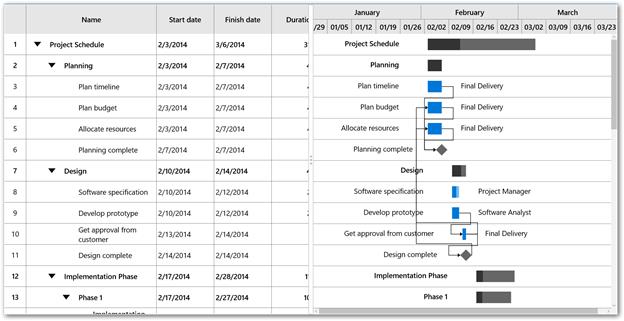
See also
How to customize the time scale label format