Appearance in UWP Gantt (SfGantt)
21 Jul 202618 minutes to read
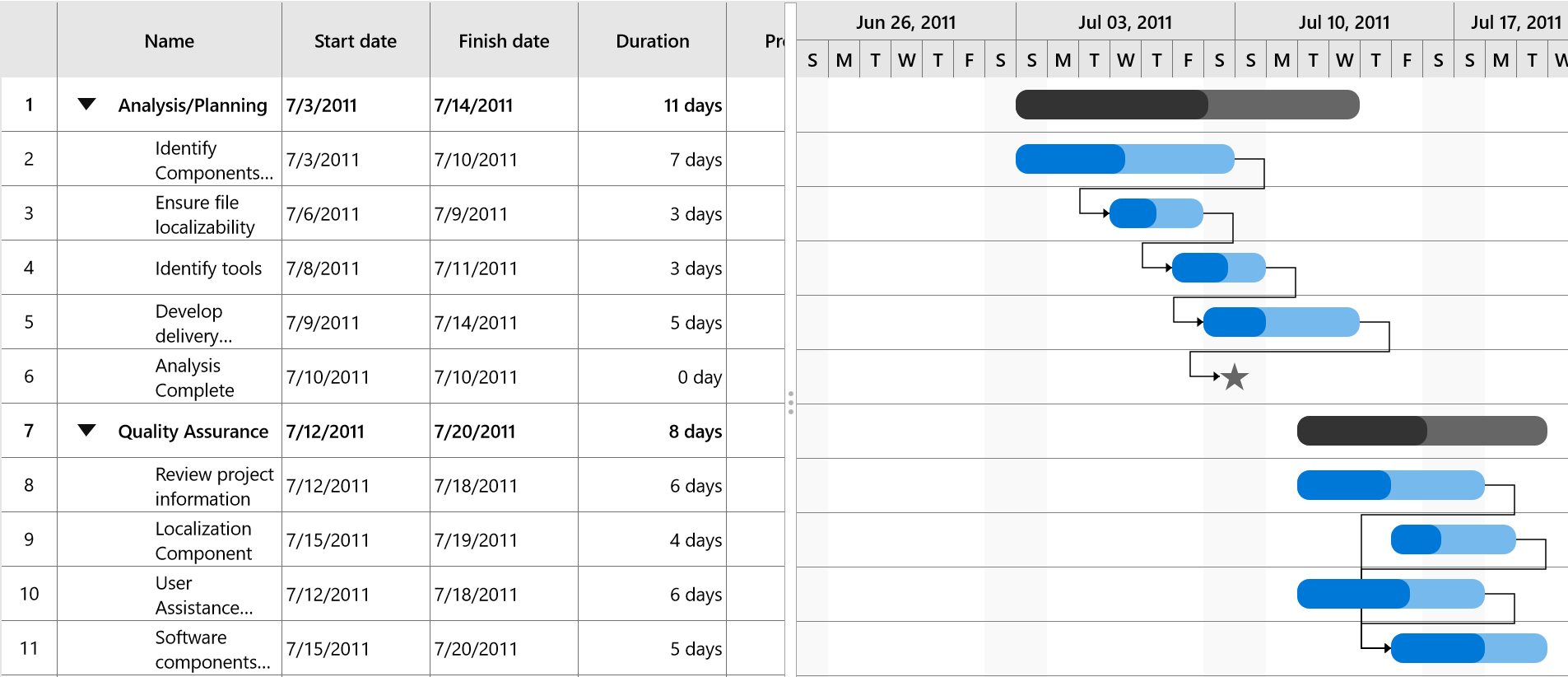
The Gantt control provides options to customize the look and feel of the task visual in the Gantt chart.
Visual customization
The colors of parent taskbar, taskbar, milestone, and progress bar can be customized using the following properties:
-
ParentTaskBarBrush– Specifies the color for the parent taskbar. -
ParentProgressIndicatorBrush– Specifies the color for the parent progress bar. -
TaskBarBrush– Specifies the color for the taskbar. -
TaskProgressIndicatorBrush– Specifies the color for task progress bar. -
MilestoneBrush– Specifies the color for the milestone.
The following code sample demonstrates how to customize the visual of a task.
<gantt:SfGantt x:Name="GanttControl" ItemsSource="{Binding TaskCollection}"
                       ParentTaskBarBrush="#33ffbe06"
                       ParentProgressIndicatorBrush="#FFffbe06"
                       TaskBarBrush="#3390a84e"
                       TaskProgressIndicatorBrush="#FF90a84e"
                       MilestoneBrush="#999999">
        </gantt:SfGantt>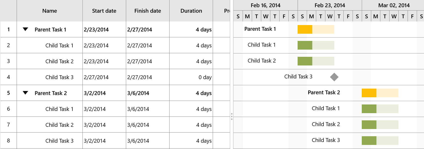
Template customization
You can customize the templates of the parent taskbar, taskbar, and milestone using the ParentTaskBarTemplate, TaskBarTemplate and MilestoneTemplate properties, respectively.
The following code sample demonstrates how to customize a template.
<Grid>
    <Grid.DataContext>
        <local:ProjectTrackerViewModel/>
    </Grid.DataContext>
    <Grid.Resources>
        <!--TaskBar Template-->
        <ControlTemplate x:Key="TaskBarTemplate">
            <Grid x:Name="PART_TaskGrid">
                <Grid.ColumnDefinitions>
                    <ColumnDefinition Width="Auto"/>
                    <ColumnDefinition Width="Auto"/>
                    <ColumnDefinition Width="*"/>
                    <ColumnDefinition Width="Auto"/>
                    <ColumnDefinition Width="Auto"/>
                </Grid.ColumnDefinitions>
                <Rectangle x:Name="PART_LeftEllipse" HorizontalAlignment="Left" Visibility="Collapsed" Fill="Brown" Height="10" Width="10" Grid.Column="0" VerticalAlignment="Center"/>
                <Thumb x:Name="PART_LeftTaskThumb" Visibility="Collapsed" Height="20" Width="20" Grid.Column="1" Background="Red" VerticalAlignment="Center">
                    <Thumb.Template>
                        <ControlTemplate>
                            <Path Data="M25.320001,0L25.320001,32 0,16z" Stretch="Uniform" Fill="#FF222222" Width="20" Height="20" Margin="0,0,0,0" RenderTransformOrigin="0.5,0.5">
                                <Path.RenderTransform>
                                    <TransformGroup>
                                        <TransformGroup.Children>
                                            <RotateTransform Angle="0" />
                                            <ScaleTransform ScaleX="1" ScaleY="1" />
                                        </TransformGroup.Children>
                                    </TransformGroup>
                                </Path.RenderTransform>
                            </Path>
                        </ControlTemplate>
                    </Thumb.Template>
                </Thumb>
                <Grid Grid.Column="2">
                    <!--Bound task height, task width and task brush-->
                    <Rectangle x:Name="PART_TaskBar" HorizontalAlignment="Left"
                                    Height="{Binding ActualTaskHeight}" Width="{Binding TaskWidth}"
                                    Fill="{Binding TaskBrush}" RadiusX="10" RadiusY="10" ></Rectangle>
                    <!--Bound task height, progress width and progress brush-->
                    <Rectangle x:Name="PART_ProgressBar" Width="{Binding ProgressWidth}"
                                    HorizontalAlignment="Left" RadiusX="10" RadiusY="10"
                                    Height="{Binding ActualTaskHeight}"
                                    Fill="{Binding ProgressBrush}"/>
                    <Canvas>
                        <Thumb x:Name="PART_ProgressThumb"
                        Canvas.Left="{Binding ProgressWidth}" Visibility="Collapsed" Canvas.Top="{Binding ActualTaskHeight}">
                            <Thumb.Template>
                                <ControlTemplate>
                                    <Path Data="M16,0L32,19.745 0,19.745z" Stretch="Uniform" Fill="#FF222222" Width="10" Height="10" Margin="-5,0,0,0" RenderTransformOrigin="0.5,0.5">
                                        <Path.RenderTransform>
                                            <TransformGroup>
                                                <TransformGroup.Children>
                                                    <RotateTransform Angle="0" />
                                                    <ScaleTransform ScaleX="1" ScaleY="1" />
                                                </TransformGroup.Children>
                                            </TransformGroup>
                                        </Path.RenderTransform>
                                    </Path>
                                </ControlTemplate>
                            </Thumb.Template>
                        </Thumb>
                    </Canvas>
                </Grid>
                <Thumb x:Name="PART_RightTaskThumb" Height="20" Width="20" Grid.Column="3" Visibility="Collapsed" Background="Red" VerticalAlignment="Center">
                    <Thumb.Template>
                        <ControlTemplate>
                            <Path Data="M0,0L25.194,16 0,32z" Stretch="Uniform" Fill="#FF222222" Width="20" Height="20" Margin="0,0,0,0" RenderTransformOrigin="0.5,0.5">
                                <Path.RenderTransform>
                                    <TransformGroup>
                                        <TransformGroup.Children>
                                            <RotateTransform Angle="0" />
                                            <ScaleTransform ScaleX="1" ScaleY="1" />
                                        </TransformGroup.Children>
                                    </TransformGroup>
                                </Path.RenderTransform>
                            </Path>
                        </ControlTemplate>
                    </Thumb.Template>
                </Thumb>
                <Rectangle x:Name="PART_RightEllipse" Fill="Brown" Height="10" HorizontalAlignment="Left" Visibility="Collapsed" Width="10" Grid.Column="4" VerticalAlignment="Center"/>
            </Grid>
        </ControlTemplate>
        <!--Milestone Template-->
        <ControlTemplate x:Key="MilestoneTemplate">
            <Grid>
                <Grid.ColumnDefinitions>
                    <ColumnDefinition Width="Auto"/>
                    <ColumnDefinition Width="*"/>
                    <ColumnDefinition Width="Auto"/>
                </Grid.ColumnDefinitions>
                <Rectangle x:Name="PART_LeftEllipse" Visibility="Collapsed" Fill="Brown" Height="10" Width="10"/>
                <!--Bound task height, task width and task brush-->
                <Path x:Name="PART_TaskBar" HorizontalAlignment="Left" Grid.Column="1"
                                Data="M1540.22,2082.07L1546.95,2102.78 1568.73,2102.78 1551.11,2115.58 1557.84,2136.29 1540.22,2123.49 1522.6,2136.29 1529.33,2115.58 1511.71,2102.78 1533.49,2102.78 1540.22,2082.07z"
                                Stretch="Uniform" Width="{Binding TaskWidth}" Height="{Binding ActualTaskHeight}"
                                Fill="{Binding TaskBrush}">
                </Path>
                <Rectangle x:Name="PART_RightEllipse" Visibility="Collapsed" Fill="Brown" Height="10" Width="10" Grid.Column="2"/>
            </Grid>
        </ControlTemplate>
        <!--Parent task template-->
        <ControlTemplate x:Key="ParentTaskBarTemplate">
            <Grid>
                <!--Bound task height, task width and task brush-->
                <Rectangle x:Name="PART_TaskBar" HorizontalAlignment="Left"
                            Height="{Binding ActualTaskHeight}" Width="{Binding TaskWidth}"
                            Fill="{Binding TaskBrush}" RadiusX="10" RadiusY="10" ></Rectangle>
                <!--Bound task height, progress width and progress brush-->
                <Rectangle x:Name="PART_ProgressBar" Width="{Binding ProgressWidth}"
                            HorizontalAlignment="Left" RadiusX="10" RadiusY="10"
                            Height="{Binding ActualTaskHeight}"
                            Fill="{Binding ProgressBrush}"/>
            </Grid>
        </ControlTemplate>
    </Grid.Resources>
    <gantt:SfGantt x:Name="GanttControl" ItemsSource="{Binding TaskCollection}"
                DisplayTaskNames="False" AllowEditing="True"
                TaskBarTemplate="{StaticResource TaskBarTemplate}"
                ParentTaskBarTemplate="{StaticResource ParentTaskBarTemplate}"
                MilestoneTemplate="{StaticResource MilestoneTemplate}">
    </gantt:SfGantt>
</Grid>
NOTE
The thumbs and ellipses will be visible only when
AllowEditingis true.