How can I help you?
Appearance and Styling in UWP Calculator (SfCalculator) control
18 Feb 20251 minute to read
All the panes in SfCalculator can be customized easily. The panes can be styled as follows:
- FunctionsPaneStyle
- DisplayPaneStyle
- InputPane Style
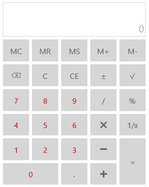
Customizing functions panel
Function pane is the panel containing number buttons and mathematical symbols. It can be styled using FunctionsPaneStyle property.
<Style TargetType="input:FunctionsPane">

<Setter Property="Foreground" Value="Red"/>

</Style>
Customizing display panel
Display pane is the panel that contain elements displaying value and expression. It can be styled as follows.
<Style TargetType="input:DisplayPane">

<Setter Property="Foreground" Value="Red"/>

<Setter Property="FontSize" Value="20"/>

</Style>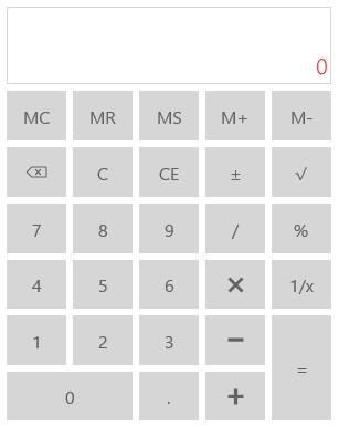
Customizing input panel
Input pane is a panel in SfCalculator that contains number buttons. It can be styled as follows.
<Style TargetType="input:DisplayPane">

<Setter Property="Foreground" Value="Red"/>

<Setter Property="FontSize" Value="20"/>

</Style>