How can I help you?
Getting started with TypeScript Tooltip
Preparing HTML document
The Tooltip control has the following list of external JavaScript dependencies.
-
jQuery 1.7.1 and later versions
-
jQuery.easing - to support animation effects in the components
Refer to the internal dependencies in the following table.
| File | Description/Usage |
|---|---|
| ej.core.min.js | It is referred always before using all the JS controls. |
| ej.tooltip.min.js | The Tooltip's main file. |
To get started, you can use the ej.web.all.min.js file that encapsulates all the ej controls and frameworks in one single file.
Create a Tooltip
Create an HTML page and add the scripts references in the order mentioned in the following code example.
<!DOCTYPE html>
<html>
<head>
<link href="http://cdn.syncfusion.com/33.1.44/js/web/bootstrap-theme/ej.web.all.min.css" rel="stylesheet" />
<script src="https://code.jquery.com/jquery-3.0.0.min.js"></script>
<script src="http://cdn.syncfusion.com/33.1.44/js/web/ej.web.all.min.js" type="text/javascript"></script>
<script src="app.js"></script>
</head>
<body>
</body>
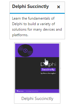
</html>The Tooltip can be created from any HTML element with the HTML id attribute and pre-defined options set to it. To create the Tooltip, you should call the ejTooltip jQuery plug-in function with the options as parameter. Refer to the following code example.
<div class="frame">
      <div class="img"  id="link1"  >
        <img src="http://js.syncfusion.com/demos/web/images/tooltip/template-05.png" alt="Delphi">
        <div class="desc">Delphi Succinctly</div>
     </div>
</div>/// <reference path="../tsfiles/jquery.d.ts" />
/// <reference path="../tsfiles/ej.web.all.d.ts" />
module TooltipComponent {
$(function () {
var sample1 = new ej.Tooltip($("#link1"),{
content: "Learn the fundamentals of Delphi to build a variety of solutions for many devices and platforms." });
});
}Apply the following style sheet
<style>
       div.img {
        border: 1px solid #ccc;
        width: 159px;
        height: 213px;
        left: 35%;
        position: relative;
        top: 20%;
      }
     div.img img {
        width: 159px;
        height: 179px;
       }
     div.desc {
        padding: 8px;
        text-align: center;
       }
    </style>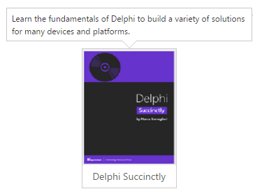
Setting Dimensions
Tooltip dimensions can be set using width and height API.
/// <reference path="../tsfiles/jquery.d.ts" />
     /// <reference path="../tsfiles/ej.web.all.d.ts" />

        module TooltipComponent {

             $(function () {

            var sample1 = new ej.Tooltip($("#link1"),{
            content: "Learn the fundamentals of Delphi to build a variety of solutions for many devices and platforms.",
            height:"100px",
			width:"100px"
			});

         });
       }
Tooltip Appearance
You can configure the appearance of the Tooltip with the title, close button and call out as your application requires.
/// <reference path="../tsfiles/jquery.d.ts" />
     /// <reference path="../tsfiles/ej.web.all.d.ts" />

     module TooltipComponent {

        $(function () {

          var sample1 = new ej.Tooltip($("#link1"),{
             content: "Learn the fundamentals of Delphi to build a variety of solutions for many devices and platforms.",
             height:"100px",
			 width:"200px",
             closeMode:"sticky",
             title:"Delphi Succintly",
             isBalloon : false
			});

            });
        }
Apply the following styles to show the Tooltip.
<style>
       div.img {
        border: 1px solid #ccc;
        float: left;
        box-sizing: border-box;
        height: 200px;
        width: 146px;
         }
        div.img img{
        width: 100%;
        height: 166px;
        }
       div.desc {
        padding: 6px;
        text-align: center;
         }
    </style>