How can I help you?
Easy customization
Split Button is used in many applications. Split Button Size, Content and content location is varied according to each application. The following sections describes you some customizable options for Split Button that can perform easily.
Content for Split button
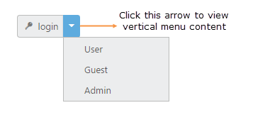
The targetID is a mandatory one, without this field it acts as normal button on two sides. This targetID property is used to specify the list of content for Split Button. The list of content is rendered as a vertical menu list. This vertical menu list is open, when you click on the down arrow of the Split Button.
The following steps explains you the details about rendering the Split Button with content.
In the HTML page, add the following button elements to configure Split Button widget.
<div class="spltspan">
    <button id="splitButton">login</button>
    <ul id="Ul11">
        <li><span>User</span></li>
        <li><span>Guest</span></li>
        <li><span>Admin</span></li>
    </ul>
</div>/// <reference path="tsfiles/jquery.d.ts" />
/// <reference path="tsfiles/ej.web.all.d.ts" />
module SplitButtonComponent {
$(function () {
var button = new ej.SplitButton($("#splitButton"), {
size: "small",
contentType: "textandimage",
showRoundedCorner: true,
//targetID used to specify vertical menu content
targetID: "Ul11",
prefixIcon: "e-icon e-login"
});
});
}Execute the above code to render the following output.
Button Size
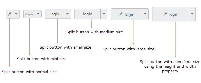
You can render the Split Button in different sizes. The following table contains some predefined size option for rendering a Split Button in easiest way. Each size option has different height and width. Mainly it avoids the complexity in rendering Split Button with complex CSS class.
List of Button size
| Button Size | Description |
|---|---|
| normal | Creates split button with content size. |
| mini | Creates split button with Built-in mini size height, width specified. |
| small | Creates split button with Built-in small size height, width specified. |
| medium | Creates split button with Built-in medium size height, width specified. |
| Large | Creates split button with Built-in large size height, width specified. |
Apart from the above mentioned predefined size option, you can set your own width and height for Split Button using height and width property.
The following steps explains you the details about rendering the Split Button with above mentioned size options.
In the HTML page, add the following button elements to configure Split Button widget.
<div class="align">
    <table>
        <tr>
            <td class="btnsht">
                <div class="spltspan">
                    <button id="splitButton_normal">login</button>
                    <ul id="Ul11">
                        <li><span>User</span></li>
                        <li><span>Guest</span></li>
                        <li><span>Admin</span></li>
                    </ul>
                </div>
            </td>

            <td>
                <button id="splitButton_mini">login</button>
                <ul id="Ul21">
                    <li><span>User</span></li>
                    <li><span>Guest</span></li>
                    <li><span>Admin</span></li>
                </ul>
            </td>

            <td class="btnsht">
                <button id="splitButton_small">login</button>
                <ul id="Ul31">
                    <li><span>User</span></li>
                    <li><span>Guest</span></li>
                    <li><span>Admin</span></li>
                </ul>
            </td>

            <td class="btnsht">
                <button id="splitButton_medium">login</button>
                <ul id="Ul41">
                    <li><span>User</span></li>
                    <li><span>Guest</span></li>
                    <li><span>Admin</span></li>
                </ul>
            </td>

            <td class="btnsht">
                <button id="splitButton_large">login</button>
                <ul id="Ul51">
                    <li><span>User</span></li>
                    <li><span>Guest</span></li>
                    <li><span>Admin</span></li>
                </ul>
            </td>
             <td class="btnsht">
                <button id="splitButton_customSize">login</button>
                <ul id="Ul61">
                    <li><span>User</span></li>
                    <li><span>Guest</span></li>
                    <li><span>Admin</span></li>
                </ul>
            </td>
        </tr>
    </table>
</div>/// <reference path="tsfiles/jquery.d.ts" />
/// <reference path="tsfiles/ej.web.all.d.ts" />
module SplitButtonComponent {
$(function () {
var button = new ej.SplitButton($("#splitButton_normal"), {
//Here we used size property to render the split button in different sizes
//normal size type is used
size: "normal",
showRoundedCorner: true,
contentType: "imageonly",
targetID: "Ul11",
prefixIcon: "e-icon e-login"
});
var button1 = new ej.SplitButton($("#splitButton_mini"), {
//mini size type is used
size: "mini",
showRoundedCorner: true,
targetID: "Ul21",
});
var button2 = new ej.SplitButton($("#splitButton_small"), {
//small size type is used
size: "small",
showRoundedCorner: true,
targetID: "Ul31",
});
var button3 = new ej.SplitButton($("#splitButton_medium"), {
//medium size type is used
size: "medium",
showRoundedCorner: true,
targetID: "Ul41",
});
var button4 = new ej.SplitButton($("#splitButton_large"), {
//large size type is used
size: "large",
showRoundedCorner: true,
targetID: "Ul51",
contentType: "textandimage",
prefixIcon: "e-login e-icon",
});
var button5 = new ej.SplitButton($("#splitButton_customSize"), {
//user given height and width
height: 50,
width: 150,
showRoundedCorner: true,
targetID: "Ul61",
contentType: "textandimage",
prefixIcon: "e-login e-icon",
});
});
}Configure the styles.
<style>
    .control {
        width: 500px;
    }
    .e-split {
        float: left;
        padding-left: 10px;
    }
</style>
Execute the above code to render the following output.
Content Type
The content of the Split Button is mainly rendered as text and images. Instead of using complex CSS classes to render Split Button with different content types, you can use some predefined content type options listed in the following table. Using this content types you can easily add different types of content for Split Button. Split Button supports the following content types.
List of content types
| Content Type | Description |
|---|---|
| textonly | Supports only for text content only. |
| imageonly | Supports only for image content only |
| imageboth | Supports image for both ends of the button. |
| textandimage | Supports image with the text content. |
| imagetextimage | Supports image with both ends and middle in text. |
Prefix and Suffix icons
Icons inside the Split Button is added easily using prefixIcon and suffixIcon property. Location of the icon in Split Button is a necessary thing. You can customize the location of Icon easily using the following mentioned options.
Split Button control also supports the Built-in icon libraries. The ej.widgets.core.min CSS contains definitions for important icons that are used in Split Buttons. You can use these Built-in icons by mentioning the icon class name as value in prefixIcon and suffixIcon property. You can use any font icons that is defined in ej.widgets.core.min CSS. It avoids the complexity in specifying icon using sprite image and CSS.
For example the following Built-in CSS class are used to display the font icons that is used by media player.
- e-mediaback
- e-mediaforward
- e-medianext
- e-mediaprev
- e-mediaeject
- e-mediaclose
- e-mediapause
- e-mediaplay
Prefix Icon
It inserts the icon at the starting position of Split Button. After this prefix icon, you can use text or suffix icon.
Suffix Icon
It inserts the icon at the ending position of Split Button. Before this suffix icon, you can use text or prefix icon.
The following steps explains you the details on rendering the Split Button with above mentioned content type, prefix and suffix icon options
In the HTML page, add the following button elements to configure Split Button widget.
<table>
    <tr>
        <td class="btnsht">
            <button id="splitButton_imageonly">login</button>
            <ul id="Ul11">
                <li><span>User</span></li>
                <li><span>Guest</span></li>
                <li><span>Admin</span></li>
            </ul>
        </td>
        <td>
            <button id="splitButton_textonly">login</button>
            <ul id="Ul21">
                <li><span>User</span></li>
                <li><span>Guest</span></li>
                <li><span>Admin</span></li>
            </ul>
        </td>
        <td class="btnsht">
            <button id="splitButton_imageboth">login</button>
            <ul id="Ul31">
                <li><span>User</span></li>
                <li><span>Guest</span></li>
                <li><span>Admin</span></li>
            </ul>
        </td>
        <td class="btnsht">
            <button id="splitButton_textandimage">login</button>
            <ul id="Ul41">
                <li><span>User</span></li>
                <li><span>Guest</span></li>
                <li><span>Admin</span></li>
            </ul>
        </td>
        <td class="btnsht">
            <button id="splitButton_imagetextimage">login</button>
            <ul id="Ul51">
                <li><span>User</span></li>
                <li><span>Guest</span></li>
                <li><span>Admin</span></li>
            </ul>
        </td>
    </tr>
</table>/// <reference path="tsfiles/jquery.d.ts" />
/// <reference path="tsfiles/ej.web.all.d.ts" />
module SplitButtonComponent {
$(function () {
var Button = new ej.SplitButton($("#splitButton_imageonly"), {
size: "medium",
//only image is used as content
contentType: "imageonly",
showRoundedCorner: true,
prefixIcon: "e-icon e-handup",
targetID: "Ul11",
});
var Button1 = new ej.SplitButton($("#splitButton_textonly"), {
size: "medium",
//only text is used as content
contentType: "textonly",
showRoundedCorner: true,
targetID: "Ul21",
});
var Button2 = new ej.SplitButton($("#splitButton_imageboth"), {
size: "medium",
//only images in both end is used as content
contentType: "imageboth",
showRoundedCorner: true,
//e-handup is a built-in class, which specify font icon
prefixIcon: "e-icon e-handup",
//e-palette is a built-in class, which specify font icon
suffixIcon: "e-icon e-palette",
targetID: "Ul31",
});
var Button3 = new ej.SplitButton($("#splitButton_textandimage"), {
size: "medium",
//text and image is used as content
contentType: "textandimage",
showRoundedCorner: true,
prefixIcon: "e-icon e-handup",
targetID: "Ul41",
});
var Button4 = new ej.SplitButton($("#splitButton_imagetextimage"), {
size: "medium",
//images in both end and text in center is used as content
contentType: "imagetextimage",
showRoundedCorner: true,
//It specifies the image in prefix location
prefixIcon: "e-icon e-handup",
//It specifies the image in suffix location
suffixIcon: "e-icon e-palette",
targetID: "Ul51",
});
});
}Configure the styles.
<style>
    .control {
        width: 500px;
    }
    .e-split {
        float: left;
        padding-left: 15px;
    }
</style>
Execute the above code to render the following output.
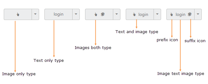
Image Position
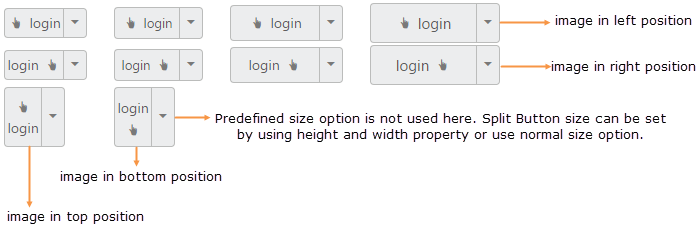
To provide the best look and feel for Split Button, position of images in Split Button is important. Using imagePosition property, you can easily customize the position of images inside Split Button without using any complex CSS. imagePosition property is applicable only with the textandimage content type property. This property represent the position of images with respect to text.
Property Table
| Image Position | Description |
|---|---|
| imageleft | Support for aligning text in right and image in left. |
| imageright | Support for aligning text in left and image in right. |
| imagetop | Support for aligning text in bottom and image in top. |
| imagebottom | Support for aligning text in top and image in bottom. |
The following steps explains you the details on rendering the Split Button with above mentioned image position options.
In the HTML page, add the following button elements to configure Split Button widget.
<table>
<tr>
    <td class="btnsht">
        <button id="splitButton_imageleft_normal">login</button>
        <ul id="Ul11">
            <li><span>User</span></li>
            <li><span>Guest</span></li>
            <li><span>Admin</span></li>
        </ul>
    </td>
    <td>
        <button id="splitButton_imageleft_small">login</button>
        <ul id="Ul21">
            <li><span>User</span></li>
            <li><span>Guest</span></li>
            <li><span>Admin</span></li>
        </ul>
    </td>
    <td class="btnsht">
        <button id="splitButton_imageleft_medium">login</button>
        <ul id="Ul31">
            <li><span>User</span></li>
            <li><span>Guest</span></li>
            <li><span>Admin</span></li>
        </ul>
    </td>
    <td class="btnsht">
        <button id="splitButton_imageleft_large">login</button>
        <ul id="Ul41">
            <li><span>User</span></li>
            <li><span>Guest</span></li>
            <li><span>Admin</span></li>
        </ul>
    </td>
</tr>
<tr>
    <td class="btnsht">
        <button id="splitButton_imageright_normal">login</button>
        <ul id="Ul1">
            <li><span>User</span></li>
            <li><span>Guest</span></li>
            <li><span>Admin</span></li>
        </ul>
    </td>
    <td>
        <button id="splitButton_imageright_small">login</button>
        <ul id="Ul2">
            <li><span>User</span></li>
            <li><span>Guest</span></li>
            <li><span>Admin</span></li>
        </ul>
    </td>
    <td class="btnsht">
        <button id="splitButton_imageright_medium">login</button>
        <ul id="Ul3">
            <li><span>User</span></li>
            <li><span>Guest</span></li>
            <li><span>Admin</span></li>
        </ul>
    </td>
    <td class="btnsht">
        <button id="splitButton_imageright_large">login</button>
        <ul id="Ul4">
            <li><span>User</span></li>
            <li><span>Guest</span></li>
            <li><span>Admin</span></li>
        </ul>
    </td>

</tr>
<tr>
    <td class="btnsht">
        <button id="splitButton_imagetop">login</button>
        <ul id="Ul5">
            <li><span>User</span></li>
            <li><span>Guest</span></li>
            <li><span>Admin</span></li>
        </ul>
    </td>
    <td>
        <button id="splitButton_imagebottom">login</button>
        <ul id="Ul6">
            <li><span>User</span></li>
            <li><span>Guest</span></li>
            <li><span>Admin</span></li>
        </ul>
    </td>
</tr>
</table>/// <reference path="tsfiles/jquery.d.ts" />
/// <reference path="tsfiles/ej.web.all.d.ts" />
module SplitButtonComponent {
$(function () {
var Button = new ej.SplitButton($("#splitButton_imageleft_normal"), {
imagePosition: "imageleft",
contentType: "textandimage",
showRoundedCorner: true,
prefixIcon: "e-icon e-handup",
targetID: "Ul11",
});
var Button1 = new ej.SplitButton($("#splitButton_imageonly"), {
size: "small",
imagePosition: "imageleft",
contentType: "textandimage",
showRoundedCorner: true,
prefixIcon: "e-icon e-handup",
targetID: "Ul21",
});
var Button2 = new ej.SplitButton($("#splitButton_imageonly"), {
size: "medium",
imagePosition: "imageleft",
contentType: "textandimage",
showRoundedCorner: true,
prefixIcon: "e-icon e-handup",
targetID: "Ul31",
});
var Button3 = new ej.SplitButton($("#splitButton_imageonly"), {
size: "large",
imagePosition: "imageleft",
contentType: "textandimage",
showRoundedCorner: true,
prefixIcon: "e-icon e-handup",
targetID: "Ul1",
});
var Button4 = new ej.SplitButton($("#splitButton_imageonly"), {
imagePosition: "imageright",
contentType: "textandimage",
showRoundedCorner: true,
prefixIcon: "e-icon e-handup",
targetID: "Ul2",
});
var Button5 = new ej.SplitButton($("#splitButton_imageonly"), {
size: "small",
imagePosition: "imageright",
contentType: "textandimage",
showRoundedCorner: true,
prefixIcon: "e-icon e-handup",
targetID: "Ul3",
});
var Button6 = new ej.SplitButton($("#splitButton_imageonly"), {
size: "medium",
imagePosition: "imageright",
contentType: "textandimage",
showRoundedCorner: true,
prefixIcon: "e-icon e-handup",
targetID: "Ul4",
});
var Button7 = new ej.SplitButton($("#splitButton_imageonly"), {
size: "large",
imagePosition: "imageright",
contentType: "textandimage",
showRoundedCorner: true,
prefixIcon: "e-icon e-handup",
targetID: "Ul41",
});
var Button8 = new ej.SplitButton($("#splitButton_imageonly"), {
imagePosition: "imagetop",
contentType: "textandimage",
showRoundedCorner: true,
prefixIcon: "e-icon e-handup",
targetID: "Ul5",
height: 60
});
var Button9 = new ej.SplitButton($("#splitButton_imageonly"), {
imagePosition: "imagebottom",
contentType: "textandimage",
showRoundedCorner: true,
prefixIcon: "e-icon e-handup",
targetID: "Ul6",
height: 60
});
});
}Configure the styles.
<style>
    .control {
        width: 420px;
    }
    .e-split {
        float: left;
        padding-left: 25px;
    }
</style>
Execute the above code to render the following output.
Theme support
You can control the style and appearance of Split Button based on CSS classes. In order to apply styles to the Split Button control, you can refer two files namely, ej.widgets.core.min.css and ej.theme.min.css. When you refer the ej.widgets.all.min.css file, then it is not necessary to include the files ej.widgets.core.min.css and ej.theme.min.css in your project, as ej.widgets.all.min.css is the combination of these two.
By default, there are 16 theme support available for RadialMenu component, namely:
- flat-azure
- flat-azure-dark
- fat-lime
- flat-lime-dark
- flat-saffron
- flat-saffron-dark
- gradient-azure
- gradient-azure-dark
- gradient-lime
- gradient-lime-dark
- gradient-saffron
- gradient-saffron-dark
- bootstrap
- high-contrast-01
- high-contrast-02
- material
- office-365
Custom CSS
You can use the CSS class to customize the Split Button control appearance. Define a CSS class as per requirement and assign the class name to cssClass property.
The following steps explains you the details about rendering the Split Button with custom CSS.
In the HTML page, add the following button elements to configure Split Button widget.
<div class="align">
    <table>
        <tr>
            <td class="btnsht">
                <div class="spltspan">
                    <button id="splitButton_customCss1">login</button>
                    <ul id="Ul11">
                        <li><span>User</span></li>
                        <li><span>Guest</span></li>
                        <li><span>Admin</span></li>
                    </ul>
                </div>
            </td>

            <td>
                <button id="splitButton_customCss2">login</button>
                <ul id="Ul21">
                    <li><span>User</span></li>
                    <li><span>Guest</span></li>
                    <li><span>Admin</span></li>
                </ul>
            </td>

            <td class="btnsht">
                <button id="splitButton_customCss3">login</button>
                <ul id="Ul31">
                    <li><span>User</span></li>
                    <li><span>Guest</span></li>
                    <li><span>Admin</span></li>
                </ul>
            </td>

            <td class="btnsht">
                <button id="splitButton_customCss4">login</button>
                <ul id="Ul41">
                    <li><span>User</span></li>
                    <li><span>Guest</span></li>
                    <li><span>Admin</span></li>
                </ul>
            </td>

            <td class="btnsht">
                <button id="splitButton_customCss5">login</button>
                <ul id="Ul51">
                    <li><span>User</span></li>
                    <li><span>Guest</span></li>
                    <li><span>Admin</span></li>
                </ul>
            </td>
        </tr>
    </table>
</div>/// <reference path="tsfiles/jquery.d.ts" />
/// <reference path="tsfiles/ej.web.all.d.ts" />
module SplitButtonComponent {
$(function () {
var Button = new ej.SplitButton($("#splitButton_customCss1"), {
cssClass: "customCss1",
size: "small",
showRoundedCorner: true,
contentType: "textandimage",
prefixIcon: "e-icon e-handup",
targetID: "Ul11",
});
var Button1 = new ej.SplitButton($("#splitButton_customCss2"), {
cssClass: "customCss2",
size: "small",
showRoundedCorner: true,
contentType: "textandimage",
prefixIcon: "e-icon e-handup",
targetID: "Ul21",
});
var Button2 = new ej.SplitButton($("#splitButton_customCss3"), {
cssClass: "customCss3",
size: "small",
showRoundedCorner: true,
contentType: "textandimage",
prefixIcon: "e-icon e-handup",
targetID: "Ul31",
});
var Button3 = new ej.SplitButton($("#splitButton_customCss4"), {
cssClass: "customCss4",
size: "small",
showRoundedCorner: true,
contentType: "textandimage",
prefixIcon: "e-icon e-handup",
targetID: "Ul41",
});
var Button4 = new ej.SplitButton($("#splitButton_customCss5"), {
cssClass: "customCss5",
size: "small",
showRoundedCorner: true,
contentType: "textandimage",
prefixIcon: "e-icon e-handup",
targetID: "Ul51",
});
});
}Configure the CSS styles to apply on buttons.
<style type="text/css">
    /* Customize the button background */
   .e-split .customCss1 {
        background-color: #121111;
    }
    .e-split .customCss2 {
        background-color: #94bbd5;
    }
    .e-split .customCss3 {
        background-color: #f3533c;
    }
    .e-split .customCss4 {
        background-color: #d1eeed;
    }
    .e-split .customCss5 {
        background-color: #deb66e;
    }
     /* Customize the button image & text color */
    .e-split .customCss1.e-btn.e-select .e-icon, .e-split .customCss1.e-btn.e-select .e-btntxt {
        color: #94bbd5;
    }
    .e-split .customCss2.e-btn.e-select .e-icon, .e-split .customCss2.e-btn.e-select .e-btntxt {
        color: #121111;
    }
    .e-split .customCss3.e-btn.e-select .e-icon, .e-split .customCss3.e-btn.e-select .e-btntxt {
        color: #cef6f7;
    }
    .e-split .customCss5.e-btn.e-select .e-icon, .e-split .customCss5.e-btn.e-select .e-btntxt {
        color: #534f4f;
    }
    .e-split {
        float: left;
        padding-left: 25px;
    }
</style>
Execute the above code to render the following output.
