How can I help you?
Checkbox
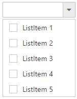
DropDownList displays checkboxes to the left of each item when you set showCheckbox property to true. It allows you to select more than one item at a time from DropDownList. Popup list stays open until the user finishes selection. When you click on an item’s text or checkbox then the checkbox checked status get change.
<input type="text" id="dropdown1" />/// <reference path="tsfiles/jquery.d.ts" />
/// <reference path="tsfiles/ej.web.all.d.ts" />
module DropDownListComponent {
var items = [{
text: "ListItem 1",
value: "item1"
}, {
text: "ListItem 2",
value: "item2"
}, {
text: "ListItem 3",
value: "item3"
}, {
text: "ListItem 4",
value: "item4"
}, {
text: "ListItem 5",
value: "item5"
}];
$(function () {
var sample = new ej.DropDownList($("#dropdown1"),{
dataSource: items,
fields: {
text: "text",
value: "value"
},
showCheckbox: true
});
});
}
NOTE
if you want to showcase the DropDownList with default checked items on data binding, specify selected field with Boolean values.
<input type="text" id="dropdown1" />/// <reference path="tsfiles/jquery.d.ts" />
/// <reference path="tsfiles/ej.web.all.d.ts" />
module DropDownListComponent {
var items = [{
text: "ListItem 1",
value: "item1",
selected: true
}, {
text: "ListItem 2",
value: "item2",
selected: false
}, {
text: "ListItem 3",
value: "item3",
selected: true
}, {
text: "ListItem 4",
value: "item4",
selected: false
}, {
text: "ListItem 5",
value: "item5",
selected: false
}];
$(function () {
var sample = new ej.DropDownList($("#dropdown1"),{
width: 300,
dataSource: items,
fields: {
text: "text",
value: "value",
selected: "selected"
},
showCheckbox: true
});
});
}
Selection Modes
The multiSelectMode property enables you to make multiple selections in the following two ways:
- Delimiter
- Visual Mode
IMPORTANT
“multiSelectMode” property accepts both the string and ej.MultiSelectMode enum value.
Delimiter
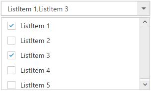
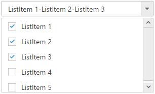
Each checked item’s text is appended to the textbox with delimiter “,” by default. This is enabled by assigning “delimiter” (string) or ej.MultiSelectMode.Delimiter (enum) value to multiSelectMode property. You can customize the delimiter option by using delimiterChar property.
<input type="text" id="dropdown1" />/// <reference path="tsfiles/jquery.d.ts" />
/// <reference path="tsfiles/ej.web.all.d.ts" />
module DropDownListComponent {
var items = [{
text: "ListItem 1",
value: "item1"
}, {
text: "ListItem 2",
value: "item2"
}, {
text: "ListItem 3",
value: "item3"
}, {
text: "ListItem 4",
value: "item4"
}, {
text: "ListItem 5",
value: "item5"
}];
$(function () {
var sample = new ej.DropDownList($("#dropdown1"),{
width: 300,
dataSource: items,
fields: {
text: "text",
value: "value"
},
showCheckbox: true,
multiSelectMode: ej.MultiSelectMode.Delimiter,
delimiterChar: "-"
});
});
}
Visual Mode
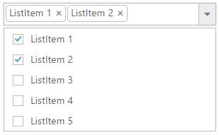
When you enable this option in DropDownList widget, each checked item’s text is appended to the text box in a box model layout. This is enabled by assigning “visualmode” (string) or ej.MultiSelectMode.VisualMode (enum) value to multiSelectMode property.
<input type="text" id="dropdown1" />/// <reference path="tsfiles/jquery.d.ts" />
/// <reference path="tsfiles/ej.web.all.d.ts" />
module DropDownListComponent {
var items = [{
text: "ListItem 1",
value: "item1"
}, {
text: "ListItem 2",
value: "item2"
}, {
text: "ListItem 3",
value: "item3"
}, {
text: "ListItem 4",
value: "item4"
}, {
text: "ListItem 5",
value: "item5"
}];
$(function () {
var sample = new ej.DropDownList($("#dropdown1"),{
width: 300,
dataSource: items,
fields: {
text: "text",
value: "value"
},
showCheckbox: true,
multiSelectMode: ej.MultiSelectMode.VisualMode
});
});
}
Check/Uncheck All
You can check/uncheck all the list items at run time by using checkAll and uncheckAll method. By default no item will be in checked state.
<input type="text" id="dropdown1" />$(function () {
var sample = new ej.DropDownList($("#dropdown1"),{
var items = [{
text: "ListItem 1",
value: "item1"
}, {
text: "ListItem 2",
value: "item2"
}, {
text: "ListItem 3",
value: "item3"
}, {
text: "ListItem 4",
value: "item4"
}, {
text: "ListItem 5",
value: "item5"
}];
$(function () {
var sample = new ej.DropDownList($("#dropdown1"),{
dataSource: items,
fields: {
text: "text",
value: "value"
},
showCheckbox: true
});
var target = new ej.ToggleButton($("#toggle"),{
"change": "onCheckUncheckAll",
"defaultText": "Check All",
"activeText": "Uncheck All"
});
});
}
function onCheckUncheckAll(args) {
if (args.isChecked) target.checkAll();
else target.unCheckAll();
}