Chart Report Item
Chart data region is used when the data needs to be presented in a visual format in the report. To present the data, choose the appropriate chart type; it will determine how well the data can be interpreted while visualizing it in chart form.
Chart types
Web Designer supports the following chart types:
-
Column charts - A column chart displays a series as a set of vertical bars that are grouped by category.
- Stacked column - A column chart where multiple series are stacked vertically.
- Percent stacked - A column chart where multiple series are stacked vertically to fit 100% of the chart area.
-
Bar charts - A bar chart displays series as sets of horizontal bars.
- Stacked bar - A bar chart where multiple series are stacked vertically.
- Percent stacked - A bar chart where multiple series are stacked vertically to fit 100% of the chart area.
-
Area charts - An area chart displays a series as a set of points connected by a line, with all the area filled in below the line.
- Stacked area - An area chart where multiple series are stacked vertically.
- Smooth area - An area chart where the data points are connected by a smooth line instead of a regular line.
- Percent stacked area - An area chart where multiple series are stacked vertically to fit the entire chart area.
-
Line charts - A line chart displays a series as a set of points connected by a single line. Line charts are used to represent large amounts of data that occur over a continuous period of time.
-
Smooth line - A line chart that uses a curved line instead of a regular line.
- Smooth line with markers
- Stepped line - A line chart that uses a curved line instead of a regular line.
- Line with markers
-
Smooth line - A line chart that uses a curved line instead of a regular line.
-
Scatter charts - A scatter chart displays a series as a set of points. Values are represented by the position of points on the chart.
- Bubble - Bubble charts display the difference between two values of a data point based on the size of the bubble.
-
Polar charts
- Polar charts - A polar chart displays a series as a set of points that are grouped by category on a 360-degree circle.
-
Shape charts
- Funnel - A funnel chart displays values as progressively in decreasing proportions.
- Pyramid - A pyramid chart displays proportional data so that the chart looks like a pyramid.
-
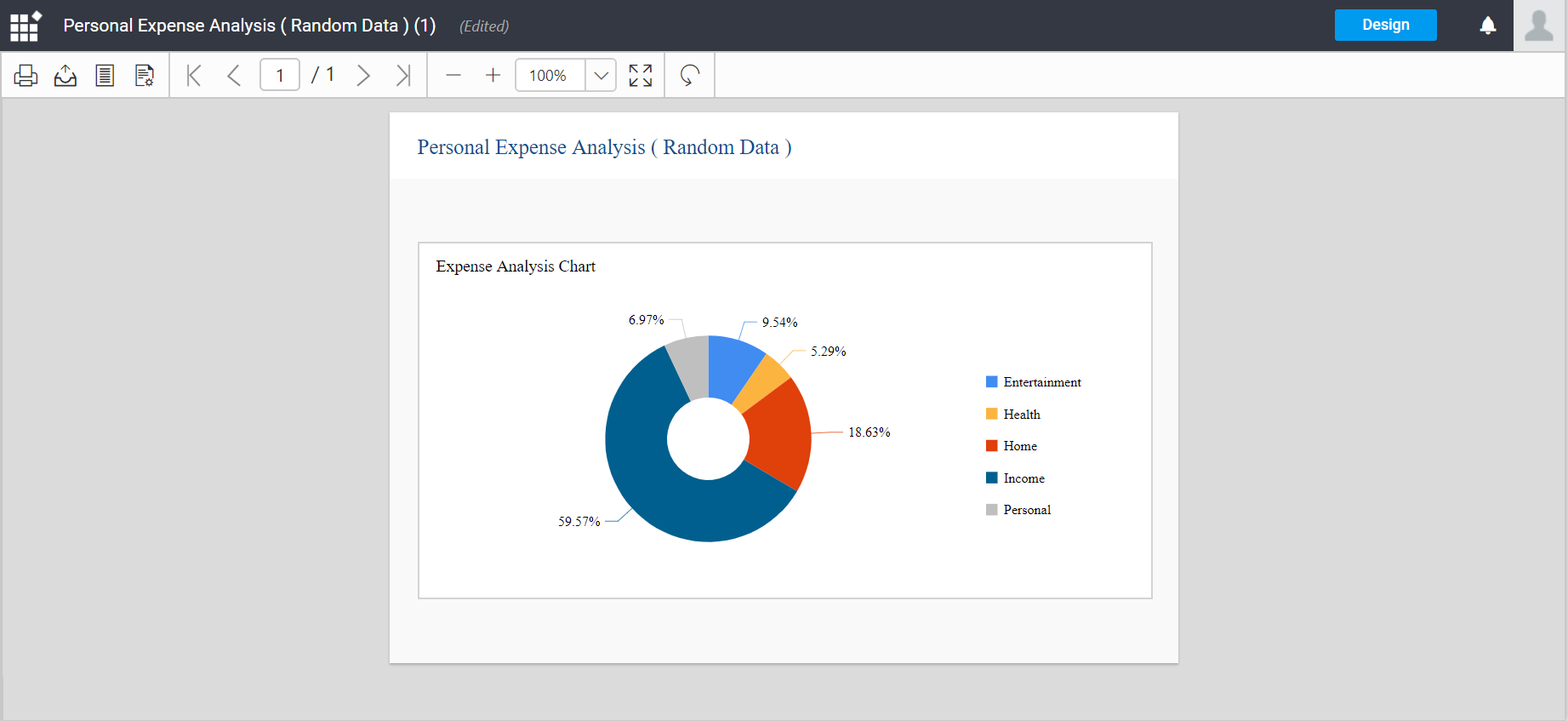
Pie chart - A pie chart displays data as a proportion of the whole. Pie charts are most commonly used to make comparisons between groups.
- Exploded pie - A pie chart where all of the slices are moved away from the center of the pie.
- Doughnut - A pie chart with an open space in the center and it displays data as a proportion of the whole.
To add a chart to a report
- Create a report and define a dataset. For more information refer Create Dataset.
Note: AdventureWorks database is used for demonstration.
-
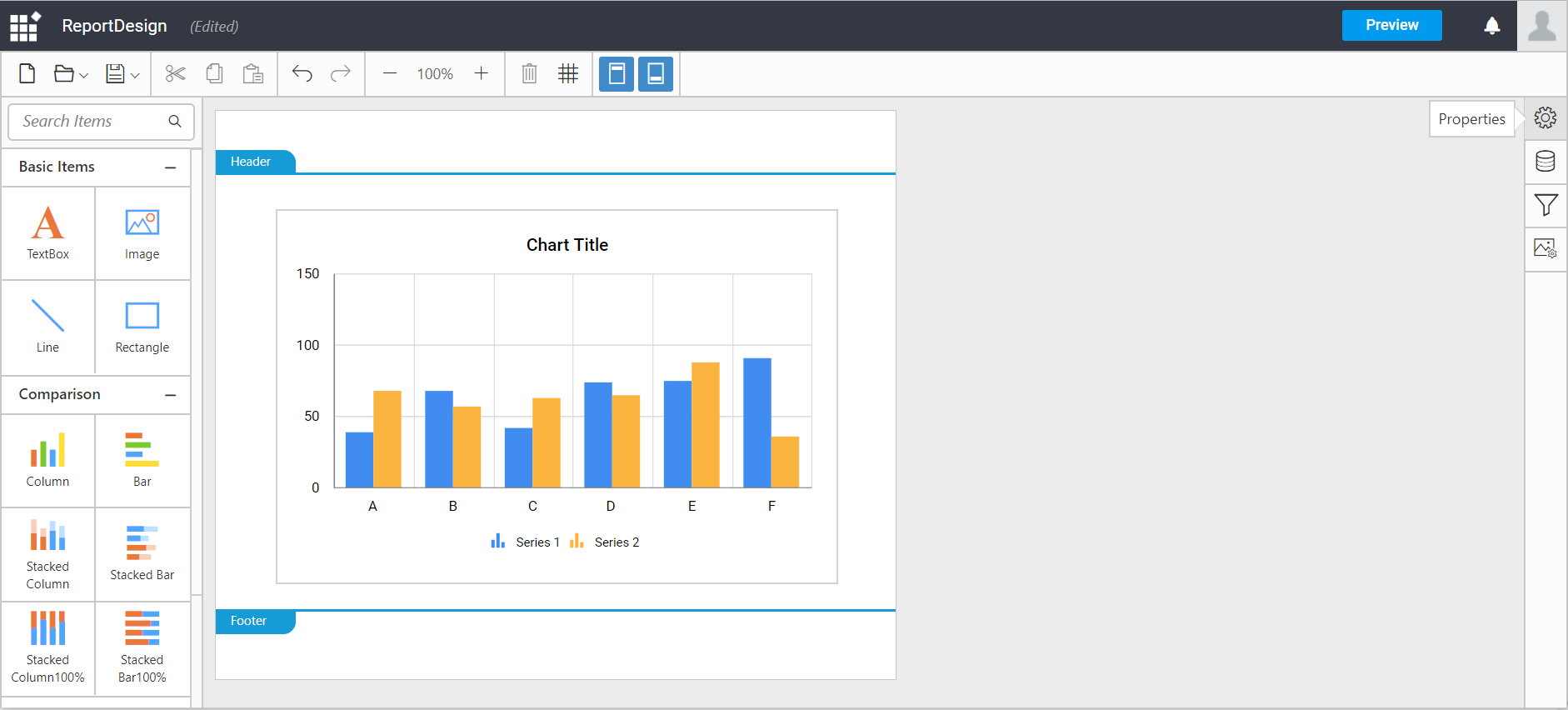
To add a Chart data region to the report, drag and drop the chart type of your choice from the item panel. The wizard offers column, line, pie, bar and area charts.
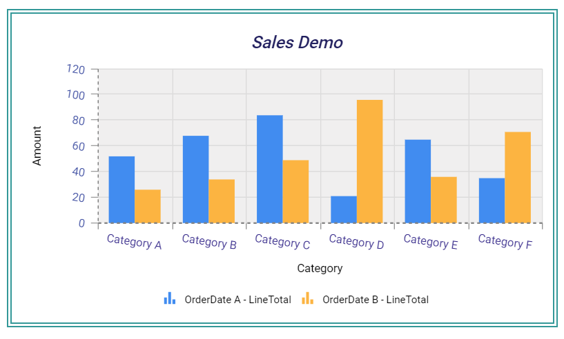
Note: Here Column chart is used to demonstrate.
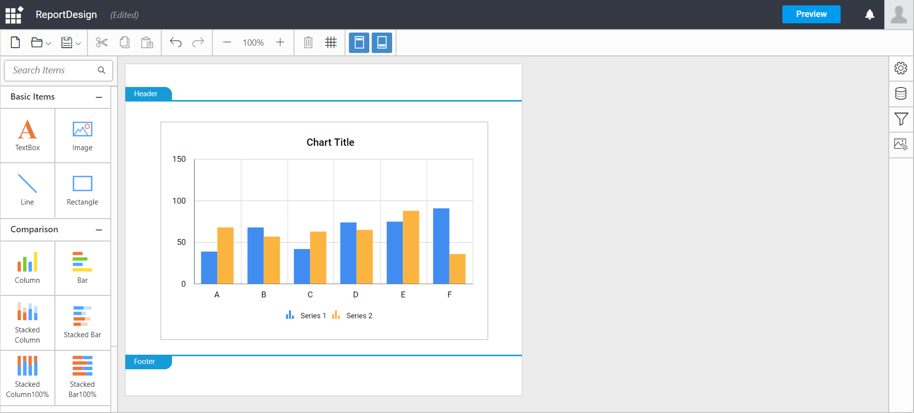
Designing a chart
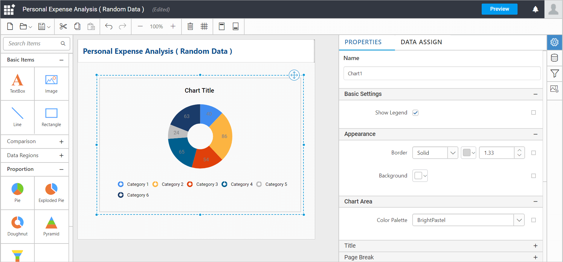
After adding a chart data region to the design surface, click the properties icon in the configuration panel to display the chart properties panel.
In the chart Properties pane, the visual effects of the charts can be designed using the Properties tab.
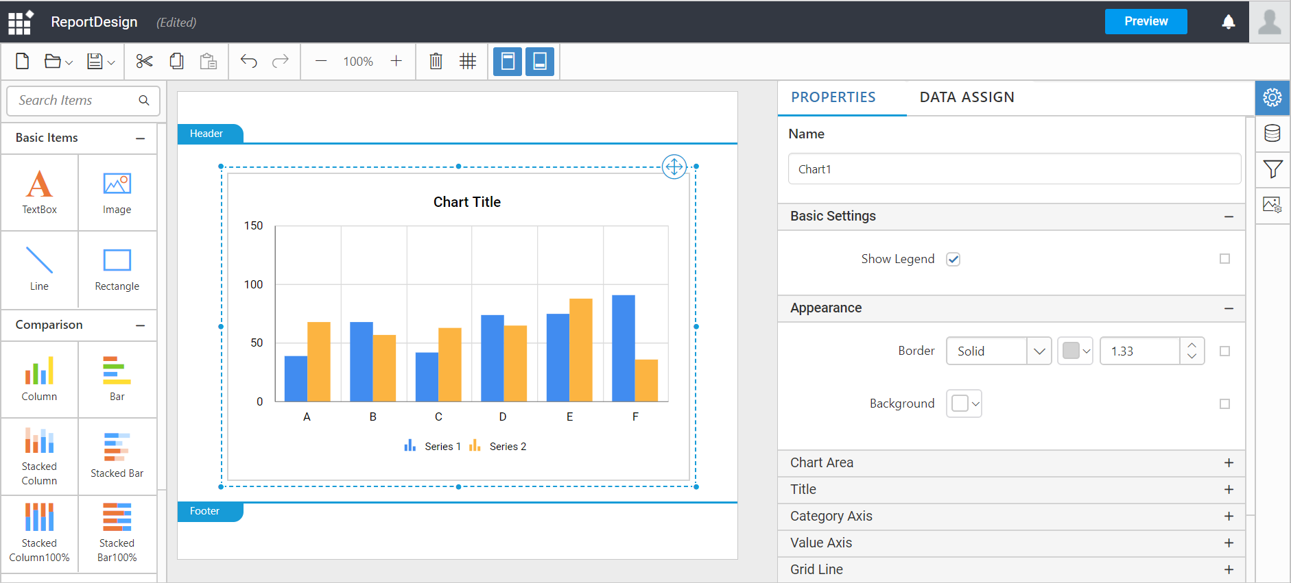
The list of properties available for the report item with default value will be displayed.
There are several elements of chart like the chart title, legend, vertical axis, horizontal axis, series, grid lines, and data point etc..
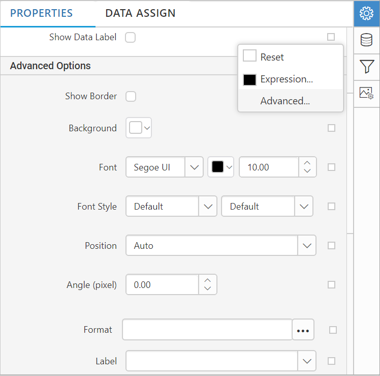
In the Properties pane , to add Expression or to open Advanced options, click the icon in the right corner of each property.
Note: RDL standard windows fonts are not supported in cross platforms. So, you need to load the unsupported fonts in application level for cross platforms.
Basic settings
Name: Title for the column chart report item can be set using this property.
Note: The properties under basic setting will be enabled in the properties window, after assigning the data to the chart.
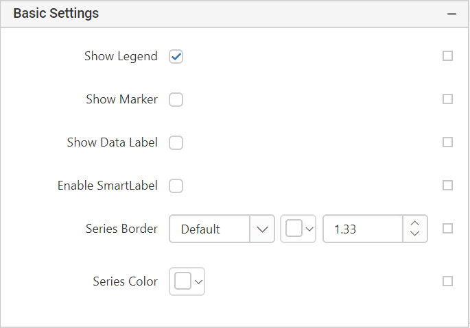
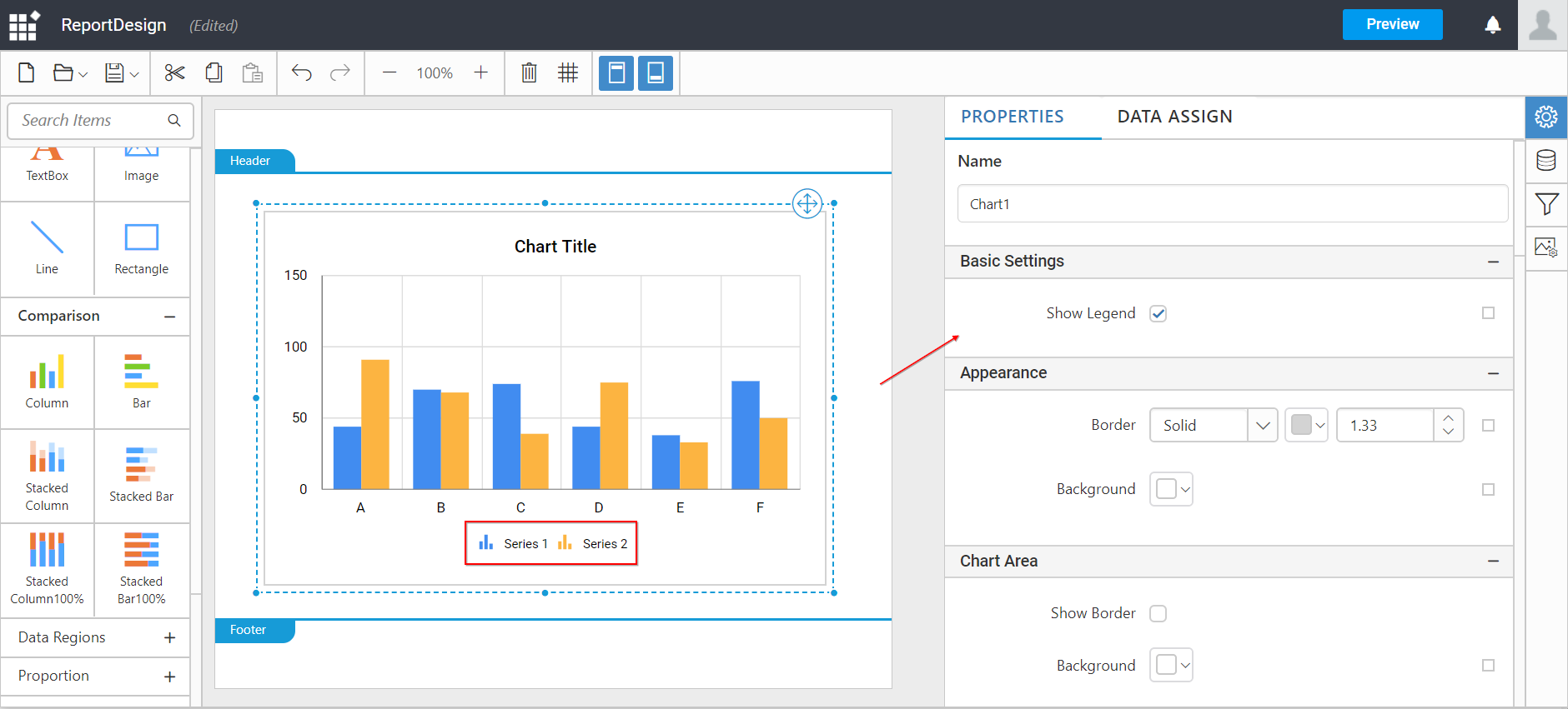
Show legend: Legends are symbols and text used to provide additional information about the chart. By default, the chart will be rendered with legend.
-
To hide the legend, clear the Show Legend check box.
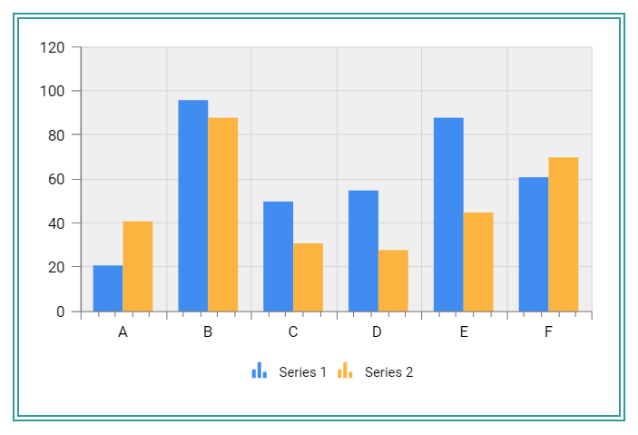
Show data label: A data label is a static part of the chart, report, or other dynamic layout. The label defines the information in the line item.
Note: RDL standard windows fonts are not supported in cross platforms. So, you need to load the unsupported fonts in application level for cross platforms.
Using the above properties in the above image, you can design the data label for better presentation of data.
Enable/disable data label by enabling/disabling the Show Data Label check box.
-
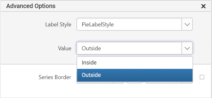
Enable smart label: Smart labels manage overlapping of labels even when a large number of labels are placed in close vicinity.
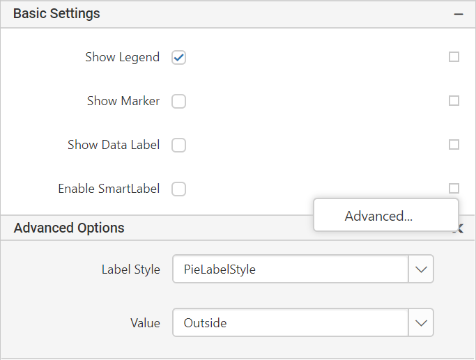
Using the advanced option, set the label style and value of smart label.
-
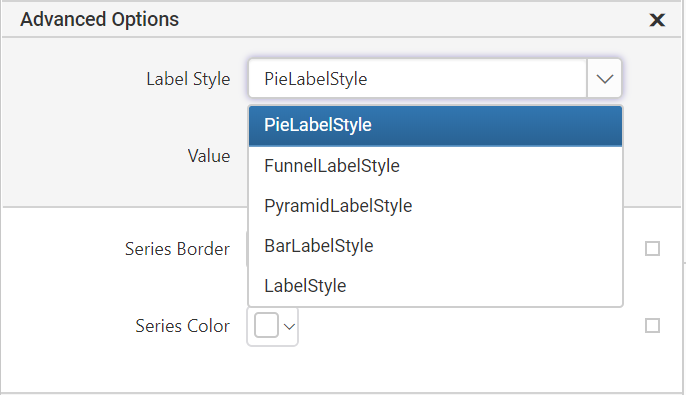
Label style : Set the label type based on the type of chart that are used to present the data.
-
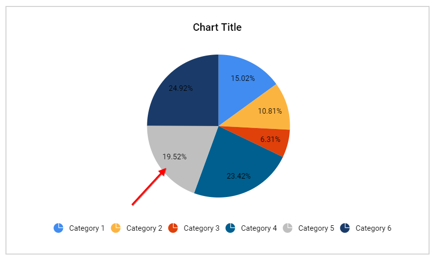
Value: The data label can be displayed inside or outside of the chart columns.
-
Inside:
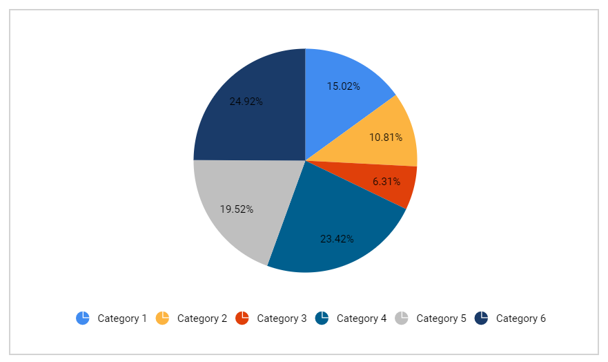
-
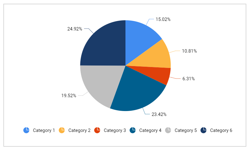
Outside:
-
Enable/disable smart label by enabling/disabling the
Show Smart Labelcheck box. -
Appearance
In the appearance category, set the border style, border width, border color, and background color of the chart to enhance the chart effects.
The border style, border width, border color for top, left, bottom, and right side can be set using the advanced option in the appearance category.
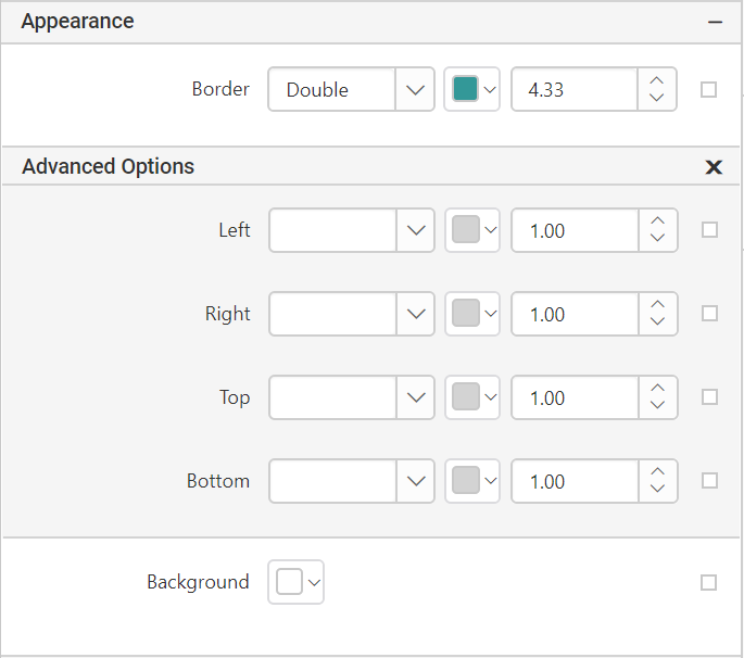
Chart area
In the chart area category, set the border style, border width, border color, and background color of the chart area.
Hide the border styles of chart area by clearing the Show border check box.
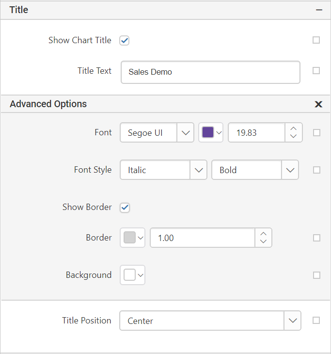
Title
The chart title can be customized by editing the Title Text property of the chart.
To enable the chart title, check the Show Chart Title checkbox.
Note: RDL standard windows fonts are not supported in cross platforms. So, you need to load the unsupported fonts in application level for cross platforms.
The chart title can be positioned, using Title Position in the below positions.
- Center
- Right
- Left
Axis properties
Types of axes
The chart has two primary axes: the value axis and the category axis.
Enable axis: To enable the axis title, check the Enable Axis checkbox.
Axis title: Set the title related to the data.
Line style : This allows to set the line style, width, and color of the axis line.
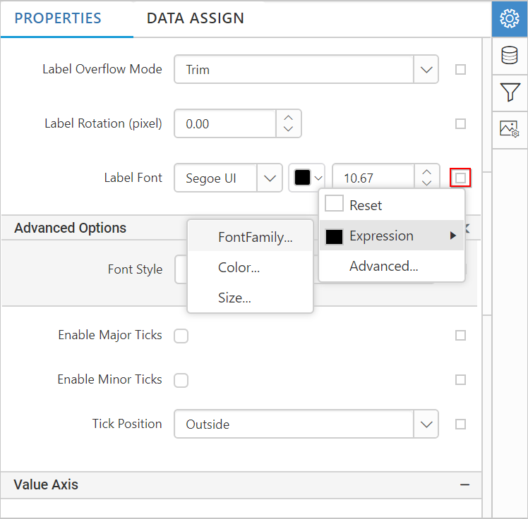
Label overflow mode: The label overflow mode can be set as Trim or Hide to adjust the data label in the axis.
Label text: To add effects to the label text, use below properties:
- Label rotation - This allows to define the rotation angle for the value labels to display.
-
Label font
- Font color
- Font size
Tick - To set the style, width, color, and length of the axis tick, and to set the visibility of the major and minor tick marks.
Grid line - The Grid line properties can be set to category and value axis.
-
To show the grid line for category axis, enable the Category Axis checkbox.
-
To show the grid line for value axis, enable the Value Axis checkbox.
Open the
Advancedoption to set the grid line style and color.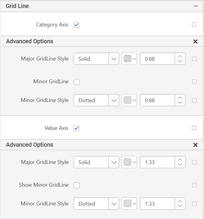
Page break - Add a page break to control the amount of information on each page.
Under page break options, select one of the following options:
- Start
- End
- Start and End
- Between
To remove the page break select None.
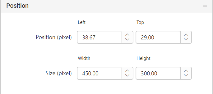
Position and size - The position and size of the chart can be changed using position and size property.
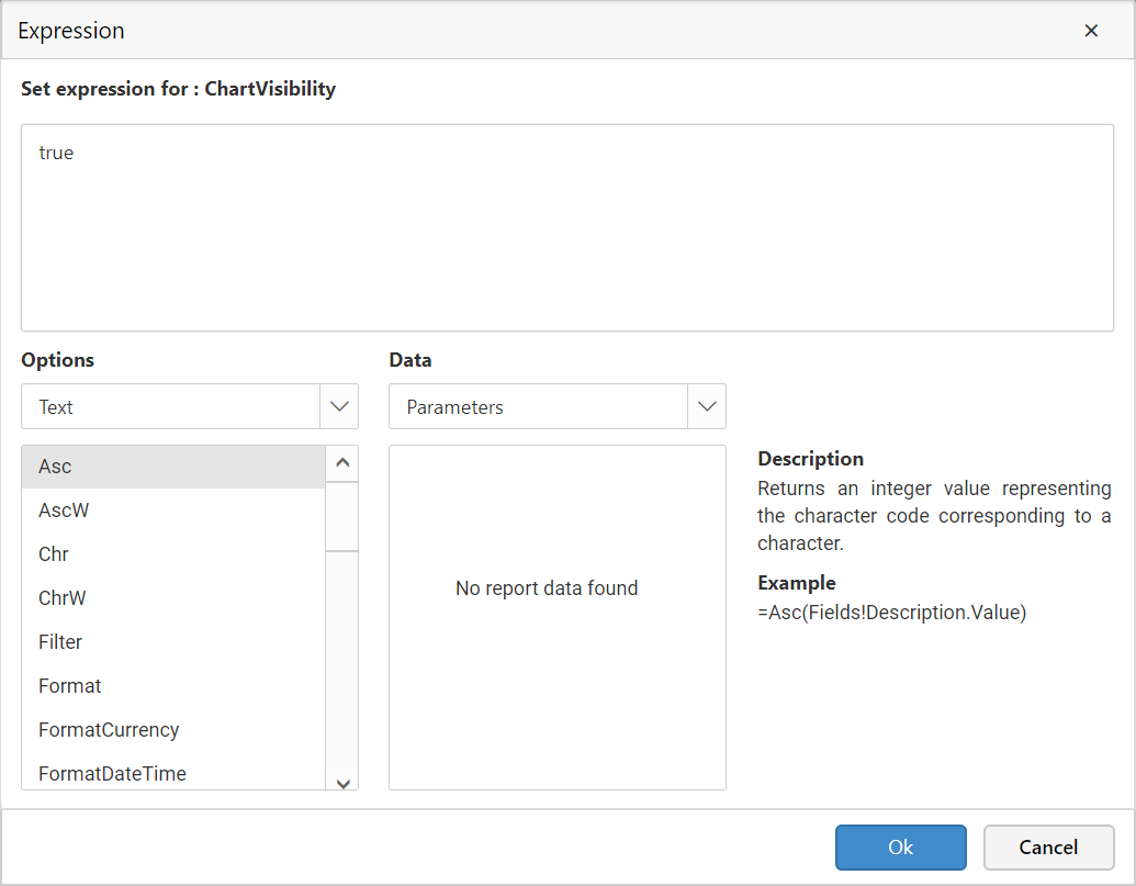
Visibility - Select an option to indicate how the report item is initially displayed in the report.
- Enable the checkbox to show the report item.
- Disable the checkbox to hide the report item.
- Show or hide based on an expression.
Select this option to vary the initial visibility using an expression.
Type an expression that evaluates to a boolean value of true to hide the item or false to show the item.
Click on the icon in the right corner and select Expression to edit the expression.
Adding Data to the Chart
Create a report and define a dataset.
Drag and drop the doughnut chart report item into the design area.
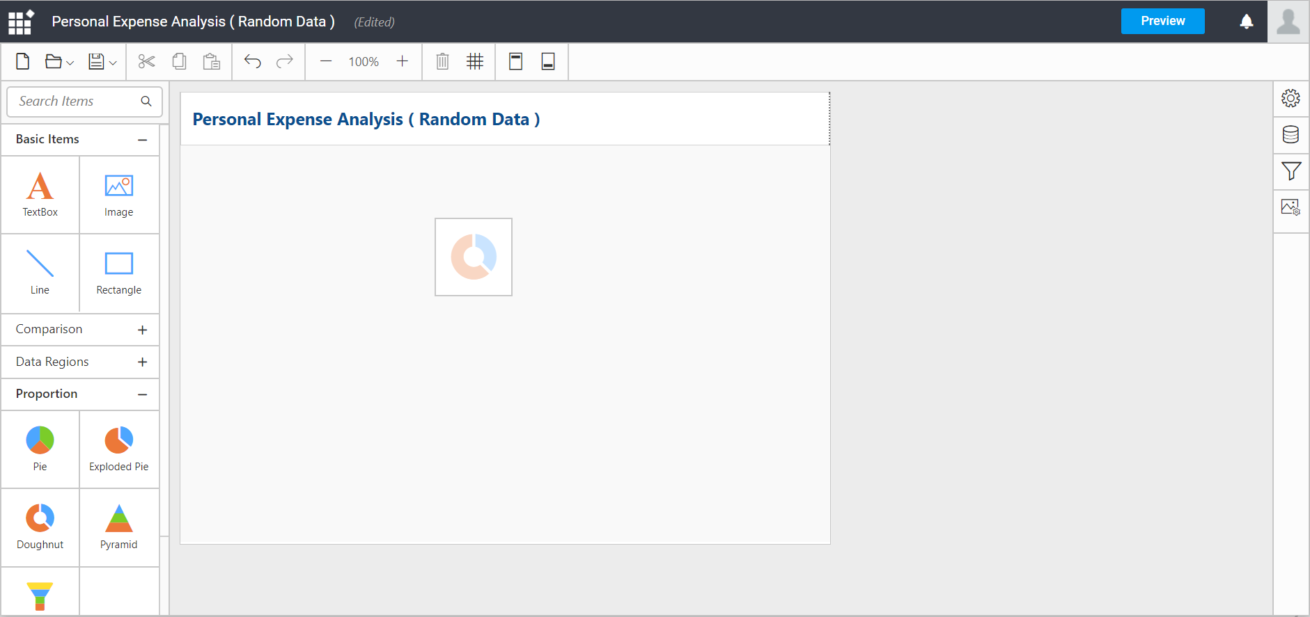
Note: Doughnut chart is used for demonstration.
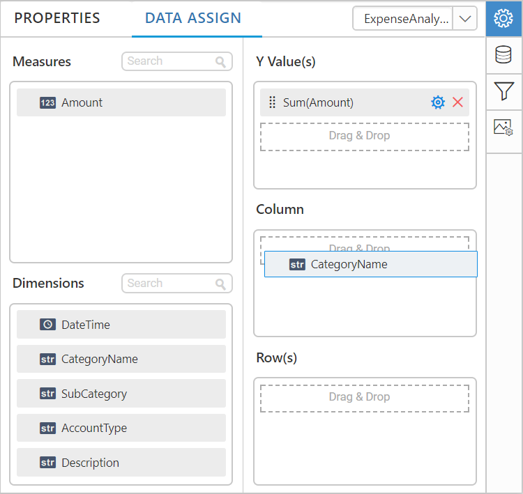
In the chart Properties pane, click the Data Assign.
The data pane will be opened with available measures and dimensions in the connected data source.
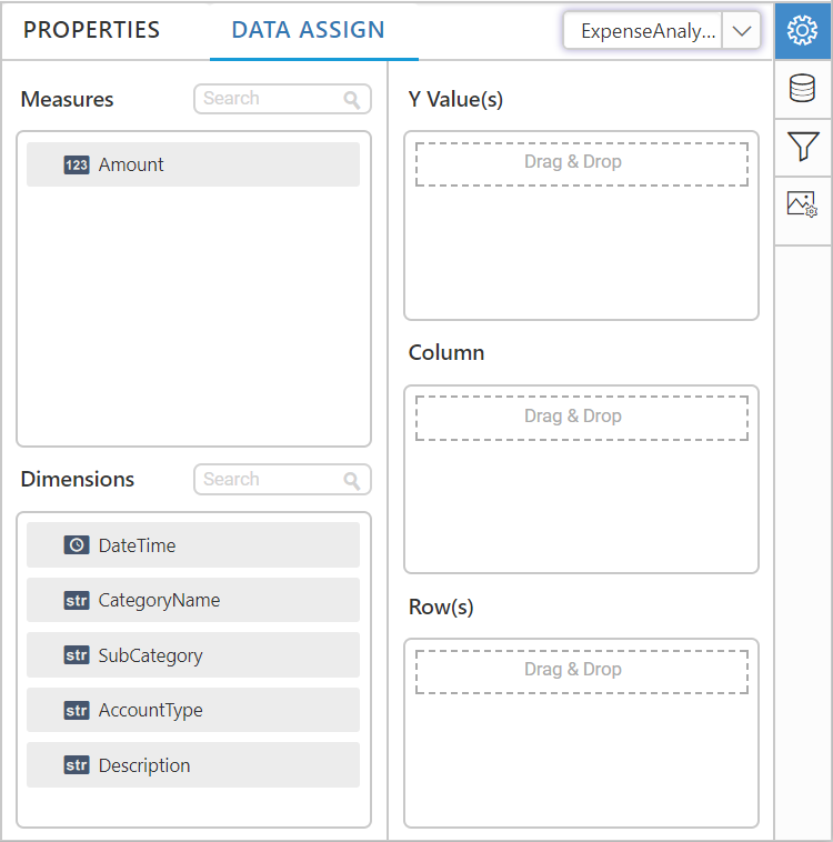
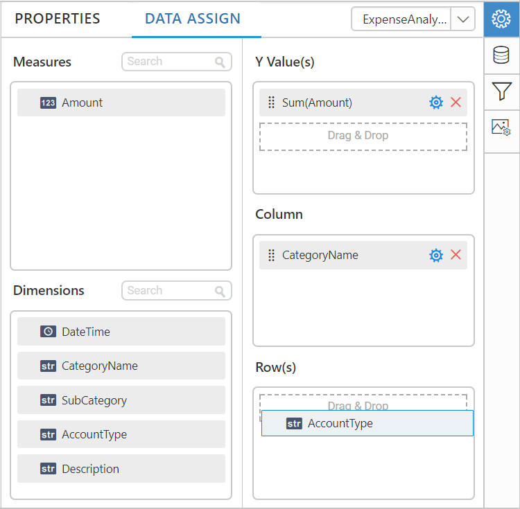
Assign value(s)
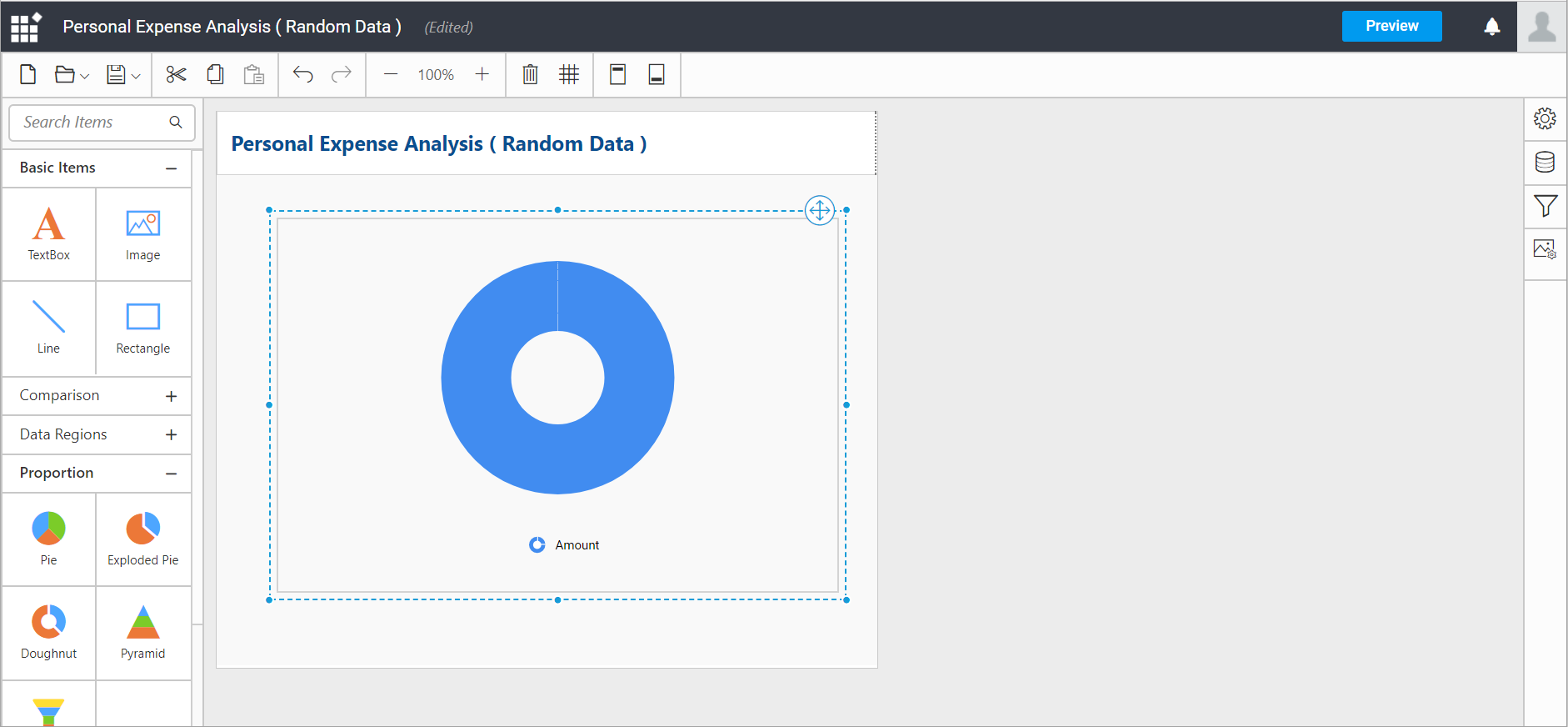
Drag and drop the Measure into Value.
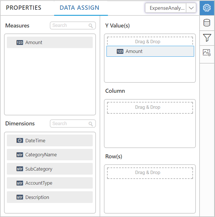
Now, the chart will be rendered like this.
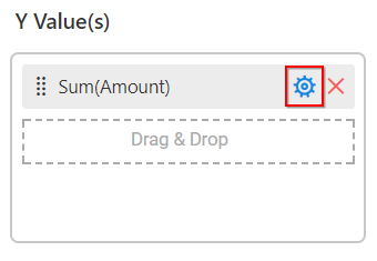
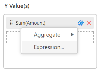
You can change the aggregate type of the value by clicking the Settings icon.
Select the required aggregate type from the list.
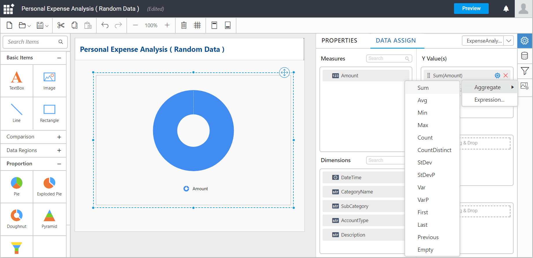
You can set Expression by clicking the Settings icon.
You can add more number of values by drag and drop the Measures into Value field.
You can also add Dimensions and Columns to Value(s).
Assigning column
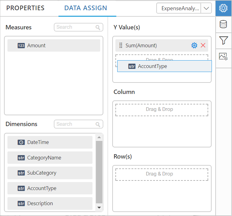
You can add the Dimension to Column field by drag and drop.
You can add Measures to Column(s) field.
You can limit the data to be displayed by choosing the filters option.
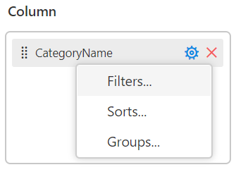
Filters: Filters are used to limit the data in the report after the data is retrieved from the data source. When you add the filter to a chart data, the report will retrieve data that matches the filter conditions.
Click the Filters..., will launch Filter Dialog where you can filter the data need to be displayed.
You can Add multiple filters by clicking the ADD.
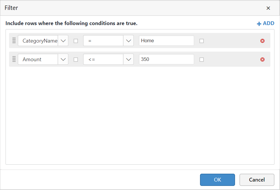
Click Ok.
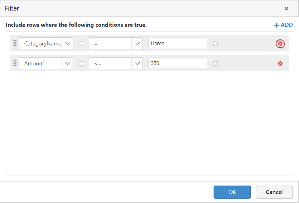
You can clear the filter by clicking the close icon in the each row.
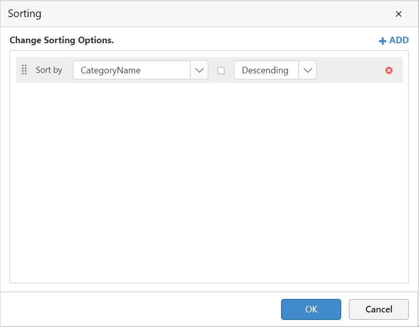
Sorting: You can control the order in which data appears in a data region by representing sort expressions. You can sort the chart either in ascending or descending series.
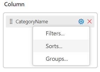
Click Sorts..., will launch Sort Dialog where you can sort the data.
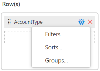
Assigning row(s)
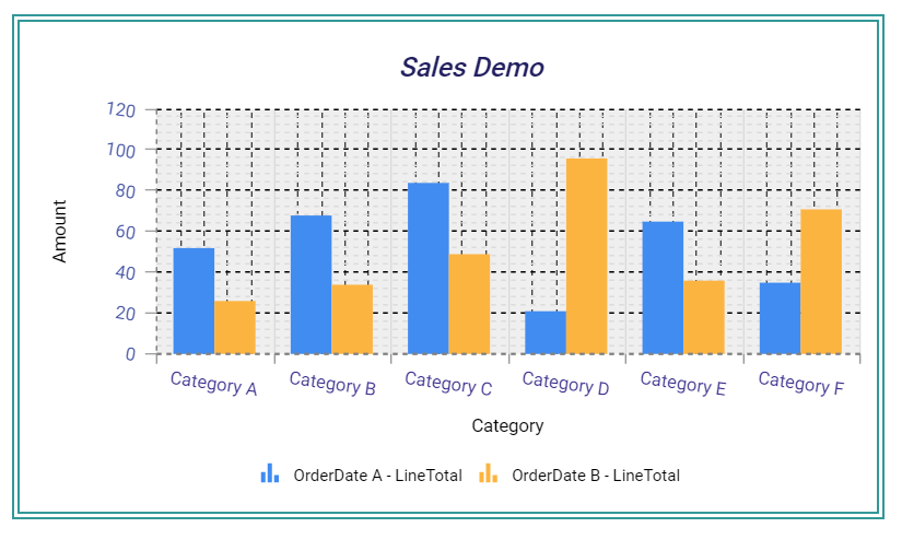
You can add a dimension level or hierarchy to Row section for series rendering of the chart.
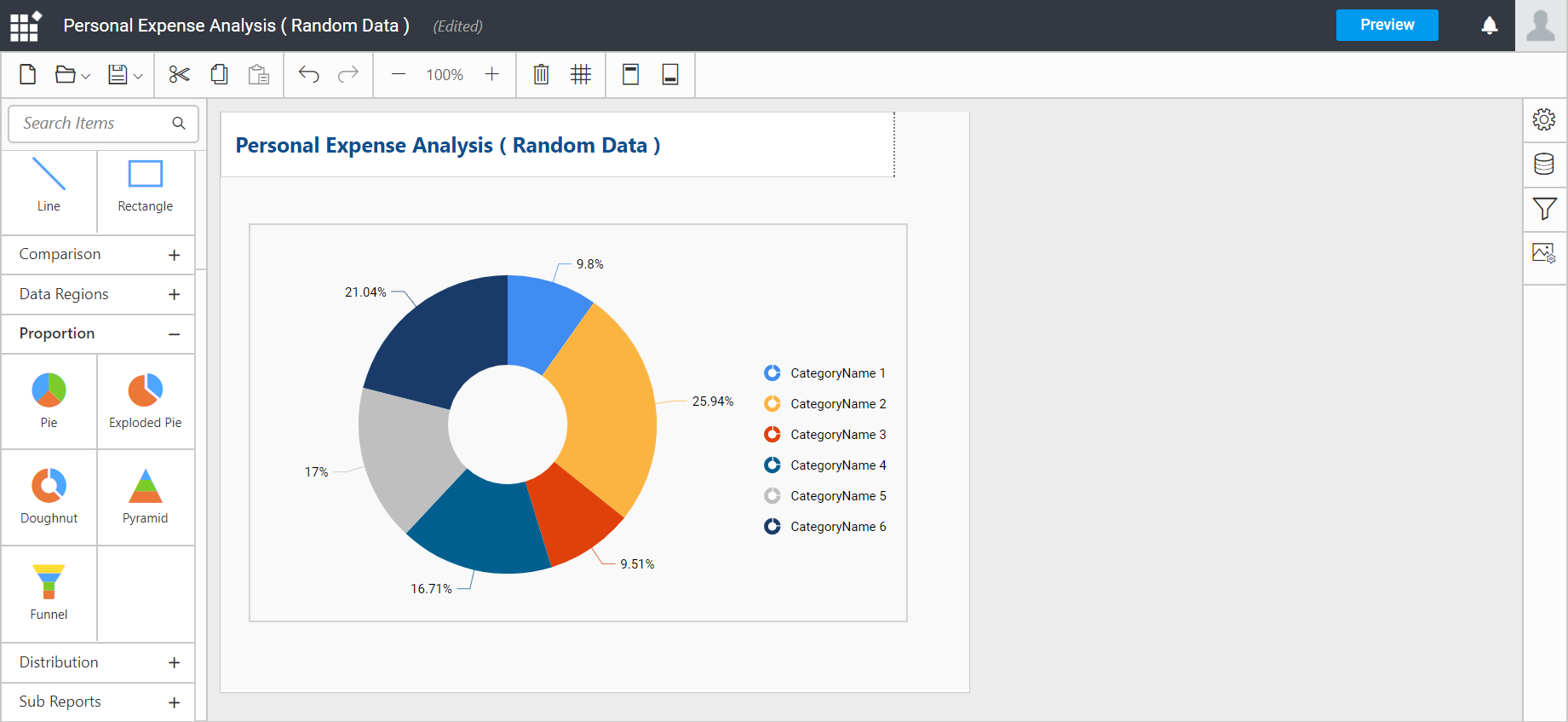
The chart will be rendered in series as shown in the image below.
You have settings options similar to column(s).
You can add more number of values by drag and drop the Dimension into Row field.
Now, the chart Preview will look like below.