Draw Chart Report Item
You can add a chart to the Report Designer using the following steps.
Add a data source and dataset to the Report Designer.
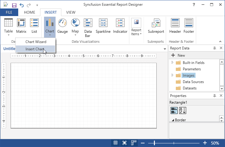
Inserting chart through Insert Chart
-
Click Chart in the Insert Tab,Select Insert Chart in the list and drag it to the Report designer.
-
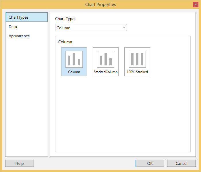
A Chart properties wizard opens,Click OK.Then chart will be added with its default properties.
-
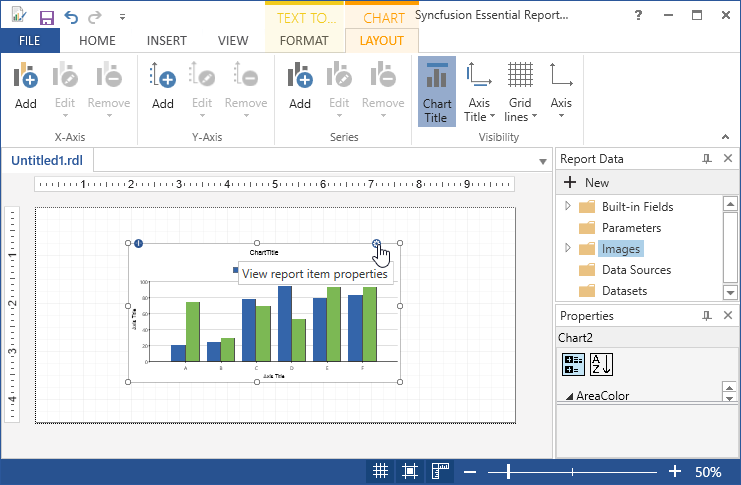
To change the Values of Value Axis, Area color and Category Axis,Double Click on the chart.
-
To Add the Report Items such as text boxes, lines, and images and rectangle to the chart,click and drag the selected report items to the chart.
-
Drag a data field to the category axis panel and the value axis panel.
-
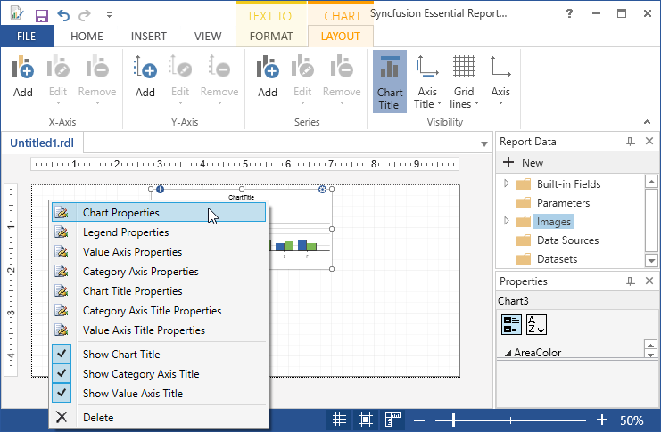
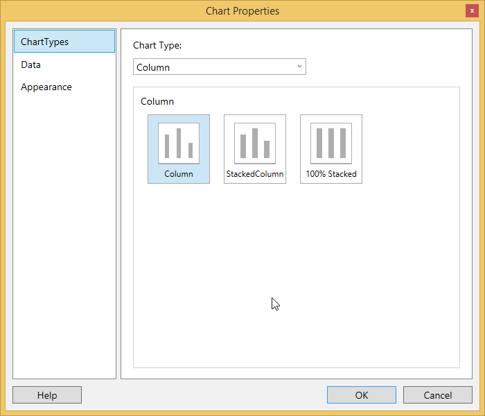
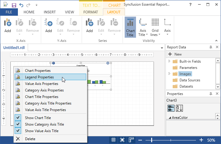
To Apply Styles to the Charts,Right Click on the Chart and select the Chart Properties from the context menu.
-
In the Chart Properties dialog, select any of the following.
-
General - To change the chart type and ToolTip of the chart.
-
Data - To set the Dataset name and data fields of the corresponding datasets.
-
Appearance - To set the Chart name and border options and background options.
-
-
Click OK.Then the values are updated in the Chart.
-
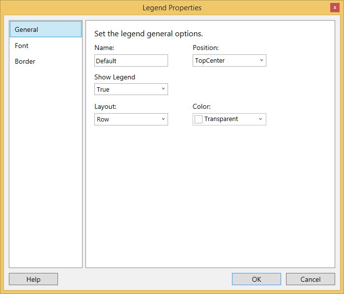
Right click on the chart and select Legend Properties from the context menu.
-
The Legend Properties dialog opens. Select any of the following.
-
General - To change the position, color, name and layout of the legend.
-
Font - To set the font color, font family, font size, and font style of the legend.
-
Border - To set the border color and border width of the legend.
-
-
Click OK.Then the values are updated in the Legend.
-
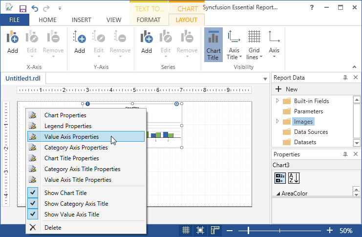
Right click on the chart and select Value Axis Properties from the context menu.
-
General - To change the direction, line style, line width and line color of the value axis.
-
Label - To set the font family, font size, font angle, font style, font color, and visibility of the value axis label.
-
Tick - To set the style, width, color, and length of the value axis tick, and set the visibility of the major and minor tick marks.

-
-
Click OK.Then the values are updated in the Value Axis.
-
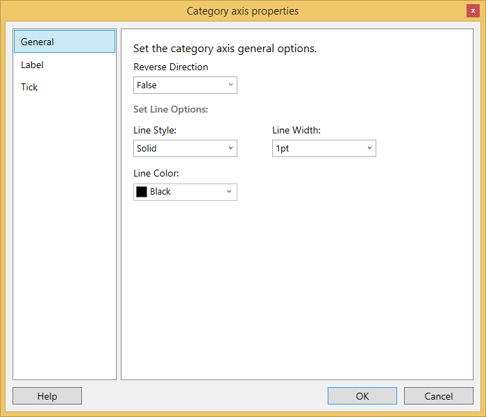
Right click on the chart and select Category Axis Properties from the context menu.
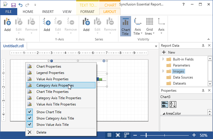
-
General - To change the direction, line style,line width and line color of the category axis.
-
Label - To set the font family, font size,font angle, font style, font color, font weight and visibility of the category axis label.
-
Tick - To set the style, width, color, and length of the value axis tick, and set the visibility of the major and minor tick marks.
-
-
Click OK.Then the values are updated in the Category Axis.
-
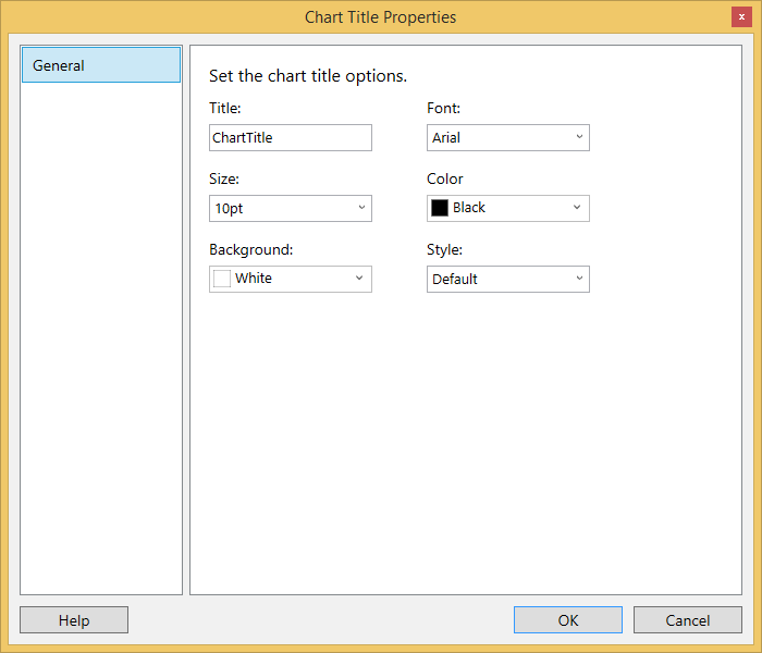
Right click on the chart and select Chart title Properties from the context menu.

- General - To set the chart title options like title, font, color, size, background and style.
-
Click OK to update the values for Chart title.
-
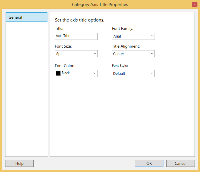
Right click on the chart and select Category Axis title Properties from the context menu.
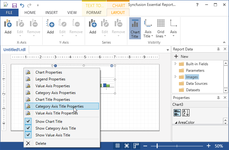
- General - To set the chart title options like title, font family, font color, font size, title alignment and font style.
-
Click OK to update the values for Category Axis title.
-
Right click on the chart and select Value Axis title Properties from the context menu.
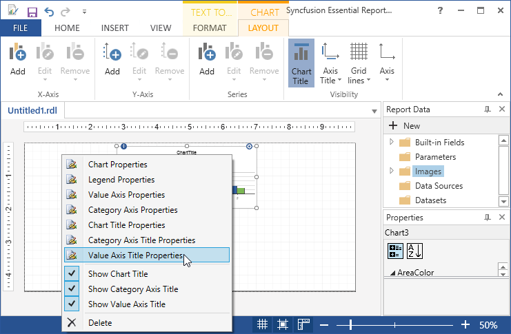
- General - To set the chart title options like title, font family, font color, font size, title alignment and font style.

-
Click OK to update the values for Category Axis title.
-
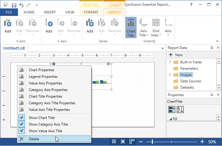
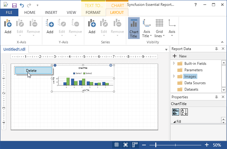
To delete the chart,Right click and select delete.
Inserting chart through Chart Wizard
-
Click on Insert tab, and select Chart.
-
Choose Chart Wizard, in Insert > Chart.
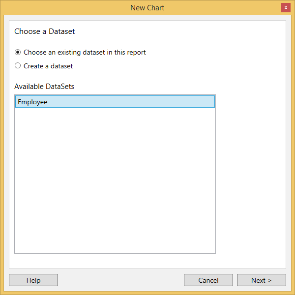
I. Choose an existing dataset in this report,if dataset is already added.
II. Choose create a dataset, if dataset is not added.Then Create datasource and dataset,and follow the following steps.
-
If dataset is already added select available datasets and click Next.
-
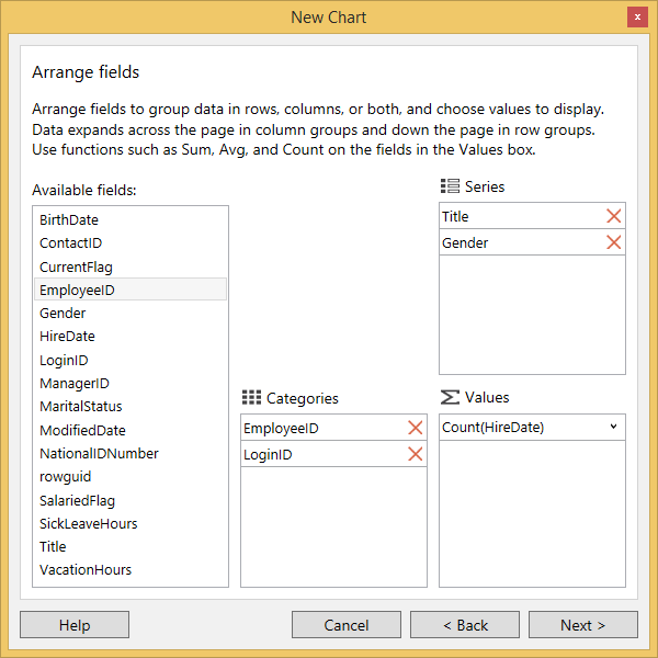
Drag to available fields to the corresponding Series,Categories and values and click Next.
-
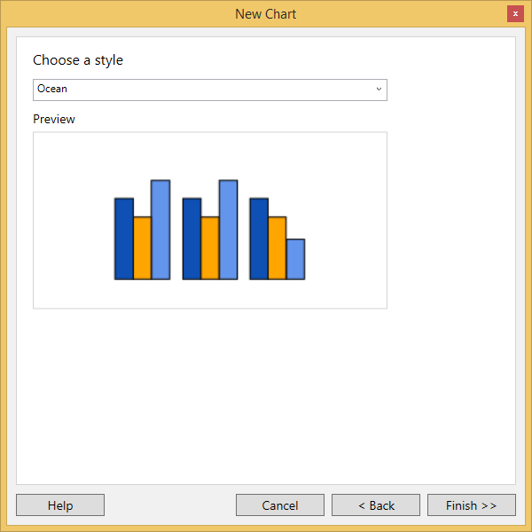
Select the Style and Layout of the table and click Finish.
-
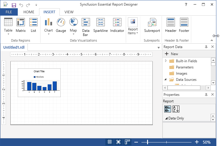
Then the chart will display with the selected fields.
-
To Apply Styles to the Charts,Right Click on the Chart and select the Chart Properties from the context menu.
-
In the Chart Properties dialog, select any of the following.
-
General - To change the chart type and ToolTip of the chart.
-
Data - To set the Dataset name and data fields of the corresponding datasets.
-
Appearance - To set the Chart name and border options and background options.
-
-
Click OK.Then the values are updated in the Chart.
-
Right click on the chart and select Legend Properties from the context menu.
-
The Legend Properties dialog opens. Select any of the following.
-
General - To change the position, color, name and layout of the legend.
-
Font - To set the font color, font family, font size, and font style of the legend.
-
Border - To set the border color and border width of the legend.
-
-
Click OK.Then the values are updated in the Legend.
-
Right click on the chart and select Value Axis Properties from the context menu.
-
General - To change the direction, line style, line width and line color of the value axis.
-
Label - To set the font family, font size, font angle, font style, font color, and visibility of the value axis label.
-
Tick - To set the style, width, color, and length of the value axis tick, and set the visibility of the major and minor tick marks.
-
-
Click OK.Then the values are updated in the Value Axis.
-
Right click on the chart and select Category Axis Properties from the context menu.
-
General - To change the direction, line style,line width and line color of the category axis.
-
Label - To set the font family, font size,font angle, font style, font color, font weight and visibility of the category axis label.
-
Tick - To set the style, width, color, and length of the value axis tick, and set the visibility of the major and minor tick marks.
-
-
Click OK.Then the values are updated in the Category Axis.
-
Right click on the chart and select Chart title Properties from the context menu.
- General - To set the chart title options like title, font, color, size, background and style.
-
Click OK to update the values for Chart title.
-
Right click on the chart and select Category Axis title Properties from the context menu.
- General - To set the chart title options like title, font family, font color, font size, title alignment and font style.
-
Click OK to update the values for Category Axis title.
-
Right click on the chart and select Value Axis title Properties from the context menu.
- General - To set the chart title options like title, font family, font color, font size, title alignment and font style.
-
Click OK to update the values for Category Axis title.
-
To delete the chart,Right click and select delete.