Appearance
12 May 20171 minute to read
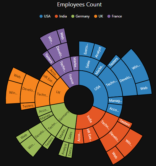
The appearance of the Sunburst Chart can be customized as shown below
Palette
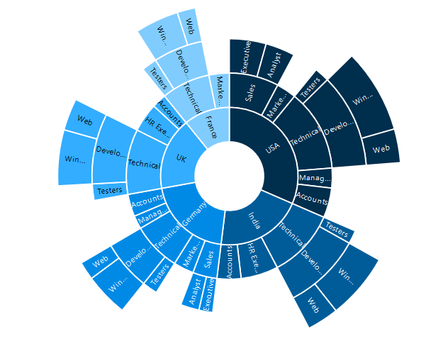
The Sunburst Chart displays different segments in different colors by default. You can customize the color of each segment by providing a custom color palette of your choice by using the palette property.
"use strict";
var palette = ["#002e4d", "#005c99", "#008ae6", "#33adff", "#80ccff"];
ReactDOM.render(
    <EJ.SunburstChart id = "sunburst1"
    palette = {palette}>
    </EJ.SunburstChart>,
          document.getElementById('sunburst')
);
The Sunburst Chart rendered with palette colors
Built- in Themes
The Sunburst Chart supports different themes.
- flatlight
- flatdark
- gradientlight
- gradientdark
- azure
- azuredark
- lime
- limedark
- saffron
- saffrondark
- gradient-azure
- gradient-azuredark
- gradient-lime
- gradient-limedark
- gradient-saffron
- gradient-saffrondark
You can set your desired theme by using the theme property. Flat light is the default theme used in the Sunburst Chart.
"use strict";
ReactDOM.render(
    <EJ.SunburstChart id = "sunburst1"
    theme = "flatdark">
    </EJ.SunburstChart>,
          document.getElementById('sunburst')
);